


Color isn’t something we can pick arbitrarily. Color affects a lot more than it might seem at first glance.
In fact, when it comes to colors in branding, a misuse of color can cost you hundreds of dollars without you even realizing it.
More than 60% of companies reported that being consistent in branding added up to 20% more growth to their brand. Color psychology in branding is a big factor that directly affects a brand strategy in both consistency and identity.
When more than 85% of consumers are making a purchase decision based on visuals alone, it makes sense why colors are vital to success.
Understanding what each color represents and conveys to a potential customer is crucial if you want to convert more in 2026.
Below, we will explain why color psychology in branding is important and which colors you should be using in your brand strategy on a consistent basis.
Are you trying to improve your branding but don’t know where to start? Let us help you.
What Colors in Branding Should You Care About?
There will always be colors that customers gravitate toward due to how they affect their emotions.
From a subtle emotion from your logo to a strong emotion while watching an ad, colors affect customers more than we realize.
If you want your brand to stand out, you first need to learn the seven key colors that have the biggest impact on customer behavior. Understanding and mastering these can elevate both your branding and marketing strategies.
Though many colors are available for branding, we are focusing on these seven. They stand out for their popularity and branding strength.
Top 7 Colors That Matter Most for Your Brand
1. Blue
According to color psychology, blue consistently ranks as the most popular color in the world. Not only for branding, but in general. Blue conveys trust, dependability, and security. A lot of people associate blue tones with a sense of calm and restoration.
This is why big healthcare companies generally use blue tones and hues.
That being said, they aren’t the only big companies using blue.
Big brands such as Facebook and Twitter (before the X change) focus on using blue for their branding.
The color isn’t only suited for big companies, though. This color works exceptionally well for brands that want to make customers trust them.
Even with all its strengths, blue isn’t seen as only positive. Since blue is rare in the foods we eat, most people wont associate the color with food and in some cases it might put them off certain food in general.
Blue can also feel unfriendly and cold since it is generally used by healthcare companies and big corporations.
Blue is an excellent choice for branding due to the feeling of trust and calm it brings, that being said, it’s important to notice if those emotions fit in your industry and niche. Using a color that doesn’t appeal to your target audience will only work against you in the long run.
2. Red
Red is the polar opposite of blue. Where blue aims to make you feel calm, red is meant to empower you and fill you with energy.
Bright colors such as red are mainly used for calls to action due to how easy it is to see and how much attention it demands. The goal is simple with red for CTAs, to get visitors to click and convert.
This being said, red isn’t only positive. It also has a lot of negative connotations such as anger, pain, and a feeling of danger.
When used correctly, you can use those emotions to your advantage.
Red is used in different things in our day to day lives.
From stop signs to how teachers highlight mistakes in our work.
The color is everywhere, but one thing is for certain: it evokes a strong emotion, be it good or bad.
Red’s impact can vary widely, which makes using it correctly essential. You don’t want your brand to be judged harshly or misunderstood just because the color red sent the wrong impression to everyone.
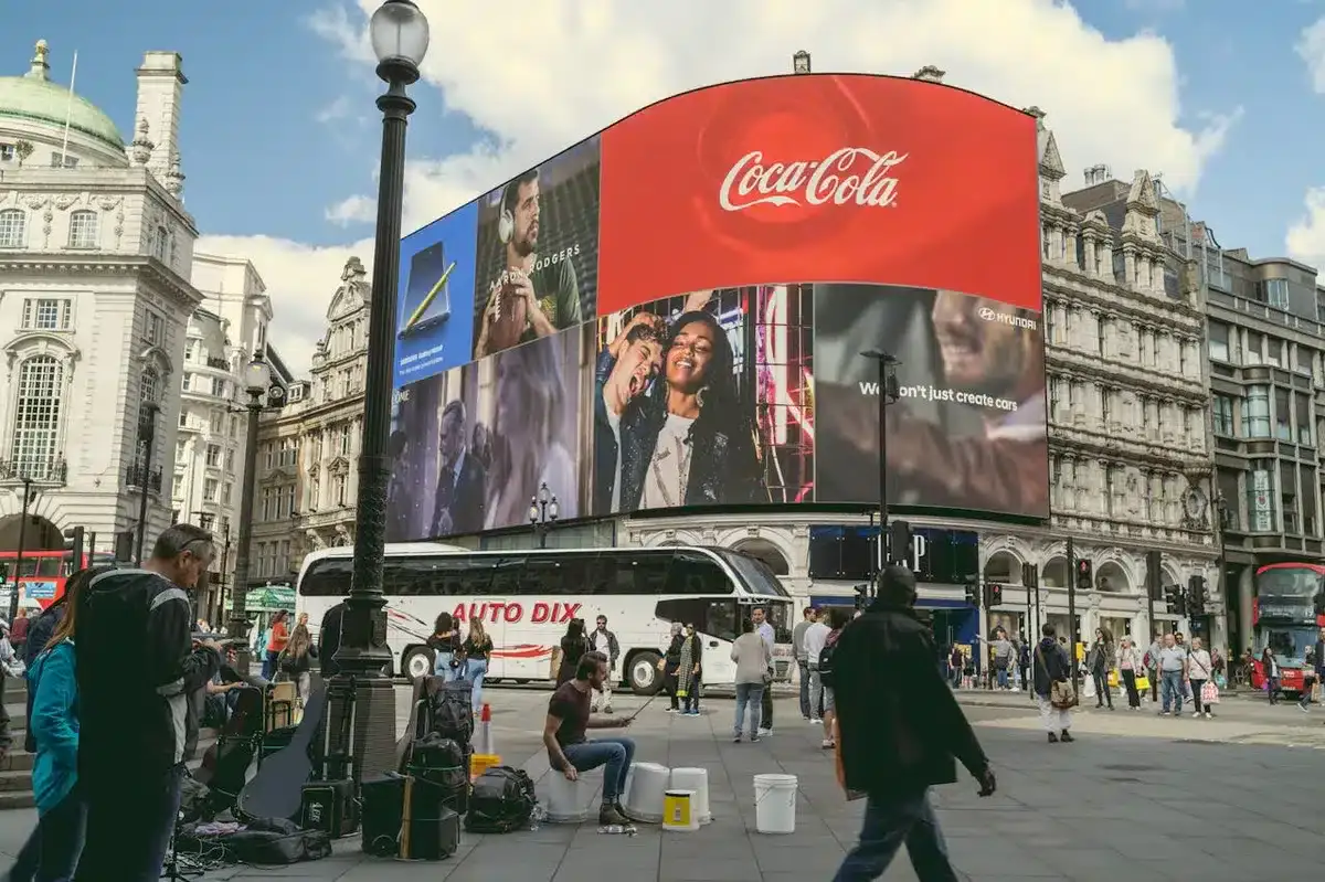
A fantastic example of a popular brand that has been using red for its branding is none other than Coca-Cola. They entice people into buying their drinks by using exciting branding and a vibrant color such as red.
3. Green
Green is everywhere on our planet.
Whenever someone sees green, they think of life and nature. This is why big brands such as Whole Foods use green as their main color for their branding.
Green isn’t only tied to food brands, though.
Many popular nature brands, including John Deere and Land Rover, feature green tones. These brands want to show their attachment to the wilderness and being outdoors.
Although green is generally seen as fresh and positive, ti can take a negative feel when misused. Some viewers can quickly associate it with poison or sickness. So understanding how and where to use green is a must.
Avoid using green on liquids unless you can instantly explain why it has that color right after.
4. Black

Nowadays, it feels like most brands are opting for a minimalistic approach to their logos and branding.
From Nike to Sony, all these brands understand the simplicity and versatility that come with using the color black (or shade, if you want to be technical about it).
Black may not spark strong emotional reactions like red, but it does communicate a sense of sophistication and premium quality. This is the main reason why a lot of popular brands nowadays have shifted towards a minimalist all black logo.
Despite how versatile the color black is, it doesn’t always translate that well to different industries.
Black minimalistic branding works perfectly for sectors such as tech and fashion, but it’s not ideal for industries such as healthcare. The color can often be tied to death and can create the wrong impression for patients and customers alike.
Although black and minimal logos suit industries such as tech or fashion, they tend to fall in healthcare, where the color’s association, with death can feel unsettling or inappropriate.
A good example of a brand that uses a black logo is none other than Nike. They have been using the all-black swoosh logo for more than a decade.
Red conveys empowerment and strength.
However, black highlights the brand’s elegance. They show that it’s a lifestyle and not just a brand.
5. White
How can we talk about black color branding without talking about white color branding right after?
White color branding is very similar to black color branding due to both trying to achieve a minimalistic look.
White offers an unmatched feeling of simplicity, cleanliness, and purity. That being said, without the right balance, it may come off as boring and bland. To make white pop in branding, your brand should include something distinctive and unique that gives it character.
When used without any clear intention, white can end up being the weakest and most forgettable color in your branding identity palette. White works best for brands that understand how to combine it with other colors and subtle hues to make it pop.
Explore how we improved Tianma America’s overall engagement rate by 158% with a new branding strategy in our latest case study.
6. Purple
Purple is generally linked to royalty and high status and those associations and ideas still influence how people perceive it today. The color generally evokes feelings of wisdom, wealth, and refinement.
Brands use this color to signal their superior quality of both products and services to their potential customers.
Purple can also be a double-edged sword if not careful, though. People can see purple as a color that suppresses a population and represents excess.
Many brands use purple effectively, with Twitch being one of the best examples. From the logo to the full website design, purple and its different tones are everywhere. Since Twitch positions itself as a premium streaming platform, the color aligns perfectly with the experience they are looking for.
Are you going through a rebranding checklist only to find out how much work it actually takes? Don’t worry; we can do all the heavy lifting.
7. Orange

Orange signals confidence, bravery, and personality. It’s a lively and charismatic color that brings with it uplifting emotions without the sharp, high-energy that red brings.
That being said, it can be a difficult color to work with due to how polar opposite someone can see the color.
With more than 29% of people ranking it as their least favorite color, it’s easy to see why a bad use of it would cost your potential clients in the long run.
For a lot of people, orange can carry negative connotations, making a brand using it seem immature, careless or even irritating. That may be fitting for playful and fun brands such as Cheetos known for their immature branding. Yet on the opposite end of this we have brands such as Hermès using orange to create an iconic and sophisticated identity
What differentiates them? The shades and tones of orange.
Cheetos uses a bright, bold orange.
In contrast, Hermès opts for earthy orange tones. These tones enhance the color and add sophistication.
A different shade, tint, or tone can change how potential customers see a color. This is a perfect example.
Bring Your Brand to Life with Blacksmith
Now that you know the power of color psychology in branding, you understand what emotions each popular color can evoke in people. This directly helps your brand if you know how to take advantage of each color.
But knowing the colors is only the first step. Knowing how to implement them correctly into your brand without it backfiring is the difficult part.
Don’t worry, here at Blacksmith, we pride ourselves on our knowledge of everything branding-related. From colors in branding to modern strategies, we ensure that you get the best branding possible.
As a branding agency, we’ll provide a team of brand designers ready to create a proper strategy for your company. No cutting corners or delivering half-baked branding. Your brand deserves the best, and we will provide that and more for you.
Still on the fence about it? Click this link so we can talk about your brand and how much work it needs to look its best.


