


Did you know that 88% of consumers become loyal customers after getting an order from the same brand at least three times? Different strategies that start online and end with the packaging design of your products achieve this.
Your packaging design is a lot more important than you might think. It’s not all just about picking some pretty colors and graphics; it’s about creating a design that resonates with your brand and your ideal customer.
This article offers great packaging designs for your products. You’ll find ideas ranging from unique, out-of-the-box styles to classic, well-crafted options. Use these designs as inspiration!
Looking for a completely new packaging design for your latest product? We can help.
Why is Packaging Design Important?
Before we get into this packaging design list, let’s quickly go over why having a good packaging design is important.
Good packaging design makes your product stand out. When done well, it can also encourage customers to make a purchase. First impressions are important when it comes to sales, and having an amazing package can set you up for success right from the start.
People want to know that they are not wasting their hard-earned money on a subpar-looking design, including packaging. This means that putting in extra effort toward your product’s packaging goes a long way.
But what do good packaging designs look like in the first place?
Below we’ll go over 15 of our favorite packaging designs of this year. All of them offer unique packaging ideas that are great for inspiration.
1. Thelma’s Treats
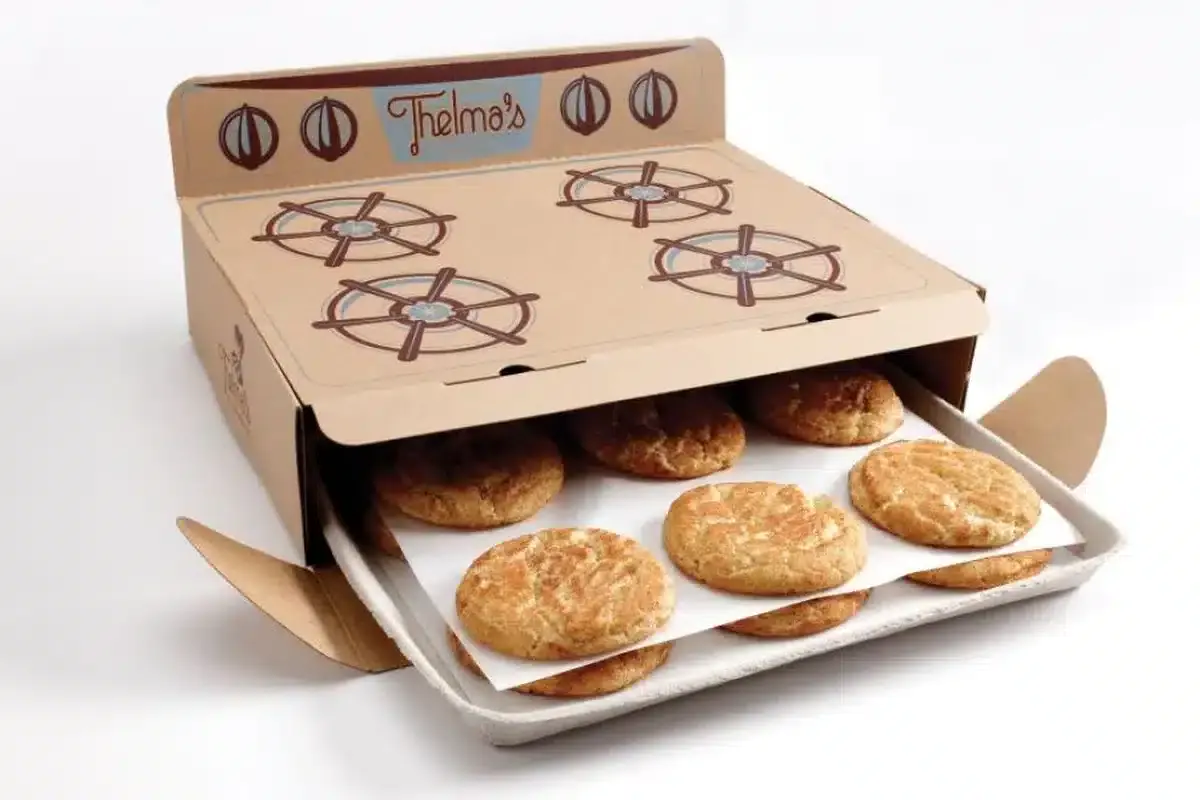
Thelma’s Treats is a pastry brand with amazing-looking desserts and even better-looking packaging. With its unique oven box, you get a beautifully made cardboard box in the shape and look of an oven.
Inside you’ll get all the cookies you ordered, and you can pull them out the same way you would when baking cookies at home.
This small touch makes the experience of eating cookies a lot more fun and interesting. The box design incorporates colors that the brand itself inspires and correlates with. This helps customers instantly recognize what brand it is and have it in the back of their minds even after they ate the cookies.
This unique design is different from the plain boxes at other cookie stores. That’s why customers keep returning for more. Their amazing cookies are also a big part of it though!
2. Szent
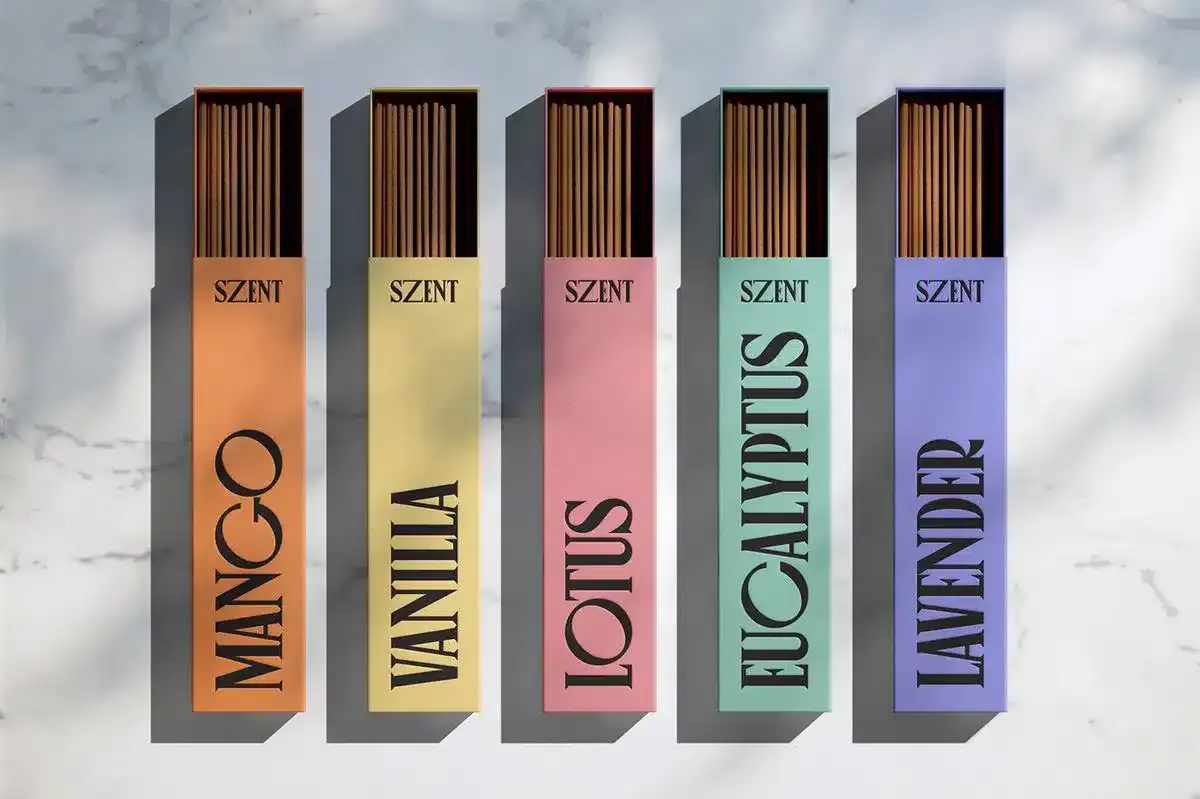
Szent grabs the very boring and ordinary incense packaging design and changes it to a modern and bold design that demands people to look at it. Vibrant colors and big fonts make it easy to spot and even easier to read what scent each box is.
The box is also easy to use, which is completely different from standard incense packaging that generally requires you to break a part of the box.
Szent fixed the problems with incense packaging and added its own touch. The result is a beautiful box that will definitely catch attention.
3. Bronse Coffee
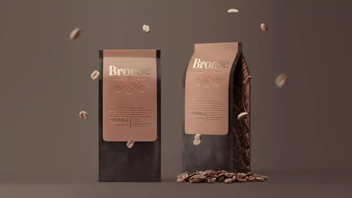
Bronse had a difficult mission when it came to packaging. They had to make a packaging design that not only looked good and turned heads but also kept their coffee beans fresh and sealed.
They didn’t try to reinvent the wheel. Instead, they focused on classic coffee packaging. They used textures to enhance the design.
They played with their brand colors and added cool textures to their packaging. This gave them a premium look that improved their entire product. Their bronze lettering on their brand name also cemented their product as a premium choice for coffee enthusiasts.
It’s not always about completely changing a packaging design to stand out. Sometimes, focusing on the smaller details of the design is what you need to make the perfect packaging for your brand.
4. Nature’s Post
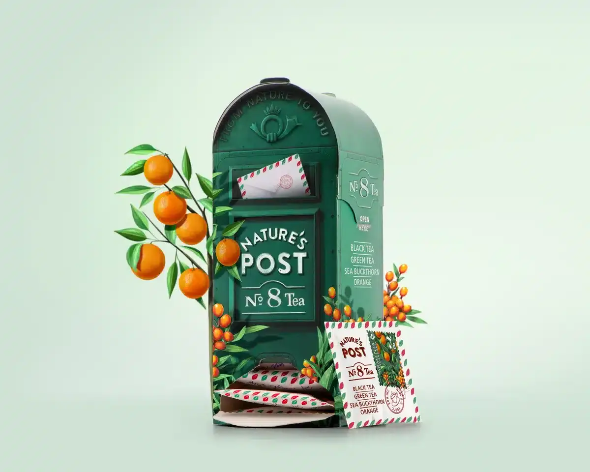
Similar to Thelma’s Treats, Nature’s Post has an unconventional but fun way of packaging its products. Nature’s Post uses a green mailbox instead of a regular tea box. This mailbox opens from the bottom. It delivers teabags that look like sealed envelopes.
This packaging is the perfect example of how going out of the box for your designs can make your brand memorable. The attention to detail in the mailbox and envelopes shows your customers that you care about them.
This, in turn, makes it so that their tea box stands out whenever someone is looking for a different tea to try.
5. Juva
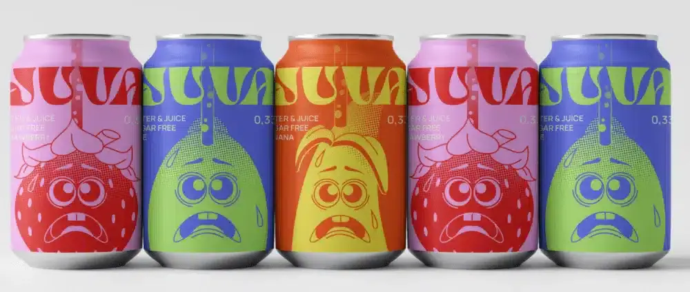
Bold packaging on beverages is nothing new. In fact, most big brands like Coca-Cola and Mountain Dew use vibrant colors to attract customers to their products. Juva jumps on this trend and uses vibrant colors as well, but puts a different spin on it by adding interesting illustrations to them, too.
These illustrations help customers instantly recognize what flavor each can is without having to get close to read it. They may not change their packaging design like others, but they add a modern twist to a trend that has lasted for decades.
6. Beau Cacao
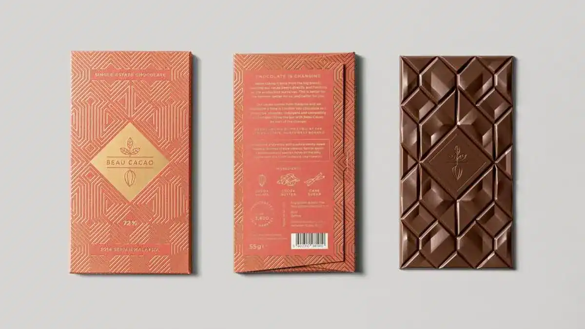
Beau Cacao is a premium chocolate brand with a packaging design that exudes elegance. A bright orange color with a mesmerizing geometric design that is hard to miss. They also play with the texture to make the shapes stand out even more.
This packaging design fits well with the chocolate. The chocolate is cut into different geometric shapes that match the same pattern. This makes the visual and tactile experience completely different from other chocolate brands.
Overall, this packaging design is by far our favorite one when it comes to chocolate bars. Elegant, consistent, and high-quality traits draw people to the product no matter what.
7. Absolut Vodka

Absolut Vodka is a brand that has been around for years while changing little to nothing on its bottle or packaging… until now. Their latest gift pack has some very vibrant and interesting designs on its packaging.
They chose an open packaging design instead of a completely closed one. This way, they can showcase their vodka differently. Their typography stays exactly the same, and they barely use any to let the packaging design and their bottle do all the talking.
Having a fun design, especially for a gift, is fantastic. It shows that the brand understands the importance of standing out and making the packaging extra special.
8. Happy Socks

Happy Socks is a popular brand famous for its unique sock designs. However, many people who haven’t bought their products don’t realize that their packaging is also special.
Each set comes in a unique themed box that looks almost too good to throw away. This helps keep their theme consistent and unique. Imagine how boring and unappealing it would be if these fun and creative socks came in a small brown box with just a logo stamped on it.
Remember, one of the goals of exceptional packaging design is to create a great first impression that lasts in a customer’s mind. You want to awe your customer so much that they take pictures and talk about it with their friends and family.
In search of a complete redesign but don’t know where to start? Let us help.
9. Mallows Chocolate Lab

Mallow’s Chocolate Lab is a perfect example of less is more for packaging sometimes. They choose a muted color scheme instead of bright, bold colors like many brands. Their elegant font stands out and does the talking.
Using muted colors can grab attention, even if it seems odd. In a market full of bright colors, this approach stands out.
When your packaging design is the only one that isn’t demanding attention, it tends to get noticed and picked up. Mallows knows how to catch a potential customer’s eye. They use a bold font that clearly shows the bar’s flavor.
This helps the customer decide quickly instead of having to go searching for the flavor all over the packaging. Or, even worse, they don’t notice that the chocolate bar has other ingredients, such as nuts.
10. Oatly
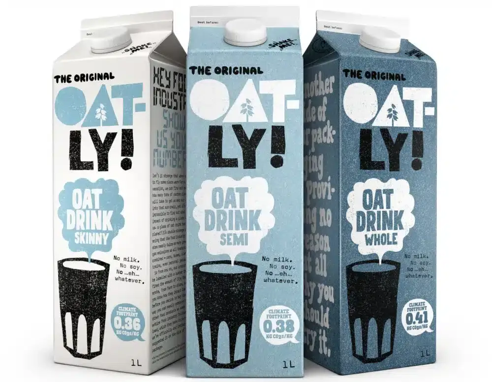
Oatly’s cartons feature fun, hand-drawn illustrations. This style makes them stand out from the boring, generic designs found everywhere else. Instead of feeling like a big brand is making it, their packaging makes it feel personal and almost as if a friend or family member drew it.
This attracts customers who might be tired of big corporate brands and who are looking for a smaller brand that can satisfy their needs.
11. Moth

Moth’s cocktail cans are a great example of how a minimalist design can work when mixed with punchy colors and a good, readable font.
By ensuring their font is easy to read, they engage the customer’s interest in their drink, the type of cocktail it is, and how much alcohol is in the can. This solves any mistakes of buying an alcoholic beverage by accident.
They also work with various artists on special dates, like anniversaries. This draws in a new audience.
Overall, this is a fun and to-the-point way to use your packaging design to help customers know exactly what they’re buying from afar.
12. Bite Me
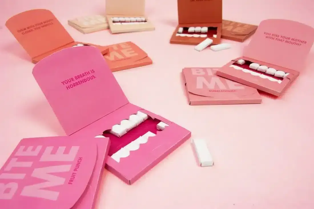
Bite Me is a gun brand that has a very unique mouth packaging for its gum. You can pull out and eat each tooth. While other gum brands have done it in the past, the bold colors that help the white gum stand out work really well for them.
If you notice, every color of their packaging resembles the colors of people’s gums. This makes the whole look of the packaging that much more unique and fun.
13. Tide (Eco Box)

Making a packaging design that not only looks good but also serves a purpose is amazing when done correctly. Tide created these eco boxes that not only use less plastic overall per product but also serve as a twist and pour box.
This makes it perfect for people who want a convenient solution to gigantic bottles of detergent that can be difficult to pour at times.
While this packaging design doesn’t stand out as much as others on the list, it gains points for convenience. Customers who want an easier way to use detergent will be drawn to this packaging design and product.
It’s not always about looks; having a package that makes a customer’s life easier is always a major plus.
14. Help Remedies
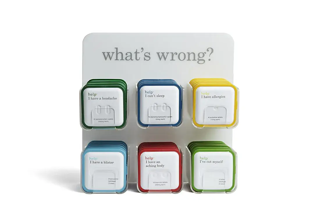
Help Remedies, is a healthcare brand that transformed how retailers sell and package over-the-counter pills. They chose a simple package instead of confusing designs. This helps you find what you need quickly.
Their vibrant colors make it easy to find the product, while the typography instantly tells you what the pills are for.
This is perfect for people who want a quick solution to any small medical issue they might be going through, like body aches or headaches.
15. Clutch

Clutch is a premium health and supplements brand that focuses on a minimalist and sleek design for all their products. By using muted colors and no illustrations, they were able to let customers focus entirely on their typography.
This meant that they could focus on explaining the product without anything else drawing their attention.
Clutch’s packaging design stands out. It’s subtle and elegant, attracting customers who want high-quality products.
Get a Packaging Design That Stands Out With Blacksmith
After going through all of these packaging designs, you might have some amazing ideas for your product’s packaging. But where do you start and how do you make it a reality? This is where we come in. At Blacksmith, we specialize in unique packaging designs.
As a full-service branding agency, we have seasoned brand designers ready to make your packaging design a reality. We’ll use modern branding techniques that increase conversion without losing the essence of what your brand is all about.
Still unsure if your packaging design needs some work? Click here to schedule a call with us and we’ll audit your brand and packaging and show you how and where you can improve to sell more.


