


Having an okay-looking B2B website doesn’t cut it anymore if you want potential customers to check your products. With more than 200 million active websites nowadays, it’s easy to understand why your website needs to stand out.
You’re not only fighting for the attention of customers inside your own industry and niche. You could be battling hundreds of brands from many industries. Each one is trying to get your customer’s attention.
This means that now more than ever, your B2B website has to look exceptionally well. And that’s why you’re here. You’re looking for inspiration that can help you guide your initial idea into a complete vision.
Whether you’re making a brand new website or are planning to redesign your B2B website, we’re sure you will find ideas here.
This article shows you 20 of the best B2B designs we’ve seen this year. They all stand out and are exceptional in their own way, and serve as great inspiration when thinking about how you want your website to look.
Are you trying to build a B2B website but don’t know where to start? Let us help.
Our Favorite B2B Website Designs of This Year
This list isn’t made in any particular order. We handpicked all the websites below. We’ll explain what makes each special and what you should take from them as an idea for your own website.
We also expect that you take inspiration from them, not just create a 1-to-1 copy of a website you liked. Make sure you add your own ideas and designs to it so the website is completely unique to your brand.
You want your customers to feel excited when they visit your website. They should not confuse themselves or think, “Have I seen this design before?”
Make sure to take notes of which essential website features they used and check if you can implement them into your B2B website too.
1. Surfer

Surfer is a content optimization tool completely powered by AI. They help companies all over the world create high-quality content that improves their SEO.
Their website doesn’t use a lot of images or in-your-face illustrations. Instead, they use vibrant colors to keep their visitors’ attention on what really matters. They instantly tell their visitors how vital SEO is for their website with a simple sentence: “95% of pages get no traffic.”
They keep their high-converting homepage simple. This helps visitors understand what the company does and how it can help them.
This is a perfect example of less is more on a website. Visitors just want to know what your product is and what it does as quickly as possible.
2. Mural
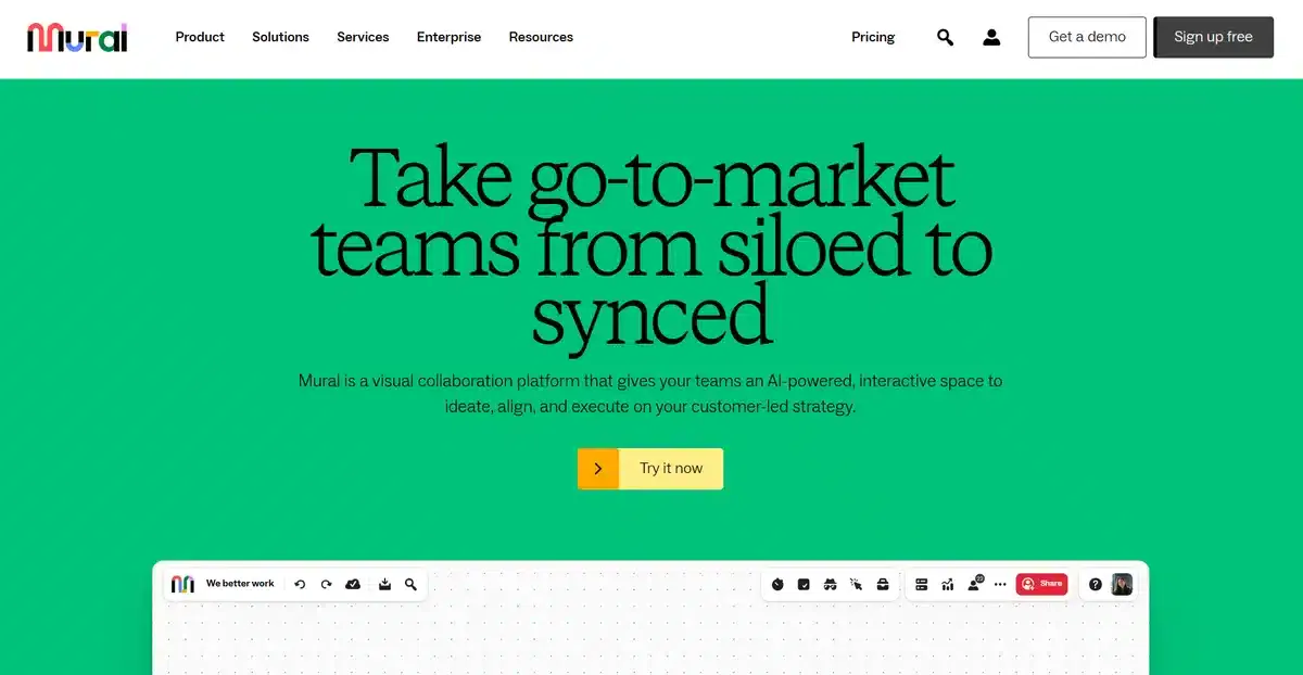
Mural is a popular company that helps teams collaborate on one easy-to-use whiteboard. In it, they can add their ideas and edit the ideas of other collaborators in an easy way. Mural knows that the best way to sell a product of this kind is to let visitors try it out.
So instead of going on about the features their product has, they leave a CTA button letting visitors instantly try out the product. This entices them to get it if it’s what they are looking for.
We love the vibrant and smart use of white space on Mural’s B2B website. It lets the real star of the show, their product, be the center stage on its homepage.
3. Slack
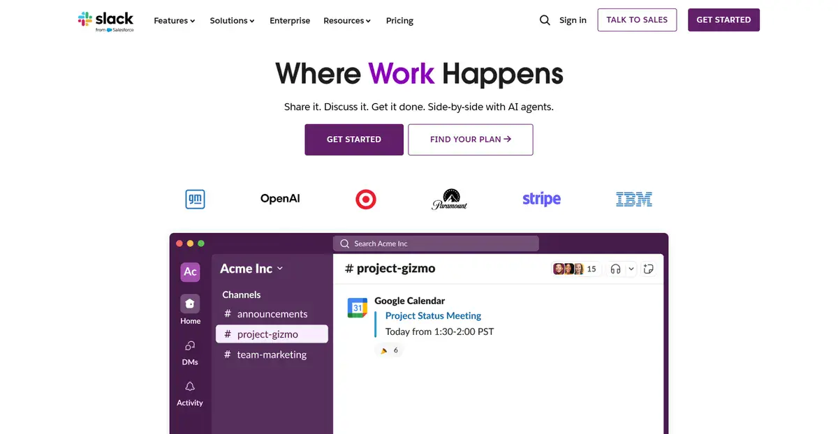
Unless you’re living under a rock, you should know about Slack. They are one of the biggest business communication platforms out there right now. It helps businesses organize their teams via channels so they can all access content and important information in an easy-to-use way.
Slack’s website makes sure to instantly tell its visitors who use their app so that they feel more comfortable trusting the app for their company.
It’s easier to trust an app and a company if their users are from NASA, Target, Uber, and others.
Their use of testimonials and social proof is fantastic and is something you can implement for your website if you want to remove as many doubts from visitors as possible.
4. Group 14

Group 14 is a company focused on developing silicon-carbon composite materials that improve the performance of lithium-ion batteries.
When a visitor opens Group 14’s B2B website, the site greets the visitor with a banner image of the latest project Group 14 was involved in. This helps them build credibility with visitors interested in partnering with them for future projects.
Showing accolades and past projects is always a perfect way to cement a brand as a prominent leader in an industry, and Group 14 does this exceptionally well.
If you want to learn more about Group 14, you can check our Group 14 case study here.
5. Avivar Capital

Avivar Capital is an investment advisory company that mostly focuses on investment strategies tailored to institutional, private, and public clients.
Their website uses a beautiful hero image behind very direct and to-the-point copy that reads “Supporting Investors With Purpose.”
This copy instantly tells visitors that they’re looking for investors that want to do some sort of change in the world and not just another project with no positive goal in mind.
They don’t need to add more or less to their homepage. They provide one service and they’re happy to explain more and show more on a call or via email.
Which is why the CTA button is right below the only sentence on the page.
6. ServiceTitan
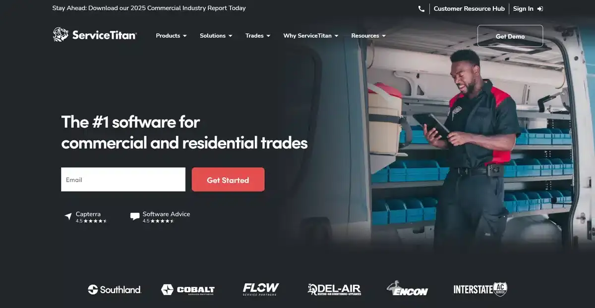
ServiceTitan is a company created for service professionals and contractors all over the world. Their homepage is simple but effective. They explain just enough with their main sentence to incentivize people to give them their email addresses.
If you want more details, keep scrolling. You’ll find a breakdown of how the software works and what it can do for you.
This B2B website is a great example of how to organize a homepage in a way that isn’t overwhelming to visitors who just opened it. Instead of bombarding them with information from the start, it slowly eases them into the information by scrolling down.
7. Notion
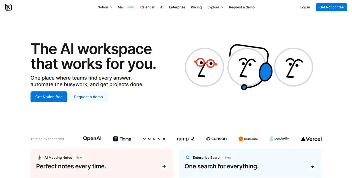
Notion is a very popular and well-known productivity-focused app with thousands of users all over the world. Big brands such as Figma and Headspace use their app, allowing visitors to know it is a good product.
Their website’s look stems directly from how their app looks. The black and white main colors and the organization of everything in grids create a distinct style. The first thing visitors see as they open the Notion website is a simple sentence explaining what Notion can do for you.
As visitors scroll down, they’ll learn more about how Notion works and how they can customize it for whatever they need.
Notion shows us how you can organize your features in a way that is easy to understand and entices visitors to test the product.
Explore how we lowered GeminiBio’s bounce rate by 23% with a brand new web design in our latest case study.
8. 3form
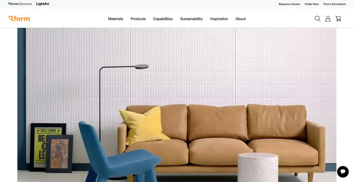
3form is a company dedicated to creating sustainable architectural products and solutions. The website showcases and explains the usage and application of each material. This helps visitors understand how much of a difference is being made compared to what a normal architecture company does.
As you keep going down their beautiful minimalist website, you’ll find different sections. From products you can buy to how they recycle and where they do it.
Transparency is important for every business handling products if they want to gain the trust of their customers.
We love this website mainly due to the sheer amount of white space they use to let their copy and images do all of the work.
Generally, brands try to cram in as much information and images as possible and end up overwhelming their visitors.
9. Simplecast

Simplecast is a company that helps people distribute and host their podcasts on all platforms.
As soon as a visitor enters their website, they’re greeted with retro colors and a minimalist look that is bound to turn some heads.
Their main copy tells you exactly what you need and provides you with a 14-day trial right below it. This CTA placement is smart since it instantly entices visitors into trying out the trial.
Right below it they explain a bit more in detail what they’re about and how they can help you solve your podcast distribution issue.
Simplecast’s website doesn’t waste visitors’ time.
By going directly to the point, a lot of visitors will convert instantly without even having to scroll down at all.
10. Tianma America
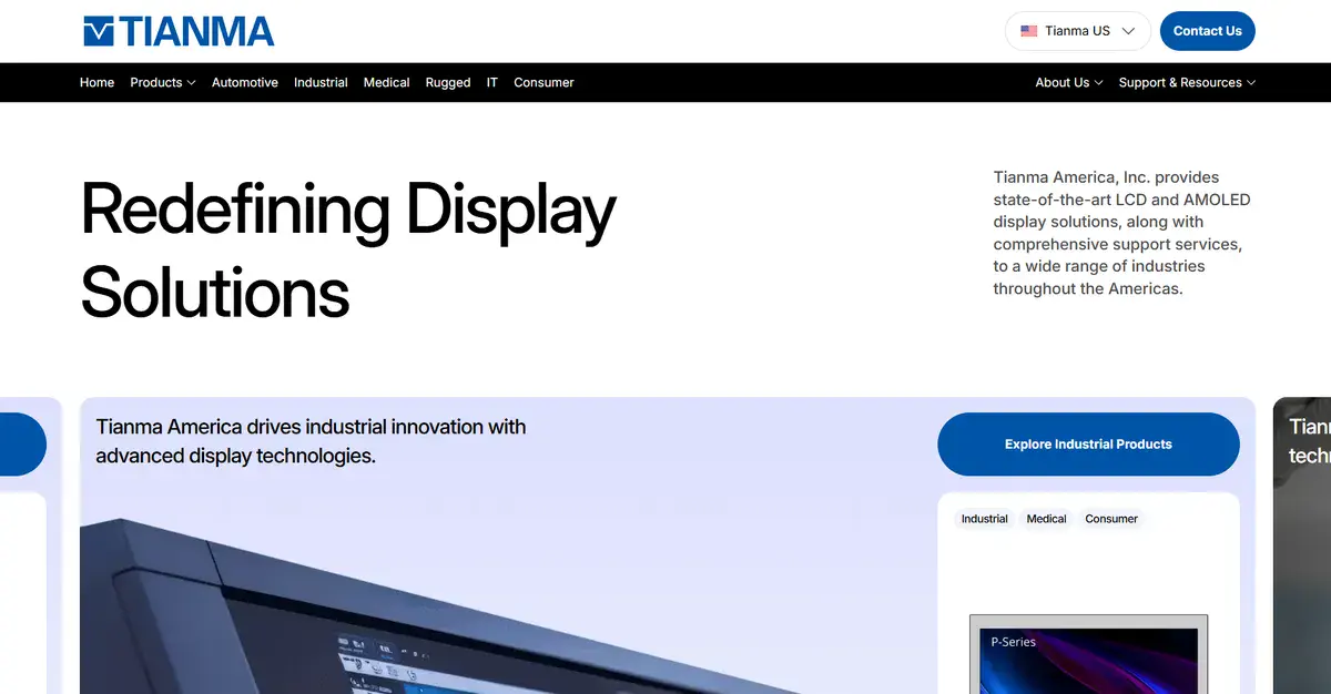
Tianma America is a pioneer in everything related to advanced LCD and AMOLED display technologies. Visitors can instantly browse through Tianma’s latest innovative products as soon as they open their homepage.
This makes it convenient for potential clients who only want to know what they offer and if it fits with the project they’re organizing.
If you want to learn even more about Tianma America, you can check out our Tianma America case study here.
11. Typeform
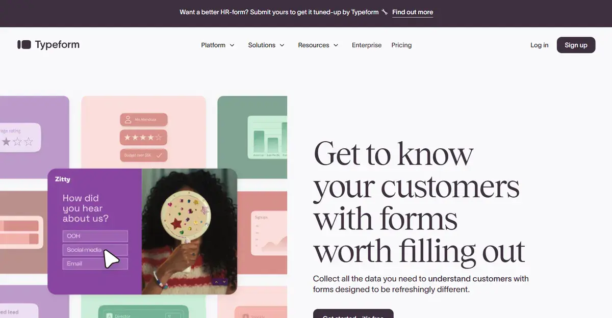
Typeform is a well-known form and survey builder that helps companies all over the world design interesting forms that bring back important information from customers.
Their website is the perfect mix of good copy and visuals that help visitors visualize what the brand is all about. Just from the video alone, you can learn most of what Typeform can do for your company.
This not only makes the CTAs more likely to get clicked on, but it also serves to keep visitors engaged and curious about what Typeform can do. If they want to learn even more about the brand, they scroll down and find out everything about their forms.
12. Stripe
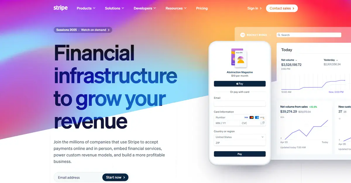
Stripe is a famous online payment solution created to facilitate every transaction you make online. The website shows this with a clear, straightforward style. It quickly directs your focus to their product.
A bold copy accompanies the app itself, which helps drive home the point of what it offers.
As you scroll down, you’re met with impressive visuals that change depending on how much you scroll. Not only does it look fantastic, but it also keeps a visitor’s focus by being flashy.
They’re not afraid of using colors either. The whole B2B website is full of vibrant colors that help bring everything together.
Explore how we increased Vertx’s engagement time by 58% with a brand new web design in our most recent case study.
13. Atlassian (Jira)
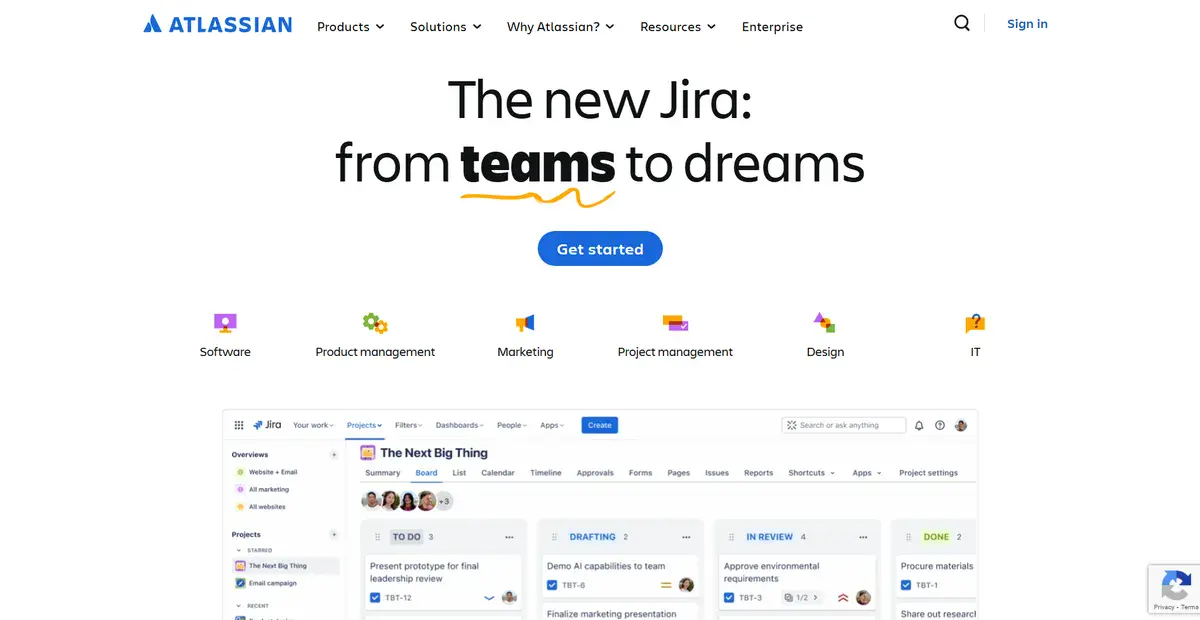
Atlassian serves as a fantastic productivity and collaboration tool that helps teams organize big projects into manageable pieces that they can track and manage.
The website introduces their most recent update in bold letters so that visitors can find out what the new Jira changes are.
As visitors scroll down, they can slowly learn more about all of what Jira can now do with flashy visuals that help showcase the new features.
The website offers the perfect amount of copy that helps visitors get a deeper understanding of what Jira can do for their business. All while staying engaged with interactive buttons.
Their website footer is a perfect example of how to implement and take full advantage of it as well.
14. Loom

Trusted by many, Loom is the go-to video messaging tool that lets brands communicate effectively via screen recordings.
This app is also made by Atlassian, and like Jira, the website is exceptional at explaining what their app can do for you.
They use a very unique branding idea to talk about their service.
Considering their app is all about video recordings and how it can simplify and improve the workflow of your business, the homepage has a great video showcasing how it works.
If visitors want to learn even more about Loom after watching the video, they can scroll down and watch how it all works. They implemented new AI tools into the app and defined what the app is used for.
This is the perfect showcase of how a SaaS website should look like.
15. UpKeep

UpKeep is an interesting company that aims to help brands manage, maintain, and increase the reliability of teams all over the world.
While the website is a bit similar to Stripe’s website, this one differentiates itself by being a lot more minimalistic.
This helps their visuals do most of the talking while the copy complements it.
While this website doesn’t innovate like others on this list, it does everything well.
16. Vanta
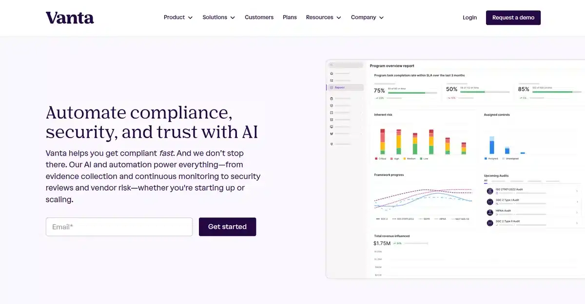
Vanta is a great brand that helps companies all over the world achieve full security compliance for their websites.
While their website uses toned-down colors, the copy is very direct and to the point.
They want to let you know how vital it is to have full security compliance that is automated and easy to manage. This gives visitors a sense of urgency as soon as they enter the website and entices them to press the “Request a demo” button much more.
As you scroll down their website, you’ll see various testimonials. They highlight why full security compliance matters.
17. Shopify
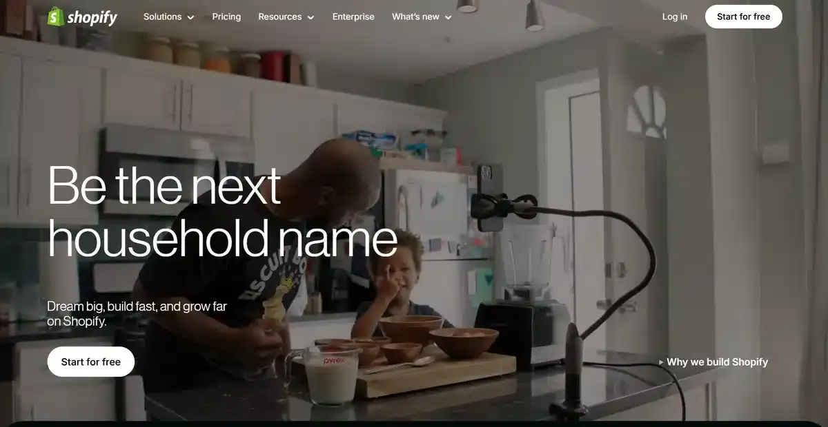
It’s hard to talk about amazing B2B websites without talking about Shopify. They offer dozens of different eCommerce products and services for businesses of all sizes.
So how do they manage to fit all of that on one homepage?
The simple answer? They don’t! They don’t cram everything onto one homepage.
Instead, they use it to show what your brand can do with a Shopify store.
They add interactive elements and visuals everywhere to showcase different parts of their store without having to rely on copy to explain them.
Throughout the homepage, they add different CTAs that incentivize visitors to check their plans and start a Shopify store.
Want to sell more with your eCommerce website? Learn about the best B2B eCommerce practices to increase sales here.
18. Deep 6 AI

Deep 6 AI is a SaaS company that helps clinics and hospitals recruit patients for clinical trials in an easy and legal way.
As soon as a visitor opens the website, they are greeted with a beautiful, high-quality hero banner that covers the whole screen.
As they keep scrolling down, they get to learn more about the company and how they provide their services to different clinics and hospitals throughout the United States.
To further increase the trust between the brand and the visitor, they provide their security standards badges, which show their commitment to doing the right thing.
If you want to learn more about Deep 6 AI, you can check our web design healthcare case study here.
19. Modash
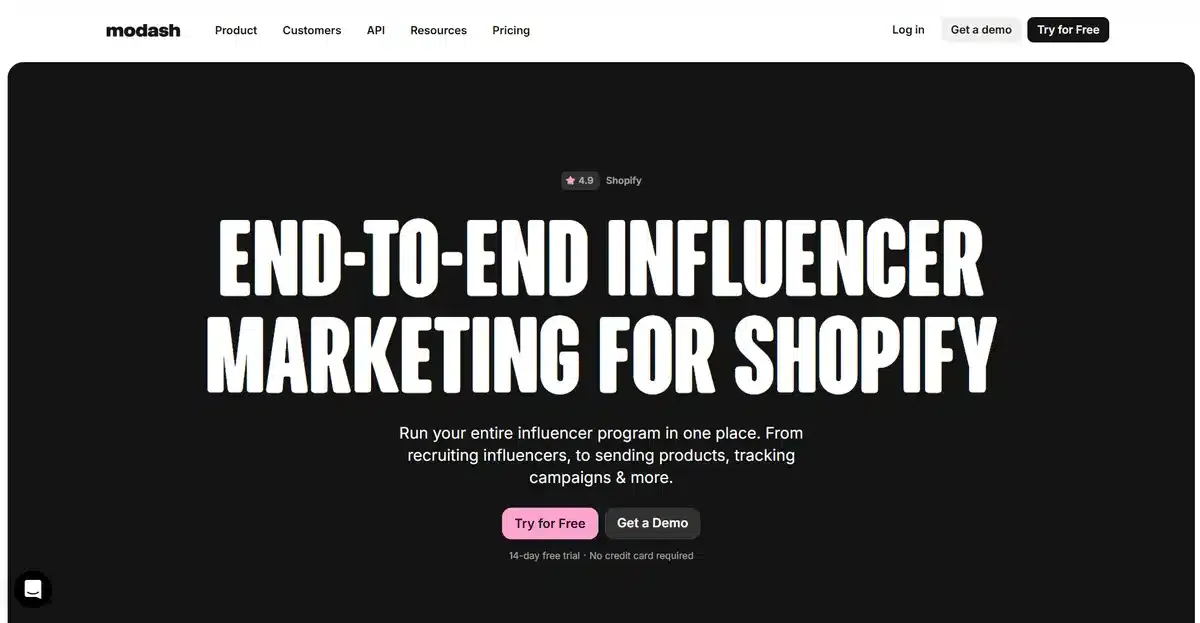
Modash has been helping different companies monitor and organize influencer campaigns on every major social media platform out right now. Their website uses pastel colors and bright CTAs to help visitors find them quicker.
Once you enter the website, you’re instantly greeted with copywriting that has no fluff. It tells you exactly what they offer and how they do it.
This leaves visitors with a simple choice of picking whether to click the CTA and explore further or leave.
This quick yes or no response makes it a lot more likely for visitors to find out more since the copy itself entices them.
20. Asana

Asana is an extremely popular work management platform that simplifies and organizes different tasks and projects into an easy-to-use package that anyone can collaborate on.
Entering their website is a delight, with their pastel colors and simple copy that instantly tells a visitor what they offer.
If that doesn’t convince someone to test their app, people can go and view a demo that will help visualize the app’s capabilities and what it can do for them.
Notice how they use a darker color for the CTA that takes visitors to the app itself and a lighter color that blends with the background for the “View Demo” CTA. This entices potential users to click the “Get Started” button first.
Get a Custom B2B Website That Converts With Blacksmith
We just went through 20 amazing web design examples of exceptional B2B companies. These all serve well for inspiration as long as the design you’re taking inspiration from makes sense for your website.
That being said, creating a B2B website from scratch takes a lot of work.
In fact, it can take weeks and even months to structure it all if you’re doing it by yourself. Luckily, you don’t have to do it all alone.
With Blacksmith, you can focus on other areas of your business while we build the B2B website that your company deserves.
As a professional web design agency with experienced designers, we can build a B2B website that connects with your ideal customer and looks great.
Unsure if investing in a custom website is what your company needs to grow? Click here to schedule a call with us and we’ll show you all the areas you’re losing customers in by not having a proper website set up.


