When we think about an underrated part of a website, we instantly think of the footer. This is why we created this article with footer examples; this way, you are able to notice its importance easily.
If we take into account that visitors tend to stay for a maximum of 54 seconds on average on websites, then having a footer to simplify their navigation starts to make more sense.
A footer is a fundamental part of any good website that understands that its users’ experience is always the most important aspect of it.
We’ll explain what makes them good and what you should consider copying from each one.
Trying to build your first website but don’t know where to start? Let us help.
Our Top 17 Favorite Footer Examples to Motivate You in 2026
When thinking about creating a website and making it look its best, the footer is one of the last things web developers consider.
In fact, footers are a must-have for any website that values its customers and visitors alike.
So it’s clear that footers are important for your website, but what does a good footer look like?
We have compiled a quick list of some of the best footer examples we’ve seen to date.
Let’s get started!!
1. Aisle
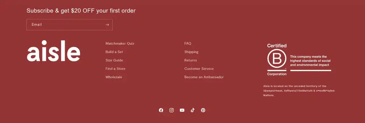
Aisle is a popular eCommerce business that tries to put its mark on the world by selling reusable tampons and pads for women. They start off this footer example list by showing us that a footer shouldn’t be small and easy to ignore.
Aisle uses a lot of free space to make its footer take up most of your screen. This makes it easy to see both the CTA they have as well as their B Corp badge on the right side.
The footer is spot-on in its purpose, communicating he brand’s commitment to transparency and sustainability and guiding users to the product purchase page.
2. Callista
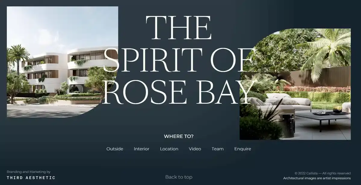
Callista is a luxury apartment in Rose Bay with a website that lets you visit and explore its apartments via a virtual tour.
This footer shows how effective simplicity can be. It offers a brief list of their additional projects and features a few apartment images to give visitors visual context.
They also add a very clever “back to top” button that makes it easy to go back to the top without scrolling.
Overall, this is the type of footer most brands should go for if they don’t want to think too much about it.
Although it’s not the most unique option on this list, it delivers all the key elements that a good footer needs to have
3. Seven Grams Caffe

Minimalistic and to the point are the words we would use to describe Seven Grams Caffe’s footer.
Their “Quick Links” column gives you fast access to all the essential pages. Plus, you can sign up for email updates to get their top deals before anyone else.
Overall, their website footer is to the point and easy to navigate which is exactly what every website should strive for.
4. Buffer

If you’ve used social media for your business, then you most likely know about Buffer. They are one of the go-to social media management tools in the market right now.
As expected, their footer is packed with different pages to go to.
While it might seem like too much, they organize it in a way that makes it easy to find anything you’re looking for.
With such a wide range of features available, it’s logical for them to display many of them in the footer. This setup makes it very easy for visitors to locate the right place in seconds.
Just like most good footers, it provides you with links to all its social media profiles so people can check them instantly.
While this many page links might not suit your business, it’s still good to take note of how organized it all is.
5. Wine Club of the Month

Wine Club of the Month is a business with a subscription service for all its wines. Its footer is a simple and quick way to find out more about them and how their system works.
This makes it easy to know what to pick in their subscription without having to go through different pages.
Their footer also provides you with all the information you may need about them in a neat, organized column.
Overall, this is a great use of a footer and provides people with all the information and pages they will need.
6. Barnes & Noble

Barnes & Noble is a beloved bookstore in the US with decades’ worth of history. Just as its bookstores, the footer is perfectly organized despite having a lot of different information everywhere.
You’ll find a full list of their services in one section and a breakdown of the most popular categories in another, making it easy to explore what’s trending.
They added a subscription section called “Stay in the Know.”
Here, you can share your email to get updates on new books and events.
This footer may overwhelm visitors with too much information, so it’s not a model most companies should follow. However its subscription CTA is exceptional and definitely something email-driven businesses should learn from.
7. Drunk Elephant

Despite its name, Drunk Elephant is a beauty brand that offers a whole selection of different skincare products for you to choose from. As you scroll down to the end, you’ll be met with one of the best footer examples you’ll see on this list.
The bright highlighter-yellow design makes it stand out instantly while the clearly listed main categories let visitors spot what they’re searching for quickly.
They didn’t stuff the footer with all their products.
Instead, they grouped them into categories. You can click the link in the footer to see all the related products.
Looking to improve your website but don’t know where to start? Let us help.
8. Lorelei Londres

In the heart of Italy is Lorelei Londres, a luxury hotel known for its charm and hospitality.
Their footer provides visitors with all the must-have contact details they might need, from their physical location to their phone number and email.
They also entice you to send them your email in case they have events or discounts in the future.
Simple and to the point is what we think about when we see Lorelei Londres’s footer.
9. Hootsuite

Like Buffer, Hootsuite is a fantastic social media management tool that most small business brands have seen and used over the years.
They offer a packed footer showing all of Hootsuite’s best features and all the information you would want to know about them as a company.
They also give you a whole column with guides so you can learn how to better use their tool and get the most out of it.
They also have Apple and Google App Store download buttons at the bottom, giving users a simple way to install and the tool on their mobile device.
10. People’s Magazine

People’s magazine is a very well-known news outlet that creates content about everything related to American culture.
Clean and to the point, their footer highlights its newsletter CTA os users can instantly subscribe and stay updated. It’s also broken into clear sections, helping visitors locate the right page much faster.
They also put all their social media accounts in the footer but placed them close to their CTA so they’re easier to notice and click.
11. Petco
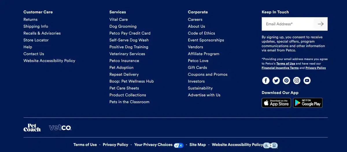
Petco is a beloved pet shop in the U.S. known for having everything from toys to medicine for your pets.
They provide us with a perfect footer example by showing us how to properly divide pages into easy-to-digest sections.
All their information is grouped into three categories: customer care, services, and corporate. This layout helps users quickly identify which column to check based on what they need.
They also provide you with a clear CTA that asks you for your email in exchange for special offers and discounts.
To top it all off, in the bottom right, you can find the app link for both Apple and Android.
While having a lot of content can be bad most of the time, if organized correctly, it can work perfectly for many businesses.
12. Tenzo

Tenzo is one of our personal favorites on this list. They are a brand that sells matcha tea that is affordable and accessible without sacrificing quality.
This footer example shows how to maintain brand consistency from top to bottom. It includes key links for visitors such as matcha recipes and starter kit pages.
Since matcha and similar beverages are popular on social media, they placed their social media icons on the right side. The surrounding white space makes them stand out and easy to notice.
13. loungefly

loungefly is a clothing brand that caters to an audience in love with pop culture. Their website has one of the best footer examples on this list when it comes to simplicity.
Unlike generic footers that direct visitors to shop pages, Loungefly dedicates this area almost exclusively to customer support, making it easy for users to find help with any product concerns.
They also provide links to their social media accounts in a subtle way by using normal written links instead of logos.
14. Sideshow
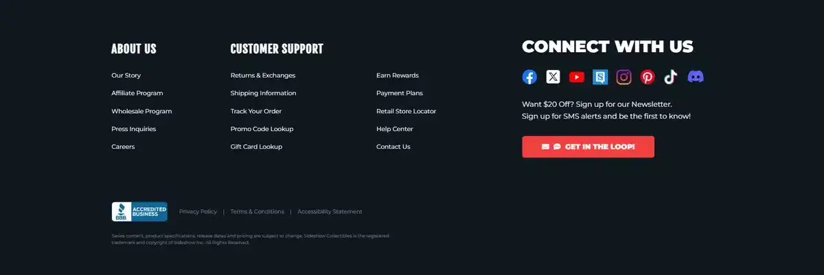
Sideshow is a pop culture company focused on creating high-quality statues and figures of popular games and movies. This footer example includes everything you’d want a good footer to have.
This footer includes everything it needs. It has a quick CTA for email sign-ups, their story, and customer support info.
15. milk_shake

Despite its name, milk_shake does not sell milkshakes but instead sells hair products. They designed their footer to be minimalistic, to the point, and organized in its approach.
They have different sections such as shop, help, and contact, so it’s easy for visitors to find what they’re looking for.
Just like most footers on this list, they also provide visitors with all the links to their social media accounts.
16. RCA Records
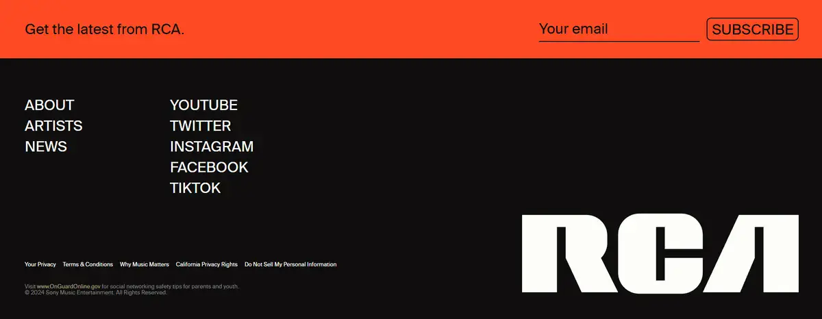
RCA Records is one of the most influential record labels in the world and is the preferred label of hundreds of popular artists.
This footer example earns its spot on this list due to its clean, cohesive design that perfectly matches the brand. They intentionally keep the links minimal so visitors naturally focus on their social platforms and artists.
We don’t suggest too much simplicity in links for most businesses. However, we do recommend that your branding stays consistent, even in the footer.
17. Manic Panic

Manic Panic is a rock-and-roll-inspired clothing brand that has been around for more than 40 years. Its footer is simple while providing visitors with everything they need at a glance.
The footer shows everything, from products and customer support to an About Us page.
Manic Panic makes sure its footer is easy to navigate and straight to the point.
Get a Custom Website That Converts with Blacksmith
After looking at all those footer examples, the idea of adding one to your website might have sparked.
But, making a good footer isn’t just about knowing how you want it to look; it’s about creating a footer that works for your website specifically.
But don’t worry, here at Blacksmith we’re experts in creating tailor-made footers for our custom made websites.
With our Custom Web Design Service, we’ll create the perfect website for your brand with a beautiful footer included. Best of all? You’ll be able to check on its progress every step of the way. This lets you provide feedback if you feel that something should be changed.
Still unsure if you need a footer for your website? Let’s set up a call so we can explain the importance of a footer in 2026.

