


Did you know that a website’s design alone creates at least 94% of first impressions?
This means that visitors will judge your brand and subsequently your product or service based on how your homepage looks.
This means that now, more than ever, it’s vital for your homepage to look exceptional if you want to stand out from the thousands of other New York websites.
In a competitive place like New York, failing to use all parts of your website can drive visitors to find other options. Amazing NYC Fintech brands and marketing agencies in New York invest in their custom websites so they perform their best.
But don’t worry; fortunately, money isn’t the only thing that can help your homepage look its best. As some of our examples below will show you, sometimes what your website needs is a touch of creativity to truly shine.
Let’s first discuss why a strong homepage matters before checking out our favorite examples from New York companies.
Do you want to improve the look of your website but don’t know where to start? Let us help.
Why Your Homepage Matters
It seems obvious that a strong homepage matters for your New York website. Still, many owners don’t grasp just how important it is.
Your homepage is where every visitor starts their journey with your brand.
Regardless of the product or service they are looking for, every single visitor will look at your homepage.
This means that having a subpar homepage sets you up for failure right from the beginning. It shows a lack of professionalism. It also suggests you don’t care about potential customers if your homepage looks bad.
Your homepage should clearly communicate what your brand is about and what it can do for your visitors in a quick and easy-to-understand way.
It should guide users to where they need to be, and it should entice them to check your products or services instantly.
Your homepage should also reflect your brand identity and why people should care about your brand over the competition.
What is keeping a visitor from just closing your website and going to a competitor’s website?
Having a creative homepage is just the first step in your homepage design journey.
Making it functional and enticing for visitors is the really important part.
Our Top 28 Favorite NYC Homepage Examples
This list is in no particular order. We handpicked every single homepage on this list, and each one has something that makes it special. From interesting illustrations to smart use of white space.
Each one should spark new ideas for your own homepage.
Remember, you’re using these websites as inspiration, not as a direct copy and paste. Getting inspired and using an element from a website is fine; completely copying a design isn’t.
1. Squarespace
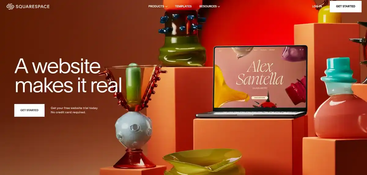
Squarespace is by far one of the most popular website builders in the world, and for good reason.
They offer a simple approach to website building without any coding required. Their homepage exudes that New York premium feel with vibrant colors and a corner-to-corner high-quality image.
This perfect example shows how certain homepages work best with little to no content.
Instead of cluttering the homepage with content, they offer a simple and to-the-point call to action and let the images do all the work.
Squarespace has a big hurdle to go over.
WordPress currently power more than 43% of all users, meaning that Squarespace’s homepage needs to provide value in a way that makes visitors prefer it over WordPress.
2. Peloton
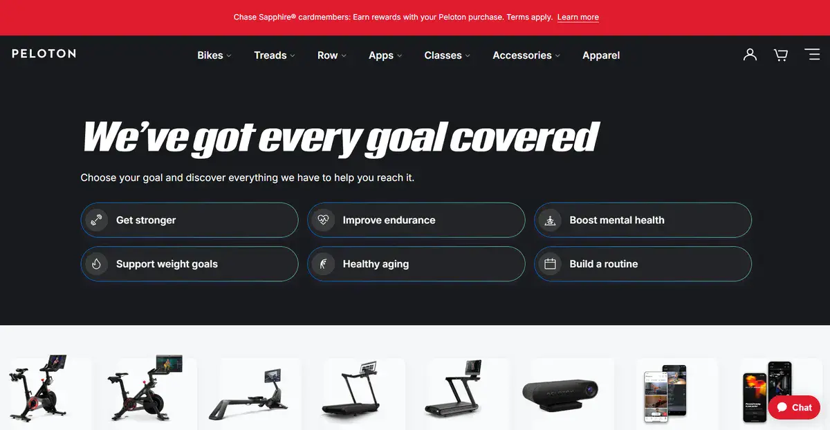
Peloton is one of New York’s most popular fitness companies right now.
Not only are their services fantastic, but so is their homepage. As soon as you enter, a prompt greets you to click what you want to improve in.
This instantly entices people who want to learn more about what Peloton can do for them. Their copy is very persuasive and keeps pushing visitors to sign up every step of the way.
Their website has complete multilingual support as well which helps reach even more people.
3. Warby Parker
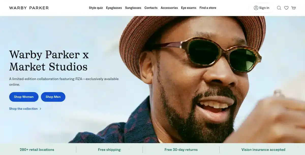
Warby Parker is a New York-based eyewear company that provides anything from regular glasses to sunglasses. Their website provides a great example of how to sell a product and increase engagement time with good web design.
As soon as you enter, you’re met with their latest limited edition product, which gives you a sense of urgency and FOMO.
As you go down the homepage, you find not only their best-selling products but also their new arrivals and trending products as well.
4. Glossier
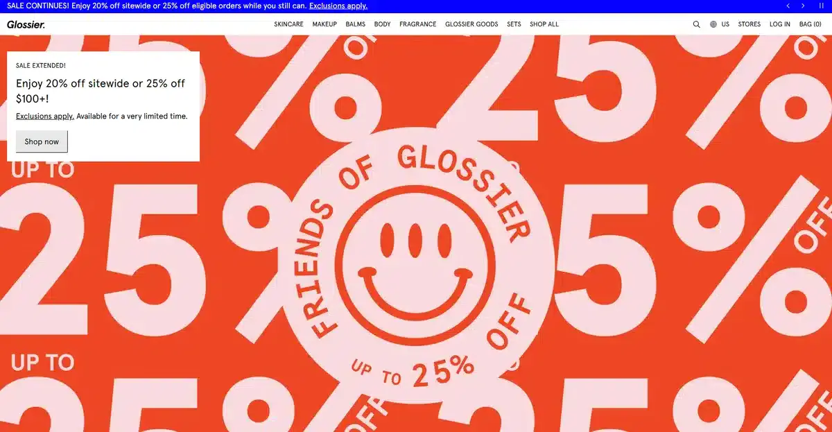
Glossier is a popular makeup brand that has been around for more than a decade. They thrive on vibrant colors and illustrations that pop and demand attention.
That’s why, as soon as you enter Glossier’s website, you’re met with one of the punchiest and most vibrant sale banners we’ve ever seen.
This is a brand strategy that won’t work for everyone but it’s perfect for a brand like Glossier.
Not only does it tell you instantly what you’re getting, but it conveys it well regardless of the device you’re using.
This is perfect for New Yorkers on the move who might miss their sale otherwise while in the metro or walking around.
5. Oscar Health
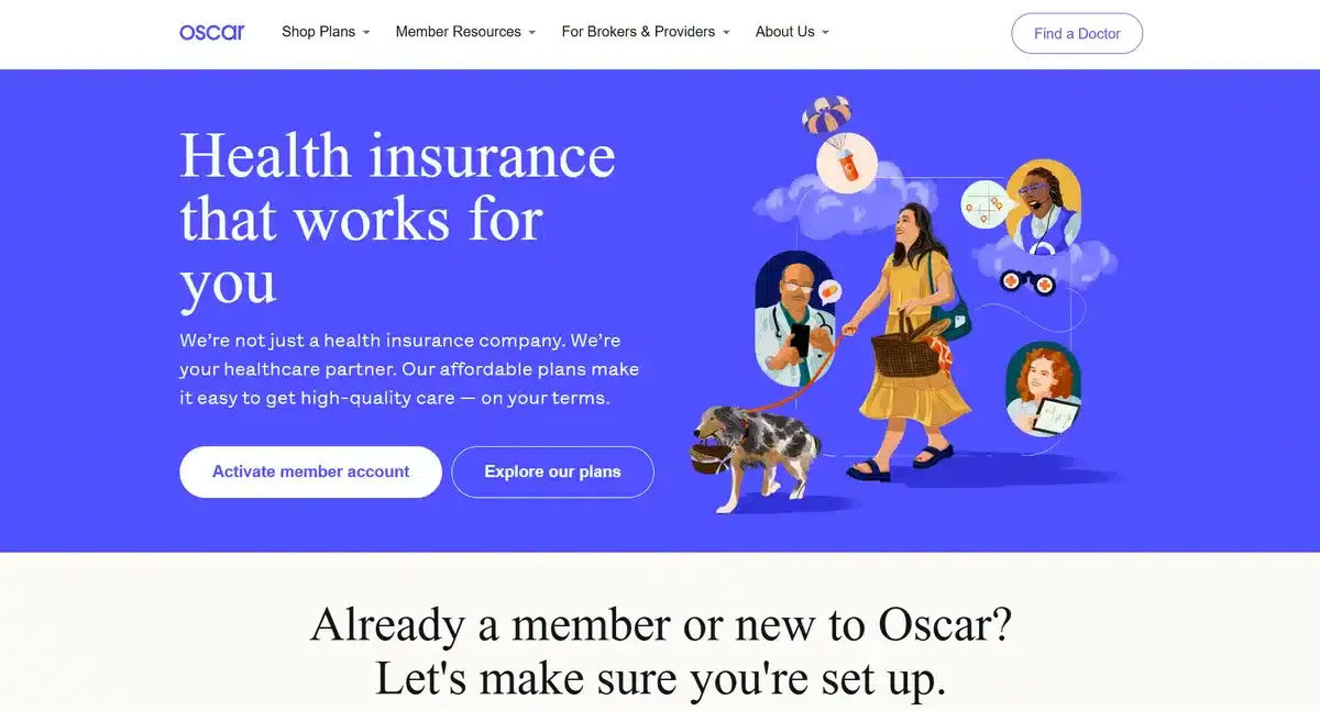
While health insurance isn’t something often seen as fun or creative, Oscar Health manages to make it inviting and interesting with a custom hand-drawn illustration.
Their customly designed website feels inviting and friendly from the start.
Despite being a big healthcare brand, they push this “you and me” narrative that makes it less daunting to get insurance.
6. Away
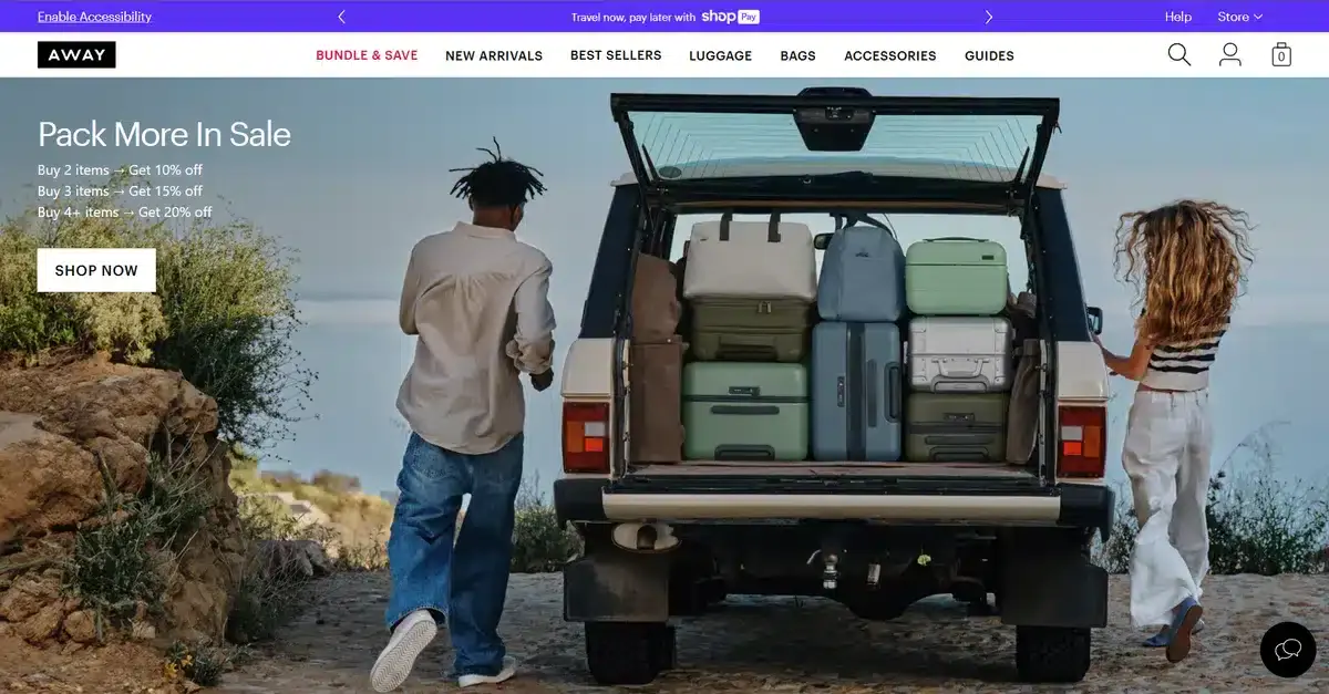
Away is a New York-based luggage company with an interesting homepage.
Instead of showing you their products in a catalog, they prefer to sell you a story. The banner image showcases a car filled with their luggage, which inspires visitors to travel and do the same.
Selling a narrative is always stronger than selling a product by itself. Away makes full use of this.
7. Chobani

Chobani is a popular yogurt brand founded in New York. Their website is a great example of how to make your product stand out by contrasting it with vibrant backgrounds.
Their banner images not only look amazing, but they slowly showcase most of their popular products.
Best of all?
All of these images come with their respective CTAs, so people feel even more enticed to check the product out.
8. Vice Media
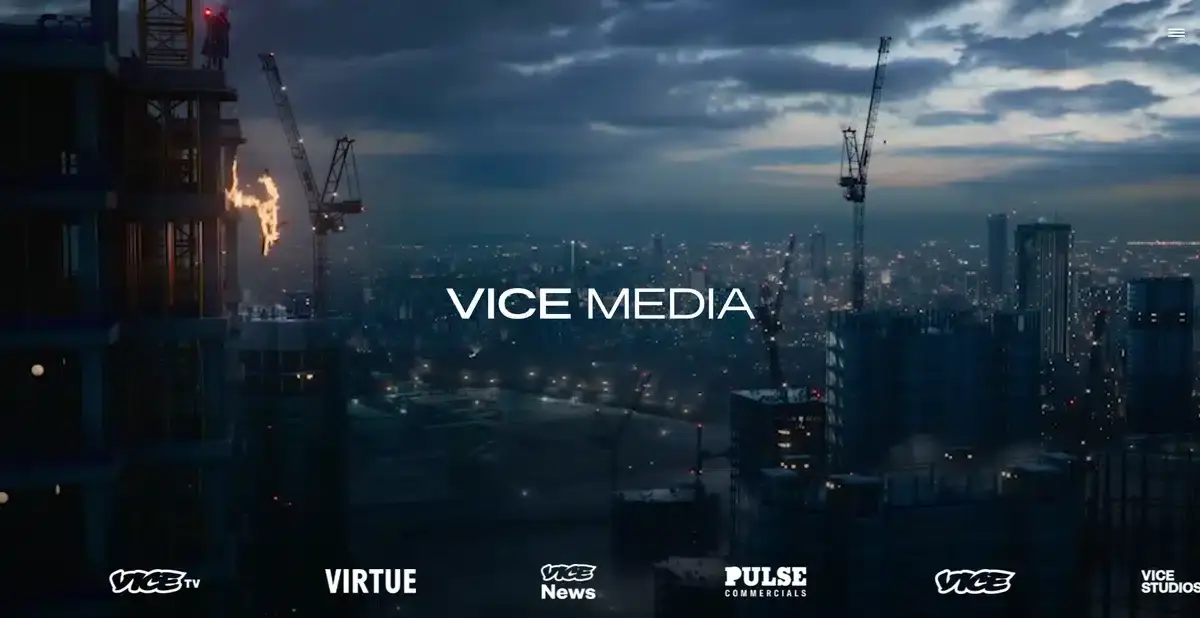
Vice Media is a popular, well-known, and sometimes controversial news company based in New York.
As soon as visitors open the homepage, a series of videos showcasing important moments Vice has gone through over the years greets them.
This is a perfect example of how to captivate and keep visitors interested as soon as they land on a homepage.
9. Blue Apron
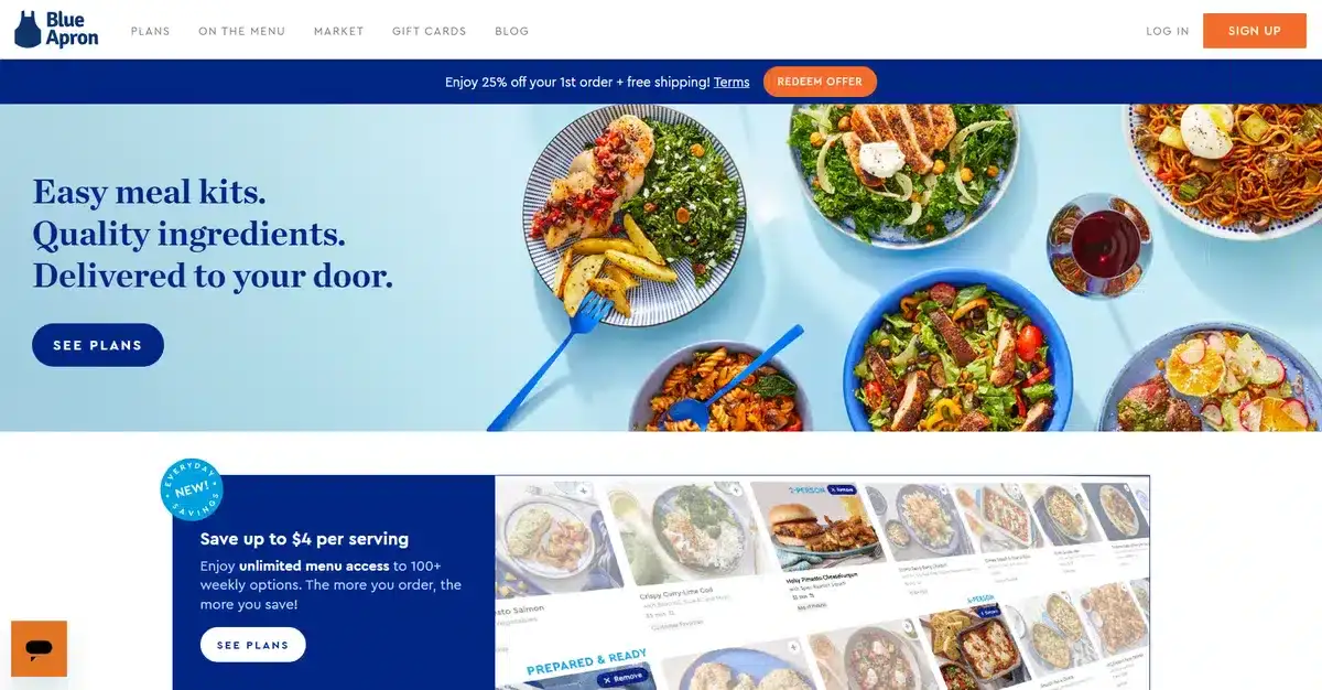
Blue Apron is a meal kit brand that took the world by storm a few years ago.
Not only do they deliver amazing meal kits, but they also have an amazing homepage that helps them sell them.
As soon as you enter their homepage you’re greeted with a quick overview of their plans and a way to pick one for yourself.
Letting visitors learn more about what they can get with each plan at their own pace is the perfect way to not overwhelm them.
10. Etsy
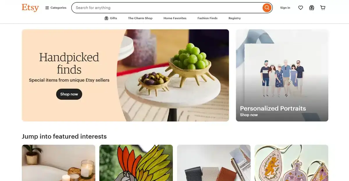
Unless you have been living under a rock, you should know about Etsy.
They are a New York eCommerce company. They focus on selling vintage and handmade products from various vendors.
Their homepage is split into boxes, each with its own copy and idea.
While it might seem like a mistake to provide completely different options on one single homepage, it actually works well since it provides customers with a sense of freedom.
With eCommerce expected to grow to $4.8 trillion in 2025, it’s safe to say that Etsy is in a great this spot this year.
11. Behance
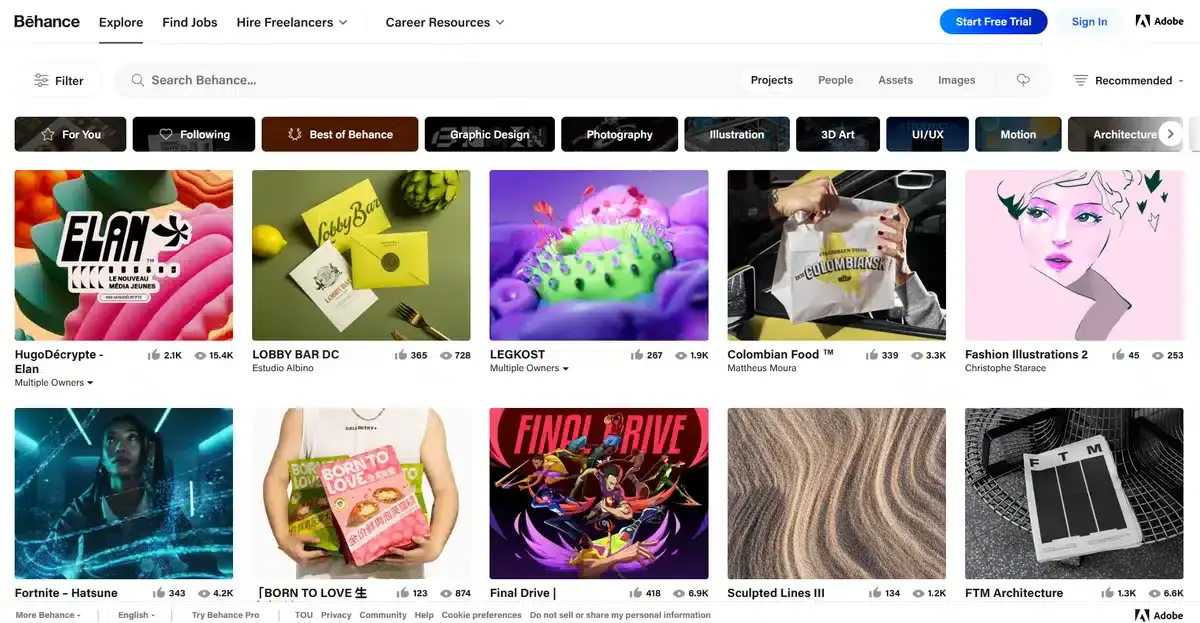
Adobe owns Behance, a well-known social media platform for creative professionals.
Since Behance is made for creative people, you’d expect their homepage to wow and amaze visitors as soon as they click on the link.
And it certainly does.
While the main part of the homepage features a big copy explaining what they have to offer, the rest of the homepage showcases different creators’ latest projects.
12. Kickstarter
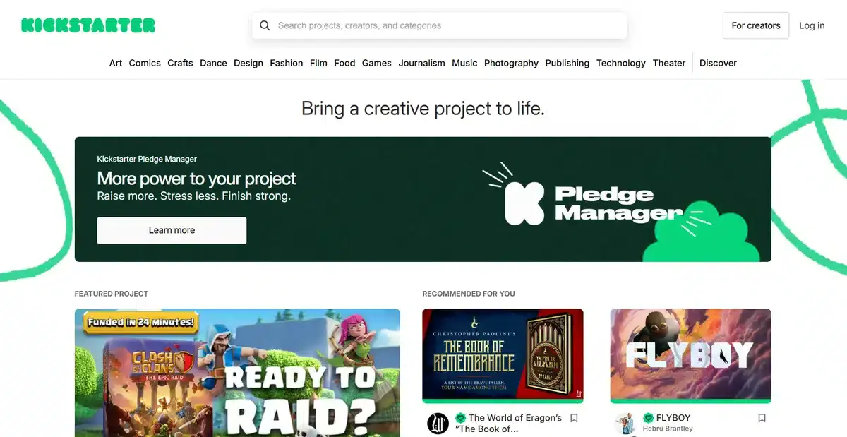
Kickstarter is where a lot of brands with unique ideas go for funds from the community.
The idea for Kickstarter is genius and is one of our favorite brands of all time.
When you open their website, you see featured projects. They also show recommendations based on what they think you’ll like.
Their homepage is filled with essential website features that make the overall user experience a lot better. They divide their homepage into bite-sized sections that help users find new projects they might be interested in.
13. Zocdoc

Zocdoc is a fantastic company that helps you find the perfect doctor for your problem and that accepts your insurance.
Their homepage goes straight to the point and lets you find a doctor based on your procedure, conditions, and more.
This approach makes it likely that visitors will try their service and potentially use it whenever they need to find an appointment again.
14. Datadog
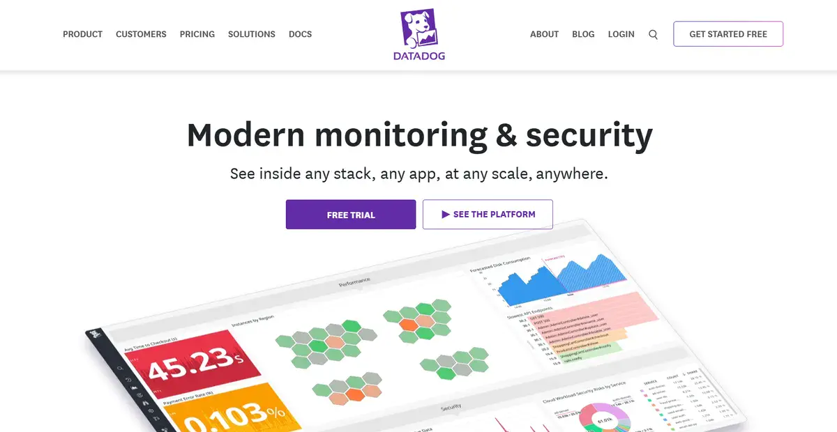
Datadog is a fantastic New York-based SaaS company with different cloud-scale applications for companies all over the world.
Despite their services being inherently complicated to explain, they offers a simple solution by letting visitors use their services in a free trial, or if they want, they can watch a video instead.
This is all from the homepage so it’s easy for visitors to give their service a try with little to no commitment at all.
Plus, they provide visitors with links to their service page which is a perfect example of how to do it.
With more than 71% of organizations saying they’re sure to invest in AI-powered software, it’s safe to say that SaaS companies wont be going anywhere.
Learn how we increased AJ Oster’s average engagement by 118% with a website redesign in our latest case study.
15. Thinx

Thinx is a New York-based company that specializes in absorbent and comfortable underwear for women.
While it might seem like any other underwear brand, this one focuses on absorbent underwear in case of accidents.
Their homepage has amazing and comforting copy that helps women feel more comfortable buying this type of underwear.
Not only that, they focus on showing that their product isn’t just for one body type, but for every single one.
16. Betterment
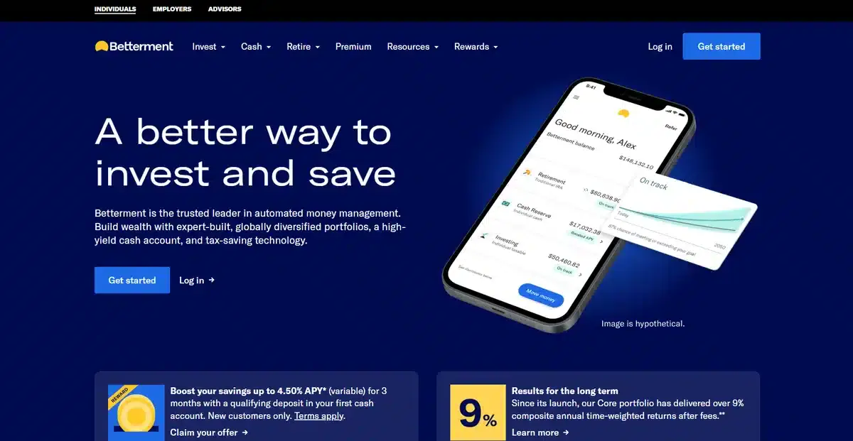
Betterment is a New York-based fintech company that focuses on helping clients invest in a smart and easy way. Their homepage shows that sentiment is true by explaining all the benefits visitors can get by joining Betterment.
Their minimalist website is a perfect example of less is more when it comes to selling a service.
If visitors want to learn more about the service, they can scroll down and learn about all the features they offer.
The number of fintech companies have doubled in recent years so having a homepage that stands out and catches a visitors attention is crucial.
17. Brooklinen
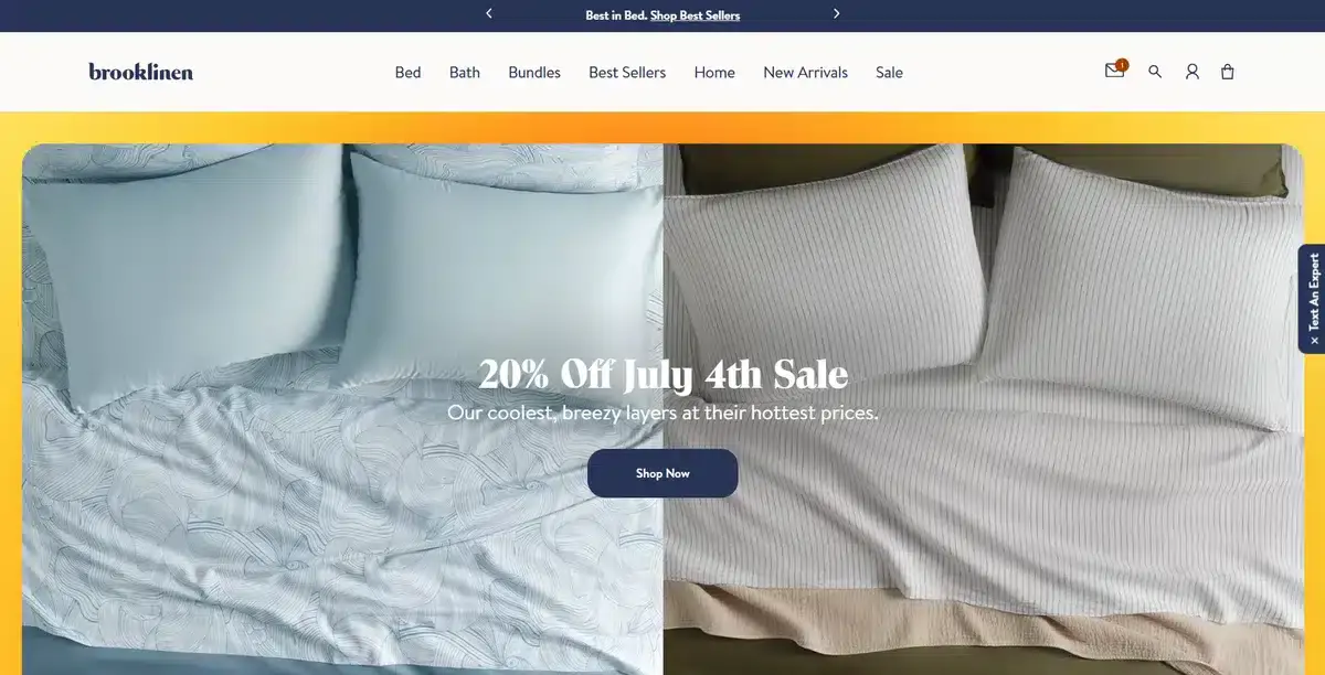
Brooklinen is a premium bed sheet brand founded in New York in 2014. Their products are high quality while offering them at reasonable prices.
As soon as visitors go to their homepage, the latest sale greets them, enticing them to click and explore faster.
18. Hims
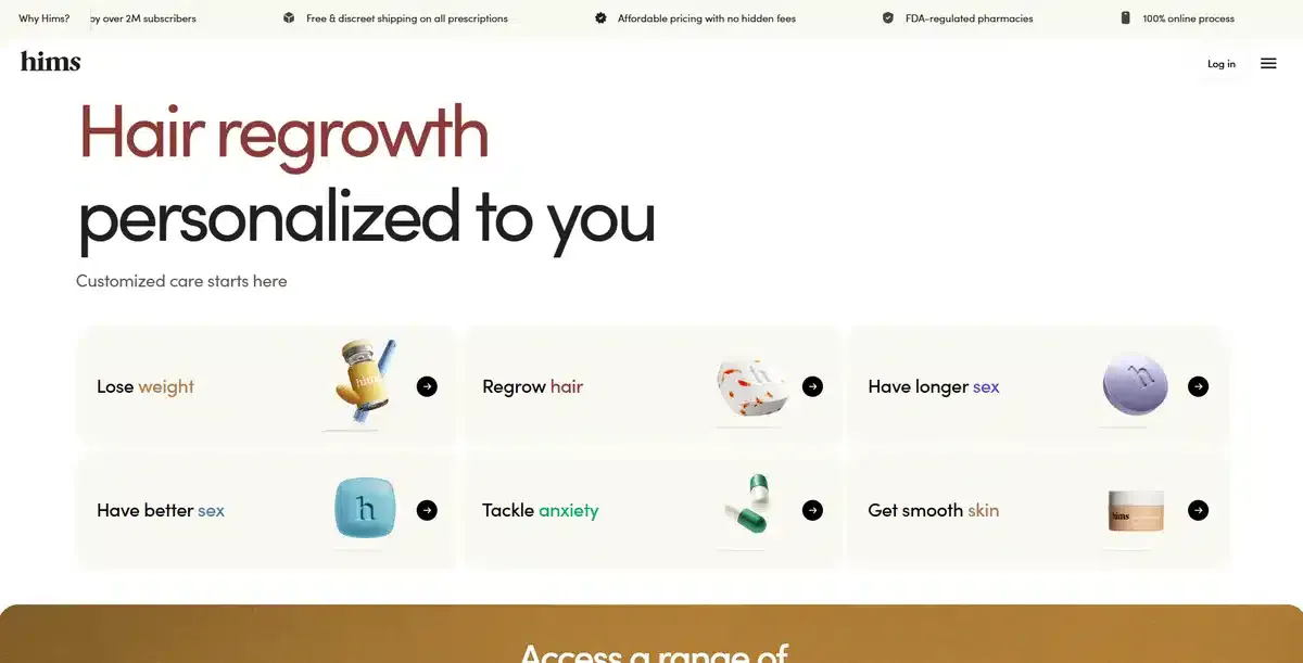
Hims is an innovative healthcare company with over-the-counter medicine for different problems and conditions in the form of a subscription service.
Their homepage is a great way to spark interest in the subscription service. It highlights all the benefits of joining.
All without being overwhelming or judgmental.
19. Harry’s
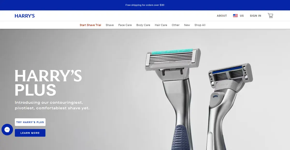
Harry’s is a New York-based shaving company with a subscription service for shavers and other products.
When visitors arrive on their website, they find playful copy. It’s light-hearted but clearly explains the features of their latest product.
Instead of bombarding visitors with information, they keep it simple and let a single video do all of the technical talk if needed.
20. Noom
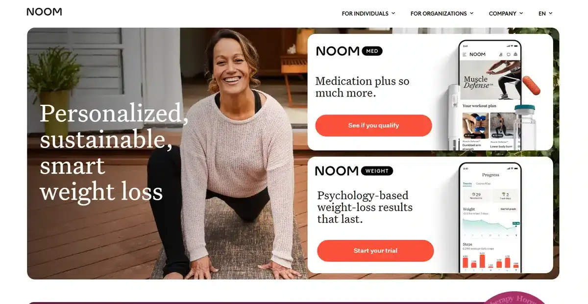
Noom is a popular app with both an in-depth medication app and a weight loss version.
Both of them have helped thousands of different clients over the years and continue to do so now.
Their website is minimalist and to the point. They instantly show you both app versions and let you qualify for the medication app or try a trial for the weight loss version.
They segment their whole homepage into blocks for easier consumption and separate their apps from other products, such as their hormone replacement therapy medicine.
21. Casper
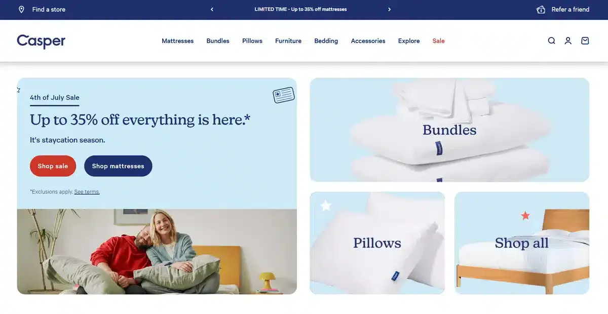
Casper is the go-to brand for people who are looking for a better night’s sleep.
From mattresses to pillows, they offer everything to get their customers as comfortable as possible.
Their website is a great example of color psychology used well in web design. Their soft tones of blue paired with white can evoke a feeling of calmness and stillness.
This is perfect for the type of products they are selling, and it helps visitors tie those colors to a good night’s rest.
22. MongoDB
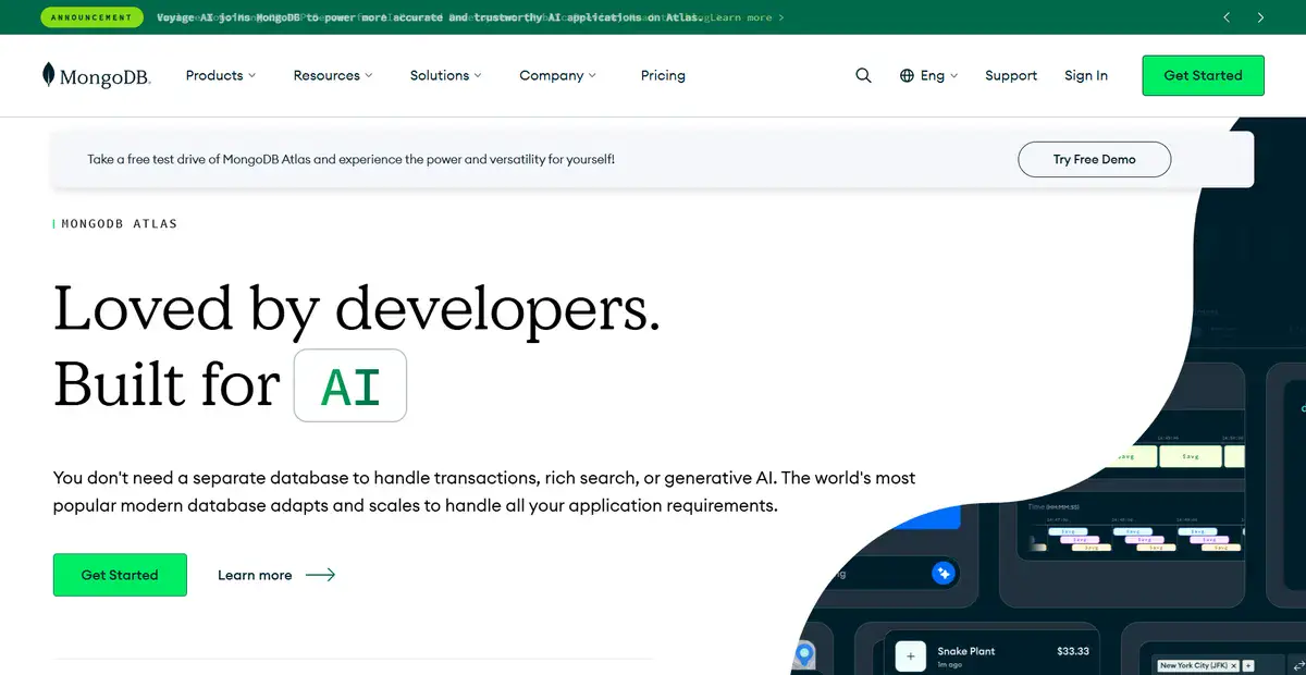
MongoDB is a popular NoSQL database that lets developers store their files as JSON-like documents.
This company was founded in New York and has been making waves for years now as the go-to NoSQL database for web developers all over the world.
Their website serves as a great reminder that you should always tailor your homepage to your customer persona.
Everything on their homepage is about developers and for developers. This makes it easy for developers to trust them and want to try their services much faster.
23. FreshDirect
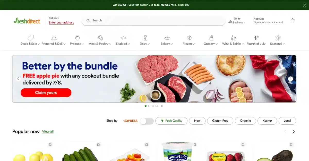
FreshDirect is a simple but useful service that lets you order your groceries from the convenience of your home.
They had their start in New York and have been slowly moving to other states as they grew in popularity.
Their homepage is simple, direct, and wastes no one’s time. When a visitor clicks on their website, they see popular products that many choose for their orders. They also find weekly deals on fresh items for less.
24. Daily Harvest
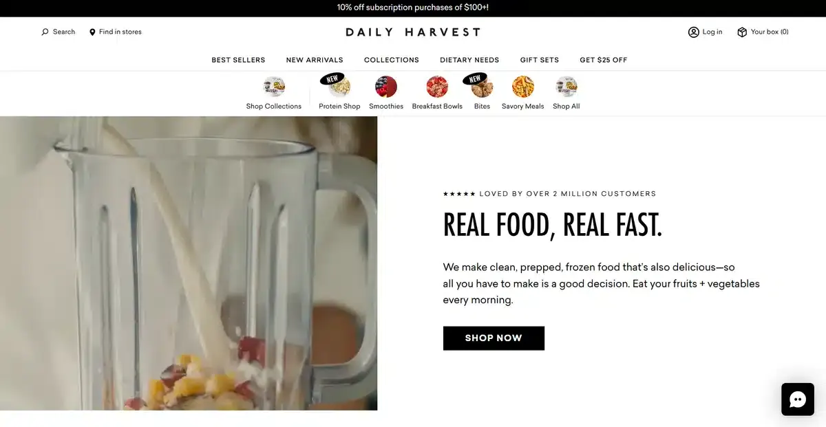
Daily Harvest is a food brand that focuses on providing high-quality and organic products that help you eat healthily.
Their homepage greets new visitors with a testimonial video and some popular products they might like.
While it might seem counterintuitive to provide testimonials before showing any product, it works great for them.
Why? Because it instantly shows visitors that their products are premium and worth the price.
Learn how we increased Good Food’s page speed by 99.99% with our modern web development services in this case study.
25. Stash
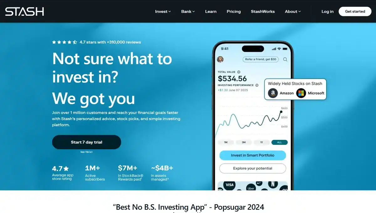
Stash is a NY-based fintech SaaS company that offers simple investment options for people who want to get into investing but don’t know where to start.
Their homepage shows what they offer and how they can help you. You’ll find everything you need to know to find the perfect investment.
26. Great Jones
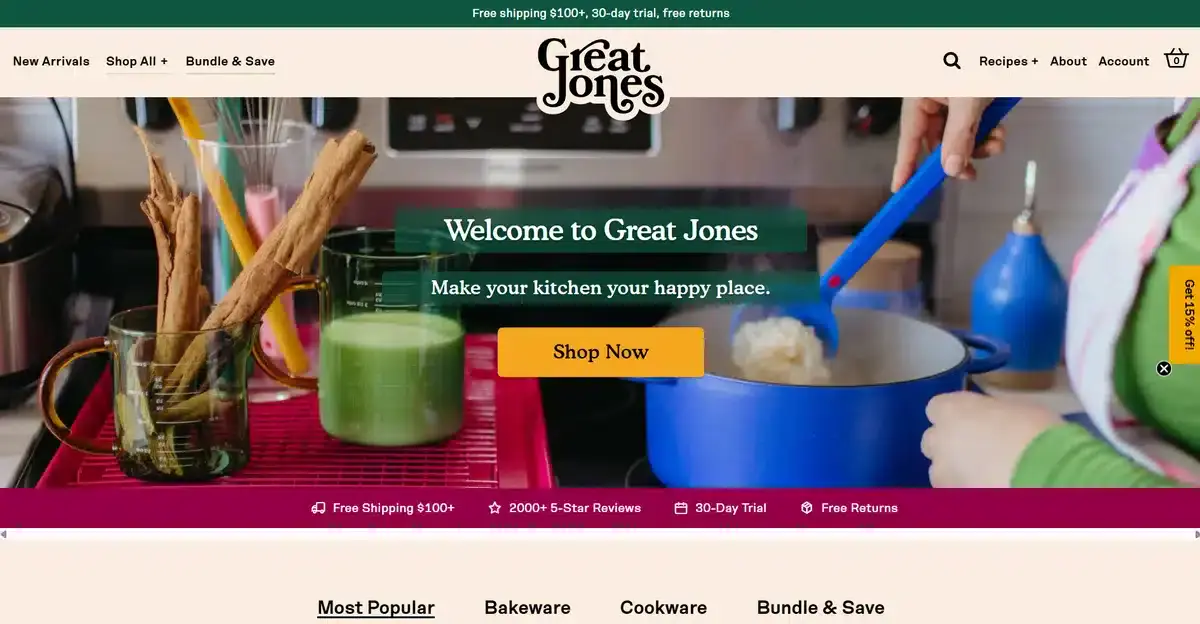
Great Jones is a popular company that focuses on making high-quality kitchen utensils that look good and last a lifetime. Their homepage is a burst of color, but in a controlled way, by adding color in blocks with their products.
Instead of filling their homepage with copy, they let their vibrant products do all the talking.
This is perfect for brands with unique products that stand out.
27. Rokt
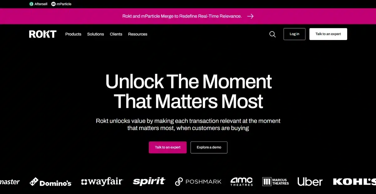
Rokt was founded in New York and offers an innovative eCommerce SaaS product that big brands like Uber use all the time. They offer services that facilitate and enhance a customer’s experience for higher conversions.
Their homepage is simple and to the point, explaining what the service can do for your business.
As you scroll down, they explain exactly how everything works and what it can do for your brand.
With the fintech market expecting to grow to $644 billion by 2029, it makes sense why companies like Rokt are pushing modern websites that attract most amount of users possible.
28. Misen
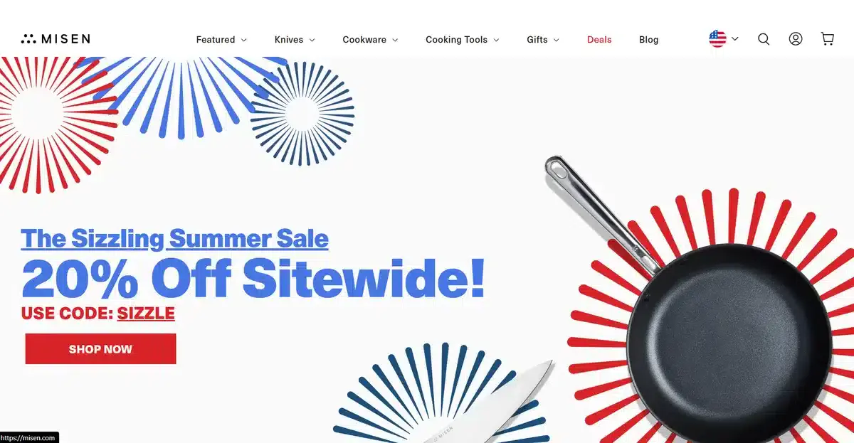
Last but not least, we have Misen, a New York-based brand that specializes in premium kitchen knives and cookware.
Similar to Great Jones, they provide a variety of products that users can access from their well-organized homepage.
They use interactive images for all their products, allowing visitors to see the product in use in a real kitchen. This helps them envision themselves using those products in their homes.
Get a Custom Website for Your New York Company With Blacksmith
We just went over 28 amazing-looking websites and quickly discussed what made each of them inspiring and creative.
Now it’s your turn to use all this inspiration you got here to create a website that helps your NYC brand stand out from hundreds of other brands trying to do the same.
The truth is, applying your ideas on your website takes a lot of knowledge. You also need to invest a lot of time. This is time you could be using to work on other aspects of your business, so what now?
Don’t worry, that’s where we come in. Here at Blacksmith, we are experts in custom website creation. From creating one from scratch to redesigning a website that helps you stand out in your industry.
As a local web design company in New York, we have a group of seasoned web designers ready to implement practical SEO strategies and ideas that will elevate your brand and give you the traffic and conversions it deserves.
Unsure if investing in a custom website is the right choice for your brand?
Don’t worry, click here to schedule a call with us and we’ll audit your brand and website. This way, we can show you what is making you lose clients and how we can help you fix it in no time.


