


With more than 1.1 billion unique websites in the world as of 2026, it’s never been more important to stand out.
But there has to be a balance between standing out with creative ideas and filling your website with clutter.
This is where minimalist websites come into play.
When done correctly, a minimalist website can elevate your brand and help visitors find what they want quickly.
Below we’ll show you some of the best minimalist websites we’ve seen this year, ranging from eCommerce websites to big engineering companies.
Want a minimalist website but don’t where to start? Let us help.
Our Top 30 Favorite Minimalist Websites This Year
1. LUCI
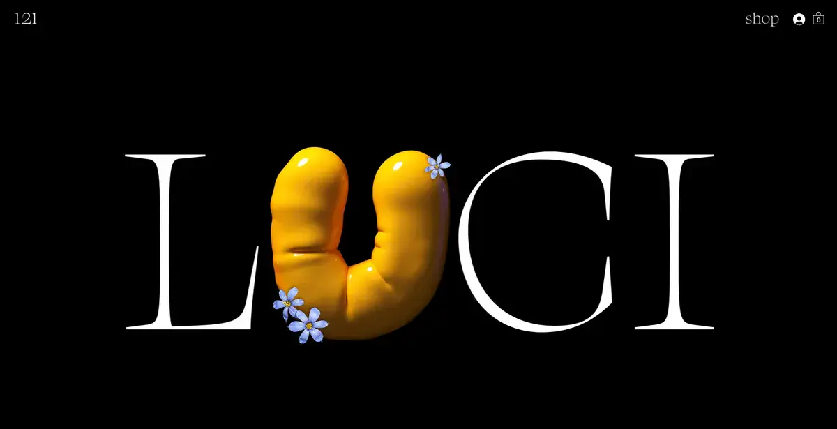
LUCI starts off this minimalist websites list with its beautiful use of typography and bold lettering. Their clever use of white space makes it so visitors have no option but to look at the logo or the oversized products.
By stripping away the usual distractions found in most websites, LUCI lets their product’s vibrant color take center stage. This is the perfect example of minimalism done right and it’s especially effective when showcasing jewelry and accessories.
2. Studio Nido
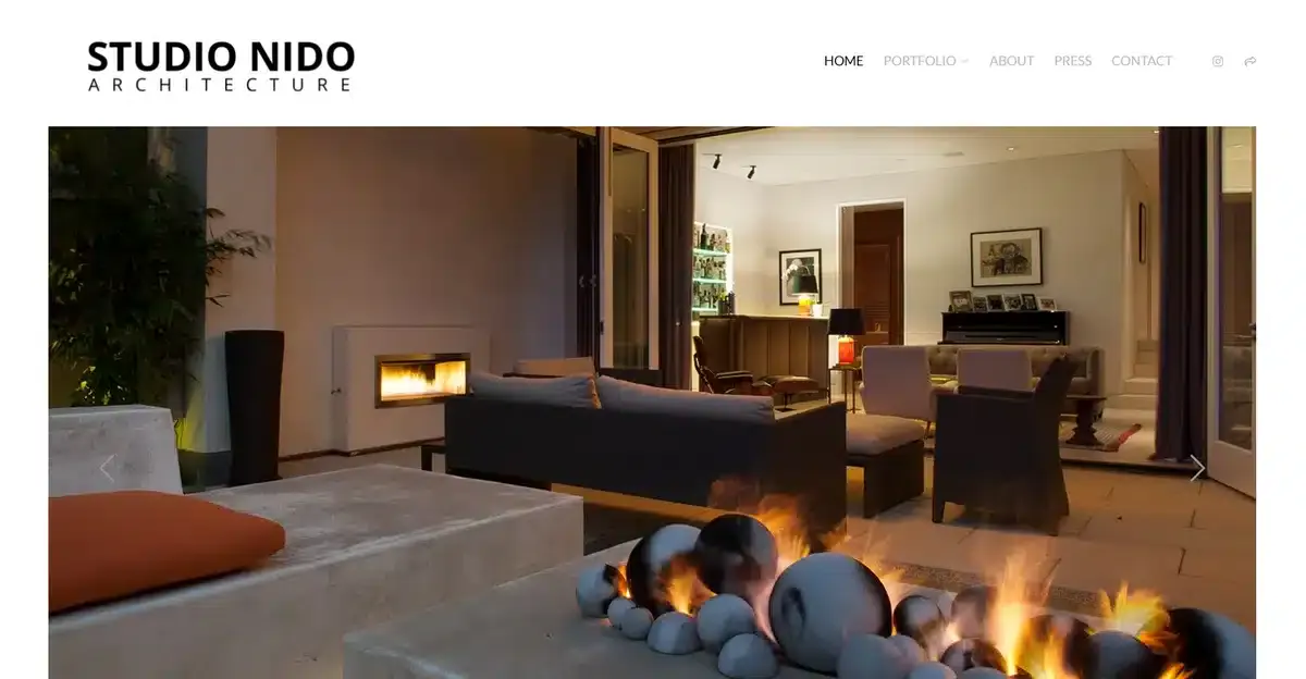
Studio Nido is a San Francisco-based architectural firm with a stunning minimalist website. From the moment you land on their homepage, you’re greeted with a picture of their minimalist interior design. There’s no witty slogan, no call to action, or even a quick summary about them, only the image.
This website style draws in visitors by offering a quick glimpse of what the brand is able to create and motivates them to keep exploring. It may not be an approach that suits every business, but for architecture, it aligns perfectly with how the industry showcases its craft.
3. Mowellens
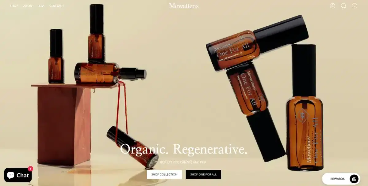
As soon as you open Mowellen’s website, you are greeted with a full-screen image of their latest product. Their call to action and short product description draw in visitors. This makes them want to click the link to learn more.
The smart use of color on their product and images helps them pop out more on an otherwise black and white website.
4. Mogutable
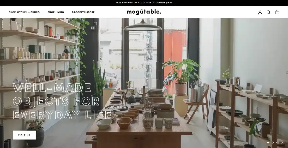
Mogutable has one of our favorite designs out of our minimalist websites list. They sell many products on their eCommerce site. To reduce clutter, they use neutral colors and small fonts.
They let the product shine with big images. When you hover over them, the images change. There’s no need for long descriptions.
5. Aesop
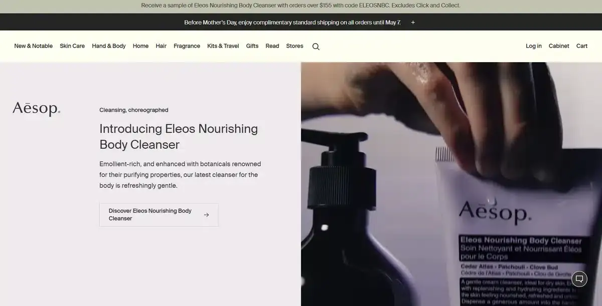
Aesop is a reputable skincare brand known for its high-quality products. By using neutral colors all over its website, it is able to let its products do all the heavy lifting.
Through thoughtful use of white space, Aesop is able to direct visitors’ attention exactly where it need to be for high conversions. Rather than relying on a traditional menu to showcase each product line, they make use of small collages that lets users pick their next step.
6. Kinfolk
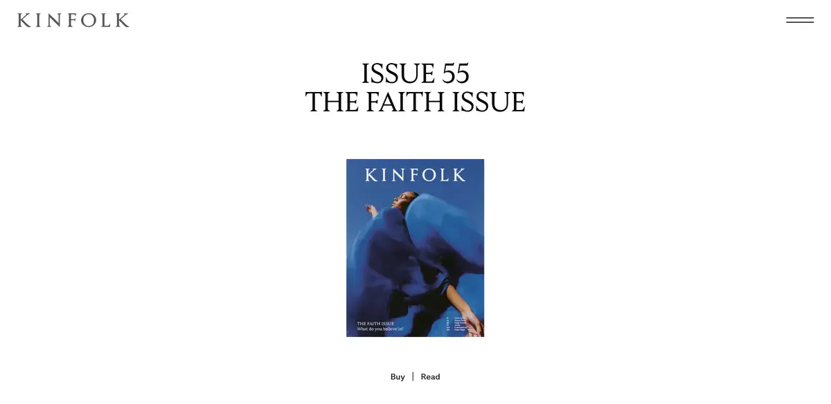
Kinfolk’s website is a great showcase of how good use of white space can help captivate and draw attention to your product. Their clean typography and bold use of images help visitors feel welcome and not overwhelmed by content. The website stands out from other minimalist websites by exuding elegance by maintaining as little content on their site as possible.
7. Supima

Supima is a luxury brand that sells premium cotton to clothing brands worldwide. Their website’s colors align with their product by using an off-white for the background. As soon as you enter their home page, you’re greeted with their mission statement as well as the brands they work with worldwide.
While this website includes a lot more text than typical minimalist designs, it’s offset with a lot of well thought white space. The result is a website with copy that feels relevant and elevated rather than heavy and overwhelming.
8. Leen Heyne
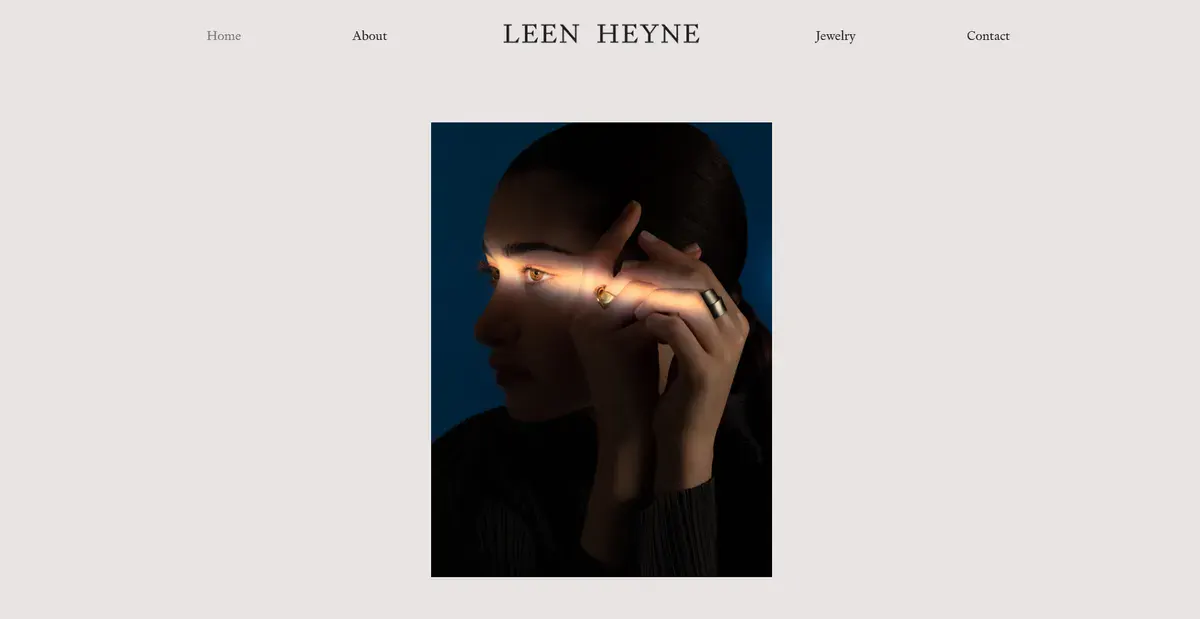
Leen Heyne is a jewelry brand with a very minimalistic website that aims to wow its visitors with its unique looking products. This is as close to having only essentials on your website looks like.
Their homepage keeps copy to a minimum, offering only short and brief messages about the brand and its design process. Their center-column layout leaves ample white space on both sides, which helps visitors focus on a single element at a time instead of getting distracted by multiple things at once.
9. Sliders
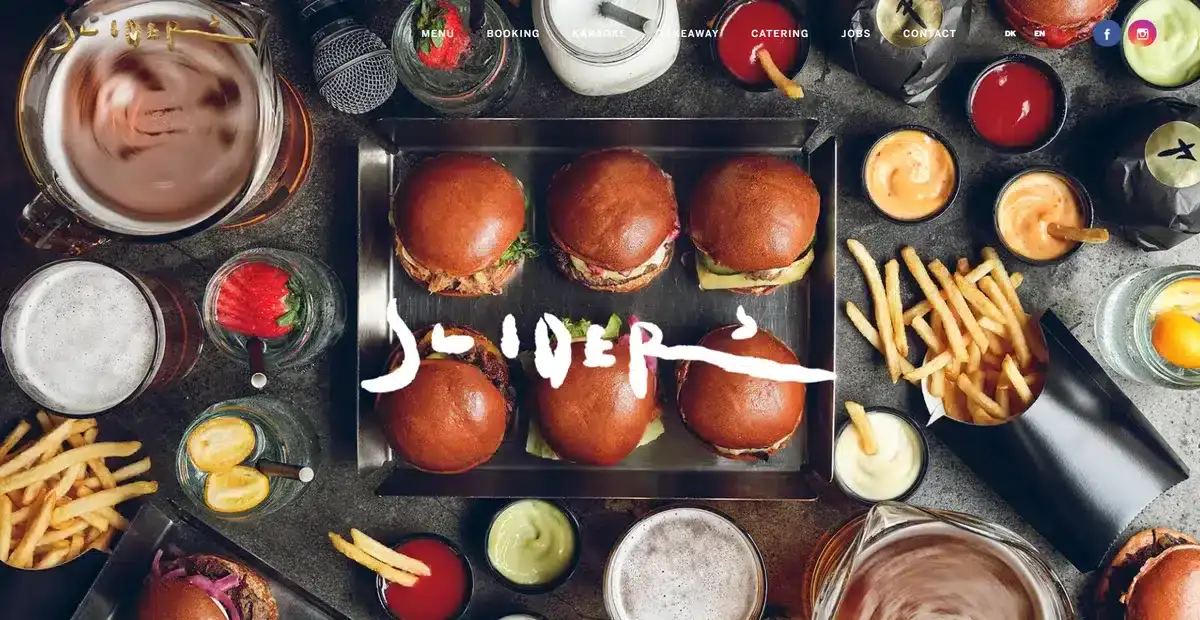
Sliders is a restaurant based in Copenhagen. Their website is a beautiful example of how a high-quality image can completely explain what a business sells. When you enter their homepage, you are met with this stunning table of food from their menu.
The logo is positioned right in the middle of the image. This placement makes the name easy to read. It also allows the beautiful background picture to shine.
Overall, this is a fantastic website to use as inspiration for any restaurant looking to create their very first website.
10. soilboy
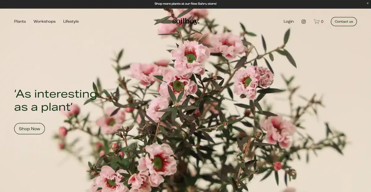
soilboy shows that you can sell anything with a minimalist website if you know what you’re doing. As soon as you enter the website, you get a close look at how well-kept and trimmed their bonsai trees are.
As you scroll down, you get a quick look at some of the other products they sell. All accompanied by a small sentence that quickly explains what the product is.
Explore how we increased Quali’s demo requests by 130% with a new web design in our most recent case study
11. Projects Contemporary Furniture
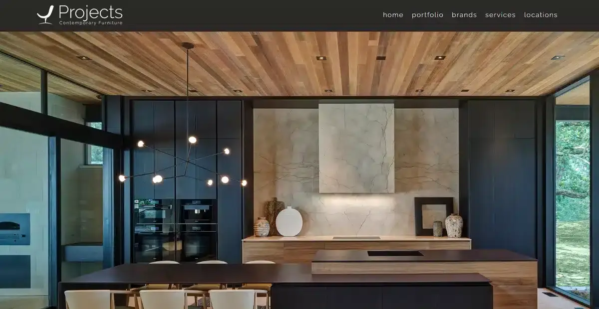
Projects Contemporary Furniture is a luxury showroom that wows visitors from the moment they enter its website. A big image shows what they offer and how their furniture can completely redesign a space with no use of typography whatsoever.
As you scroll down, you get to learn more about the business and its mission statement. Overall, their website is the perfect mix of clean images and smart copy.
12. Eiktyrne
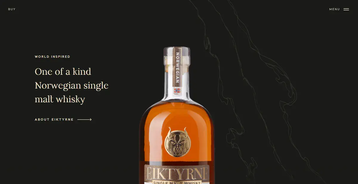
Eiktyrne is a luxury Norwegian whiskey brand known for its single malt options. Their website design screams minimalism from the moment you go in. They introduce their most popular whiskey first and let you take in the bottle’s details and colors.
Instead of overwhelming visitors with product details, they let the product speak for itself. If a visitor wants more information about a specific product, they can click on the product page to explore and learn more.
13.HPI Real Estate
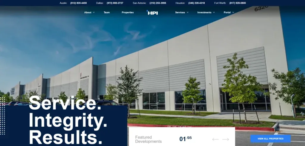
HPI Real Estate is an industry leading real estate firm based in Texas. Their website is straightforward and makes it easy for any visitor to find what they need without having to go through different pages.
Removing clutter from a website is what minimalism is all about. Leaving only the essentials so it’s easy for visitors to get what they need with minimal effort.
Explore how we redesigned HPI Real Estate’s website and improved their MQLs by 180% in our latest case study.
14. Ginventory
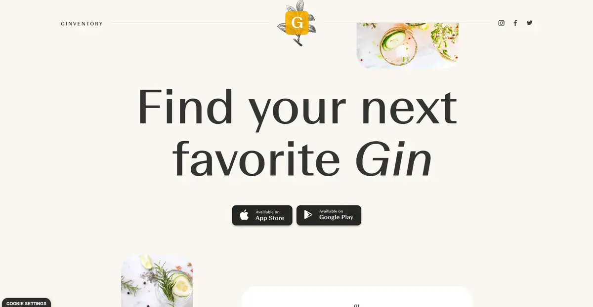
Ginventory is a brand all about getting customers the perfect gin for them. They showcase this by welcoming website visitors with their slogan “Find your next favorite gin” in a big and bold typography.
This approach instantly shows visitors what they’re getting in to without making them scroll or dig through the whole website. And if they do scroll, the visuals demonstrate how the companion app works which encourages users to download it
15. amstein
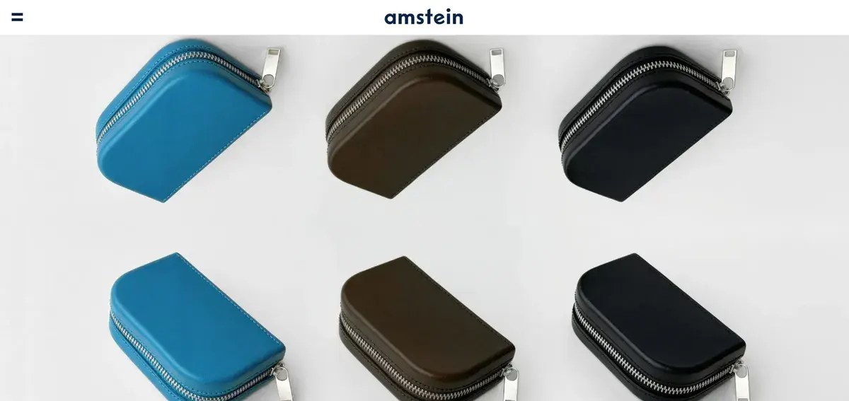
amstein is a London-based brand that sells everyday accessories like handbags. Instead of welcoming visitors with a long mission statement and a wall of text, they use the start of the home page as a place to showcase their product.
By eliminating every other element apart from its products, it makes it easy for visitors to decide whether they want to learn more about the product or not.
16. Brooklyn Candle Studio
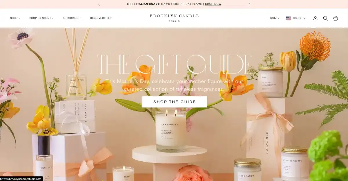
Brooklyn Candle Studio is a great example of how to utilize images in a way that creates white space without being boring. From the moment you open their website, a collage of images welcomes you and leads you to different products.
Remember, the goal of a minimalist website is to prevent visitors from feeling overwhelmed with too much information. Using a collage with minimal copy lets people absorb the visuals and explore the products at their own pace.
17. Andluca
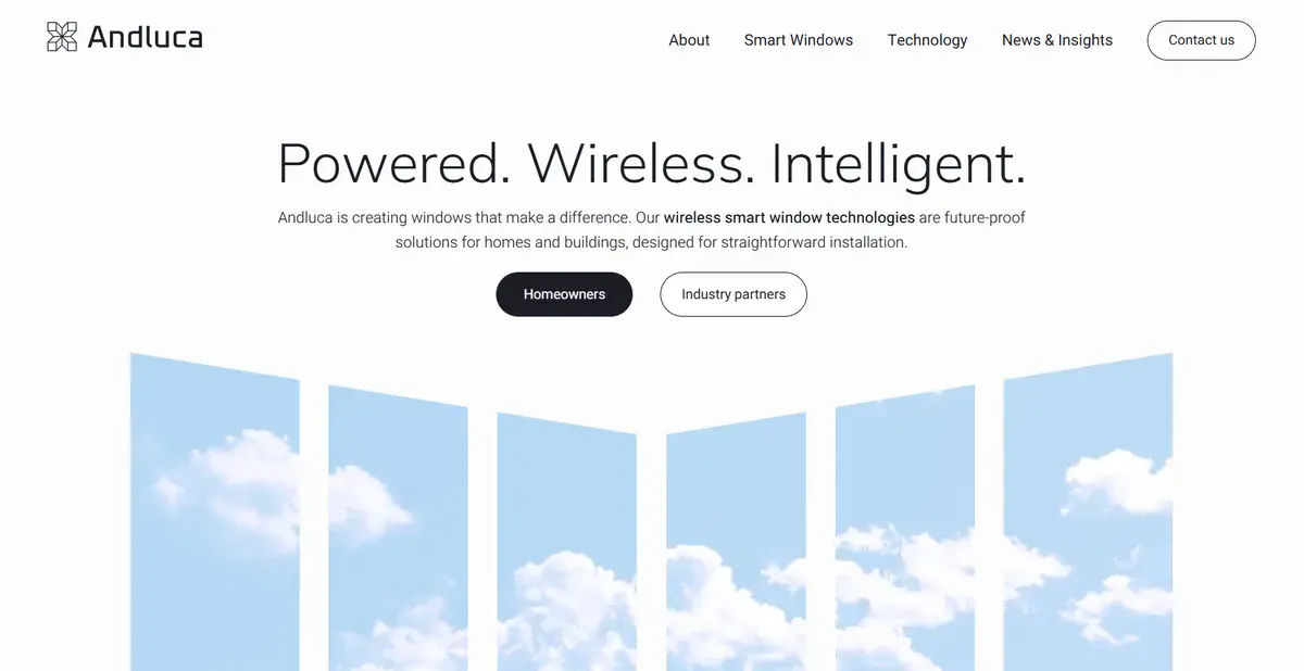
Andluca is a beautifully made minimalist website that takes a creative approach by showcasing the importance of windows in homes. Its website uses a white background that lets both images and strategic copy stand out.
Like other minimalist sites we’ve mentioned, Andluca focuses on their product. They use images to showcase how it benefits clients.
18. Fontshare
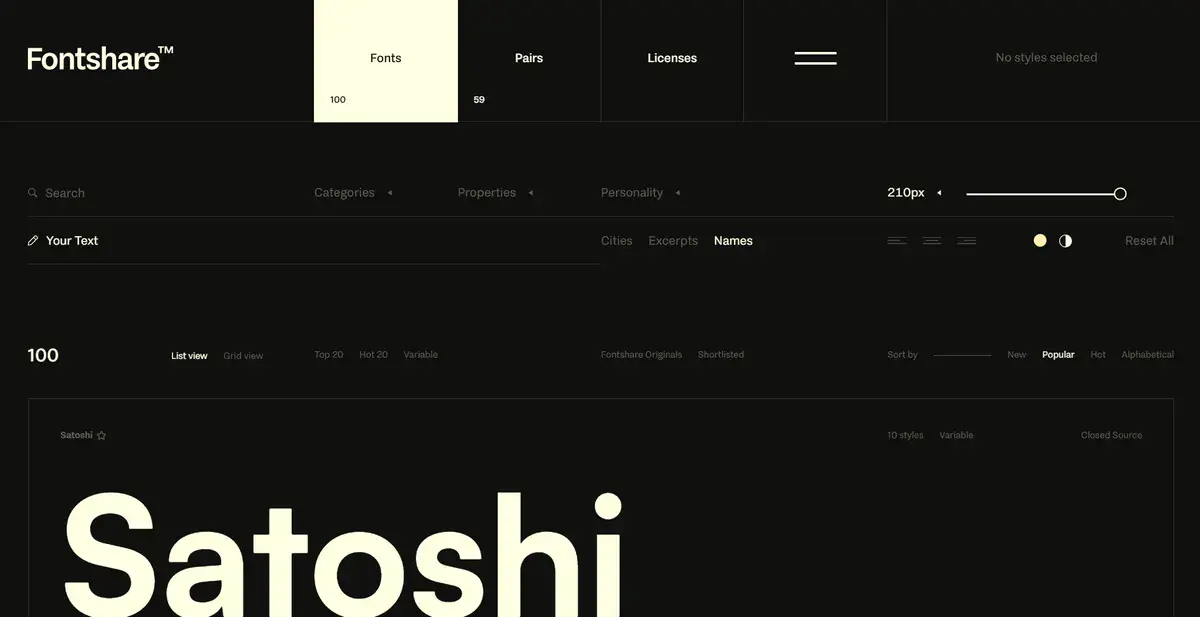
Fontshare is a popular website that helps people all over the world pick the perfect font for any project they’re working on. Considering fonts are hard to sell and show as an image, they took a different route. They made their whole website interactive so people can write and check if the font is what they really want.
Pair that with a sleek and elegant website design with minimal fluff, and you get web pages that are a delight to browse through.
19. Muji
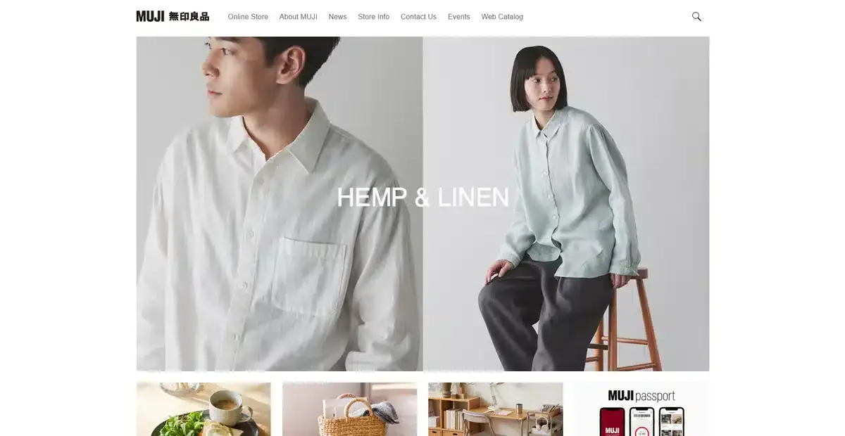
Muji is an eCommerce website that ticks all the boxes when it comes to minimalism. They use a white background with little to no copy, which lets their high-quality products get all the attention. All while making sure their most sold products get the biggest images.
20. Lars Tornoe
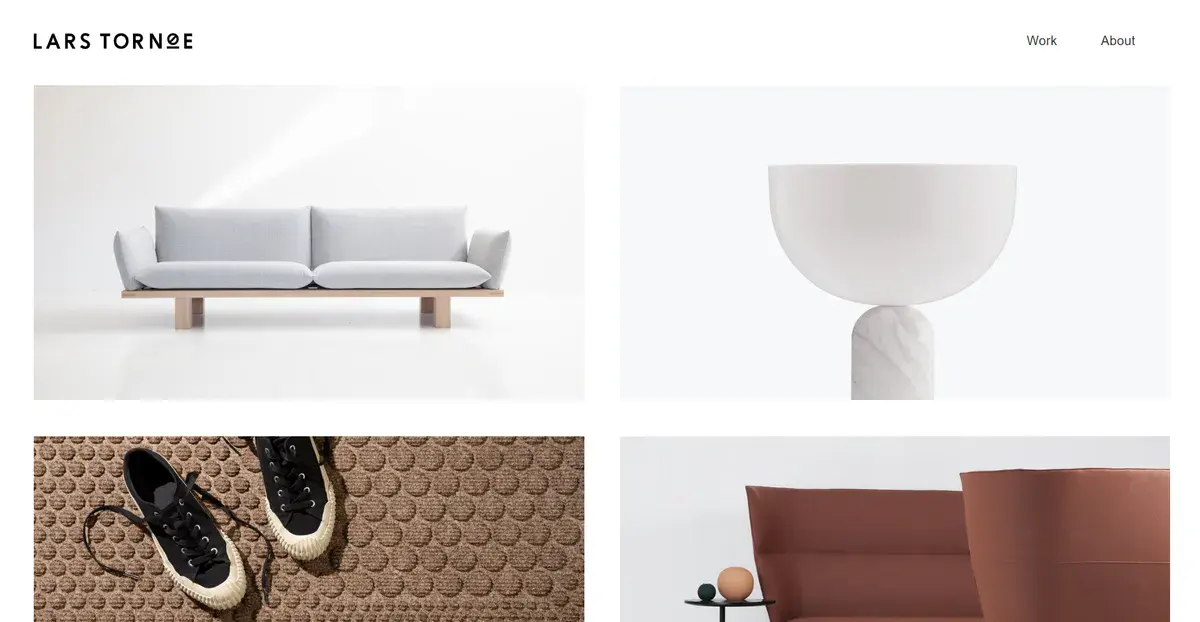
Lars Tornoe’s home page can easily be used as an example of how a minimalist page should look. It uses a 2-column grid with clickable images of each project they’ve done in the past.
With absolutely no copy anywhere on the website, including the footer, they direct all attention to their high-quality imagery. This website style is perfect for creative brands that want their images to speak louder than anything else.
21. ETQ
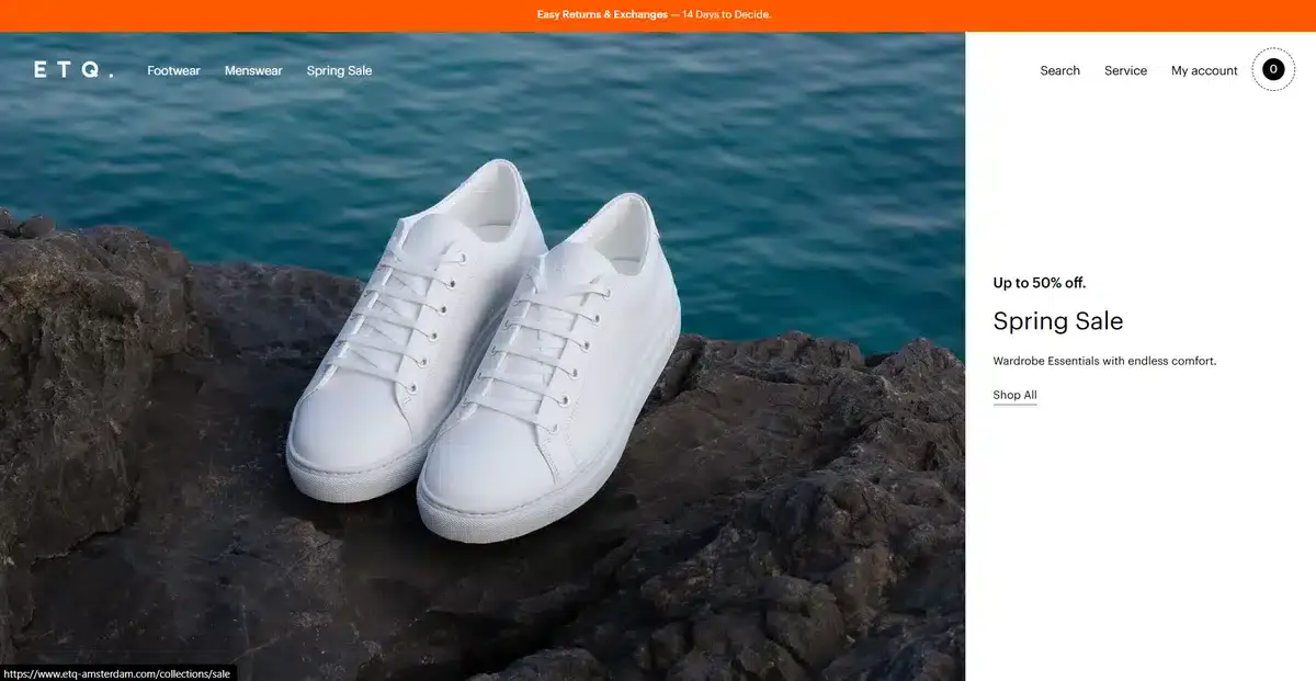
ETQ is a clothing brand based in Amsterdam with a minimalist approach in both its clothing as well as its website.
Their website only includes a quick product explanation and nothing else, no exaggerated copy or filler. With clean and exceptional website functionality, it creates an easy, streamlined browsing experience.
22. Scope Copenhagen
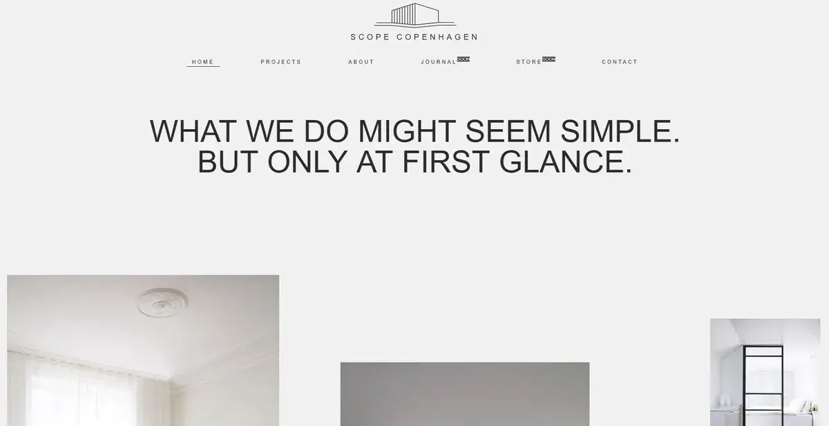
Scope Copenhagen brings a modern Danish style to any client’s home. Their website follows the same theme as their work. The moment you enter their website, only three words come to mind: minimalist, elegant, and sleek. The perfect use of white space allows the visuals to pop, while the bold and clever copy at the top adds the perfect amount of impact and attention.
Want to redesign your website into a minimalist website but don’t know what you need to do? We can help.
23. Matt D’Avella
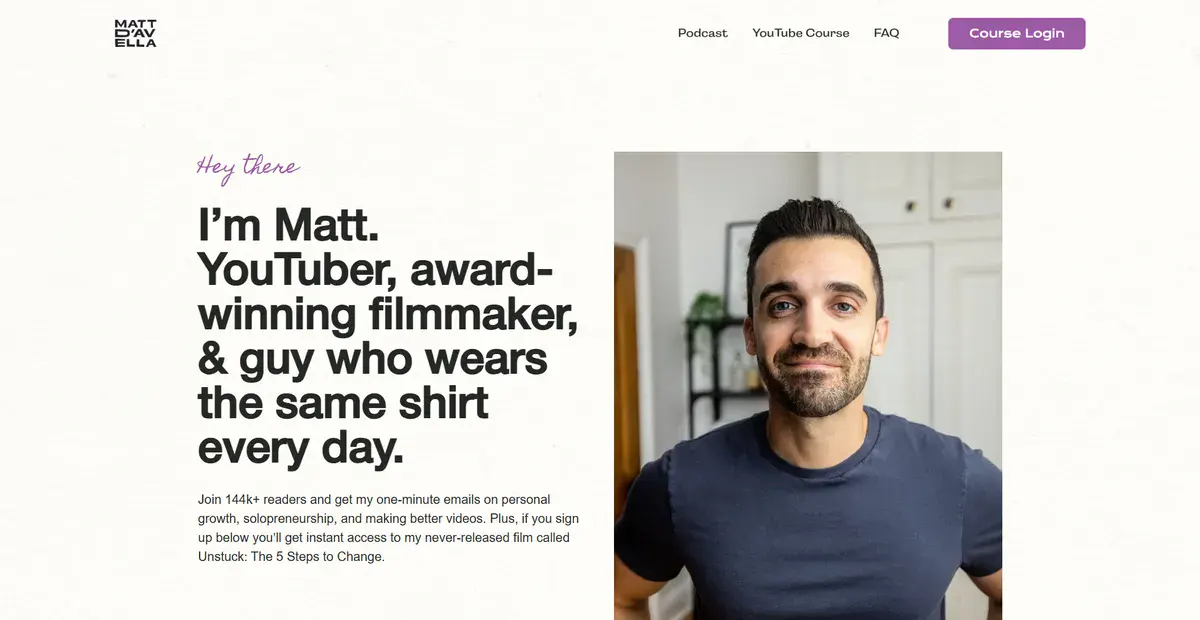
Matt D’Avella is a popular YouTuber that focuses on a minimalistic lifestyle and promotes healthy routines. His website mirrors the way he structures his content on YouTube. The moment you land on the homepage, you see a simple photo of Matt beside simple copy explaining who he is and what he offers.
He doesn’t take you on a long journey through his website to explain anything, instead he tells you outright how he can provide value. There are barely any links apart from the course he sells, which gives visitors very clear instruction as soon as they’re done reading the about me copy.
24. Charbono
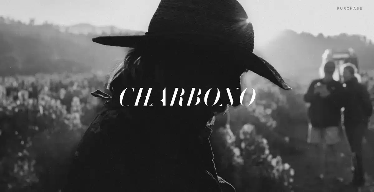
Charbono is a luxury wine brand with decades of heritage under its belt. Their website is a visual tour through what they do, what they offer, and why they keep doing it. All in one sleek and vintage package.
Most website would make the mistake of filling this whole section with constant product pitches, but Charbono chooses to stick to its roots and storytelling instead. The result is a perfect example of how compelling narrative and a well thought minimalist design can complement each other perfectly.
25. Good Books
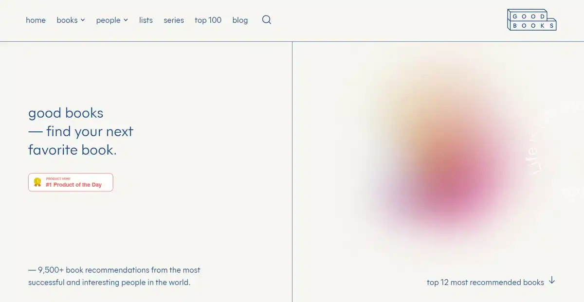
Good Books has a beautiful and understated website that focuses on its copy the most. While exploring the website you’ll see top book recommendations showcased in a subtle and natural way, without it feeling like they are trying to sell you any of them.
The more you explore, the more you become interested in reading new books and finding new ways to read more every day.
26. Member First Mortgage

Member First Mortgage has a great and unique homepage that showcases all of their important services without bombarding you with information.
The smart use of color when hovering over a service helps accentuate the areas that matter the most for potential clients without it feeling out of place either.
Explore how we redesigned Member First Mortgage’s website into a minimalist website that increased their loan applications by 70% in our recent case study.
27. Rule Studio
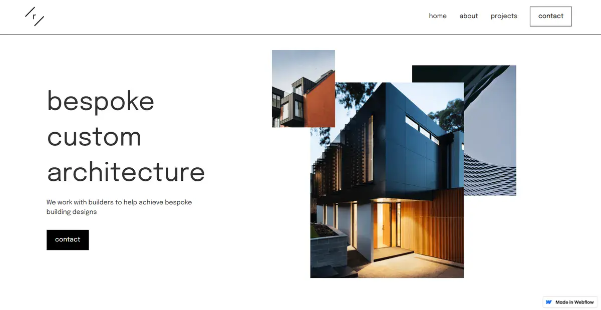
Rule Studio is an Australian-based architectural firm that focuses on bespoke design. Their website stuns visitors with its minimalist design that shows their dedication to their unique style.
Minimalism doesn’t mean you have to sacrifice your design identity. With well thought ideas and some creativity, a brand can create a minimalist website that still feels rich and expressive, such as Rule Studio’s.
28. Zenit
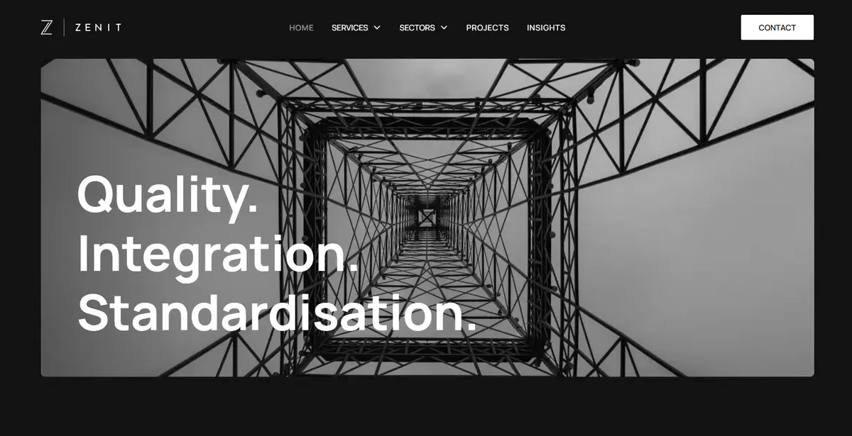
Zenit is an engineering firm from the UK that focuses on everything related to utility infrastructure. Most of its website has the same black and white tone with some hints of color to highlight important parts.
Their homepage functions as an all-in-on landing page, where they can showcase their services, capabilities, and value right from the start. This completely eliminates the need for visitors to run around the website searching for important information.
29. The Maker Makes
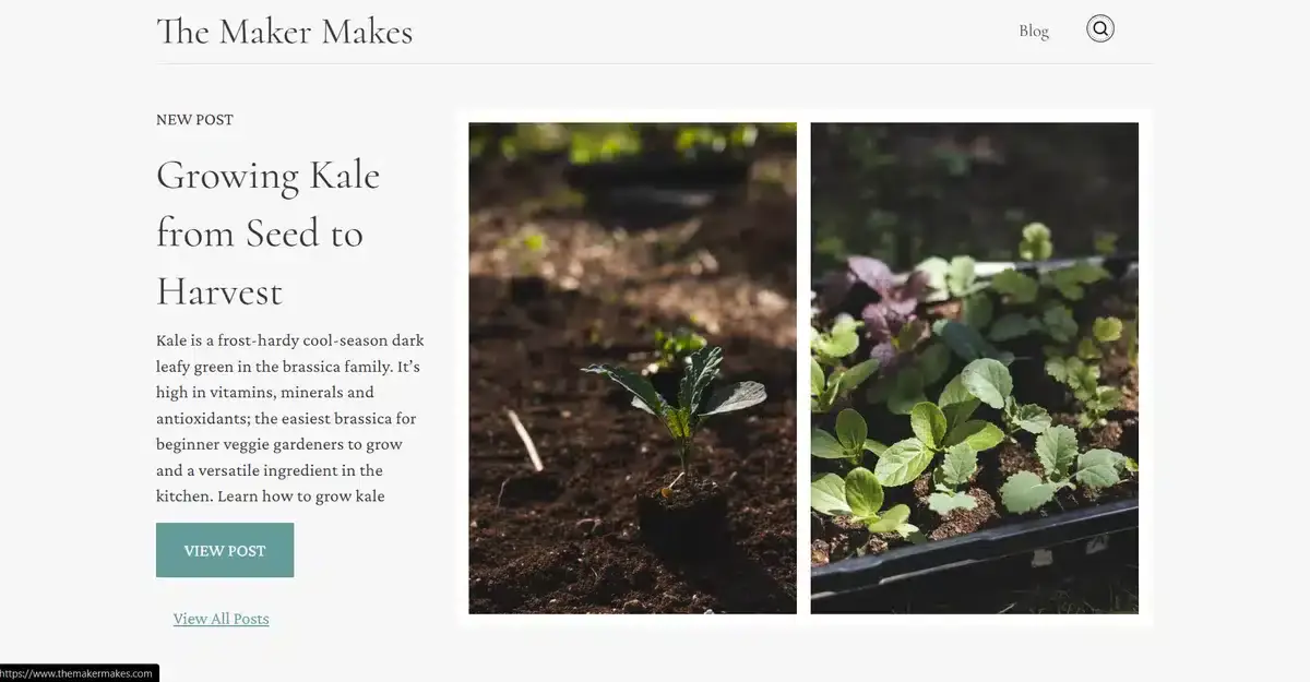
This is by far one of our favorite designs on our minimalist websites list. The Maker Makes is a food blog with a focus on high-quality images and detailed copy. If visitors like any dish featured on the homepage, they can simply click the image and get the complete recipe and article of how it’s made and what ingredients they’ll need.
Simple, elegant, and to the point. Exactly how minimalist websites should be.
30. Pure Cosmetics
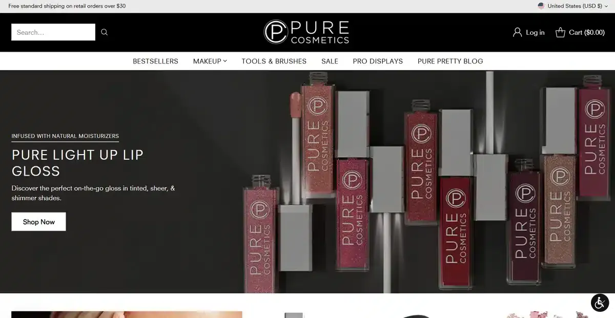
Pure Cosmetics stands out as an environmentally conscious beauty brand focused on natural formulations. Their website communicates this clearly from the start with brief, informative copy that explains what every single product provides you with.
Instead of using an image block like most businesses, they opt for full-screen images that accentuate their high-quality products. This approach is great for businesses that have very few products and want to highlight them as much as possible.
Get a Custom-Built Minimalist Website that Converts With Blacksmith
We just went through 30 of our favorite minimalist websites of 2026. From very minimalist websites with barely any copy to websites with their whole story on one single home page.
You might have gotten inspired by some of these examples, especially if you can picture your brand using some of these designs. But where do you start and what do you need if you want to get a minimalist website for your brand? That’s where we come in.
Here at Blacksmith, we’re website experts with dozens of projects under our belts. As a professional web design agency, we’ll get our group of seasoned web designers ready to create the perfect minimalist website for your brand.
They’ll create a mockup that ties your design ideas with all of the modern touches and features that every good website should have.
You’ll get a custom website that is both functional and stylish. No need to make sacrifices to make them both work.
Still unsure if investing in a new custom website is what your business needs to thrive? Click here and schedule a call with us so we can prove to you how many more conversions and traffic your brand could get with a custom website.


