


Poor urgent care web design can drive patients away.
More than 75% of users assess a company’s credibility solely based on its website design alone. This creates a major setback for urgent care facilities that want to attract patients through their digital front door.
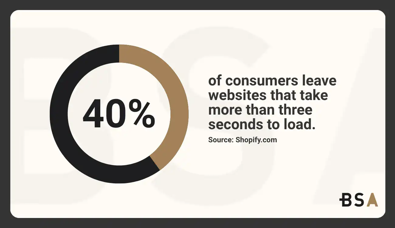
Take a look at your current urgent care website design. Does it load fast enough?
Studies reveal 40% of consumers leave websites that take more than three seconds to load.
Visitors abandon slow-loading and non-responsive websites more than any other reason. They’re five times more likely to exit sites that perform poorly on mobile devices.
The right strategy makes all the difference in website projects, especially for healthcare sites.
In this piece, we’ll get into the nine most harmful web design mistakes that urgent care facilities make.
You’ll learn exactly how to fix them. These solutions will protect your budget and boost patient acquisition and retention significantly.
Does your urgent care clinic need a website redesign but don’t know where to start? Let us help.
Top 9 Urgent Care Web Design Mistakes We See All the Time
This list is in no particular order. All of the issues should be addressed to the same degree of importance.
Even solving one of these mistakes can greatly improve your website traffic if handled correctly.
Mistake 1: Using a Generic Template for Your Urgent Care Website
Generic templates might seem like a good deal since they’re quick to set up and budget-friendly.
But your urgent care website deserves better, as picking a template website can prove to be costly in the long run.
Why templates fail to build trust
Patients looking for urgent care feel anxious and need reassurance. A cookie-cutter website template sends the wrong message when they need help most. Generic templates don’t meet the core needs of healthcare websites.
They lack focus on trust, referrals, and compliance. These standard designs feel cold and impersonal and it’s the last thing a worried patient wants to see.
Picture yourself as a patient. Would you trust a medical facility with a website that looks just like a dentist’s office, a chiropractor’s clinic, and a med spa?
This kind of similarity hurts credibility.
Templates have problems beyond just looks. Most don’t properly address healthcare requirements like HIPAA compliance and ADA accessibility standards. These aren’t nice-to-have features, these are features that healthcare providers must have, no question asked.
There’s another reason why templates fall short. They limit your ability to create experiences centered around patients.
Studies show templates often put the healthcare provider’s needs ahead of patients. This goes against what today’s patients expect from healthcare.
Patients see rigid, impersonal websites as a sign of rigid, impersonal care.
How custom design improves patient engagement
Custom urgent care web designs that increase engagement time are revolutionizing patient experiences.
Web designers craft custom sites tailored to your urgent care facility and consider your unique needs and patient demographics, setting them apart from templates. This method makes navigation fit how your patients search for information.
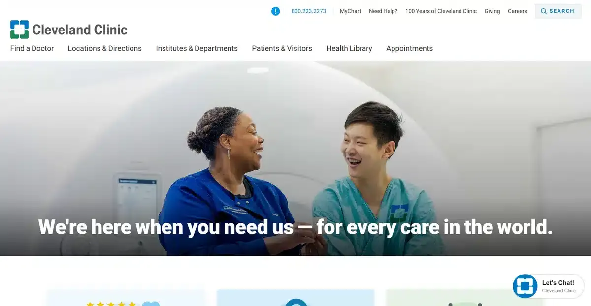
The Cleveland Clinic showed custom design’s impact by adding staff videos to their website, which made patient trust jump by 40%.
And this isn’t just a random number, they show how custom elements strike a chord with healthcare consumers.
When comparing a custom web design with a template, there is really no debate that a custom web design will always be the better choice.
Custom websites excel at putting patients first. They help create shared interactions that give patients the knowledge they need to make better health decisions. Custom designs adjust to fit each patient’s needs. This means patients aren’t pushed through fixed information paths.
Custom websites usually work better for SEO. Their optimized structure lets search engines index content better than template-based sites.
Since most patients find urgent care facilities through online searches, this means more patients at your door.
A custom design investment pays off through better credibility.
A professional, unique website builds confidence in your practice. Urgent care facilities need this. Patients often decide quickly based on first impressions. Credibility can help you stand out as the chosen provider instead of being overlooked.
Custom websites grow better with your practice. As your urgent care services expand, a custom website adapts without template restrictions. Your digital presence can grow naturally with your physical practice.
Mistake 2: Poor Mobile Responsiveness
Mobile optimization is no longer optional – your urgent care website must have it. Right now, more than 60.4% of global web traffic comes from mobile devices. Patients want a continuous connection with your website on any screen size.
Why mobile-first design matters
This move to mobile browsing has changed how patients connect with your urgent care facility online.
Search engines have adapted their ranking systems. Google now uses mobile-first indexing and ranks websites based on their mobile versions. Your urgent care website will lose visibility if it’s not mobile-friendly, especially at times patients need to find you most.
A mobile-responsive website builds patient trust.
Bad mobile experiences create poor first impressions and make potential patients leave your site. This high exit rate tells search engines your content isn’t helpful, which hurts your visibility even more.
Patient behavior shows why this is vital: people often search for urgent care on their phones while traveling or away from home. Your mobile site could be the first step toward building an in-person relationship with a patient.
Common mobile UX issues in urgent care sites
Urgent care websites often have mobile design problems that are easy to fix. Layouts that look perfect on desktop can break on mobile screens. Content jumps around, becomes hard to read, or disappears.
Forms don’t work well on mobile. Patients who try to pre-register or give information find forms that don’t work with mobile keyboards. This leads to mistakes and giving up. These problems add stress to already difficult situations.
Navigation becomes tricky on smaller screens. Desktop menus turn into confusing interfaces on mobile. Patients struggle to find key information about services, hours, and insurance.
The biggest concern: important contact information and emergency details can be hard to find on mobile versions. In medical situations, patients may pick other urgent care centers. They do this when they find more information available.
How to test your site on different devices
You need several approaches to test mobile properly. Browser developer tools offer quick checks for simple responsiveness.
Chrome, Firefox, and Edge let you see how your site looks on different screen sizes.
In spite of that, simulation tools can’t show exact behavior. Services like BrowserStack let you test on real mobile devices in the cloud. This shows problems that simulators might miss, like touch response issues or device-specific bugs.
Check your site’s loading speed on mobile connections. Tools like Google’s PageSpeed Insights look at mobile performance separately. A one-second delay can increase exit rates by a lot, so speed optimization is vital.
To test touch targets, follow these guidelines: make all touchable elements at least 44×44 pixels with 10mm space between them.
Test forms on real mobile devices while walking or distracted to see how they work in real-life situations.
Test your urgent care website regularly on popular devices. Make this part of your regular maintenance, especially after updating content or changing design.
By 2028, there will be 7.9 billion smartphone users.
So, to thrive in urgent care, it’s essential to ensure a great mobile experience.
Mistake 3: Confusing or Cluttered Navigation
Poor website navigation creates frustration for patients seeking urgent care online. Your site visitors are often stressed, in pain, or worried. They shouldn’t struggle to find important information.
What patients expect at the time they visit your site
Patients who visit urgent care websites have specific goals in mind. They need quick answers and solutions rather than company history or background information.
Patients typically search for these details right away:
- Contact details and location (phone number, address, directions).
- Services offered (what conditions you treat).
- Insurance and pricing information.
- Online check-in or appointment scheduling options.
Clear navigation ranks high among the factors that influence a patient’s choice of urgent care clinic.
Most patients want their information within two or three clicks. Many urgent care websites hide key details in complex menus. This forces patients to click through unnecessary pages.
Mobile navigation plays an even bigger role today.
Data shows 82% of patients use smartphones to access healthcare websites. This means your menu design should work smoothly on every device.
Mistake 4: Missing or Outdated Business Information
If your urgent care web design has missing or old information, it’ll make it harder for patients to reach you when they need help.
The accuracy of your website directly affects both care quality and your ability to attract new patients.
Everything your urgent care site must show
Medical situations require your urgent care website to display complete, current business information.
Your website needs these crucial elements:
- Accurate contact details – Your business name, phone number, and address should be the same everywhere online. Wrong information confuses patients and makes your facility harder to find in local searches.
- Current operating hours – Regular hours, holiday schedules, and special hours must be clear. Patients need this information quickly. This is especially true on weekends and holidays when urgent care is most important.
- Services offered – A clear list helps patients know if you can treat their specific conditions. They need this information before making the trip to your facility.
- Insurance and payment information: Patients should know which insurance plans work at your facility and what options exist for those without coverage. This helps avoid billing surprises.
Just having this information isn’t enough – it must stay current.
Explore how we increased Tradewind Market’s demo requests by 140% with a new web design strategy in our latest case study.
Patient trust suffers from missing details
Wrong or missing details break patient trust in serious ways. Doctors say patient care suffers in 44% of visits due to missing clinical information.
The same applies to your website; patients doubt your competence when they can’t find what they need.
Missing information causes real problems. Doctors report that important clinical details are missing in one of every seven visits. These gaps cause 15.6% of primary care errors that doctors believe harm patients.

Website visitors face similar challenges.
Wrong hours on Google Business Profile mean patients find locked doors. Bad phone numbers stop patients from reaching you in emergencies. These gaps send patients straight to your competition.
Your online visibility also takes a hit from missing website information. Google shows medical practices with complete, optimized profiles more often.
Facilities with old information get bad reviews and become harder to find when patients need them the most.
Complex cases make this even worse. Patients with multiple conditions often have more missing information.
This creates a direct link between case complexity and information gaps. Your website must provide detailed information for every possible patient situation.
Mistake 5: Slow Loading Speed
A fast loading website is an essential website feature every urgent care website should have.
Speed is a massive issue, especially when your urgent care website takes too long to load.
Studies show pages that load within 2 seconds get an overall increase in conversions, yet many sites overlook this vital aspect of urgent care web design.
How speed affects bounce rate and SEO
Loading time dramatically shapes how users behave on your site.
When pages take between 2 to 5 seconds to load, bounce rates jump from 9% to 38%. Sites that take more than 6 seconds to load see bounce rates climb to 61%. Urgent care facilities lose real patients because of these delays.
Healthcare websites face a big challenge. Patients want quick information.
Pages loading between 3.1 and 4.0 seconds see 6% fewer conversions than faster ones. Sites taking 9 seconds or more to load lose 84% of potential conversions.
Google ranks websites based on their speed. They measure this through Core Web Vitals – metrics that show how well pages load, respond, and stay stable. Your urgent care website’s search visibility suffers when these metrics fall short.
Urgent care facilities cannot afford slow websites. Patients who need quick medical help will switch to other providers if pages take too long to load.
Google’s John Mueller points out that visitors rarely wait longer than three seconds. The average webpage loads in 3.21 seconds, so urgent care sites must do better to stay ahead.
A faster urgent care website ranks higher and turns more visitors into actual patients.
Learn how we increased Deep 6 AI’s conversion rate by 32% with our web design services in this case study.
Mistake 6: Weak or Missing Calls to Action (CTAs)
Compelling calls to action build a vital bridge between passive browsing and patient conversion on your urgent care website.
Websites with engaging CTAs have 121% higher click-through rates than those without clear prompts.
What makes a CTA effective
Strong CTAs begin with action-oriented language that creates urgency. Direct wording such as “Book Now” or “Call Today for Immediate Care” works better than generic phrases like “Learn More” or “Click Here.” These command words help potential patients take immediate steps.
The visual design plays a key role in how well CTAs perform. Your buttons should use contrasting colors that pop from the rest of your page.
This visual difference naturally draws the eye to the action you want patients to take. Size makes a difference too – CTAs need to be large enough to click easily without dominating the page.
Good CTAs go beyond design to show clear benefits. “Schedule Now for Same-Day Relief” works better than just saying “Schedule Now.” This approach answers what patients really want to know: “What’s in it for me?”
Adding trust elements near your CTAs boosts conversion rates. Short testimonials or star ratings next to appointment buttons make a difference.
Urgent care facilities can encourage quick action by saying “appointments filling fast.” This creates a sense of urgency.
Where to place CTAs on your site
Smart CTA placement can transform conversion rates. The golden rule puts your most important CTA “above the fold” – visible without scrolling. This approach lets visitors see your call to action right when they land on your site.
Your content should naturally include CTAs throughout. They work best at key decision points – after service descriptions or testimonials. This thoughtful positioning guides patients to act when they’re most convinced of your value.
Urgent care websites need to show “Book Appointment” and “Check Wait Times” buttons clearly on their high-converting homepage and service pages. These action points need enough white space around them to stand out.
Multiple competing CTAs can overwhelm visitors. Each new button should serve patients’ needs rather than just fill space. Focus on creating clear conversion paths instead of adding more buttons.
A/B testing different CTA versions shows what strikes a chord with your audience.
Try different button colors, words, and positions to find what drives the most conversions.
Mistake 7: Ignoring SEO Fundamentals
Web design and SEO go hand in hand. Your urgent care facility becomes invisible to patients at the time they need you most if you ignore basic SEO principles on your website.
Why SEO is critical for urgent care visibility
Urgent care facilities need SEO because of the time-sensitive nature of their services.
Patients who need immediate treatment often pick an urgent care center from the top search results quickly.
Your facility misses out on potential patients when SEO isn’t optimized. These same potential patients end up choosing other care centers that appear first because of it.
Here’s a fact: local searches rarely include business names. Patients search based on their needs with terms like “urgent care,” “emergency room,” or “accident” plus their location. The number of patients you see depends on how visible you are for these essential terms.
Local SEO tips for urgent care clinics
Local SEO directly affects how many patients find your urgent care center. Your Google Business Profile needs the most attention. It should accurately show:
- Operating hours.
- Contact details.
- Services offered.
- Physical address.
- Photos of your facility.
Your name, address, and phone number must match exactly on all online directories. Search engines trust your info more when it’s consistent. This boosts your local search rankings.
Mistake 8: Lack of Trust-Building Elements
Patients base their urgent care facility choices primarily on trust. A website needs to build confidence quickly through elements that comfort worried patients who need immediate medical attention.
Importance of doctor bios and patient reviews
Doctor biographies shape the way patients view medical practices.
Research shows that 92% of patients read physician bios before booking their first visit. These profiles help patients get to know their potential doctors.
Most patients look beyond just credentials; they want to understand the doctor’s approach to care, motivation to practice medicine, and core values.
Patient reviews play a crucial role in building trust.
Studies reveal that 77% of patients check online reviews first to find new doctors. These reviews significantly affect how patients choose urgent care facilities and influence search rankings.
Visual cues that build credibility
Urgent care facilities should include specific visual elements that build trust.
Professional headshots create personal connections before patients visit. These photos should feature friendly and skilled medical professionals. They need to look welcoming and experienced. Clear display of credentials adds another layer of trust.
Certification badges, HIPAA compliance symbols, and professional membership logos serve as quick trust indicators. These elements subtly boost patient confidence.
The website’s color scheme also matters psychologically. Blues create feelings of trust and calm. Greens represent healing and balance. That’s why they are great choices for healthcare websites.
A thoughtful combination of these trust elements helps your urgent care website evolve beyond basic information. It creates a powerful first impression that encourages patients to choose your facility.
Mistake 9: Not Maintaining or Updating the Website
Your urgent care facility’s effectiveness suffers when you neglect your website.
Outdated websites often become prime targets for cybercriminals, with over 70% of successful cyberattacks exploiting known vulnerabilities in outdated software.
Why regular updates matter
Security risks emerge from outdated websites. Neglected software updates create vulnerabilities that put patient data at risk.
Patient trust diminishes when they see outdated content on your website. Your facility’s professionalism comes into question. Deleting outdated content improves user experience and boosts your brand’s reputation by ensuring content is as accurate as possible.
Healthcare never stands still. The COVID-19 pandemic required healthcare websites to post alerts about handling patient visits.
Websites without this messaging led visitors to notice practices as insensitive to important health issues and out of touch with reality. Your website should mirror your practice’s current protocols and services.
How to set a maintenance schedule
Your urgent care website needs regular audits to stay effective. Routine reviews guarantee your site stays up-to-date, user-friendly, and optimized for search engines.
These audits should find and fix broken links, refresh outdated content, verify mobile responsiveness, and ensure all features work properly.
Your maintenance calendar should include:
- Weekly: Check for broken links and update time-sensitive information.
- Monthly: Review analytics to identify underperforming pages.
- Quarterly: Conduct complete content audits and update service descriptions.
Website audits help monitor performance metrics like page loading speed, bounce rates, and user engagement. Regular data analysis reveals areas that need improvement to boost user experience.
Clear goals make your maintenance schedule successful. With diligent monitoring, you’ll get the tools to boost your SEO strategy and drive more traffic to your urgent care website.
Get a Custom Urgent Care Web Design with Blacksmith
We just went through 9 of the biggest urgent care web design mistakes you can make this year.
Each one affects your website in a bad way. Making sure you work on every single mistake is vital if you want your urgent care website to thrive.
But what if you don’t have the time or the knowledge to fix the issues your website might have?
That’s where we come in. Here at Blacksmith, we’re web design experts with 10+ years of website knowledge. From web redesigns to building a website from scratch, we have everything your website needs to thrive and get the traffic it deserves.
As an experienced web design agency, we have a group of seasoned web designers ready to apply all of the modern SEO techniques that will put your urgent care website on the map.
Unsure if investing in a custom web design for your urgent care clinic is a good choice? Don’t worry, click here to schedule a call and we’ll audit your urgent care website and show you where and how you’re losing patients.


