12 UX Elements For a Great L.A. Urgent Care Website


Did you know that Google processes over 8.3 billion searches per day, which averages more than 96,000 per second. And every minute, 70,000 health-related searches happen online.
Your L.A. urgent care website might be failing to capture this massive audience.
As you read this, consider that thousands of potential patients are searching for urgent medical care. But why do so many urgent care websites struggle with user experience?
Healthcare websites face unique challenges. Users need to find information quickly, often while experiencing stress or medical concerns. Your L.A. urgent care web design must prioritize user experience to meet these expectations. There’s simply no room for confusing navigation or slow-loading pages.
This article explores 12 essential UX elements that transform good urgent care websites into exceptional patient-centered digital experiences. With easy appointment booking and telehealth options, your site can stand out in the competitive Los Angeles healthcare market.
Want to build a custom urgent care website but don’t know where to start? Let us help.
1. Navigation UX for Urgent Care Websites
For companies in Los Angeles, having good navigation determines whether patients find critical information or leave their website frustrated. In urgent care sites, every second matters. Good navigation helps users find services, hours, and booking options faster.
UX impact on navigation
Strong navigation design creates measurable benefits for both patients and providers. When users can easily find what they need, bounce rates decrease while engagement increases.
Research indicates that 90% of users won’t return to a site after experiencing poor navigation. This matters especially for urgent care facilities, where patients often search under stress.
Clear paths to book appointments, access service information, and find location details turn visitors into patients. When navigation fails, potential patients leave for competitor sites.
We’ve seen too many urgent care websites lose patients simply because visitors couldn’t find basic information like operating hours or insurance acceptance.
Best practices
-
Intuitive Layout: This forms the cornerstone of effective navigation. Organize content logically, grouping related services and information together. Always keep your navigation menu visible. It should include key pages like services, about us, contact info, and the patient portal.
-
Clear Labeling: Use straightforward language like “Book Appointment” rather than vague phrases that make users guess what lies behind a click. Save the clever wordplay for your marketing materials.
-
Mobile Prioritization: Create touch-friendly interfaces with larger buttons and simplified menus that work perfectly on small screens. If your navigation doesn’t work on mobile, you’re missing the majority of your audience.
-
Strategic CTAs: Position your most important action buttons prominently in the navigation menu to increase click-through rates. Make it impossible to miss your “Schedule Appointment” button.
2. Mobile Optimization in Los Angeles Healthcare Sites
Mobile devices account for over 61.5% of global website traffic, making smartphone optimization a cornerstone of effective healthcare web design. For L.A. urgent care centers, meeting patients on their phones determines your digital success.
We’ve noticed that many urgent care websites still treat mobile as an afterthought; yet this approach costs thousands of potential patients annually.
UX impact on mobile users
Patients increasingly rely on smartphones as their primary tools for healthcare research and appointment scheduling. With the majority of users accessing healthcare information through mobile devices, a poorly optimized site creates significant barriers to care.
The consequences of poor mobile optimization hit your bottom line hard. For every second your website fails to load, you lose potential patients who will simply click back and visit your competitor. This directly impacts your urgent care center’s patient acquisition and revenue streams.
Best practices
Responsive design: Your website must automatically adjust to fit any screen size, providing a seamless experience across all devices. This approach adapts the layout, images, and text for ideal viewing on smartphones.
Speed optimization: Is crucial for mobile users facing hardware and connectivity challenges. You want a fast and optimized website that delivers all of the important information as fast as possible in case of an emergency.
Touch-friendly interfaces: Design large, touch-friendly buttons (minimum 44×44 pixels) with clear navigation. Ensure menus are straightforward and provide quick access to essential patient resources.
Examples from L.A. urgent care sites
SF Valley Urgent Care‘s mobile site prioritizes fast access to appointment booking, insurance verification, and location information. The three most common needs of mobile users searching for urgent care services.
If your urgent care website isn’t optimized for mobile, you’re essentially turning away the majority of potential patients before they even consider your services.
3. Speed and Performance Optimization
Page speed directly impacts patient decisions; 53% of mobile users abandon sites that take more than 3 seconds to load. In Los Angeles, urgent care centers provide immediate medical help. Here, every second counts.
We’ve seen too many urgent care websites lose potential patients simply because they take forever to load. Think about it, when someone needs medical care, they’re already stressed. The last thing they want is to wait around.
UX impact on load time
When patients search for immediate care, they expect instant access to information. Studies reveal that websites loading in under 2 seconds achieve conversion rates three times higher than those taking 5 seconds.
The financial impact is measurable. A one-second delay in page load time leads to a reduction in conversions. For an urgent care practice with 1,000 daily visitors and a 20% appointment conversion rate, a mere two-second delay could result in losing nearly 25% of potential revenue.
Load time is also vital for urgent care website SEO since Google prioritizes fast loading websites for organic searches.
If your website can’t load quickly, patients might wonder if your medical care will be just as slow.
Best practices
Image optimization should be your first priority. Large, uncompressed images significantly slow down load times. Use compression tools like JPEGmini or TinyPNG to reduce file sizes without sacrificing quality. Consider next-gen formats like WebP for even better results.
Enable browser caching to store static resources locally, reducing load times for returning visitors. This approach stores elements like images and scripts so patients don’t need to download them again. It’s like giving frequent patients a VIP pass to skip the line.
Invest in quality hosting rather than budget options that struggle during high-traffic periods. Reliable hosting provides consistent speed and uptime, ensuring patients can access your site when they need it most. Cheap hosting often becomes expensive when you consider lost patient conversions.
Explore how we increased DeeP 6 AI’s conversion rate by 32% with a new web design.
4. Appointment Booking Experience
Appointment booking separates successful urgent care websites from those that frustrate patients into leaving. We’ve seen too many practices lose patients simply because their booking process feels like solving a puzzle in a medical emergency.
UX impact on scheduling
Effective appointment scheduling directly influences patient outcomes through multiple channels. Timely reminders and intuitive booking processes contribute to better adherence to treatment plans, reducing missed appointments.
Well-designed scheduling systems save valuable time for patients and healthcare providers alike, yet their impact extends beyond convenience.
Best practices
The best appointment booking systems feel almost invisible; patients complete their booking without thinking about the process itself.
Self-scheduling accessibility: Offering 24/7 appointment booking without requiring patients to navigate complex phone systems leads to higher satisfaction rates.
Mobile-friendly booking: Your booking system needs responsive layouts that adapt seamlessly to various screen sizes. Prioritize a minimalist approach with touch-friendly buttons and clear language on prompts. Including a “Tap-to-Call” feature offers users a quick option to speak directly with staff if needed.
Form simplification: Complex, time-consuming forms deter patients from completing the scheduling process. Ask yourself: does a patient really need to fill out 15 fields just to schedule an appointment?
Examples from L.A. urgent care sites
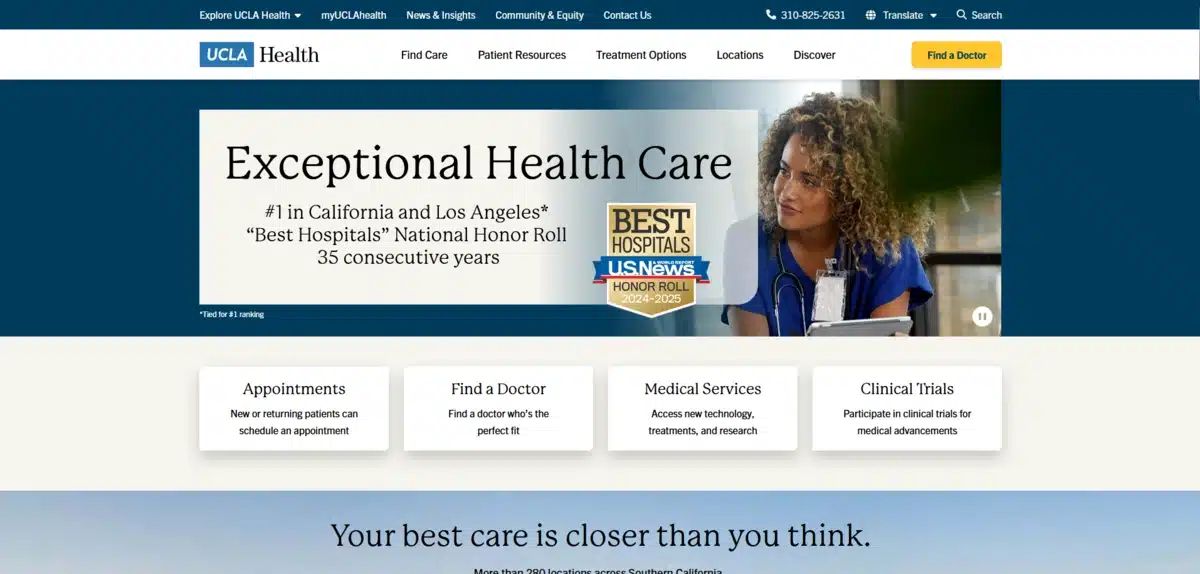
UCLA Health demonstrates excellent appointment transparency by clearly indicating that walk-ins are welcome while showing current wait times. Their system provides estimates but prioritizes patients based on illness severity.
They also make their website easy to use no matter the language with their multilingual website.
5. Accessibility and Inclusivity in Design
Creating inclusive urgent care websites goes beyond compliance. It directly impacts patient outcomes and expands your facility’s reach. A study revealed only 4.9% of hospitals on honor roll lists achieve full WCAG 2.1 compliance, highlighting a critical gap in healthcare accessibility.
A mistake we see in California websites all the time is the lack of accessiblity on their website.
UX impact on accessibility
Websites that are hard to access block people with disabilities from getting timely medical help. Research shows 80% of hospitals remain only semi-compliant with accessibility standards, leaving a significant portion of patients unable to fully utilize digital healthcare resources.
The impact extends beyond individual frustration. For users with disabilities, poor digital accessibility means they cannot independently manage their health, schedule appointments, or access crucial medical information.
Best practices
Follow POUR principles by making your website Perceivable, Operable, Understandable, and Robust. This framework ensures users can easily perceive information, operate interfaces, and understand content across different platforms.
Implement specific technical features, including:
-
Alternative text for images
-
Screen reader compatibility
-
High-contrast color schemes
-
Keyboard accessibility
-
Video captions and transcripts
Adhere to legal standards, including ADA (Americans with Disabilities Act), Section 508, and WCAG (Web Content Accessibility Guidelines). These frameworks provide clear guidelines for creating accessible digital experiences.
Examples from L.A. urgent care sites
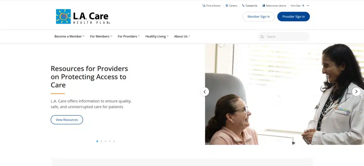
L.A. Care Health Plan demonstrates a strong commitment through their accessibility statement, specifically noting compliance with Section 508 and WCAG 2.0 Level A and AA standards. Their site works with assistive technologies like screen readers.
6. Effective Use of CTAs
CTAs function as the bridge between browsing and booking on urgent care websites. Research shows well-crafted CTAs can increase conversion rates by up to 161%. A significant boost that most practices overlook.
UX impact on conversions
Without clear CTAs, visitors often leave healthcare websites without taking desired actions, resulting in missed conversion opportunities. The impact is immediate. A clear, compelling call-to-action directly influences whether a visitor books an appointment, contacts your facility, or clicks back to find a competitor.
For urgent care centers facing high competition in Los Angeles, CTAs become your secret weapon.
Best practices
Contrasting Colors: This visual distinction draws attention and increases click-through rates. We’ve seen practices increase bookings simply by changing their CTA button color.
Strategic Positioning: Include additional CTAs at the end of major content sections where visitors are primed to take action. Think of it as meeting patients where they are in their decision-making process.
Compelling Language: Replace boring “Submit” with specific phrases like “Schedule Your Appointment” or “Get Started Now”. Action-oriented language generates 12.7% higher conversion rates.
7. Trust-Building Through Testimonials
Real patient testimonials are strong trust signals on urgent care websites. They directly impact healthcare choices. Research shows 78% of new patients report that positive testimonials increased their likelihood of choosing a particular practice.
UX impact on trust
We’ve noticed something interesting about how patients research urgent care facilities—they don’t just want to know about your services and hours. They want to hear from real people who’ve walked through your doors, sat in your waiting room, and experienced your care firsthand.
This makes perfect sense when you think about it. Healthcare decisions feel personal and vulnerable. When someone needs urgent care, they’re often stressed, in pain, or worried about a loved one. Hearing about another patient’s success builds an emotional bond. This connection goes beyond what clinical credentials can offer.
UX impact on trust
Patient testimonials function as psychological bridges between skepticism and trust. When potential patients visit your website, they’re not just gathering information, they’re evaluating whether your facility feels right for their needs.
Trust cannot be purchased or manufactured. It must be earned through transparency and authentic experiences.
Best practices
Authenticity trumps everything else when it comes to testimonials. Fake or overly polished testimonials feel corporate and impersonal.
HIPAA regulations create challenges here, but they’re not insurmountable. You have two main options: obtain written permission through a testimonial release form or make content completely anonymous.
Testimonial release forms should include patient contact information, explicit permission statements, acknowledgment of potential marketing usage, and confirmation that the patient wasn’t compensated.
8. Doctor and Staff Profile UX
Staff profiles directly impact your practice’s credibility, turning website visitors into actual patients. Research shows that medical websites should focus on staff details. Patients often assess healthcare providers before visiting the clinic.
UX impact on credibility
We’ve noticed that professional staff profiles form the foundation of patient trust. Healthcare UX research indicates that potential patients first want biographical details about providers. This makes these profiles vital for converting visitors into patients. Visitors make initial judgments about your practice based on staff credentials and presentation.
A comprehensive provider information helps patients develop comfort with your practice before scheduling appointments. This pre-visit familiarity reduces anxiety about seeking urgent care services, particularly for first-time patients who are unfamiliar with your facility.
Best practices
High-Quality Images: Professional photographs humanize your practice, creating emotional connections with potential patients. Avoid stock photos that undermine authenticity.
Showcase Credentials: Include each provider’s education, specializations, board certifications, and years of experience without overwhelming visitors. Dr. Leonardo’s PROVIDER-Sites effectively present this information directly on the homepage.
Include personal elements that make providers relatable. Brief descriptions of practice philosophy, patient approach, and even personal interests help patients connect beyond clinical credentials. Vitalife Coastal Infusion exemplifies this through comprehensive provider narratives.
Balance clinical expertise with approachability in profile descriptions. Focus equally on professional qualifications and communication style, as patients value both aspects when selecting providers. While showcasing credentials is important, it can lead to issues where profiles feel too clinical and impersonal.
9. Security and HIPAA Compliance
HIPAA compliance forms the cornerstone of patient data protection for urgent care websites. Yet, here’s the challenge most facilities face: creating secure digital experiences without making patients jump through endless hoops.
UX impact on data trust
Protecting patient information goes beyond legal requirements—it creates foundational trust that determines whether visitors return to your site. Healthcare UX designers face a unique challenge: maintaining rigorous security protocols without sacrificing website user experience.
Clear privacy disclosures build patient confidence by explaining how personal health information will be collected, stored, and used.
Best practices
Implement role-based access control (RBAC) to ensure that only authorized personnel can access sensitive patient information. This approach assigns different access levels based on staff roles within your organization.
Encrypt data both in transit and at rest to protect patient information. Use Transport Layer Security (TLS) for data traveling between your website and users’ browsers, coupled with AES encryption for stored data. All interactive features involving Protected Health Information should utilize end-to-end encryption.
Examples from L.A. urgent care sites
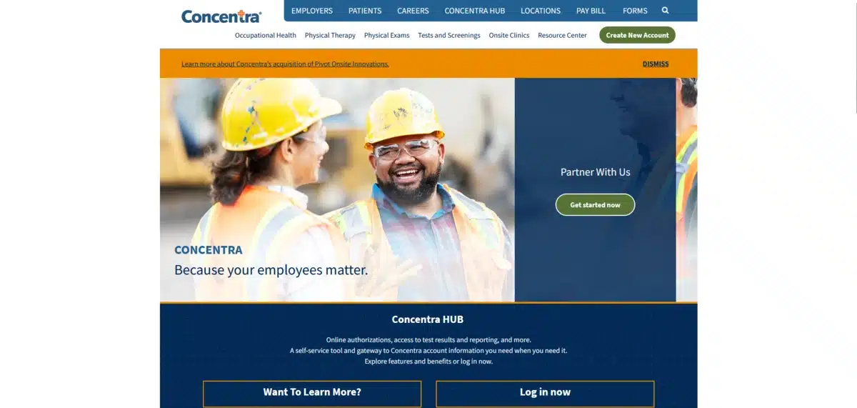
Concentra‘s Los Angeles locations showcase excellent security implementation through their HUB platform, which restricts user access to only pertinent data. Their combined ID/password login system protects patient information while still allowing convenient access to test results.
10. Telehealth Integration UX
Telehealth has shifted from a nice-to-have feature to an essential component of urgent care practices. Your virtual care interface serves as your digital front door, directly impacting patient acquisition and retention.
That being said, many urgent care facilities still struggle with telehealth implementation. The challenge isn’t just technical; it’s about creating meaningful patient connections through a screen.
UX impact on virtual care
Research indicates that many telehealth platforms still treat virtual visits merely as digital versions of in-person care, missing opportunities to create meaningful patient connections. Unlike traditional websites, telehealth UX directly influences clinical outcomes by affecting how comfortably patients communicate their symptoms.
Mental fatigue from video calls presents a unique challenge that many practices overlook. Research from the University of Galway shows that seeing yourself on video calls can lead to user fatigue. Poor interfaces similarly lead to reduced engagement, with patients less likely to schedule follow-up appointments or adhere to treatment plans.
Don’t worry! These challenges have solutions once you know what patients need during virtual consultations.
Best practices
Create frictionless onboarding experiences by minimizing technical barriers. Many platforms require downloading apps and creating accounts before consultations, yet these hurdles frustrate users already experiencing healthcare stress.
Build visible privacy indicators throughout the interface. Patients need to see and feel their data remains secure, beyond mere compliance statements. Clear recording notifications, explicit participant lists, and consent-driven data handling create the foundation for patient confidence.
Keep navigation clear and minimize unnecessary clicks to make consultations more comfortable for both patients and providers.
11. Search and Filtering Tools

Search functionality on urgent care websites directly impacts how quickly patients find critical information during medical situations. Nearly one-third of all mobile searches relate to location, making powerful search tools vital for L.A. urgent care facilities.
UX impact on discoverability
Search brings in three times more visitors to healthcare websites than non-search methods. This shows that it is the main way patients look for medical information.
Time sensitivity shapes search behavior on urgent care sites. Patients searching for immediate care often experience stress, making intuitive search capabilities crucial for retaining visitors.
Best practices
Place search bars prominently on your homepage, making them immediately visible without scrolling. Implement auto-suggestion functionality that completes queries as patients type, helping them find information faster with fewer keystrokes.
Create multi-faceted filtering options allowing patients to narrow results by insurance acceptance, services offered, wait times, or proximity. Ensure your search picks up on medical terms and common symptom descriptions. Patients usually don’t use clinical language.
Learn how we boosted Arc of Northern Virginia’s engagement rate by 335% with a new web design.
12. Visual Branding and Consistency
Visual elements act as the digital face of your urgent care facility. They shape how patients view your services even before they arrive. With 75% of patients searching for healthcare providers online, your visual branding creates lasting first impressions.
UX impact on brand perception
Strong visual branding generates patient loyalty by creating emotional connections that transform caregivers into advocates for your services.
We’ve noticed that practices with consistent visual identity across all touchpoints appear more professional and trustworthy to potential patients.
Throughout your digital footprint, consistency prevents brand fragmentation as healthcare systems expand across multiple facilities and service lines.
Best practices
Create a visual identity that actually reflects your practice’s personality. We’ve seen too many urgent care sites that look generic and forgettable. Your comprehensive visual identity should encompass your logo, brand guidelines, and messaging frameworks specifically tailored to medical practice needs.
Color choices matter more than you might think. Implement a color scheme that strategically uses color psychology. Calm greens evoke trust and reliability while contrasting colors highlight important action items.
Maintain consistency between your website and physical locations. This creates seamless experiences for patients transitioning from digital research to in-person visits. If your website uses blue as a primary color, your waiting room should incorporate similar tones.
Prioritize legibility through large, readable fonts, particularly for practices serving older adults or individuals with disabilities. Keep visual elements like menus and navigation streamlined yet comprehensive enough to showcase your full range of services.
Examples from L.A. urgent care sites
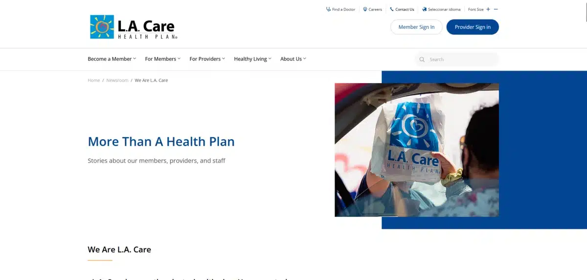
L.A. Care Health Plan effectively uses their website to mirror their brand’s ethos, principles, and values—creating an intuitive, visually appealing space that builds credibility.
The most successful L.A. urgent care websites we’ve analyzed share one common trait: they look professional without being sterile and approachable without being unprofessional. That balance is exactly what your practice needs to achieve.
Get a Custom Urgent Care Website With Blacksmith
We’ve walked through 12 essential UX elements that separate exceptional L.A. urgent care websites from forgettable ones. Your website functions as both your digital front door and the most powerful patient acquisition tool.
That being said, creating a custom urgent care website that abides by all these UX elements takes considerable knowledge and time. This might be time you could use to focus on other aspects of your urgent care company. So what now?
That’s where we come in. Here at Blacksmith, we are website experts, with dozens of different custom websites under our belts.
As a Los Angeles web design agency, we offer a team of seasoned web design professionals ready to create a relevant and modern urgent care website tailored to LA’s needs.
Are you unsure if investing in a custom urgent care website is what your business needs? Don’t worry, click here to schedule a call with us and we’ll audit your website and company. This way, we can show you how you compare to your main competitors and which areas you need to work on if you want more patients on a monthly basis.