


Not having a properly designed website in 2026 is one of the worst decisions you can make for your business.
When 50% of consumers base their opinions of your business solely on your website design, it makes sense why you should have it looking as good as possible.
Exceptional web design is almost mandatory in 2026 if you want to stand out. You need to impress visitors as soon as they open your site. Otherwise, they’ll most likely leave and find another brand who compels them to buy from them.
But what do those exceptional small business websites look like?
GeminiBio is a perfect example of how crucial a good web design is for a brand regardless of the industry they’re in.
This article lists our top 20 favorite small business websites. We explain why we love them and what makes them great.
In need of a custom website for your brand but don’t know where to start? Let us help.
Best Small Business Website Examples for 2026
1. Ception
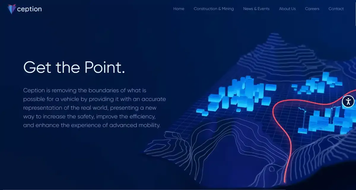
As soon as you open Ception’s website, you know exactly what they offer and what they’re all about. Their creative use of visual elements helps drive home their advanced localization solution.
By using different tones of blue, they managed to divert our attention to the important sections of their website, like their service and call to action. Proper font size changes and text weight also help drive the user towards said call to action.
Some may find it too minimalist. But, it keeps visitors from being overwhelmed by links, content, and clutter.
2. Fat Cat Creamery
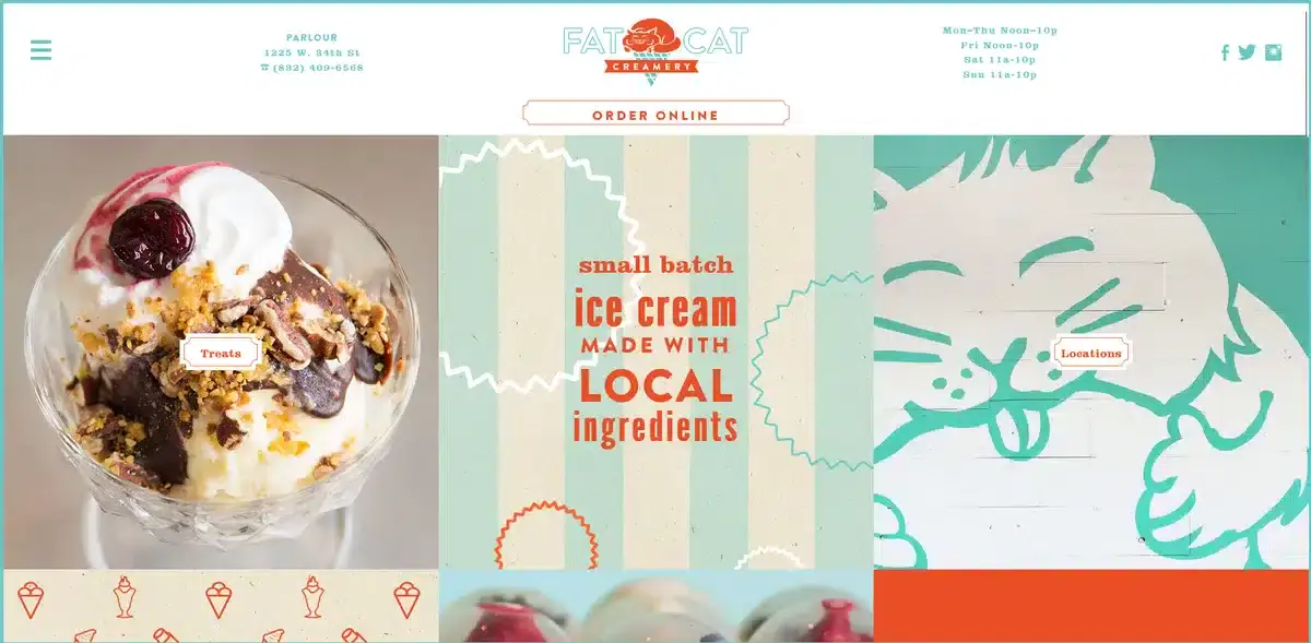
Fat Cat Creamery’s website is the perfect blend between their ice cream and their love for cats. From the high quality ice cream images to the silly cat illustrations, the website exudes a charm you wont usually find online.
Wherever you look, there are engaging content blocks that tempt you to engage and click on them.
The clever use of colors helps them guide you towards the areas of the website they want you to see the most. All while staying true to their brand’s theme of loving everything cat related.
3. Loro Eats
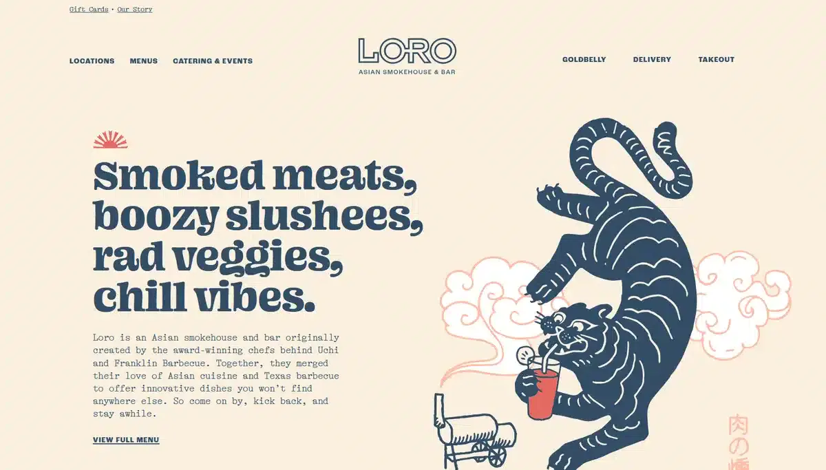
This small business website is the perfect example of a user-centric approach to websites. Not only does it look fantastic on a desktop, it also looks amazing on mobile.
Stunning illustrations paired with a unique font help visitors learn more about Loro Eats before they order their food.
They know most orders come from mobile visitors. So, they made the user experience mobile-friendly and easy to navigate.
While it might seem excessive to make your website as mobile-friendly as possible, it’s actually really important in 2026. Statista shows that more than 50% of all web traffic comes from mobile devices alone.
Not having a mobile-friendly website not only puts you lower in rankings but also deters people from interacting with your website in general.
4. Livso
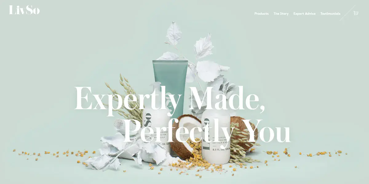
Livso’s website design is the definition of modern done right. The home page explains what they provide and why you should care without being too in your face about it. A solid background helps showcase their product a lot better while also accentuating their slogan.
Remember, less is more when it comes to website design. The easier it is for visitors to understand who you are and why they should care about your brand, the better.
5. The Cheshire Lawn Care
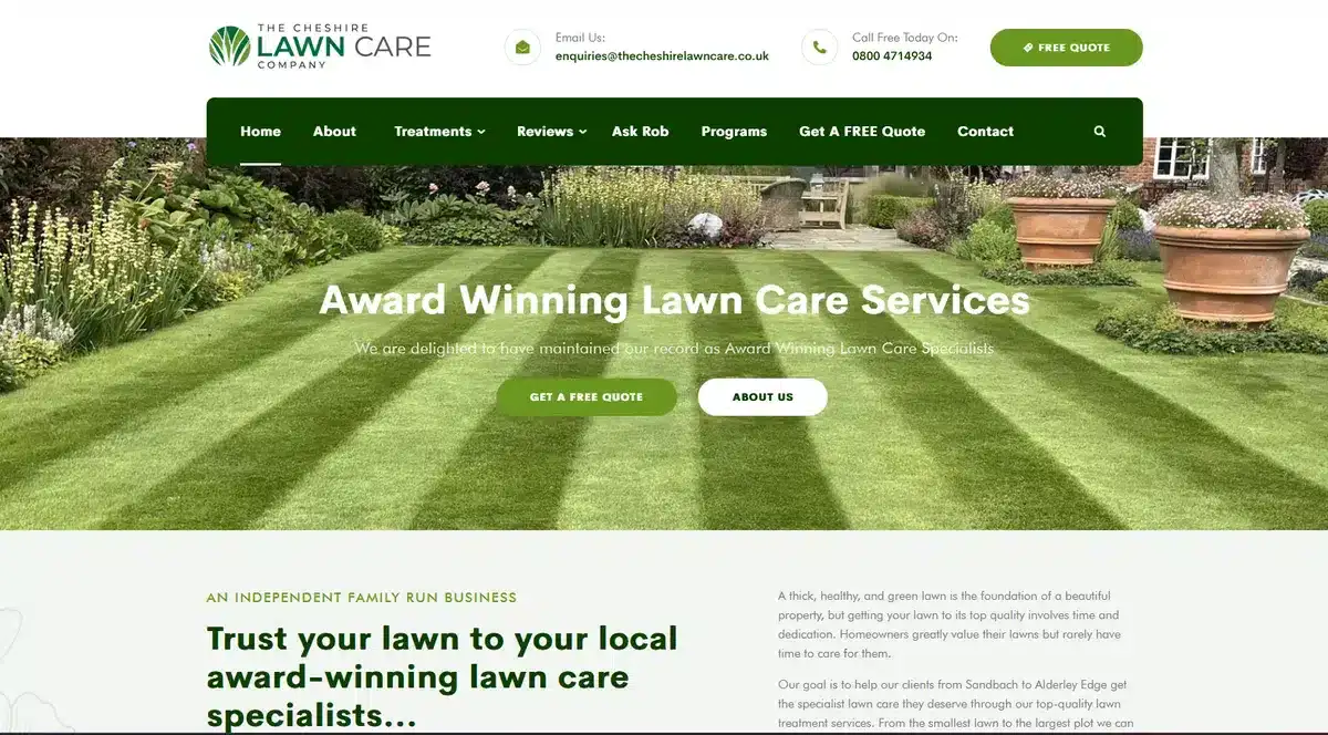
Professional is the first thing that comes to mind when you open The Cheshire Lawn Care’s website. While some websites make you jump through hoops to get the service you want, they make it as easy as possible to get it.
The website is organized in a way that you always have a call to action on screen so customers can easily schedule a call with them.
Not all websites have to be witty and super creative in their approach. Sometimes simple and to the point works, especially when you’re providing a service that is simple, like lawn care.
6. Islango

This small business website is all about selling you the experience of going on a new adventure. Their high-quality video on the main page makes it easy to imagine your dream vacation. Detailed descriptions of popular spots add to the excitement of hiring their services.
Islango’s planner helps you find the best date for you and even recommends destinations that you might not know about.
For them, it’s all about making it as easy as possible for visitors to book a date and get the yacht they want.
Their brand identity is cohesive across their website. They have a detailed FAQ page that answers potential customers’ questions.
The best small business websites have one thing in common: they make it as easy as possible for visitors to convert into customers. How? By simplifying everything without grabbing the visitor by the hand and forcing them to do anything.
7. Casa Mami
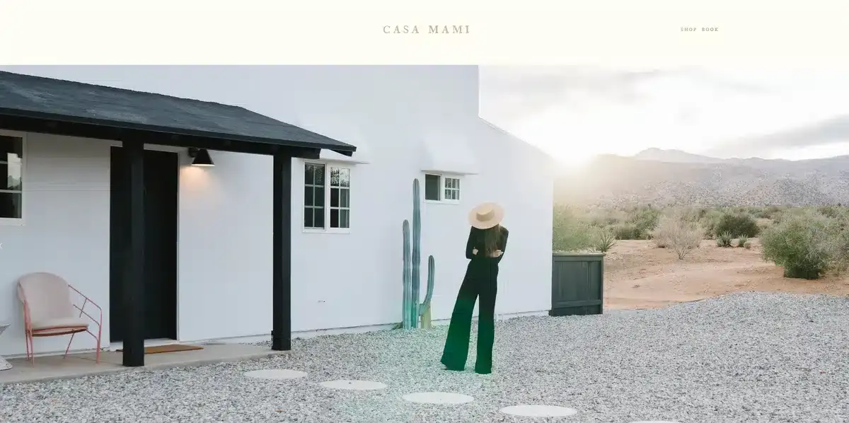
Casa Mami’s website screams luxury and high quality as soon as you enter. They let their images do all the talking by using big image sliders and small fonts.
You get a glimpse of what your next vacation can look like, all without even having to check another page or scroll.
This is an immersive experience that lets their locale do all the heavy lifting. While it’s not a website design we would recommend for every small business out there, it’s definitely one that will turn heads if used properly.
8. Sonos

This is as close as you’ll get to a perfect brand identity with a website. Sonos is all about innovation and pushing boundaries in the audio space. As soon as you enter their website, you’re shown how much commitment they have toward giving you the best experience possible.
As you start scrolling through the page, you get a glimpse of what makes their product high-quality and why you should trust them.
While they could stop at letting their product do all the talking, they know that social proofing their brand and bringing in Grammy winners to testify their quality is way better
They know their products are a luxury for many. So, each product page includes a detailed description and beautiful images. This helps customers gauge whether the price of the products is worth their money.
9. Bowery
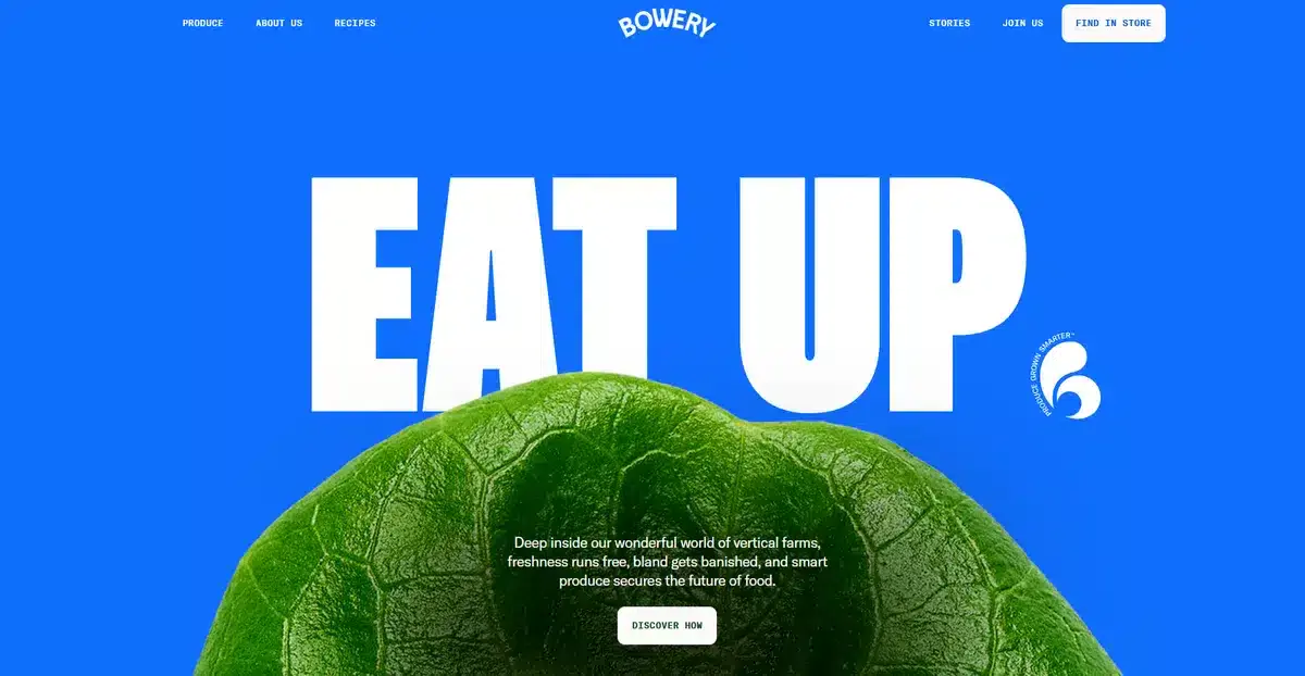
Bowery’s website hits you with punchy colors and a bold font as soon as you enter, making you pay full attention to what is being said.
Bowery is all about showing where your produce is coming from and explaining each step. As you scroll down, they give you the full rundown of what their process is while also sprinkling in some CTAs here and there.
In most cases, this much content would be overkill. But they keep it interesting with interactive elements and moving parts.
10. The Wild Rabbit
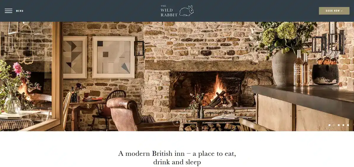
Wild Rabbit’s website looks cozy and welcoming as soon as you go in. You can see their effort to make it feel like home. They showcase it with stunning visuals.
The website isn’t selling you a service or accommodation; it’s selling you an experience. The lack of written content helps it double down on its visuals as well.
Sometimes storytelling can work even with little to no words, and The Wild Rabbit’s website is proof of that.
11. Puffin
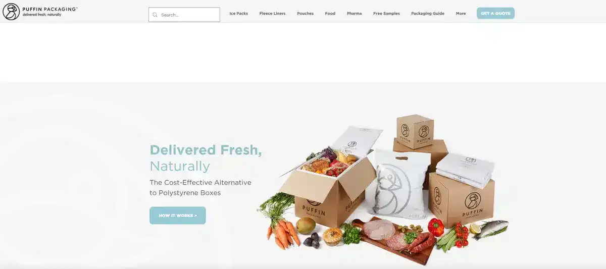
This small business website shows that even eco-friendly packaging can be interesting if you put a clever twist on it.
Puffin’s slogan “Delivered fresh, naturally” is witty and tells you what they offer as a brand. Also, their brand identity is consistent across their website. It keeps the clever, conversational tone of their slogan.
Just like many other small company websites, they make sure their testimonials are up to date and easy to find so their social proofing is in check.
Overall, this is a beautifully designed website that teaches you that being a bit more informal and clever can be good when needed.
12. The Shine App
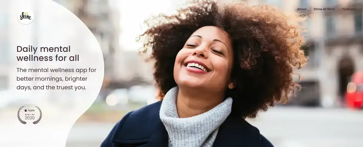
This website lets you know what they’re offering as soon as you download their app while showcasing their accomplishments. The more you scroll through the website, the faster you get enticed into downloading the app and learning more about it.
The whole website is colored with relaxing pastel shades that almost put you at ease as you read its content.
The Shine App not only have testimonies of people who have used the app in the past, but they also provide you with information about their teachers and therapists. This helps visitors feel reassured that actual human beings are treating them, not bots giving basic answers.
This is a masterclass in social proofing, brand identity, and tailor-made content. They know exactly who they are talking to and how to get their trust.
13. Ratio
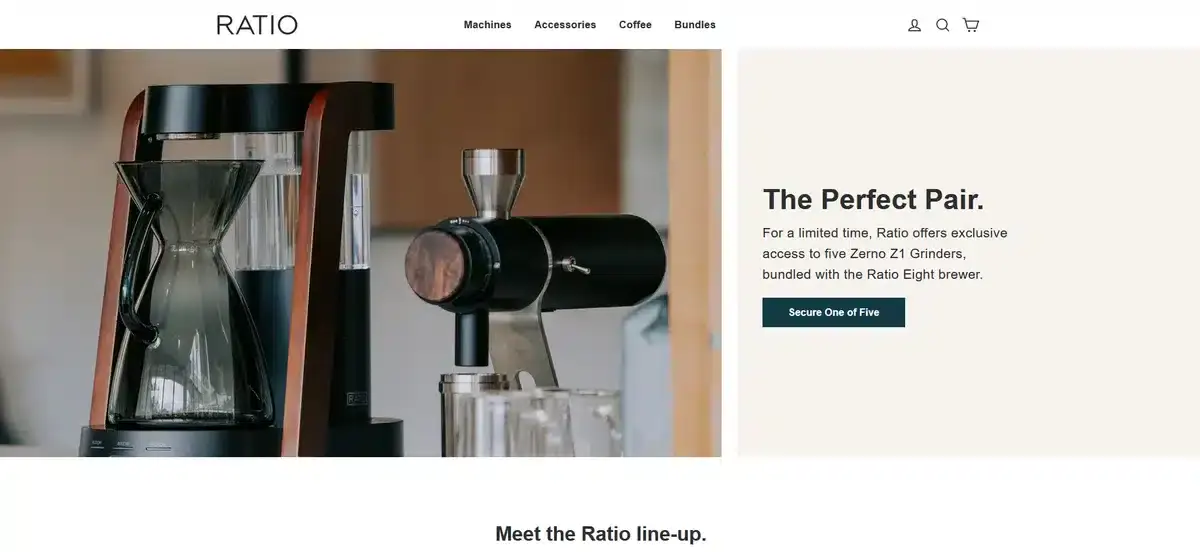
Ratio sells top-of-the-line coffee machines. Their website uses exclusive, high-quality colors to match that. Not only that, they also provide you with polished videos that help you decide on which model to go for.
As you scroll down, you’ll find detailed testimonials from people with different lifestyles, from surfers to bloggers. This helps drive home the fact that, despite it being a luxury brand, it doesn’t mean it’s exclusive to just one lifestyle.
Selling a luxury product that can still call in the masses is a hard thing to do, and Ratio does it perfectly with their website.
14. Shwood Eyewear
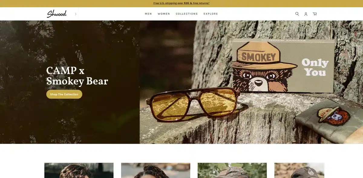
This small business website is simple but gets its message across. They sell premium wooden sunglasses for people who love to be outdoors. Their videos, images, and illustrations sell you on an outdoorsy, premium lifestyle.
While there’s no bold text or out-of-the-box ideas on the website, Shwood does everything well. Remember, your number one priority is to ensure that you meet all the important website qualities. Being witty and creative in your approach will turn heads, but if the website is lackluster then it’s all for nothing.
15. Solo Salon
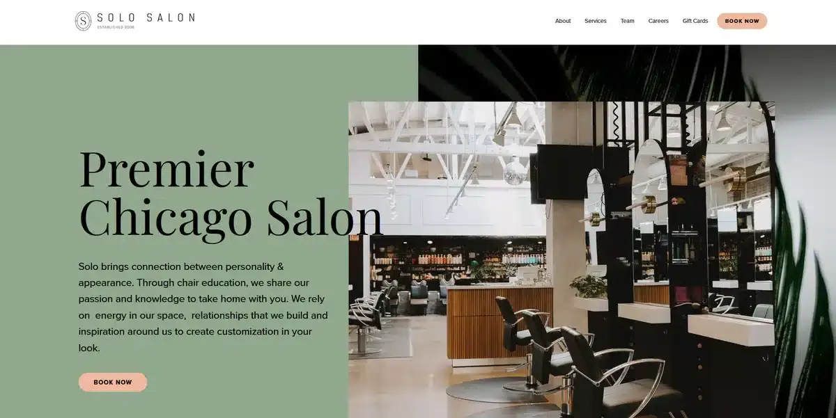
Solo Salon’s website aligns seamlessly with its locales. It doesn’t matter where you look; the website screams “we do it best” without feeling too in your face.
The use of social media posts to highlight their work is a great way to social-proof their brand without feeling too boring or corporate.
The color palette is subtle and only has some extra pop for its call-to-action buttons, which helps guide visitors toward it.
16. Ohm Studio
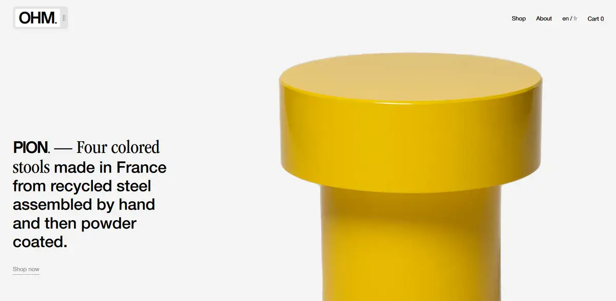
Ohm Studio’s website doesn’t waste your time. As soon as you enter, you’re met with a brief explanation of what they do while showcasing a high-quality product image.
They let their product do all the talking by letting it take center stage and using as little copy as possible. While this stylistic choice might not be the best for every single brand out there, it certainly works for Ohm Studio.
17. Postevand
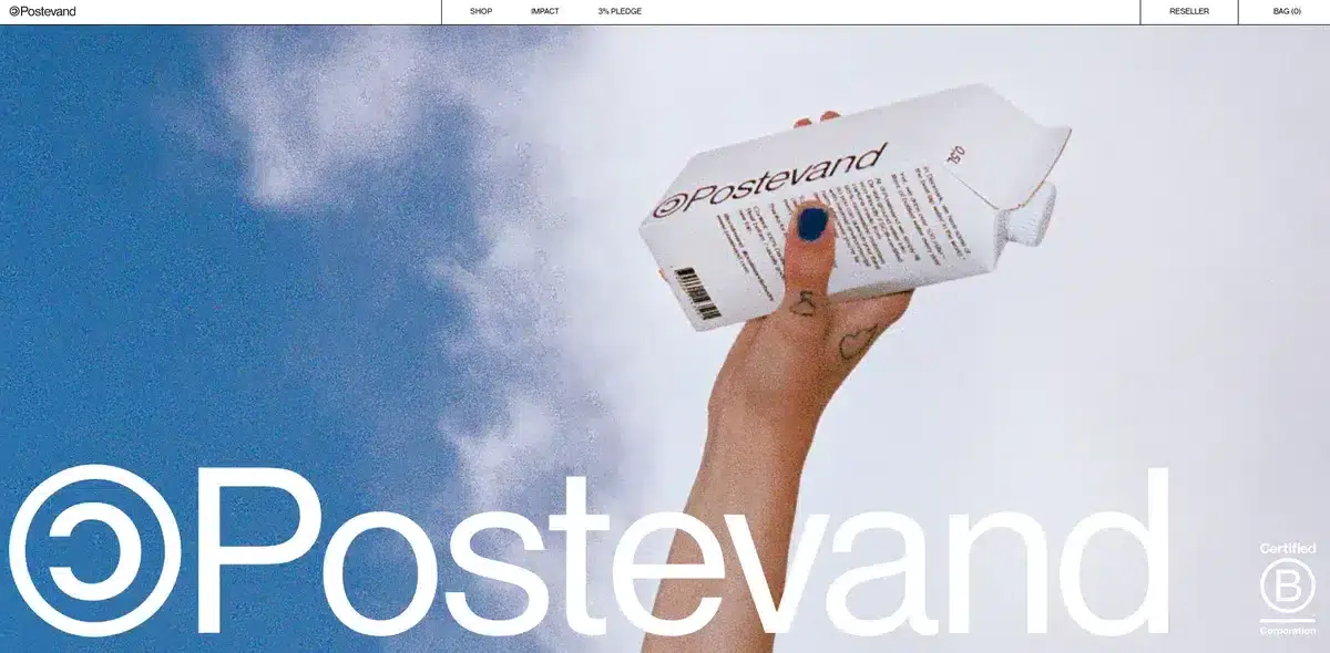
Eye-catching, grunge, and different are ways we’d describe this small business website. Postevand’s style might make you believe they’re about to release a new album, but in reality, they’re selling tap water.
This is an interesting twist on something most people would find boring. They do all this while explaining how they use less plastic than the competition. The website, is very simple and minimalist, letting their copy do all the talking.
There is barely any color throughout the website apart from the product backgrounds, which in turn helps it stand out.
18. Cocokind
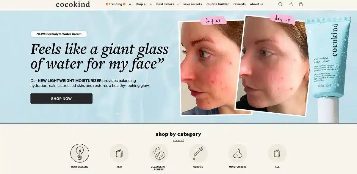
Cocokind may seem like just another skincare brand. But their website branding sets them apart from the competition.
As soon as you enter their website, you’re greeted with a testimonial of one of their popular products, which in turn helps build trust off the bat. As you scroll down, you’ll notice their branding is cohesive and easy to digest.
The clever use of neutral colors throughout their website helps their products, which have punchy colors, pop a lot more. Pair this all with amazing product images and enticing calls to action, and it’s easy to understand why people love buying from them.
19. Piboco
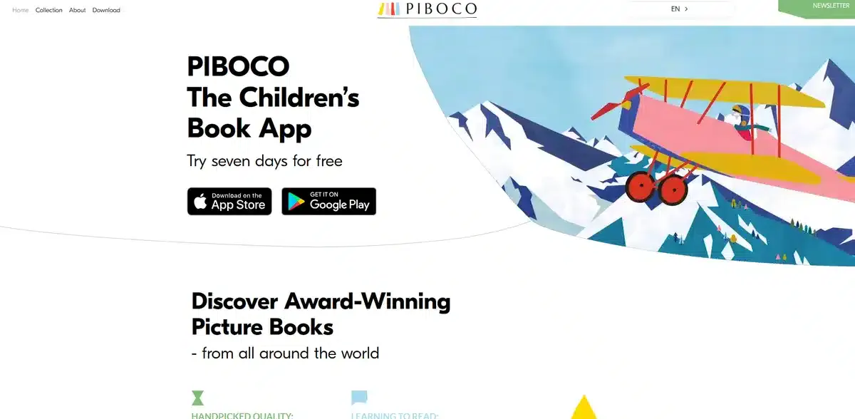
Piboco is in an interesting spot; they have to market to parents looking for books their kids want to read. That alone is already a difficult task to do in person, but how do you make it work on a website?
Piboco manages to do it by handpicking their books, making sure it’s completely kid-friendly and, most importantly, making it easy to get into.
As soon as you enter their website, you’re greeted with a quick video showing how reading with your kid can become a magical experience. Right beside it, there’s a quick CTA giving you a 7-day free trial for you to give it a try and make your own decision.
The website design is minimalistic and uncluttered, making it easy for both parents and kids to enjoy.
Piboco understands it caters to mobile users, so it guarantees the mobile experience is as good as the desktop version.
To attract more visitors, they added a language toggle. It lets users switch between 5 languages.
This is without even mentioning the myriad of testimonials they showcase as you keep scrolling down.
Overall, Piboco’s website is the definition of perfection when it comes to where to look for inspiration in building a website.
Trying to build a brand new website for your brand but don’t know what to do? We can help.
20. Magic Spoon
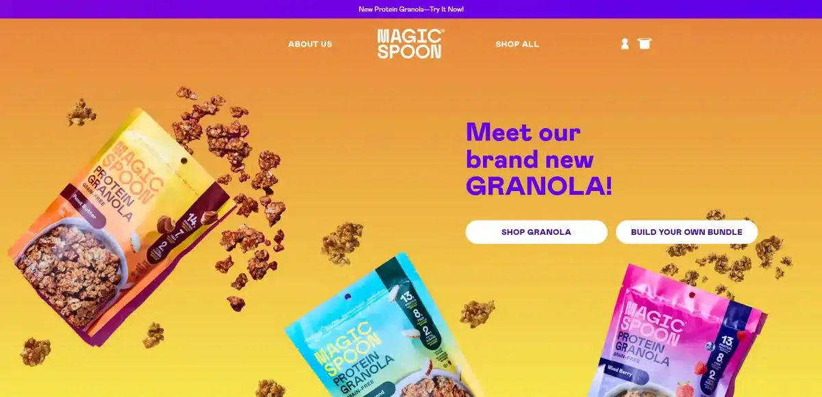
Last but not least, we have Magic Spoon. They are a brand selling high-protein cereal with no added sugar. You’d expect a mellow, gym-like approach. Instead, their website greets you with a vibrant, high-contrast color palette.
They want you to know that cereal is meant to be fun even if you are an adult. While the website might feel a bit cluttered with all the products and vibrant colors everywhere, they make it work.
How? By using high-contrast colors that help highlight their copy and CTAs.
As you check their products, you can see how they compare their product’s nutritional values with other popular cereals. This is great since it helps potential customers decide whether Magic Spoon’s cereal is worth the extra money or not.
Their website has customer reviews and testimonials sprinkled throughout. It’s hard to miss them.
While this bold approach doesn’t fit every brand, there are a lot of good things you can take from its website as ideas for your own website.
Now that you know how good small business website look like, let’s figure out what are the important qualities of good websites.
What Are The Qualities Of Exceptional Small Business Websites?
In a sea of small business websites, few have improved enough to become a go-to in their niche.
Remember, you want your website to leave a lasting impression on visitors so they’re eager to go back and potentially buy something.
But how do you make small business websites stand out from the crowd?
Well, there are a few qualities that exceptional websites have. These generally are:
Stunning Visuals
High-quality images and videos play a huge role in small business websites. Nothing hooks visitors faster than content that meets their needs without wasting time.
Distinct Branding
A great way to stand out from the competition is by having a strong brand identity that is reinforced throughout your website. Savvy small business website owners know it’s vital to impress visitors. Nothing beats consistent branding for that.
Lightning-Fast Loading Speeds
While having a fast-loading website might not seem as important, it’s actually one of the driving factors for people who are looking to buy a product. A study made by Google shows that 53% of users will leave a website if the page takes more than 3 seconds to load. Smart small business website owners know this and make sure their website loads as fast as possible.
Amazing User Experience
Small business websites that focus on their UX above all else are generally the ones with the highest retention rates.
From having intuitive menus to good website footers that have all of the information visitors needs. There are a lot of different UX improvements small business websites can add without knowing.
But what does it mean to have a good UX? It means their websites are easy to navigate. Visitors can get from point A to point B without issues. Most importantly, the site looks great on any device.
Tailor-Made Content
High-quality content is a must in 2026. Any small business website creating content on a weekly basis is already miles ahead of the competition. Blog posts, simple stories, and product descriptions that talk to customers directly are just some ways to keep visitors engaged.
Social Proofing
A bad review can completely destroy the reputation of any brand if they’re not prepared. Which is why building trust is important for any small business website looking to grow. Having multiple case studies, customer reviews, and testimonials is a fantastic way to build trust towards your brand and push potential customers into buying your product.
Create a Converting Website For Your Business With Blacksmith
Your website is often the first point of contact that most potential customers have with your company. This means that having a subpar or outdated website is an easy way to lose revenue in the blink of an eye.
With Blacksmith, those issues are a thing of the past. Designing a custom small business website with us ensures that your brand will skyrocket in both conversions and retention rate. All while being clever, creative, and most importantly, tailored to your brand.
Regardless of you needing a custom website built from scratch or a website redesign, with us you’ll get the results you deserve.
Blacksmith is a digital agency that lives and breathes website design. We create websites that stand out from the crowd all while being mindful of modern UX practices. We are committed to bringing out the best of your brand to the online world through custom-made solutions.
Whether you want to start fresh or feel like your website needs a glow-up, we’re here to help you from start to finish. Give us a call.


