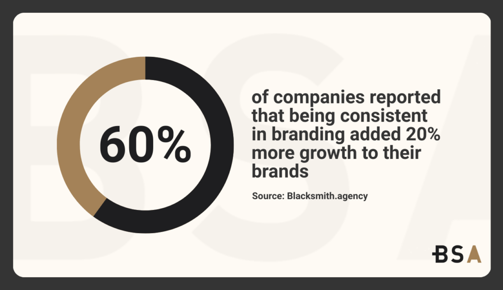
Did you know that 60% of companies reported that being consistent in branding added 20% more growth to their brand? One of the biggest aspects when it came to consistency was font psychology. Knowing what type of font is ideal for your industry and business is a must if you want to get the most out of your website and brand in general.

Typography is not an aesthetic choice anymore. In 2026, font psychology plays a big role in how users see your brand when it comes to credibility, emotion, usability, and brand authority. As digital experiences become more competitive and attention spans go down, the impact of font psychology has increased.
This article will break down everything you should know about font psychology in 2026 and how you can implement it in your business.
Trying to improve your branding but don’t know where to start? Let us help.
What is Font Psychology?
We can’t talk about font psychology without explaining what it is first. Font psychology looks at how different typefaces can impact our feelings, actions, thoughts, and choices. Every font carries visual cues, such as weight, curvature, spacing, and structure. These all trigger subconscious associations in the viewer’s mind.
These associations may develop through cultural exposure, historical usage, and repeated contexts. Over time, people start associating certain typographic styles with professionalism, authority, friendliness, creativity, or urgency. When users encounter a font, they process these signals almost instantly, often before reading the actual words.
For websites, this psychological processing happens in milliseconds. Users form opinions about a website’s credibility, clarity, and quality before they engage with the content itself.
Why Font Psychology Matters in 2026
Typography has always mattered, but several trends have elevated its importance in 2026.
First of all, competition for attention is the highest it has ever been. Users look at dozens of different brands every single day, which makes it hard to keep their attention, let alone get them to buy your product or service.
Fonts now serve as visual shortcuts that help users decide whether your content is trustworthy and worth their time at all.
AI-generated content has flooded the market. This makes it easier to create written material. So, design and presentation now matter more for perceived quality. Typography has become a key differentiator between generic output and an intentional, premium experience.
Third, accessibility and usability standards continue to evolve. Font choices now directly impact inclusivity, readability, and compliance. Poor typography does not just harm aesthetics; it completely degrades a user’s experience.
Finally, brands are increasingly omnichannel. Fonts need to perform consistently across websites, apps, email campaigns, dashboards, and even physical environments. A team that understands font psychology can maintain a cohesive emotional signal across all its touchpoints, ensuring higher odds of conversions.
Core Psychological Signals Font Communicate
Every typeface sends signals beyond the literal text. These signals can be grouped into several psychological dimensions. Fonts communicate your brand’s personality. Rounded, soft fonts feel friendlier and more inviting. In contrast, sharp, angular fonts come across as assertive and technical.
Fonts can communicate authority. Structured, balanced fonts with consistent strokes suggest professionalism and stability. Irregular or playful fonts often signal informality.
Fonts can also influence perceived effort. Clean and clear fonts show clarity and efficiency. But fancy fonts can seem demanding or distracting.
But most importantly, fonts influence emotional tone. Typography influences how content feels, even if users can’t say why. It can make text seem serious or casual, modern or traditional, calm or urgent.
Serif Fonts and Psychological Perception
Serif fonts are characterized by small and deliberate strokes or extensions at the end of letters. Historically associated with print, academia, and editorial design, they continue to carry strong psychological weight in 2026.
Serif fonts generally signal reliability, authority, and tradition. They’ve been used in books, newspapers, and formal documents for centuries. So, they feel established and credible.
Serif fonts are often used by brands online. They help convey expertise, heritage, and intellectual depth. Financial institutions, law firms, schools, and publications often use serif fonts to build trust.
That being said, serifs can also feel too traditional and conservative if not used well. In fast-moving industries like technology or consumer startups, traditional serif fonts may signal rigidity or outdated thinking unless carefully modernized.
This year, serif fonts are increasingly popular. These designs maintain the credibility of classic serifs while using cleaner shapes, higher contrast, and improved screen readability.
Sans-Serif Fonts and Modern Psychology
Sans-serif fonts don’t have the decorative strokes found in serif fonts. They are clean, minimal, and widely associated with modern digital companies. Psychologically, sans-serif fonts aim to convey clarity, efficiency, and neutrality. They are often perceived as more accessible and easier to scan, especially on screens.
Technology companies, SaaS platforms, healthcare systems, and consumer apps all use sans-serif typography because it drastically reduces friction and supports fast comprehension.
In 2026, sans-serif fonts dominate interfaces where usability and scalability are priorities. They adapt well to responsive layouts, perform reliably across devices, and support multilingual typography better than most, if not all, serif options.
But, sans-serif fonts can feel a bit impersonal if used too much. Brands that only rely exclusively on generic sans-serif fonts may struggle to differentiate or convey any sort of emotional depth. This has led to increased customization and proprietary type systems that introduce subtle personality while preserving clarity.
Script Fonts and Emotional Impact
Script fonts mimic handwriting, which creates a strong emotional response when used correctly. Psychologically, script fonts convey creativity, intimacy, elegance, or nostalgia. They feel personal and expressive, often evoking craftsmanship or a human touch.
But script fonts are one of the fonts with the biggest risks. Poor legibility, inconsistent spacing, and excessive ornamentation can instantly lower usability and trust. In 2026, script fonts are barely used, but they are used intentionally and in specific places. They appear the most in logos, accents, or short headlines instead of in long-form content.
When used well and with the right brand, like luxury, personal, or creative brands, script typography can evoke strong emotions. But when used incorrectly, it can leave a feeling of unprofessionalism or gimmick.
Explore how we increased Deep 6’s direct traffic by 22.4% with a new branding strategy in our recent case study.
Display Fonts and Attention Psychology
Display fonts are, as the name suggests, for display and to stand out. They often feature exaggerated proportions, unconventional shapes, and a strong visual personality.
From a psychological standpoint, display fonts trigger attention and memorability. They are especially effective for headlines, campaigns, and moments where standing out and differentiating matter more than readability.
In 2026, display fonts are mainly used in hero sections, landing page headlines, and brand campaigns. They help create a distinct voice while also capturing interest quickly.
However, display fonts should be used strategically. Using them too much can lead to visual fatigue or reduced comprehension. Exceptional brands pair display fonts with highly readable body text to properly balance emotion and clarity.
How Font Psychology Influences Branding
Typography is one of the most powerful brand assets at your disposal. It operates at all times and shapes perception every time users encounter your content.
Fonts establish brand personality, which means that a brand using a bold, geometric sans-serif communicates confidence and innovation, while a brand using a refined serif signals expertise and stability.
Typography can also affect consistency. Repeated exposure to the same font system builds familiarity and recognition over time, which reinforces brand identity even without logos or imagery.
In 2026, a lot of brands will invest in custom typefaces. Proprietary fonts allow companies to control emotional tone, accessibility, and differentiation simultaneously. They also prevent brands from blending into the sea of default typography used all over the web.
Font psychology plays a central role in whether a brand feels premium or generic, approachable or authoritative, progressive, or conservative.
Font Psychology and Trust Signals
Trust is the number one outcome influenced by typography. Users automatically assess whether a website feels legitimate within seconds. Fonts that aren’t inconsistent, outdated, or overly decorative can trigger skepticism, even if the content itself is accurate.
Clean, well-structured typography suggests professionalism and care. Proper spacing, hierarchy, and reliability all reinforce the perception that a brand is competent and reliable.

In regulated industries such as healthcare, finance, and legal services, font psychology directly impacts user confidence. Typography choices can either reduce anxiety or amplify it.
In 2026, trust-driven design places typography alongside security indicators, UX clarity, and content tone as a core credibility factor.
Typography and Conversion Behavior
Font psychology doesn’t stop at perception, and that’s because it also influences action. Typography affects how easily users process information. With easy-to-read text, users experience a lower cognitive load, making them more likely to continue engaging.
Fonts will also influence emotional readiness. A calm, balanced typeface can reduce friction during decision-making, while an aggressive and chaotic font can increase hesitation.
CTA effectiveness is strongly tied to typography. Button labels rendered in a clear, confident font will outperform those in stylized or hard-to-understand typefaces.
In A/B testing, changes to typography alone can produce a substantial difference in conversion rates, scroll depth, and engagement time if you do them correctly.
In 2026, high-performing teams treat and use typography as a conversion lever, not as a cosmetic choice.
Learn how we improved CBS Rental’s growth in impressions by 44.5% with a new branding strategy in our latest case study.
Readability, Legibility, and Cognitive Load
Readability focuses on how easily readers can understand text, while legibility emphasizes how easily they can distinguish characters.
Both of them are a core part of font psychology. Hard-to-read text makes people spend more time trying to understand it. This can lead to fatigue and cause them to stop reading.
Factors that affect readability include font size, line height, letter spacing, and contrast, not just font choice itself. In 2026, accessibility standards ask for higher attention to these details. Fonts must support users with visual impairments, cognitive differences, and diverse reading environments.
Readable fonts support longer sessions, higher retention, and an overall higher comprehension of what is being presented, all of which directly impact performance metrics.
Cultural and Contextual Considerations
Font psychology, unfortunately, isn’t universal. Cultural context directly influences how typography is interpreted and seen.
Certain fonts might be seen as modern in one country and completely outdated in another. Script styles may look elegant for some cultures and very formal in others.
Global brands must consider localization and language support when selecting fonts. A typeface that performs well in English may struggle with character sets, diacritics, and more in another language.
Common Font Psychology Mistakes to Avoid
One of the most common mistakes is only caring about aesthetics and disregarding usability. Beautiful fonts that decrease readability and lower performance.
Another mistake we see all the time is relying on default system fonts without customizing them at all. While it’s safe, this often results in bland and indistinct experiences.
Inconsistent typography across different pages will quickly lower brand cohesion and weaken its impact overall.
Finally, and probably the most important mistake, is ignoring accessibility in fonts. This not only limits your potential reach, but it severely damages your trust and credibility.
The Future of Font Psychology
As digital experiences get more immersive and personal, font psychology will matter more for sales and keeping customers. AI-driven personalization may soon start applying adaptive typography based on user behavior, context, or accessibility needs.
Moving forward, typography will continue to evolve from a design detail into a core tool for improving trust, performance, and communication.
Get a Custom Branding Strategy That Converts With Blacksmith
After going through this guide on font psychology and what each popular typography does, it’s clear that fonts are vital to any business that wants to sell more. But how do you know which font suits your business and branding? That’s where we come in.
Blacksmith is a Professional Branding Agency with a group of seasoned digital marketers ready to implement the perfect font for your business. From creating the ideal font from scratch to building a branding strategy that leverages that new font altogether, we will ensure that your business gets the visibility and conversions it deserves.
Still unsure if a custom branding strategy is what your business needs? Don’t worry, schedule a call with us and we’ll provide you with a free brand audit. This way, we can show you how a new branding strategy can help you separate your business from your competitors while also bringing in new customers.


