


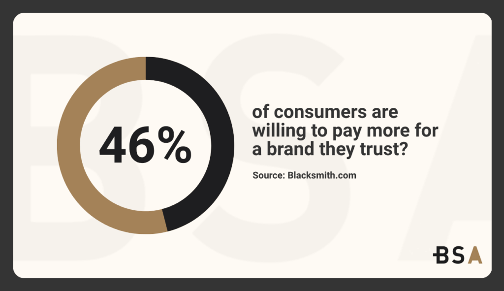
Did you know that 46% of consumers are willing to pay more for a brand they trust?
But this trust can be easily broken by companies that make bad branding decisions and end up losing all of the trust they built through the years.
Branding is supposed to show the world who you are, what you stand for, and why customers should trust your company.
When done incorrectly or when bad branding strategies occur, it can cause a loss in sales and even complete shutdowns.
This article will show you 20 bad branding examples from both big and small companies to showcase how even the biggest names have issues with branding as well.
Trying to improve your branding but don’t know where to start? Let us help.
Our Top 20 Bad Branding Examples
This list is in no particular order. You should take all these examples into consideration and internalize them to avoid making the same mistake yourself.
Remember, a big company can make a big mistake and stabilize due to having a monetary cushion, but smaller companies don’t always have that luxury.
1. Tropicana
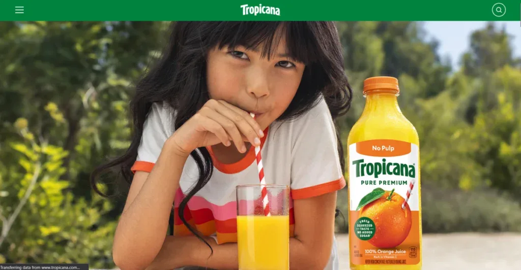
In 2009, Tropicana decided to change its iconic and recognizable orange with a straw package for a minimalist redesign.
What could be seen as a smart and modern update only confused shoppers, and many didn’t recognize the brand at all.
Within two months, sales went down by around 20%, and Tropicana reverted to its original branding strategy.
Customers usually form an emotional and visual connection to brands they like. Removing clear cues for the sake of “freshness” and “uniqueness” can end up erasing a lot of hard-won recognition.
You can avoid this bad branding decision by testing any type of major visual change with your audience before you actually roll it out and make it official.
What might seem like the perfect and logical change for your brand might be a complete miss for most of your audience.
2. Gap
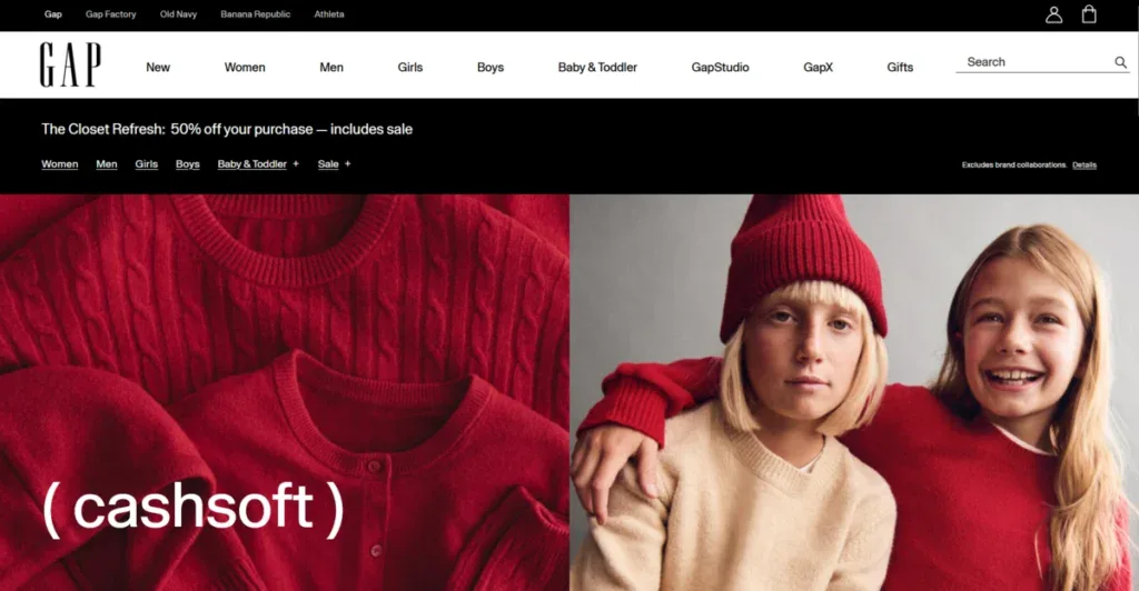
Back in 2010, Gap decided to suddenly change its well-known blue box logo for a sterile and uninspiring Helvetica wordmark.
Online backlash was instant to the point of seeing memes, fake logos, and outrage due to the change. It didn’t even take a week before Gap decided to go back to its original design.
Changing your logo is a difficult process that requires careful thinking and smart design ideas.
Remember that your logo is the way a lot of people instantly recognize your company, so redesigns with zero context or narrative will only alienate loyal customers.
Your goal when doing any sort of redesign is to evolve and improve your identity, not to erase it overnight.
3. Coca-Cola
Wanting to compete with Pepsi, Coca-Cola decided to reformulate its signature drink in 1985 with a sweeter taste. Consumers felt betrayed because they ignored the deep emotional loyalty that kept their audience with them for years.
After multiple protests, the company changed this “new coke” reformulation and brought back the original Coca-Cola flavor.
Brand equity lives in a customer’s emotions just as much as in your product.
4. Pepsi
Pepsi’s “Live for Now” commercial featured Kendall Jenner seemingly resolving a social conflict by giving a police officer a Pepsi can.
The ad got instant backlash due to its trivializing of real activism, which led Pepsi to remove the ad after only 24 hours.
Borrowing cultural movements for digital marketing strategies is always a slippery slope, especially when there is a lack of empathy and knowledge about the subject.
Without true alignment or insight, you will only get an angry audience questioning why they follow your brand in the first place.
5. H&M
In 2018, H&M decided to release a hoodie with a graphic that said “Coolest Monkey in the Jungle” worn by a black child.
The product and image sparked instant global outrage and accusations of racism. H&M instantly apologized and removed the product from its website and stores, but the damage was already done.
Diversity and cultural awareness aren’t optional. Every single campaign or strategy you create should be reviewed by people who can spot an unintentional offense before it reaches the public.
6. Radioshack
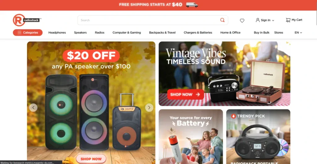
While trying to modernize their brand, RadioShack decided to rebrand as “The Shack.” Customers found the change meaningless, and the company’s biggest issue, being an outdated inventory, stayed the same. The rebrand did nothing to slow RadioShack’s decline.
A cosmetic name change won’t do anything if the core of the business and its business model are weak.
Branding amplifies your company’s reality, but it doesn’t replace it.
Explore how we increased Bonanno’s returning users by 642% with a new branding strategy in our recent case study.
7. JCPenney
In 2012, JCPenney hired Apple’s Ron Johnson to completely revamp the department store experience.
Coupons and discounts were fully replaced by “fair and square” pricing. Loyal bargain hunters felt alienated, and sales went down by 25% that same year.
As far as bad branding decisions go, acting without knowing your core customer is one of the biggest. Complete strategic changes that ignore existing behavior from customers will almost always backfire.
Instead of making drastic changes, test the waters with gradual changes and see how your core customers react to them.
8. Weight Watchers
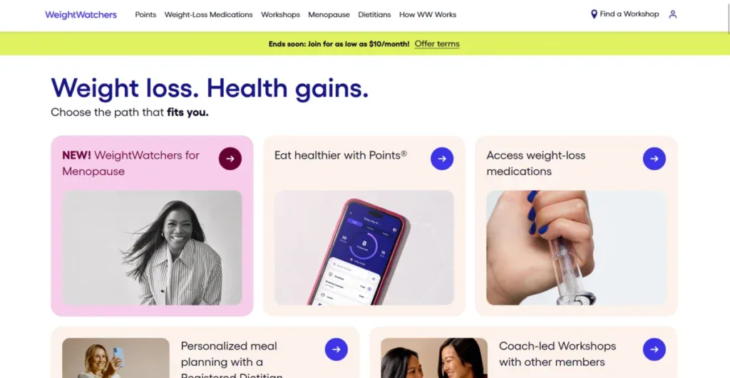
When Weight Watchers rebranded to WW in 2018, the company hoped to emphasize overall wellness over dieting.
But the new change lacked any sort of clarity, and people kept calling it Weight Watchers.
After a bit, the membership drop was clear, and the brand had to reexplain itself.
Minimalism and simplification can sometimes slide toward vagueness.
If your new name doesn’t express your purpose or your brand as it used to, then you risk confusion rather than modernity.
9. Uber
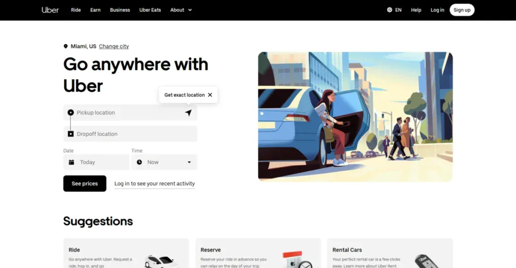
In 2016, Uber replaced its very recognizable “U” icon with an abstract geometric symbol. This made it hard for users to quickly find the app on their phones as before.
After heavy criticism and complaints, Uber reverted to its simpler “U” design.
Remember, practical usability is also an important part of branding. Easy recognition at a glance will always beat clever ideas.
10. BP
BP’s “Beyond Petroleum” campaign positioned the oil giant as eco-friendly. Then the 2010 Deepwater Horizon oil spill devastated a complete ecosystem.
The clear difference between what was said and reality was evident and destroyed BP’s reputation and trust.
Companies can’t outrun their behavior, so aligning what they say with what they do is vital. Claims of sustainability or ethics, while not following suit, risk your brand looking like a hypocrite.
11. Netflix
In 2011, Netflix announced it would split its DVD-by-mail business into a completely new brand called Qwikster, making subscribers manage two accounts and bills.
The backlash was instant since no one would want to pay double for a service they were only paying for once before.
Within a month, Netflix decided to scrap the idea and go back to its original business model.
Simplicity is part of brand value. Changes that make it confusing or harder for customers to get the same service; then trust will start to plummet.
12. London 2012 Olympics
The unique and jagged, neon 2012 Olympics logo debuted and was ridiculed instantly.
Many found it ugly, dated, and unreadable. Though the event went well, the logo became synonymous with an overthought design.
Distinct and unique don’t always mean attractive in the eyes of your customer.
Striving for originality is a must, but it must communicate something. When a logo or branding is too abstract, all it does is alienate.
13. Kraft
When Kraft introduced their new Vegemite-cheese spread in 2009, they asked their consumers to give it a name. The public mocked the winning entry, “iSnack 2.0,” nonstop.
Within a week, Kraft renamed it to “Cheesybite” and completely forgot about the winning entry’s name.
Crowdsourcing provides a fantastic way for you to get input from your consumers, but it doesn’t always mean that you should use it.
Names must fit your brand voice and culture. Novelty just for the sake of it will not provide positive value and will only hurt your authenticity.
14. Slack
Slack’s new four-colored shapes forming a pinwheel logo replaced its old hashtag logo that it had until 2019.
A lot of critics noted that the logo resembled a medical or corporate logo and lacked a bit of personality.
When you redesign your logo, double-check that your identity and personality are still recognizable.
Uniqueness and standing out from competitors take years to properly build, so always be careful you’re not discarding them for a new logo.
15. Twitter
When Elon Musk renamed Twitter to X and erased the recognizable blue bird, users and experts argued that the change killed one of the biggest social media brands out there.
While it didn’t kill the company, the change was not something most people agreed with.
To this day, most people still call it Twitter despite the full redesign happening years ago.
Heritage matters, and brands shouldn’t undergo rebranding just for the sake of it. It should have a purpose and should add to your company, not erase the culture that your audience has built for you.
16. Airbnb
The internet saw something completely different from what Airbnb’s “Belo” symbol intended to express: a sentiment of belonging.
Comparisons to body parts dominated the discussion. While the discussion slowly faded, the brand’s real intentions were not clear from the start.
Sometimes visuals carry unintentional interpretations from people. Always make sure to test designs across different groups of people before launching them to avoid any confusion or mistakes you might not have seen.
Learn how we increased AW Lake’s average session duration by 262% with a brand redesign in our latest case study.
17. Dove
Dove’s body wash campaign showed a black woman turning into a white woman after using the product. People instantly saw it as racist, and they pulled down the video immediately.
While Dove’s idea wasn’t racially motivated, the lack of explanation made it hard not to see it that way.
Representation matters, and creative teams must deeply understand historical context to avoid visual metaphors that can appear to be bad or insensitive.
18. Snapchat
In 2018, when Snapchat decided to overhaul its whole UI to separate friends from publishers, users completely disliked it.
People hated it so much that they even created a Change.org petition to revert the UI changes back to what they were before. The usage metrics dipped until a partial reversal occurred.
User experience is also brand experience. An abrupt and unnecessary functional redesign can completely alienate loyal users, even if the change looks good while creating the strategy.
19. Ford Edsel
Ford’s heavily promoted Edsel was created to fill a gap between its models. Market research completely misread consumer trends, and the car’s style felt awkward and forced.
After just a few years, Ford completely killed the brand and lost millions in the process.
Branding won’t do anything if the product you release is subpar and boring. An amazing logo and branding campaign will fail to rescue a product that your main audience doesn’t want or care about.
20. Nintendo
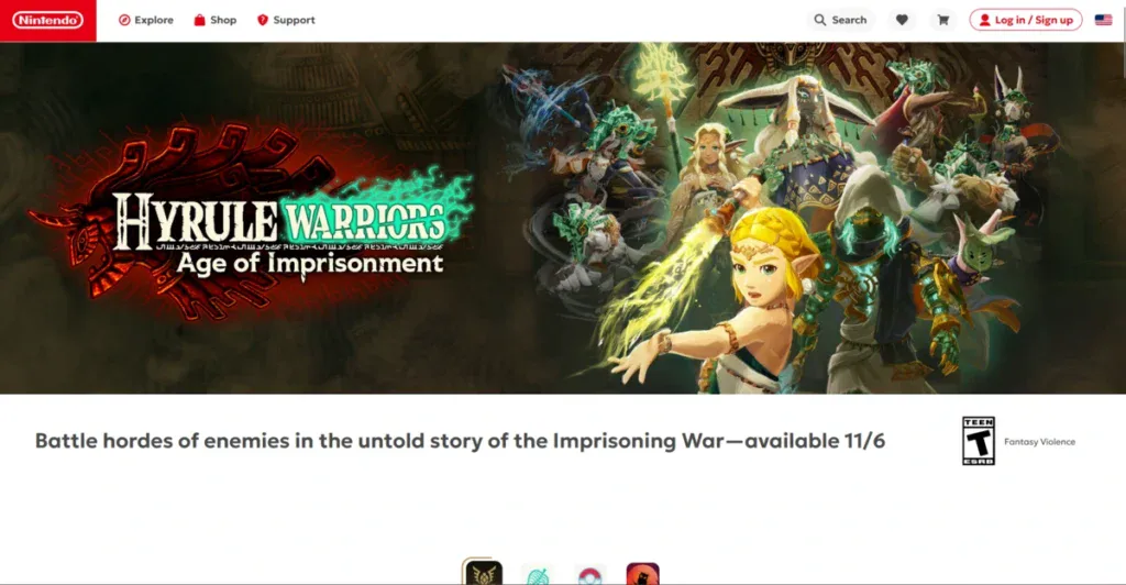
Nintendo’s successor to the Wii was called the Wii U. While on paper it might sound reasonable to do so similar to what Microsoft did when they named the Xbox’s successor the Xbox 360, the reality was different.
The Wii U sounded like an accessory for the already established and popular Wii.
Poor messaging led to weak sales for the consoles and kept going up until Nintendo released its new console, the Switch.
Clarity beats cleverness when it comes to branding. Product names should clearly explain what is new and why a consumer would care in the first place.
Get a Custom Branding Strategy With Blacksmith
After going through these bad branding examples, it’s clear how easy it is to mess up your branding if you are not careful. What might seem like an amazing idea on paper is really a bad branding mistake ready to happen.
The last thing you want to do is waste weeks, if not months, of time planning a new branding strategy only for it to fail and risk the survivability of your brand. So what can you do?
You can let us help you. Blacksmith is a professional branding agency that offers:
From logo designs to complete rebranding solutions, our marketing professionals will create the perfect plan for your brand.
Not sure if investing in a new branding strategy is what your business needs?
Don’t worry, click here to schedule a call with us and we will provide you with a full brand audit.
This way, we can show you the areas where your branding might be stopping your company from getting the traction and conversions you truly deserve.


