


There’s no denying it, the NYC Fintech industry is at an all-time high growth-wise, and it shows no signs of slowing down.
But how are they managing to get so many users consistently when at least 50% of consumers will only buy from a brand they know and trust?
By having an amazing and enticing website that hooks visitors from the start.
In this article, we’ll go over 13 of our favorite web design examples for NYC FinTech brands that are applicable to any fintech brand out there. They are all successful brands that can help inspire you when building your own fintech website.
Are you trying to build a brand new business website but don’t know where to start? Let us help.
Is Website Design Vital for FinTech Brands in NY?
Absolutely! A well-designed website helps visitors see your brand as trustworthy and credible.
Not only that, by explaining everything in a simple way, you cut most of the complex jargon and learning that come with the FinTech industry. This entices people who might not be familiar with the industry to join and be a part of your brand.
No matter if your brand targets enterprises, individuals, or startups, every NYC fintech brand should look and function at its best to grow.
Our Top 13 NYC FinTech Website Design Examples
Someone made this list with no order in mind. This list aims to inspire you and spark ideas for your own website, helping your fintech brand grow properly online.
1. Betterment
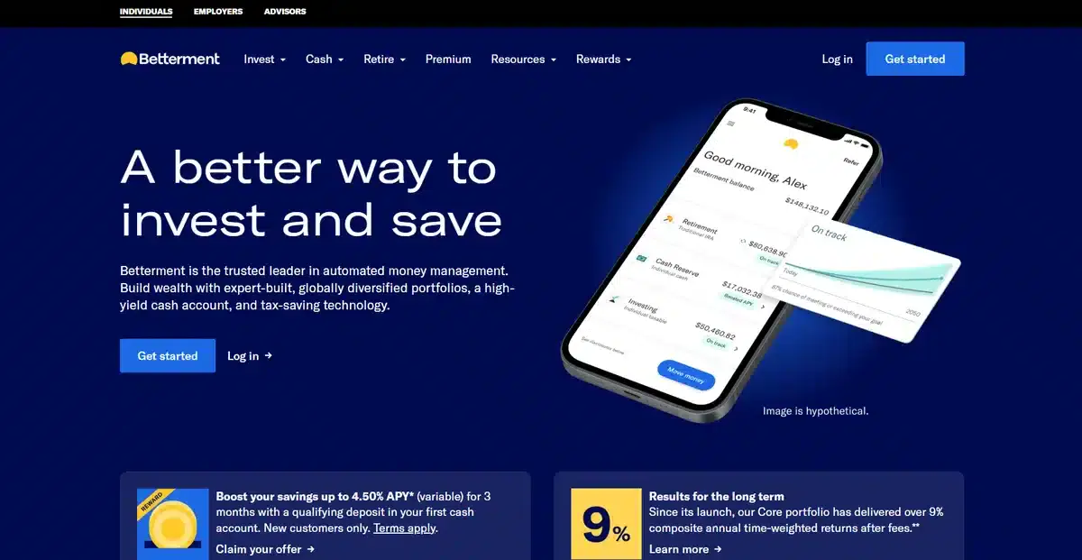
Betterment starts off this list of the best web design examples for NYC fintech brands by showing exactly how fintech websites should look.
Instead of having a distracting background, they opted for a solid color that helps visitors focus on the copy and images they added. As you scroll down, you learn how their money management system works in a simple and easy-to-digest way.
Not only does it look great, but it also has amazing website load speeds which solve a lot bounce rate issues.
Overall, this is a great and simple website that focuses on showing its visitors what its app can do for them.
2. Gemini
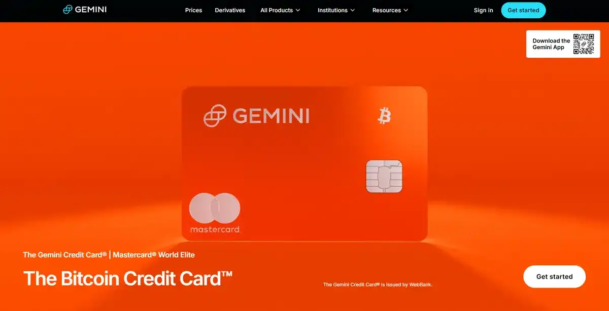
While Betterment tries to be subtle with its colors, Gemini is quite the opposite. As soon as you open their website, you’re met with vibrant colors that demand attention. Instead of bombarding you with information about what they offer, they showcase their latest features and events.
If you want to learn more about Gemini, just scroll down a bit. You’ll find them moving away from events to explain their features and options.
This method may not be as good for a new fintech brand in NYC, but it uses bold colors to grab visitors’ attention.
3. Ramp
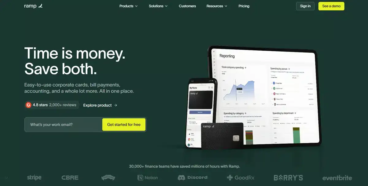
Ramp is a fintech brand that looks to manage the overall budget of a corporation. It does a great job of enticing visitors into testing the product by asking for their work email and providing them with a free trial.
This happens as soon as you enter the website, and it’s accompanied by its slogan, “Time is money. Save both.”
This is a great way to get potential customers interested in your fintech app. They can test everything that your app claims to do without spending a dime.
4. Yieldstreet
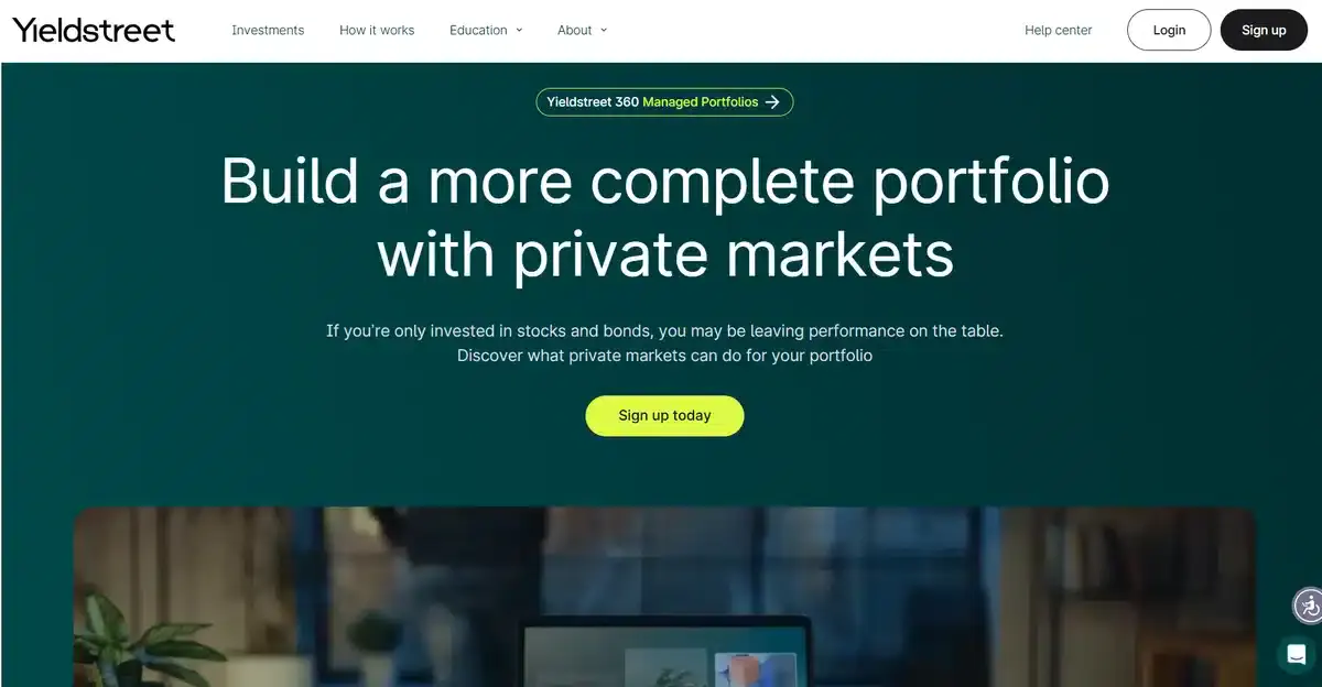
Yieldstreet is one of our more conservative fintech website approaches on the list. They use a quick video to show what their app does. Instead of bright colors or big images, they use plenty of white space. This helps you focus on what really matters.
Similar to other entries on this list, as you scroll down, you get to learn more about the product and the team behind it.
We’re fascinated by the colors they used for their website too. By using a dark color as the background, they are able to play with a more vibrant color for their CTA buttons.
5. Brex
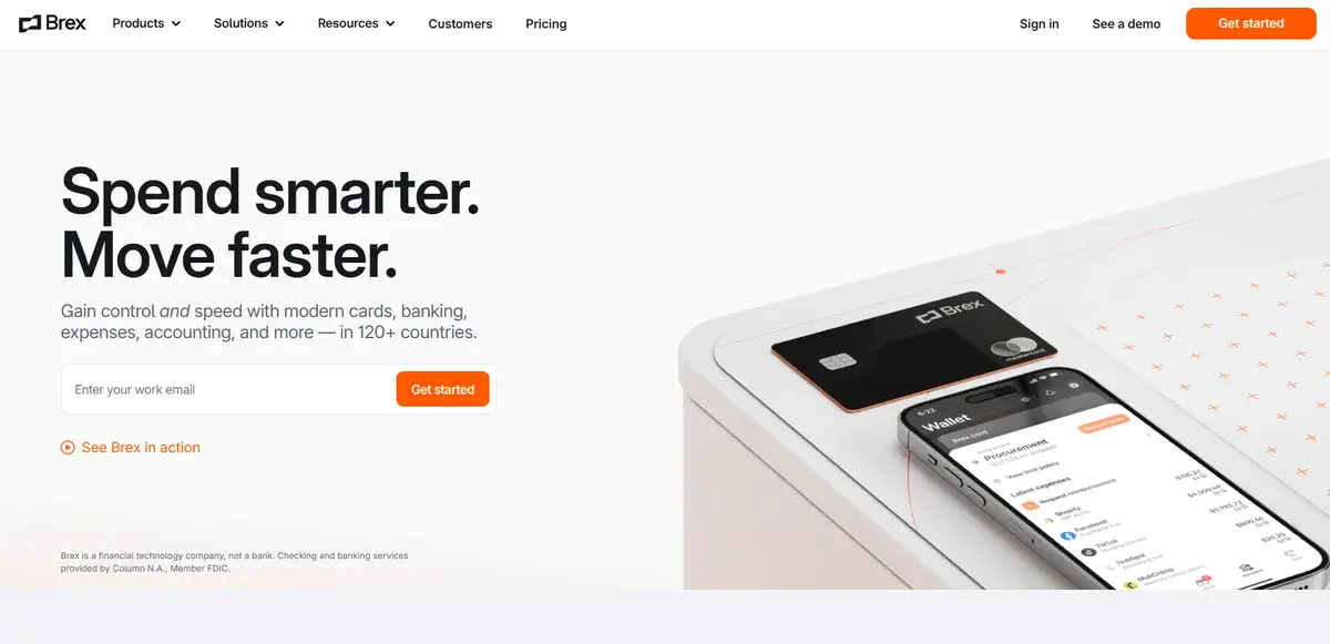
As soon as you open Brex’s minimalist website, you are greeted with ample white space and a bit of copy that entices visitors to give their work email.
By using a white background, they are able to use impactful images that visitors can instantly look at and understand.
Brex shows us that you don’t need fancy parallax scrolling or different videos to showcase a fintech app well.
6. Dailypay
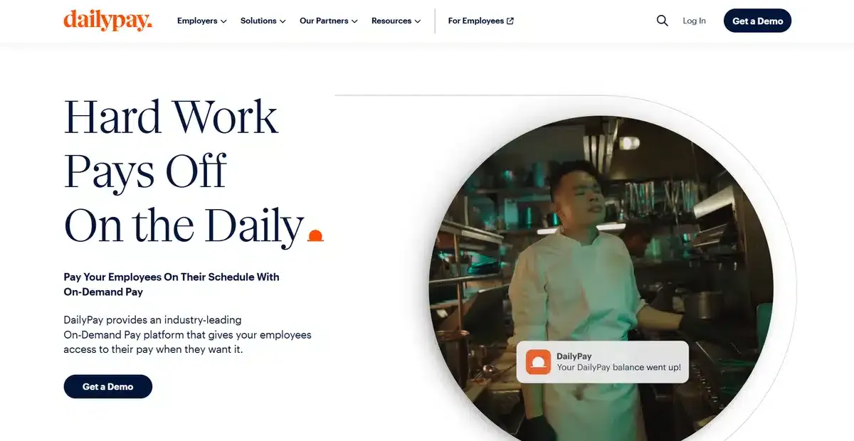
Dailypay is an on-demand pay platform that helps customers organize their payroll in an easy-to-use fashion.
Their website is simple, but it takes unique approaches. For example, it uses a circular screen for one video and a rectangular screen for the next.
Thinking outside the box is a great way to keep visitors interested in your website, and Dailypay does that perfectly.
7. Plaid
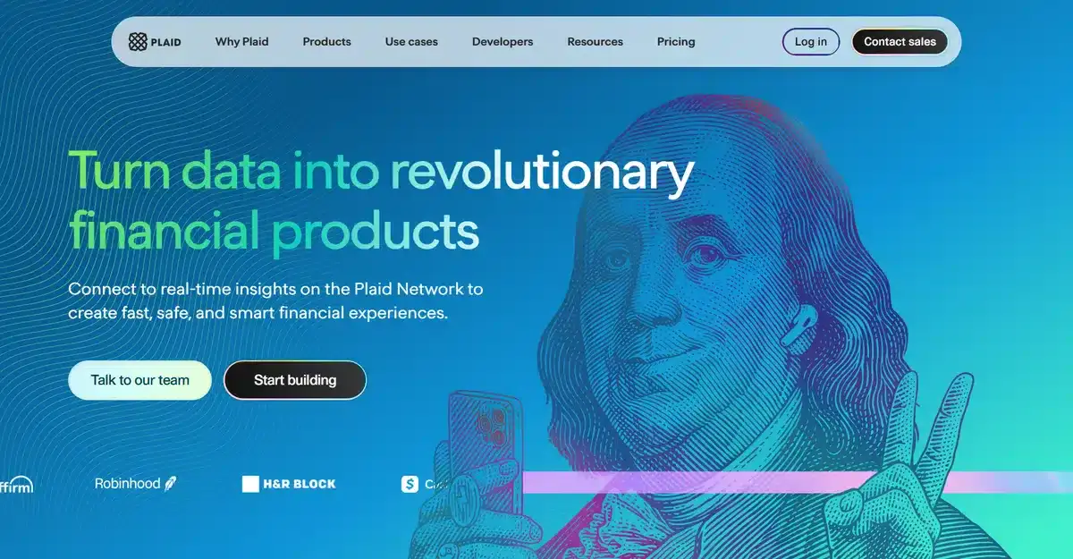
Plaid is by far one of the most creative fintech websites we’ve ever seen. When you enter their website, you’re greeted with Benjamin Franklin holding an iPhone in the background.
If this wasn’t enough to draw a visitor’s attention, hovering over their CTAs changes something on the website.
Hover over “Talk to our team,” and Franklin Benjamin winks at you. When you hover over “Start building,” the page shifts to a blend of dark mode and negative mode.
These extra efforts to stand out will immediately show visitors that, as a company, they care about their whole experience.
This is especially important for new NYC fintech brands trying to grow this year.
8. Alloy
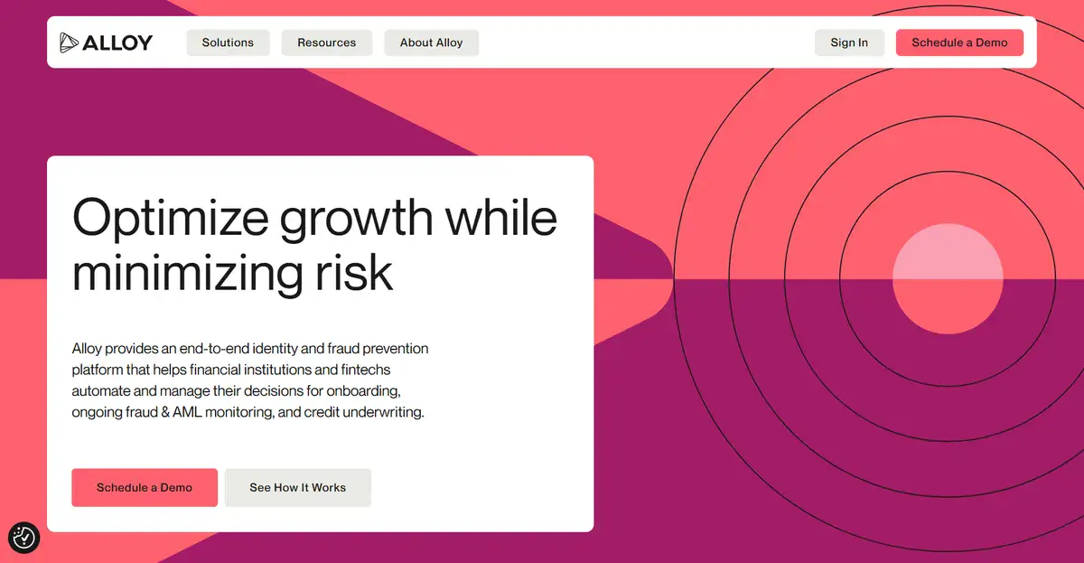
Alloy is a fintech brand that focuses on helping customers avoid fraudulent transactions and products as its main selling point.
When entering their home page, you’re greeted with a quick explanation of how their product works and how it can benefit your brand. You then are able to pick between seeing a video of how the product works or asking for a demo to try it out yourself.
Giving visitors the option to either try or view your product is a fantastic way to hook them into buying it.
9. Ocrolus
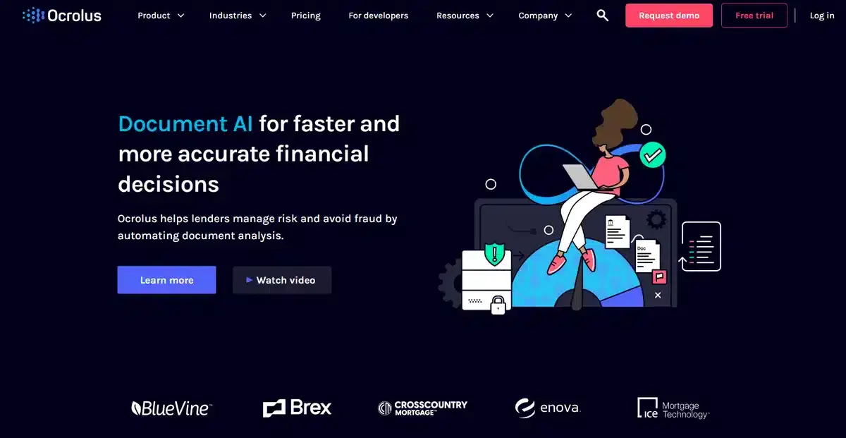
Ocrolus is an AI tool brand that helps businesses make better financial decisions while avoiding fraud. Instead of showing you its product as soon as you enter its homepage, it impresses you with an animated illustration and a bit of copy.
As you scroll through the website, you slowly start to understand how their product works and what it can do for you. Similar to what you’d expect from storytelling in a way.
This approach is good, but it needs careful planning for the homepage. It may not grab people’s attention quickly enough to teach them the key features of your product.
Want a custom website that stands out from the competition? We can help.
10. Payoneer

Payoneer is one of the most popular fintech companies in the world. It helps brands all over the world organize their payments, no matter where the other person is from.
Their website is simple and to the point, with a simple animation showing how their service works right below a CTA telling you to open an account.
As you scroll down, you’ll spot engaging parallax effects alongside illustrations that grab your attention.
Overall, Payoneer’s website is a solid example of how to do everything right, from start to finish.
11. Ondeck
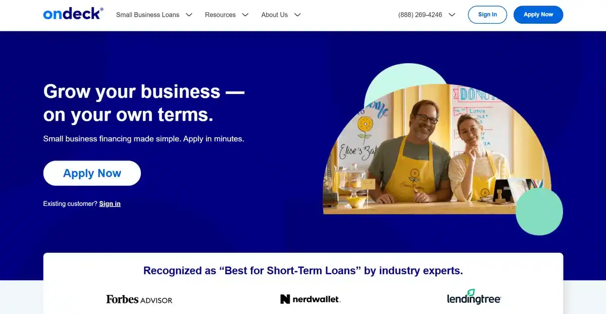
Ondeck is a fintech business that supports small businesses and helps them grow by financing their projects. Their website feels cozy and down-to-earth as soon as you open it.
Instead of showering you with different awards and testimonials from different clients, they show you what they can do for you. The darker shapes in the background make the homepage look better.
We like how they put their customers first in every section instead of selling their app as much as possible.
12. Unqork
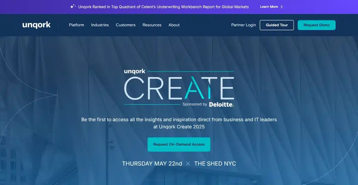
Unqork’s website inspires NYC fintech brands. It shows how to create products for various industries. They organize key products and industries into separate pages.
Anyone can reach these pages from its homepage.
By using this method, they don’t have to cram all their product information into one page and end up overwhelming their potential customers.
13. Current
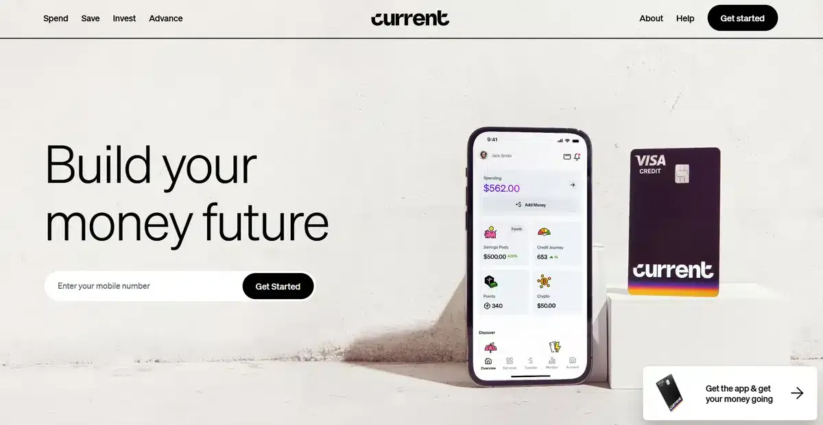
Current is a popular fintech brand that helps people build their credit without having to deal with actual banks. Their website uses a high-quality image of its product in the middle.
As you scroll down, you see different sections. They highlight important features of Current. If you’re curious, there’s a CTA to learn more.
They don’t overload their homepage with too much information. Instead, they use sections and links to other pages. This makes for a better experience overall.
Their use of grids to separate features and complete sections makes it easy for visitors to navigate and understand what to look at first.
Get a Custom NYC FinTech Website That Converts With Blacksmith
After going through all these amazing website examples for NYC fintech brands, you might have gotten a few ideas for your ideal fintech website.
But the reality is that creating or getting inspiration from any of these websites is only the beginning. Creating a custom NYC fintech website takes weeks of hard work to pull off.
But that’s where we come in. Here at Blacksmith, we’re experts at creating websites from the ground up. As a professional NYC web design agency, we offer professional web designers who use modern strategies to help your company grow online.
Unsure if a custom website design is what your NYC fintech brand needs?
Click here to schedule a call with us and we’ll show you all the clients you could be getting by the end of the year with a custom website.


