


Did you know that 42% of users abandon a website due to poor functionality, despite liking the products? This means that no matter how amazing your product is, if your website doesn’t look good or has UX issues, then visitors won’t care about the product at all.
Making a good first impression is only the first step nowadays. You now need to keep visitors interested in your custom website design if you want to convert them into loyal customers.
This is even more important for San Francisco startups that are trying to get their ideas out into the world and get the support they need.
This article goes over 15 of the most popular and high-converting homepages from San Francisco startups and what makes them successful.
The list is in no particular order since every single homepage here has a defining quality that you should take into consideration.
A quick note before we start.
Remember that you should use these homepages as inspiration and not as a 1-to-1 copy. Completely copying the design of a popular website will only bring you trouble down the road.
Are you trying to build a website for your startup but don’t know where to start? Let us help.
1. OpenAI
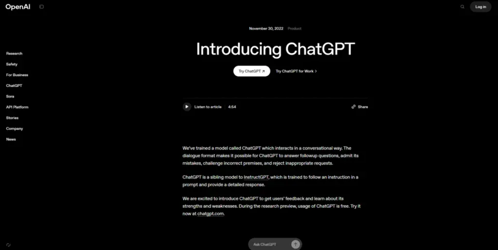
OpenAI is without a doubt the biggest startup in San Francisco right now. Ever since its launch, ChatGPT took the world by storm and is now the most used AI tool by a large margin. Most people would see a highly successful startup and think that it has a complicated website, but on the contrary.
OpenAI has a very inspiring and minimalistic website. A completely dark background with white letters is all you get design wise. There’s no illustrations or fluff; they instantly get to the point, which is their service. They also understand the importance of having their website in different languages which is why they have a completely multilingual website set up.
While adding no images or pops of color might seem extreme and counterproductive, for a popular San Francisco startup like OpenAI, it doesn’t matter since people know who they are and what they offer.
When people go to their website, they are either looking for a way to use ChatGPT or trying to find out what else ChatGPT can do for them. The homepage not only answers both questions, but it does so without wasting anyone’s time.
2. Dialpad
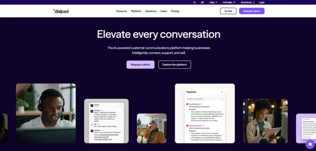
Dialpad is a prominent San Francisco startup due to their interesting take on voice intelligence.
Instead of making it generalized for everyone, they focused on creating a voice intelligence that understands sales and service teams.
This makes both call transcriptions and feedback a lot more consistent and useful compared to other voice intelligence apps.
Just like their service, their homepage is exceptional. It provides visitors with all the important information they need to understand what they offer without making them go to different pages.
They also make use of a sticky header that stays on your screen regardless of scrolling down. While this would be a massive design mistake for most websites, Dialpad manages to use it to its advantage by adding the “request a demo” and “try free” buttons to it.
3. Forte
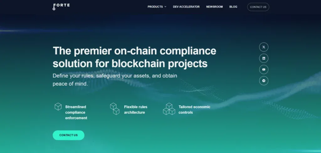
Forte is a San Francisco-based startup that focuses on helping businesses launch virtual assets without having to worry about all the compliance issues that sometimes come with it.
Their website is very straightforward and uses a mix of animated backgrounds to keep visitors interested.
Instead of bombarding you with information as soon as you go down, you slowly get information fed to you in a well-organized way. This makes it easier for you to understand what they can do for you, how they do it, and what benefits you would get from going with them over other competitors.
They even add social proof by showcasing all the brands that currently use Forte in their business to fully solidify their place as an on-chain compliance solution.
4. Cere Network
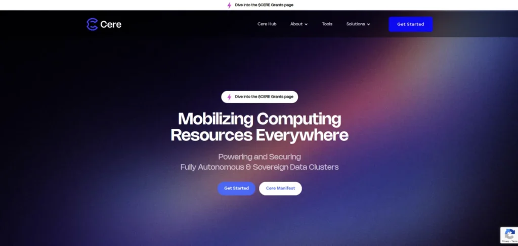
Cere Network is a popular decentralized data cloud platform fully built on blockchain technology.
With them you are able to focus on top-of-the-line data management. They make use of different AI-powered tools and decentralized data to provide you with seamless content streaming, data sharing, and more.
They opted for a homepage that briefly explains what they offer and leaves you with links for each section and major feature they offer.
This way, visitors don’t feel overwhelmed with all the information and blocks of text they would have to read on the homepage, otherwise.
The use of gradient colors helps elevate the look of the website by making images pop.
Explore how we increased Alloy’s user engagement by 51% with a web redesign.
5. Calm
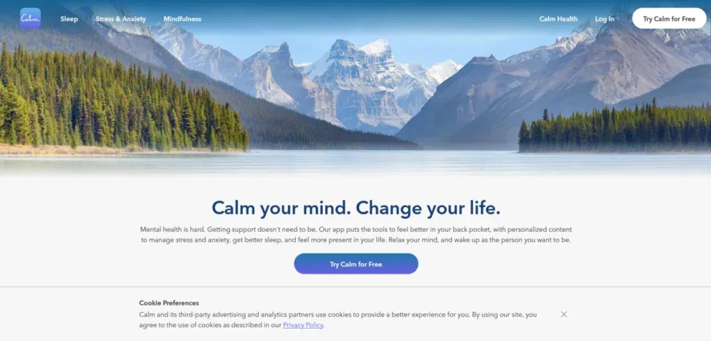
Calm is an extremely prominent San Francisco startup with a mindfulness and meditation app that helps people all over the world sleep better and relieve stress from work.
Their website is clearly made with mobile users in mind, as it has shorter sentences, loads extremely fast and has less information overall on their homepage. If visitors want to learn more about what Calm offers, then they would have to click on the “Learn More” over each feature.
What separates Calm from all the other homepages on this list is the FAQ section they added to the end of their homepage. Potentially answering a question that a visitor might have can help them connect with the brand. This will inevitably lead to them downloading and trying out the app.
6. Phantom
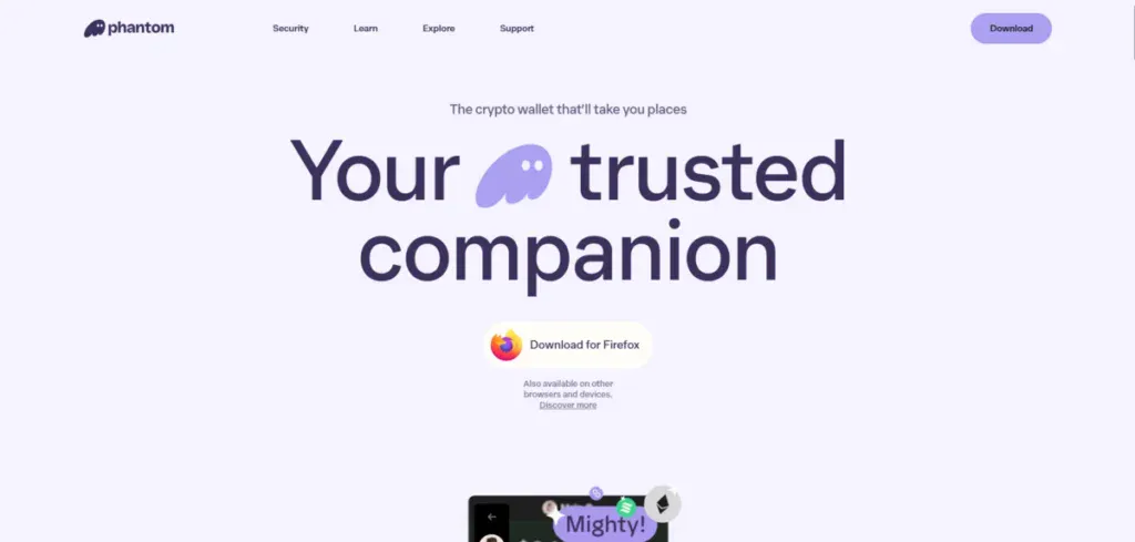
Phantom is an interesting San Francisco startup that focuses on providing users with a secure wallet for their NFTs. They help you buy and sell NFTs with little involvement from their end, which makes it the ideal wallet platform for most people.
Their website is a masterclass on how to make a simple service interesting with creative visuals and animations. As you scroll down, you’re greeted with amazing visuals that showcase how their wallet works.
You get to interact with a slide that keeps you interested in what they offer without forcing you to read blocks of text.
The smart use of color psychology also plays a big role on this website as it helps specific parts of the website to pop.
7. Discord

Discord is a popular social media startup founded in San Francisco. It has been consistently one of the most used social media apps in the world, right behind industry giants like Meta and TikTok.
Discord’s homepage goes directly into what visitors looking for a social media app like this want. They showcase how easy it is to talk and connect with friends and new people. The homepage is vibrant and matches the memorable branding identity Discord has without being overwhelming, despite the strong purple color it uses.
Like Dialpad, they use a sticky header with a CTA asking people to join Discord, so it’s easy to click and download the app.
8. Mysten Labs
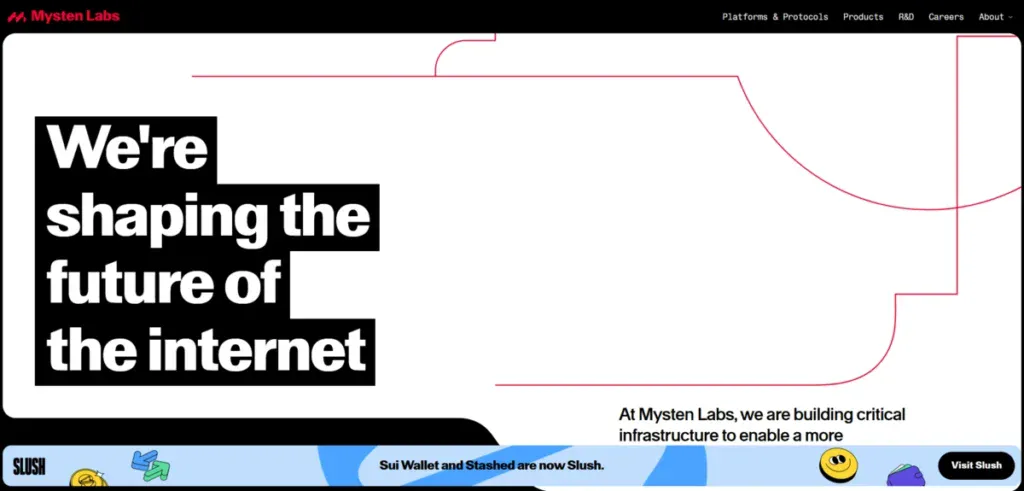
Mysten Labs is a startup based in San Francisco with the goal of creating a more decentralized internet for everyone. Their homepage is a fantastic take on a modern website. The use of white space and vibrant colors helps to keep the attention of visitors.
Instead of having their homepage as a single white page, they cut it into sections, which helps visitors find what they are looking for much faster, even if they are skimming through content quickly.
They also use illustrations effectively that users can click on to go to different pages. This makes it a lot more likely for visitors to click on it instead of a generic text CTA.
While not completely necessary or important, we do like how they added their latest blog posts and news at the end for people who want to learn more about them as a company.
Learn how we increased AJ Oster’s average engagement by 118% with a website redesign in our latest case study.
9. Hasura
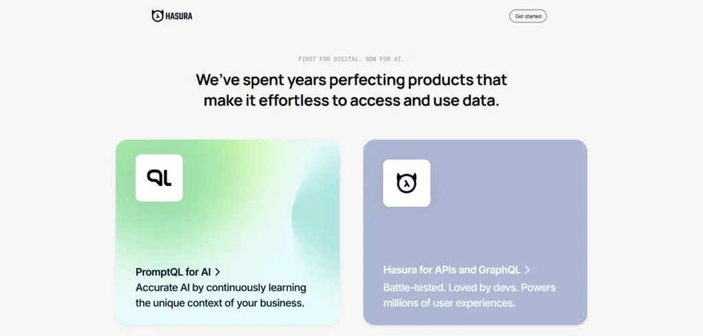
Hasura is a San Francisco-based startup that generates and unifies a GraphQL schema from your databases, which allows you to connect data together as fast as it has ever been.
Their website is refreshing to see. Instead of a long and drawn-out homepage, they opt for a homepage you can’t even scroll down. Instead, they give you two options to choose from.
Each leads you to a service they have and offers you in-depth information about it so you can understand exactly what they are doing and how they are doing it.
While this approach might not work for startups that offer a lot of different products or services, it is perfect for the ones who offer 2-3.
10. Loom

Loom is the go-to video messaging service that helps brands communicate and create screen recordings in a quick and easy way.
Instead of trying to explain their service in a normal way, they decided to show it via a video that doesn’t take itself too seriously. This makes for a short video that is fun to watch while also explaining what they offer.
That being said, if you want to learn even more about the brand and what they do, you can keep scrolling down to find out exactly how everything works.
11. Finless Food

Finless Food is a fantastic startup from San Francisco with the goal of making seafood alternatives that taste just as good as the real thing. Their main project is recreating the look and taste of tuna. It’s an ambitious project we are keeping a close eye on and can’t wait to see what happens with it.
Their homepage is a great example of less is more when it comes to websites and animations. Instead of having parallax effects or a lot of micro-animations everywhere, they have a traditional website that tells a story. They explain what they are doing, why they are doing it, and what you can do to support their cause.
12. Just. Inc
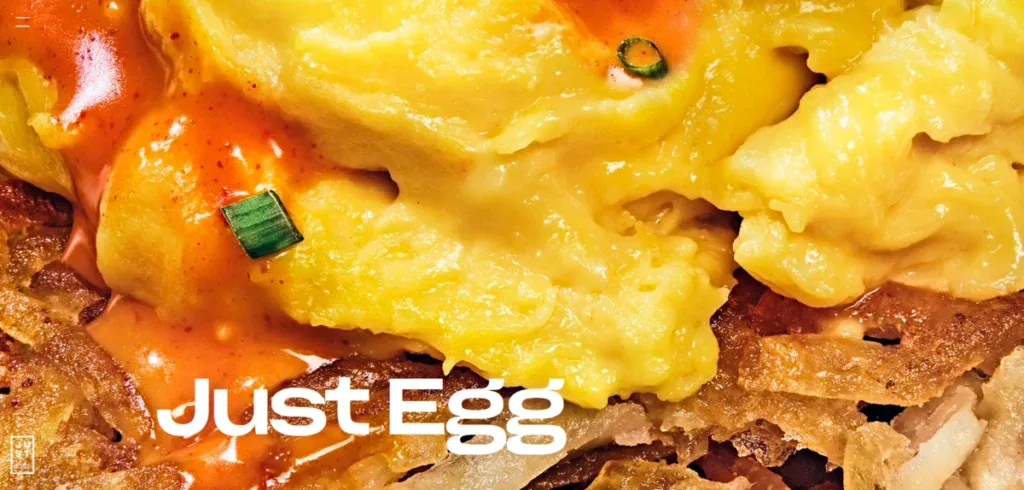
Just. Inc is an innovative startup from San Francisco that wants to change the way people look at eggs. Instead of having traditional eggs, they want to make it so consumers start eating “eggs” from plants. This egg alternative provides you with more protein and healthy fats than an egg without coming from animals.
Their whole website, but specifically their homepage, is a delight to look at with their high-quality images that have their plant-based egg as the main focus. While many view having little to no copy on a website as a negative, these images illustrate how their product perfectly emulates a real egg.
Learn how we boosted Aptive Resource’s user engagement by 270% with a new web design.
13. Hinge Health
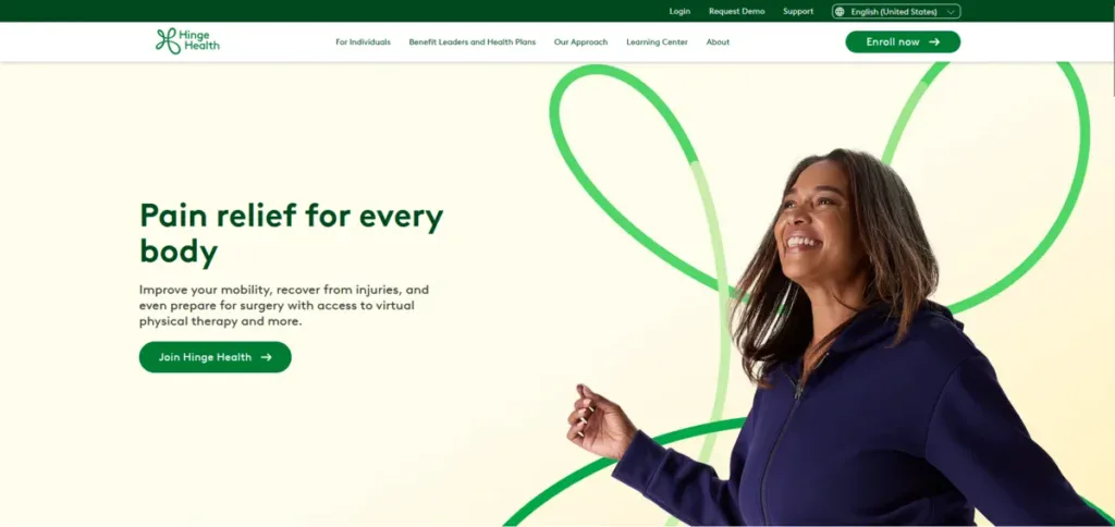
Hinge Health is a startup that focuses on the well-being of people. They provide users with a personalized plan that helps them improve flexibility, encourage joint health, and stimulate muscle growth.
Their website shows exactly this by adding images of people stretching and following a program. They back up the importance of their programs by showing statistics and things that happen to the body as it grows older.
While the homepage is simple, it tells visitors exactly what they need to hear to join the program.
14. CodeSignal
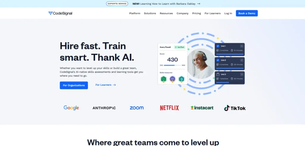
CodeSignal is a worldwide phenomenon that helps businesses teach new skills to their employees in a quick and effective way. Big companies such as Netflix, Google, TikTok, and more use this San Francisco-based startup.
Their website doesn’t waste your time and directly shows you what it can do while also providing you with important testimonials that help you trust them more.
Overall, their website is great to use for inspiration when it comes to eliminating fluff from your homepage and adding only the important information that visitors actually care about.
15. Superhuman
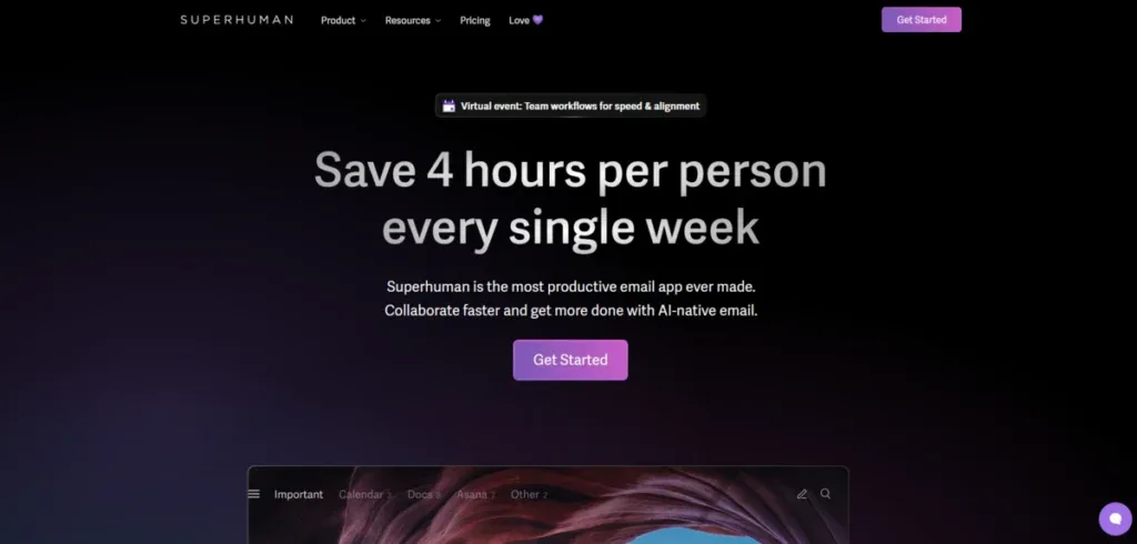
Last but not least, we have Superhuman. They are a San Francisco startup that aims to improve email productivity while getting more done with coworkers.
Their modern website uses high-quality images and vibrant colors to make scrolling down feel a lot more interesting despite the service itself feeling a bit underwhelming by itself. Their use of micro-animations and storytelling helps them explain the importance of their product without having to directly say it.
Get a Custom Startup Website That Converts With Blacksmith
We just went through 15 of the best-looking San Francisco-based startup websites and pointed out what makes them so good. Now it’s your turn to use them as inspiration for your startup’s website.
But we get it; creating a website from scratch takes a lot of time and effort that you might not have due to other startup priorities. So now what?
That’s where we come in. Here at Blacksmith, we are experts in website creation and development, with dozens of different websites under our belt. With our web design, you’ll get an increase in conversion rate in no time.
As a professional web design agency in San Francisco, we have a group of seasoned web designers ready to create the perfect website for your startup. We will use modern strategies and ideas to make sure that your website stands out while having a high conversion rate.
Unsure if investing in a custom website is a good idea for your startup? Don’t worry, click here to schedule a call with us and we’ll provide you with a free audit. This way we can show you all of the areas where you might be potentially missing out on customers as well.


