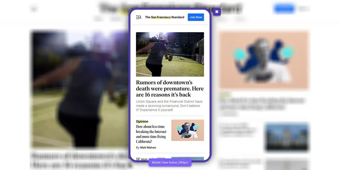
Did you know that 94% of first impressions are design-related?
This means that visitors will form an opinion of your website before even looking at your products or services.
This is especially true for mobile device users, both in San Francisco and all over the world.
With mobile devices accounting for 61% of global traffic share, your website simply can’t treat mobile users as an afterthought. We’re talking about more than half of your potential customers experiencing your brand through a smartphone screen first.
Tech companies in San Francisco now consider responsive web design trends essential. They recognize its importance in today’s online world.
In this guide, you’ll see why San Francisco businesses are choosing mobile-first design. You’ll learn key principles for successful mobile UX. We’ll explore trends shaping the market in 2025 and offer practical solutions for common challenges.
Trying to make your first mobile-first website but don’t know where to start? Let us help.
Understanding the Mobile-First Approach in Web Design
But what exactly does mobile-first design mean?
Luke Wroblewski first proposed mobile-first design, challenging the conventional wisdom of designing websites primarily for desktop users. His groundbreaking idea wasn’t just making websites work on phones.
It was about rethinking the whole design process.
What mobile-first really means
Mobile-first design represents a fundamental shift in how we approach web design creation. This approach starts with the smallest screen.
Next, it improves the experience for bigger devices. Rather than treating mobile as an afterthought, it places mobile users at the center of the design process.
The beauty of mobile-first design lies in progressive enhancement. You begin with a solid foundation optimized for mobile users, then add layers of complexity and features as screen size increases.
This stands in stark contrast to the traditional method of designing elaborate desktop sites first, then stripping them down for mobile devices.
Mobile-first design naturally improves performance since it starts with the limitations of mobile networks and processing power.
This optimization applies to all versions of your site. It makes experiences faster, no matter what device users have.
Mobile-first vs. mobile-friendly
Many websites claim to be mobile-first, yet they are merely mobile-friendly.
A mobile-friendly website is responsive to different screen sizes, shifting content to fit smaller displays.
Still, the developers conceived it with desktop users as the primary audience. The mobile experience, while functional, often feels like an adaptation rather than something purpose-built.
Mobile-first design, in contrast, is proactive rather than reactive.
Instead of designing for desktop and then adapting down, you design for mobile and then scale up.
This subtle difference in approach yields significant results in the final product.
Mobile-first sites don’t just work on smartphones; they’re optimized specifically for the mobile context, touch interactions, and limited bandwidth.
The distinction becomes clear in the user experience. Mobile-friendly sites often require users to pinch, zoom, or navigate complex menus that were originally designed for mouse interactions.
Mobile-first sites feature touch-friendly elements, simplified navigation, and content prioritized for on-the-go consumption.
Why it matters more in San Francisco
San Francisco is where tech innovation meets consumer use. This makes mobile-first design especially important for businesses here.
The city’s tech-savvy residents expect better digital experiences. They also adopt new technologies more quickly than most.
For San Francisco businesses, mobile-first design has become a necessity rather than an option.
The city’s busy culture often leads consumers to use mobile devices. They research products, find locations, and make purchases on the go.
eCommerce businesses starting out in San Francisco see particularly compelling benefits from mobile-first approaches.
Overall, a good mobile-first design boosts conversion rates. It does this by cutting down barriers for mobile shoppers, making it easier for them to complete their purchases.
Supporting mobile payment options like Apple Pay and Google Wallet, popular among San Francisco consumers, can further streamline the buying process.
Your mobile design choices reflect your brand identity in San Francisco’s competitive marketplace.
A thoughtfully designed mobile-first experience signals that your business understands modern consumer behavior and values innovation. This perception is especially important in a city known for setting technology trends rather than following them.
The forward-looking nature of mobile-first design also helps future-proof your business in San Francisco’s rapidly evolving digital market.
As mobile technology continues to advance, having a foundation built on mobile-first principles positions you to adapt more readily to emerging patterns in consumer behavior and device capabilities.
Core Principles of Mobile-First UX Design in San Francisco
San Francisco’s tech scene doesn’t mess around when it comes to mobile design or essential website features.
Adopting these mobile-first UX fundamentals isn’t optional; it’s necessary in the Bay Area’s competitive market.
Prioritizing content hierarchy for small screens
What should users see first when they land on your mobile site?
Content hierarchy becomes your secret weapon on small screens. Limited real estate means every pixel counts, forcing you to make tough decisions about what stays and what goes.
Mobile-first design naturally pushes you toward a content-focused approach. You cannot hide behind flashy graphics or complex layouts.
Start with core content that users need to complete their primary tasks. This requires ruthless prioritization, cutting anything that doesn’t directly serve user goals.
We’ve seen too many mobile sites fail because they tried to cram everything above the fold instead of creating a clear visual hierarchy.
White space becomes your friend on mobile devices. Each element needs room to breathe, improving readability and overall usability. San Francisco designers have embraced single-column layouts that scroll vertically.
This method feels easy to use on touchscreens. It also lowers cognitive load by showing information in small, digestible pieces.
Explore how we increased Tradewind Market’s demo requests by 140% after their web redesign.
Designing for touch and gesture
Touch interactions change everything about how users engage with your site. Forget precise mouse cursors—now you’re designing for fingers and thumbs.
Touch targets need to be at least 44×44 pixels, which is roughly the width of an adult fingertip. Smaller buttons create frustration and errors that kill conversions.
Equally important is the spacing between interactive elements to prevent those annoying accidental taps on neighboring controls.
Beyond basic tapping, incorporate intuitive gesture patterns like swiping for navigation, pinching to zoom, and pulling to refresh. Each gesture should provide immediate visual feedback.
Users need to know their actions were recognized. This responsiveness creates that sense of direct manipulation that makes mobile experiences feel smooth.
Optimizing for speed and performance
Speed kills, or rather, lack of website speed kills conversions.
Sites taking longer than 3 seconds to load see 53% of visits abandoned, which is a conversion disaster for San Francisco businesses competing in fast-paced markets.
Google’s Core Web Vitals measure what actually matters for performance.
For example, Largest Contentful Paint (LCP) tracks how quickly your main content loads.
On the flip side, Interaction to Next Paint (INP) measures responsiveness when users interact with elements.
And Cumulative Layout Shift (CLS) evaluates visual stability as pages load.
Here is a video showing how to optimize your website for speed and performance.
Images typically cause the biggest performance headaches. Compress files before uploading. Use modern formats like WebP. They keep quality while cutting file size by 25-34%.
Minimize HTTP requests by combining CSS and JavaScript files where possible. Implement lazy loading so images only render when they enter the viewport. This preserves bandwidth and speeds up initial load times.
Mobile browsers handle pages differently than desktop browsers, using more round-trip requests (RTRs).
Minimizing these requests becomes crucial for improving initial page speed. Browser caching stores elements that don’t change frequently, giving returning visitors significantly faster experiences.
Explore how we increased Tradewind Market’s demo requests by 140% with a new web design strategy in our latest case study.
Ensuring accessibility from the start
Accessibility isn’t something you add on later; it’s a foundation that guides every mobile-first design decision. Mobile-first design actually promotes accessibility through simplified interfaces and focused content.
Use proper heading structure (H1, H2, H3) to help screen readers navigate content logically.
Text needs to be readable without zooming. Use a minimum font size of 16 pixels.
Color contrast becomes particularly critical on mobile devices viewed in various lighting conditions.
Ensure text is easy to read outdoors or in bright light by following WCAG guidelines for contrast ratios. Provide alternatives for touch interactions to accommodate users who may struggle with touchscreens, such as keyboard navigation options.
Mobile accessibility testing gets overlooked despite mobile users outnumbering desktop users since 2017.
Designers in San Francisco must test their work on various devices and assistive technologies. This ensures that everyone can access their designs.
Emerging Mobile-First Design Trends in SF
San Francisco continues setting the pace for digital innovation, and 2025 brings some fascinating developments in mobile-first design.
We’ve been watching these trends emerge across the Bay Area, and several stand out as genuine game-changers rather than just passing fads.
1. Personalized mobile experiences using AI
AI-driven personalization has moved from “nice to have” to “must-have” for high-converting San Francisco websites. These systems analyze browsing history, purchase patterns, and contextual data to create experiences that feel custom-built for each visitor.
That being said, AI tools and personalization aren’t perfect. It requires significant data to work effectively, which can be challenging for newer businesses without extensive user history.
2. Seamless cross-device transitions
Progressive Web Apps (PWAs) have gained serious traction in 2025 for solving this exact problem.
Unlike standard websites, PWAs function smoothly across devices without requiring installation, featuring offline accessibility, fast load times, and app-like interactions regardless of screen size.

PWAs represent the future of web experiences.
Shoppers who engage across multiple channels have a 30% higher lifetime value than single-channel users, making cross-device consistency a revenue driver, not just a convenience feature.
3. Voice search and conversational UI
Voice changes how users interact with mobile apps. It allows for hands-free and eyes-free experiences. Voice User Interfaces (VUIs) let people interact in a more natural way. They mimic how we talk in daily life.
For San Francisco developers, adding voice features means prioritizing conversational design.
They need clear, concise responses and to be aware of context. Many mobile apps now use voice activation with simple trigger phrases. This makes them easier and more convenient to use.
4. Real-time interactivity and feedback
Modern mobile experiences need immediate response elements that create engaging interfaces. Micro-interactions are subtle animations or focus highlights. They help users through tricky information and shine a light on key insights.
What we find particularly effective are context-aware visual cues.
Highlighting recent information with default focus states and persistent tooltips helps users interpret information faster and more intuitively. These elements enhance decision-making and create more responsive mobile experiences.
5. Mobile-first branding and storytelling
This trend prioritizes vertical layouts and content creation specifically optimized for mobile consumption first, before adapting for desktop or print.
Effective mobile storytelling maintains linear, scrollable narratives similar to messaging conversations. San Francisco brands now focus on multisensory immersion. They use different media forms, like audio outside of videos.
This approach creates more engaging experiences.
The key insight? Mobile storytelling requires thinking differently about narrative structure, not just cramming desktop content into smaller screens.
6. Inclusive design for diverse mobile users
San Francisco places particular emphasis on inclusive design practices, with the city mandating that all government websites follow Web Content Accessibility Guidelines (WCAG) Level AA standards.
We’ve noticed that inclusive design approaches consider the full range of human diversity, ability, race, language, culture, gender, and age.
For San Francisco companies, this means addressing not just technical accessibility requirements but also creating genuinely welcoming experiences for all users.
Successful inclusive mobile experiences provide multiple entry points for people with various preferences, learning styles, and abilities.
This approach has proven to expand innovation horizons while ensuring that no users are excluded from essential digital services.
Challenges and Solutions in Mobile-First Implementation
Mobile-first design sounds great in theory, but actually implementing it?
That’s where many San Francisco developers hit roadblocks.
Common pitfalls in mobile-first projects
Here’s where most projects go wrong: hiding content just to make things fit on smaller screens.
Sure, it looks cleaner, but you’re actually making the experience worse for mobile visitors. That hidden content still loads in the background, slowing down your site without saving any data consumption. You’ve created the worst of both worlds.
Touch interactions get overlooked constantly. Developers design beautiful interfaces for mouse clicks, then wonder why mobile users struggle to navigate.
Touch targets need minimum dimensions of 44×44 pixels. Anything smaller frustrates users who can’t tap accurately.
But the biggest killer?
Poor content prioritization.
We’ve seen travel apps that bury booking options below the fold, forcing users to hunt for the one thing they actually came to do.
If users can’t find what they need immediately on mobile, they won’t stick around to search for it.
Explore how we improved Peak Support’s user engagement by 70% with our web redesign.
Balancing aesthetics with performance
You want your site to look amazing, but beautiful designs mean nothing if they take forever to load.
The challenge is finding that sweet spot between visual appeal and speed. Successful mobile-first sites embrace minimalist design principles. They use white space effectively and break complex features into simpler, expandable components.
Images create the biggest headache here. They typically make up a good portion of mobile page load size, which means your hero image could be killing conversions.
Smart compression and modern formats help, but the real solution is rethinking what visual elements actually serve your users versus what just looks nice.
Testing across devices and screen sizes
Testing feels overwhelming when you consider the sheer number of devices out there.

The mistake most teams make is trying to optimize for specific devices. Instead, focus on content requirements. Identify where your layout actually needs to adjust based on how your content behaves.
Real device testing combined with emulators gives you the best coverage. Physical devices show you real-world performance under actual network conditions, while emulators help catch those cross-platform quirks more efficiently.
This balanced approach catches the visual bugs and responsive issues before your users do.
Get Mobile-First Website That Converts With Blacksmith
Mobile-first web design has evolved from a mere design preference into a critical business strategy. San Francisco companies leading technological innovation understand this shift.
Our analysis shows how mobile constraints guide the creation of cleaner, more focused websites that excel on all devices.
Your business can’t treat mobile as secondary anymore.
If you want to grow as a San Francisco company, you need a mobile-first website.
But creating a mobile-first website takes weeks or even months depending on how complex your website is and how much optimization you need. This is time that you could spend working on other aspects of your business.
So what now?
That’s where we come in. Here at Blacksmith, we’re web design experts with dozens of different websites under our belts.
As a San Francisco web design agency, we have a group of seasoned web designers and developers ready to create the perfect website for you.
We’ll use every modern strategy and feature to ensure your website looks good on every single mobile device around without it looking cluttered or boring.
Still unsure if investing in a new mobile-first website is the right choice for your San Francisco brand? Don’t worry, click here to schedule a call with us and we’ll make a free brand and website audit for you.
This way, we can show you all the areas where you are missing out on potential customers or losing them altogether.


