


Takeaway
- Clear navigation and information hierarchy outperform visually complex designs
- Mobile responsiveness is common for the top legal firms in New York.
- Firms that modernize their UX without sacrificing professionalism stand out in a crowded market.
When people search for the top legal firms in New York, they are often graded based on credibility, reputation, and experience. Increasingly, however, a law firm’s website plays an important role in shaping that first impression long before a conversation even starts.
New York is by far one of the most competitive legal markets in the world, and the top legal firms in New York fully understand this. This means that every single aspect of their firm should be high quality; even their website should convey trust, clarity, and professionalism, all while supporting complex service offerings.
Instead of ranking legal firms based on outcomes and prestige, we will take a different approach. We will examine the websites of the top law firms in New York through a design and user experience lens. This highlights how these firms present themselves online, how easily users can navigate critical information, and how effectively their websites support engagement across desktop and mobile devices.
The firms included here are some of the most recognizable and influential names in the New York market. Their website establishes benchmarks for the industry by demonstrating how typography, layout, navigation, and even conversion strategies balance authority and usability.
This list intends to assist law research competitors, marketing teams planning a law firm website redesign, and legal organizations that want to understand what digital best practices look like.
Are you trying to redesign your law firm website but don’t know where to start?
Why Website Design Matters for the Top Law Firms in New York
For law firms operating at the highest level, a website is no longer a static brochure. Among the top law firms in New York, websites function as trust-building tools, recruitment platforms, and client gateways all at once.
Strong legal websites should:
- Establish credibility immediately.
- Make practice areas easy to understand and navigate.
- Perform better on mobile.
- Provide clear, low-friction paths for contact.
The following firm reviews focus on how effectively each website supports those goals, not on legal rankings, case outcomes, or firm size.
Website Design Reviews of the Top Law Firms in New York
1. Kirkland & Ellis LLP

Website Design: Kirkland & Ellis showcases a restrained, authority-driven design that aligns with what you’d expect from one of the top law firms in New York. The website heavily relies on typography, spacing, and hierarchy rather than flashy or decorative elements, which reinforces credibility overall.
UX & Navigation: Primary navigation is well-structured, with practice areas and insights clearly categorized. While comprehensive, it can be a bit complicated to go through pages if a new potential client is looking for a specific service or document.
Mobile Experience: The website is fully responsive and maintains readability regardless of the mobile device used.
Conversions & CTAs: Calls to action are minimal and to the point. Contact pathways exist but are not emphasized.
Takeaway: Strong authority signaling and clarity throughout the whole website.
2. Paul, Weiss LLP
Website Design: Paul, Weiss uses a very traditional, editorial-style layout that shows its reputation among the top law firms in New York. The design prioritizes professionalism and credibility over experimentation.
UX & Navigation: Menus are labeled and logically organized, though pages can feel text-heavy, especially for users who are unfamiliar with legal terminology.
Mobile Experience: Responsive across devices, but long-form pages require extensive scrolling, which can reduce usability on mobile.
Conversions & CTA: CTAs are understated and secondary to informational content.
Quick Takeaway: A credible, legacy-aligned design that could benefit from improved scannability and clearer engagement cues.
3. Davis Polk & Wardwell LLP
Website Design: Davis Polk’s website reflects a minimalist, precision-driven aesthetic consistent with financial and regulatory audiences. Its design is minimalist, clean, and highly structured.
UX & Navigation: Information architecture is solid and well-placed, with intuitive access to key practice areas and all of the firm’s resources.
Mobile Experience: Mobile optimization is excellent, with consistent typography and spacing across screen sizes.
Conversions & CTAs: Contact options are present and available at all times. Prioritizing information over lead capture.
Takeaway: One of the best UX executions on this list of the top law firms in New York, with room to strengthen conversion pathways.
4. Simpson Thacher & Bartlett LLP
Website Design: Simpson Thacher uses a conservative visual style with refined typography and controlled use of white space, reinforcing its position among the top law firms in New York.
UX & Navigation: Practice areas and firm information are easy to locate, supported by a functional search experience.
Mobile Experience: Responsive and stable, though navigation menus can feel a bit dense and packed on smaller screens.
Conversions & CTAs: CTAs are a tad limited and aren’t prioritized as much as other websites on the list.
Quick Takeaway: A dependable yet focused design that emphasizes a traditional look over high engagement.
5. Latham & Watkins LLP
Website Design: Latham & Watkins stands out with a more contemporary website design approach compared to many top law firms in New York. Subtle micro-movements, modern layouts, and a stronger visual rhythm create a more dynamic experience.
UX & Navigation: Clear segmentation between key components of the website, such as services, industries, and insights, makes exploration intuitive.
Mobile Experience: Strong mobile usability, accessible menus, and consistent readability.
Mobile Experience: Different sections display balanced CTAs that don’t aggressively prompt users.
Quick Takeaway: An excellent example of how larger firms can modernize UX without compromising their authority.
6. Skadden, Arps, Slate, Meagher & Flom LLP
Website Design: Skadden’s website showcases a legacy-first design approach common among the top law firms in New York. The visual style is very traditional, with minimal color variation and a strong emphasis on typography.
UX & Navigation: Navigation is easy to understand but dense. While users who understand this content may appreciate the depth, first-time visitors might find it overwhelming.
Mobile Experience: Fully responsive, though long menus and text-heavy pages reduce the overall efficiency on mobile.
Conversion & CTAs: The presence of CTAs is noticeable, but they remain understated. They instead rely on reputation rather than guided interactions.
Quick Takeaway: Highly authoritative design that would benefit from simplification and clearer user pathways for better overall conversions.
7. Debevoise & Plimpton LLP

Website Design: Debevoise uses a clean, editorial-style layout that reinforces professionalism and restraint.
UX & Navigation: Clear navigation labels and structured content make pages easy to find.
Mobile Experience: Its mobile layout maintains readability but can be a bit too dense for smaller screens.
Conversion & CTAs: Minimal CTA emphasis, with contact options embedded and not highlighted.
Quick Takeaway: Great clarity and credibility with some engagement signaling problems here and there.
8. Weil, Gotshal & Manges LLP
Website Design: Weil’s site balances tradition with modern elements, using restrained visuals and a strong hierarchy.
UX & Navigation: Practice areas and insights are logically grouped, supporting efficient navigation.
Mobile Experience: Their website is responsive and stable, with both consistent typography and spacing.
Conversion & CTAs: CTAs exist but aren’t the main focus of the website when compared to content exploration.
Quick Takeaway: A balanced UX approach that prioritizes information clarity over conversion focus.
9. Sullivan & Cromwell LLP
Website Design: Sullivan & Cromwell keeps a classic and institutional aesthetic aligned with the expectations set for the top law firms in New York.
UX & Navigation: Navigation is structured and easy to follow, though it is less flexible for exploratory browsing.
Mobile Experience: Responsive but conservative, with limited optimization for quick mobile actions.
Conversion & CTAs: CTAs are very minimal and largely information-based.
Quick Takeaway: Strong authority presence with room for UX modernization.
10. Fried, Frank, Harris, Shriver & Jacobson LLP
Website Design: Fried Frank’s website focuses on professionalism through muted colors, strong typography, and minimal visual clutter.
UX & Navigation: Clear access to core practices, although content can feel too layered at times, making it harder to find what you’re looking for quickly.
Mobile Experience: The mobile website is functional but not optimized for speed-focused users.
Conversion & CTA: CTAs are subtle and secondary to informational content.
Quick Takeaway: A conservative design that focuses on its legacy and credibility over anything else.
11. Clearly, Gottlieb Steen & Hamilton LLP
Website Design: Clearly Gottlieb employs a minimalist design with a global and corporate feel that is consistent and sought after by the top law firms in New York.
UX & Navigation: Information architecture is strong and well put together, which allows visitors to access services and insights as fast as possible.
Mobile Experience: A well-optimized experience for mobile users with a functional design and navigation.
Conversion & CTAs: CTAs are all informational and understated.
Quick Takeaway: A clean and efficient UX with very little emphasis on conversions.
12. Cravanth, Swaine & Moore LLP
Website Design: Cravath’s website reflects extreme restraint, relying almost entirely on typography and layout discipline.
UX & Navigation: Straightforward but rigid, favoring familiarity over flexibility.
Mobile Experience: Responsive design, but a bit text-heavy, requiring a lot of scrolling.
Conversion & CTAs: Very little CTA presence.
Quick Takeaway: A very traditional design that prioritizes legacy and authority over engagement and conversions.
13. Cadwalader, Wickersham & Taft LLP
Website Design: Cadwalader’s design leans more toward institutional, with conservative visuals and a very dense content presentation.
UX & Navigation: Clear categorization, but the pages can feel a bit crowded and overwhelming.
Mobile Experience: Mobile-friendly, but visually compressed and text-heavy.
Conversions & CTAs: CTAs are present but a tad understated and in odd places.
Quick Takeaway: Solid UX structure with an opportunity to improve readability.
14. Shearman & Sterling LLP
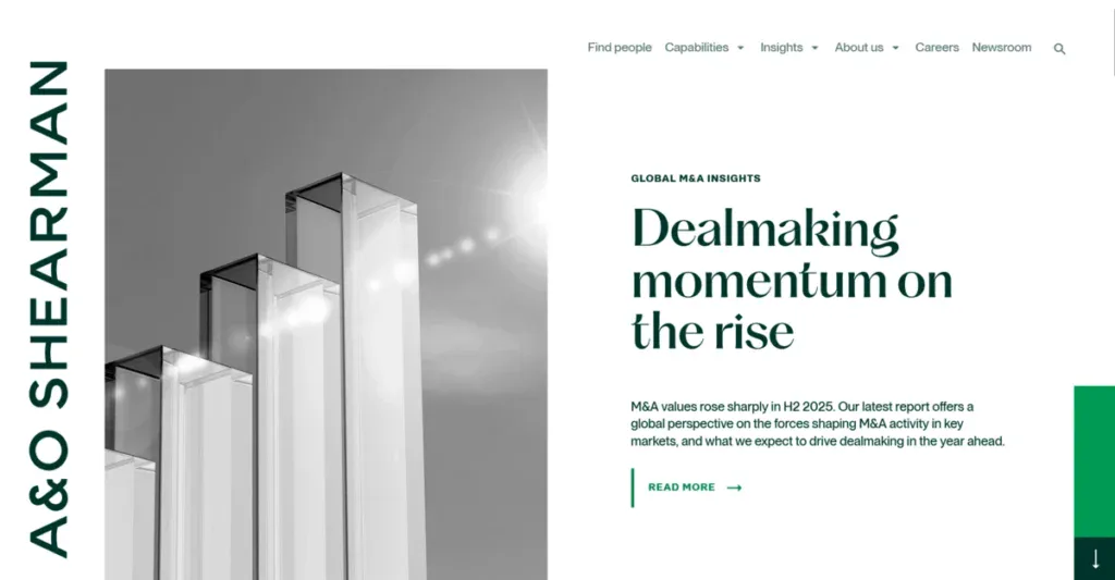
Website Design: Shearman & Sterling’s website blends traditional legal branding with slight modern refinements.
UX & Navigation: Menus are intuitive, which helps both domestic and international audiences.
Mobile Experience: Responsive with consistent formatting.
Conversion & CTAs: CTAs are informational rather than directive.
Quick Takeaway: A stable, professional UX aligned with all its global operations.
15. White & Case LLP
Website Design: White & Case uses a modern visual approach compared to all the top law firms in New York that go for a traditional and safe website look.
UX & Navigation: Well-structured navigation that directly supports its global strategy.
Mobile Experience: Strong mobile responsiveness with menus that are intuitive and easy to access.
Conversion & CTAs: CTAs are visible but conservative.
Quick Takeaway: A good example of how law firms can modernize their websites without losing professionalism.
16. Proskauer Rose LLP
Website Design: Proskauer’s website carefully balances professionalism with industry-specific messaging that targets both the sports and employment sectors.
UX & Navigation: Clear segmentation by practice and industry, which makes it quick and easy to find anything.
Mobile Experience: Responsive and readable across devices.
Conversions & CTA: CTAs are present but aren’t overwhelming.
Quick Takeaways: Strong alignment between brand focus and UX clarity.
17. Orrick, Herrington & Sutcliffe LLP
Website Design: Orrick’s website feels contemporary and modern with its clean layouts and subtle visual hierarchy.
UX & Navigation: Intuitive navigation with strong filtering options.
Mobile Experience: Well-optimized and responsive for mobile users.
Conversions & CTAs: CTAs are clear and out of the way, non-distracting.
Quick Takeaway: A modern UX approach that doesn’t forget about legal brand norms.
18. Greenberg Traurig LLP
Website Design: Greenberg Traurig uses a straightforward, content-forward design that focuses on accessibility and scale over anything else.
UX & Navigation: Easy to access all the important practice areas and documents.
Mobile Experience: Responsive, but visually dense on smaller screens.
Conversion & CTAs: CTAs are straightforward and mainly informational.
Quick Takeaway: Strong accessibility features with room for visual improvements.
19. Ropes & Gray LLP
Website Design: Ropes & Gray uses a clean, editorial design that improves readability without lowering professionalism.
UX & Navigation: A logical structure with effective content grouping.
Mobile Experience: Mobile responsiveness maintains clarity and spacing.
Conversion & CTAs: CTAs are present but a tad too understated.
Quick Takeaway: Consistent UX execution with minimal friction.
20. Arnold & Porter Kaye Scholer LLP
Website Design: This merged firm presents a unified, conservative design with a strong focus on credibility.
UX & Navigation: Clear navigation, despite the scale of the firm.
Mobile Experience: Responsive with excellent load-time performance.
Conversion & CTAs: There is a lack of CTAs throughout the website.
Quick Takeaway: An effective way of organizing complex information while using conservative UX choices
21. Milbank LLP
Website Design: Milbank’s website presents a polished aesthetic that aligns with the expectations set for the law firms in New York.
UX & Navigation: Navigation is organized and provides easy access to practices and insights.
Mobile Experience: Responsive and with good readability across all screens.
Conversion & CTAs: CTAs are present but subtle, favoring information over direct engagement.
Quick Takeaway: A credible, clarity-first design with conservative conversion cues.
22. Wilkie Farr & Gallagher LLP

Website Design: Wilkie Farr’s website blends traditional legal branding with modern spacing and typography.
UX & Navigation: Menus are intuitive, and everything is in an easy-to-access area.
Mobile Experience: The mobile website is intuitive and responsive, but some of the content sections can be too cluttered with the amount of information added to a small screen.
Conversion & CTAs: CTAs are very understated and purely informational.
Quick Takeaway: A solid website that focuses on usability without using distracting visuals.
23. Gibson, Dunn & Crutcher LLP
Website Design: Gibson Dunn uses a conservative, text-focused design that is common among top law firms in New York.
UX & Navigation: Structured navigation supports complex practice offerings, although density might hurt discovery.
Mobile Experience: Responsive, but very text-heavy on mobile devices.
Conversion & CTAs: Minimal CTA usage.
Quick Takeaway: Strong authority signaling with many ways to improve their mobile UX.
24. Sidley Austin LLP
Website Design: Sidley’s website balances global scale with consistent branding and hierarchy.
UX & Navigation: Clear and intuitive segmentation, ordered by services and industries.
Mobile Experience: Well optimized for mobile navigation and responsiveness.
Conversion & CTAs: CTAs are present but not as prevalent as the content itself.
Quick Takeaway: A scalable UX model that is well-suited for a multi-office firm.
25. Freshfields Bruckhaus Deringer LLP
Website Design: Freshfields’ website is a modern and international design with clean layouts and a strong visual rhythm.
UX & Navigation: Navigation is intuitive, which supports both transactional and informational use cases.
Mobile Experience: Strong mobile optimization with clear menus.
Conversion & CTAs: CTAs are visible but don’t attract enough attention.
Quick Takeaway: One of the more contemporary designs in the list helps to attract a younger audience.
26. Morgan, Lewis & Bockius LLP
Website Design: Morgan Lewis employs a conservative design that doesn’t take any creative risks but creates authority instead.
UX & Navigation: Easy access to all the services and locations, but content density can feel a bit high on certain pages.
Mobile Experience: Responsive, but it can feel a bit cluttered on smaller screens.
Conversion & CTAs: CTAs are mainly understated and informational.
Quick Takeaway: Consistent UX with room for improvement.
27. Perkins Coie LLP
Website Design: Perkins Coie’s website feels modern and easier to navigate than that of other top law firms in New York.
UX & Navigation: Clear access to services and locations, but the content density is high.
Mobile Experience: Strong mobile usability with readable layouts
Conversion & CTAs: CTAs are clear without being aggressive.
Quick Takeaway: A modern approach aligned with the innovation-driven sectors.
28. Goodwin Procter LLP
Website Design: Goodwin’s site uses contemporary layouts and a stronger visual hierarchy than many peers.
UX & Navigation: Well-structured navigation supports fast-growing industry verticals.
Mobile Experience: Mobile-friendly with easy access to menus.
Conversion & CTAs: CTAs are visible and integrated naturally.
Quick Takeaway: A great example of modern legal UX is in a list of the top law firms in New York.
29. Wilson Sonsini Goodrich & Rosati LLP

Website Design: Wilson Sonsini’s design shows its focus on technology by using cleaner layouts and a lighter visual tone.
UX & Navigation: Industry-focused navigation that targets startups and venture capital firms.
Mobile Experience: Optimized for mobile and enhanced readability.
Conversion & CTAs: CTAs are present but balanced.
Quick Takeaway: They take a unique approach by focusing on the tech industry and reinforcing this decision with modern UX design decisions.
30. King & Spalding LLP
Website Design: King & Spalding’s website emphasizes professionalism by using conservative and structured layouts.
UX & Navigation: Navigation supports its broad range of services, but the depth can slow exploration.
Mobile Experience: Responsive with consistent formatting.
Conversion & CTAs: CTAs are subtle and informative.
Quick Takeaway: Great execution for both desktop and mobile pages.
31. Winston & Strawn
Website Design: Winston & Strawn showcases a restrained, editorial-style website that focuses on litigation.
UX & Navigation: Menus are clear, but similar to other law firms on the list, content density remains high.
Mobile Experience: Responsive but scroll-heavy on mobile due to content.
Conversion & CTAs: CTAs are minimal and barely noticeable.
Quick Takeaway: A credible and clear website with some room for improvement, UX-wise.
32. DLA Piper LLP
Website Design: DLA Piper’s website shows its focus on a global scale with consistent branding and structured layouts.
UX & Navigation: Navigation supports international audiences perfectly.
Mobile Experience: Their mobile website is well optimized across all devices.
Conversion & CTAs: CTAs are present, but they aren’t emphasized.
Quick Takeaway: Strong scalability with a conservative, yet effective engagement strategy.
33. Covington & Burling LLP
Website Design: Covington & Burling uses a clean and simple design that reinforces its policy and regulatory credibility.
UX & Navigation: Clear access to all of its practices and insights.
Mobile Experience: Responsive and with solid readability.
Conversion & CTAs: CTAs are informational for the most part.
Quick Takeaway: Effective UX that focuses on clarity in complex topics.
34. Cooley LLP
Website Design: Cooley’s website is a firm that mainly focuses on startups, which is shown by its uncommon design when compared to the top law firms in New York.
UX & Navigation: Their industry-focused navigation helps to support emerging companies.
Mobile Experience: A very solid and easy-to-use mobile website.
Conversion & CTAs: CTAs are clear and easy to notice as you scroll down the page.
Quick Takeaway: A good example of an innovation-led legal UX.
35. Rivkin Radler LLP
Website Design: Rivkin Radler’s website emphasizes accessibility and local presence with straightforward design choices.
UX & Navigation: Simple navigation supports multi-practice discovery.
Mobile Experience: Responsive but can be too compact content-wise.
Conversion & CTAs: CTAs are visible but a bit basic.
Quick Takeaway: Functional UX with opportunities for visual modernization.
36. Harris Beach Murtha Cullina, PLLC
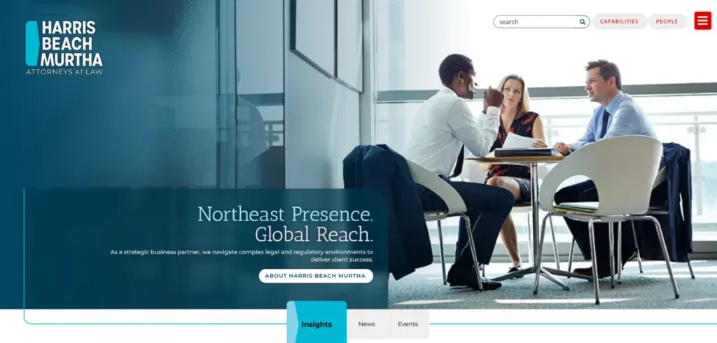
Website Design: The website uses a very traditional aesthetic with restrained visuals and clear typography.
UX & Navigation: Simple menus make exploring practices accessible, though their hierarchy could be easier to understand.
Mobile Experience: Responsive and readable.
Conversion & CTAs: CTAs are present but a bit simplistic and favor informational content over engagement and conversions.
Quick Takeaway: Functional and accessible.
37. Kasowitz Benson Torres LLP
Website Design: Kasiwitz Benson Torres uses a conservative, litigation-forward design that emphasizes authority and seriousness.
UX & Navigation: Navigation is clear and to the point.
Mobile Experience: A responsive mobile website that suffers from having too much written content stuffed into its pages.
Conversion & CTAs: CTAs are minimal and understated.
Quick Takeaway: Their website has strong authority and focuses on its litigation services mainly.
38. Goldberg Segalla LLP
Website Design: Goldberg Segalla’s website mainly prioritizes clarity and industry specificity with a clean, professional layout.
UX & Navigation: Its practice section is intuitive and easy to navigate, which improves discovery.
Mobile Experience: Well-optimized for mobile with consistent readability.
Conversion & CTAs: CTAs are visible and well-placed in strategic parts of each page.
Quick Takeaway: A practical UX approach with solid conversion strategies.
39. Norton Rose Fulbright LLP
Website Design: The site showcases its global scale with structured layouts and conservative branding, which is common among top law firms in New York.
UX & Navigation: Clear segmentation supports multinational audiences, but as a result, it adds depth and complexity.
Mobile Experience: Responsive design and stability across all devices.
Conversion & CTAs: CTAs are informational rather than directive.
Quick Takeaway: Impressive scalability with restrained engagement design.
40. Quinn Emanuel Urquhart & Sullivan LLP
Website Design: Quinn Emanuel’s website stands out from the list for having a very distinct visual tone while maintaining professionalism.
UX & Navigation: A litigation-first navigation helps users find exactly what they need quickly.
Mobile Experience: Mobile pages are easy to read and navigate and don’t feel cluttered with content.
Conversion & CTAs: CTAs are clear and appropriately used.
Quick Takeaway: Distinct branding supported by good UX decisions.
41. Paul Hastings LLP
Website Design: Paul Hastings employs a modern, polished design that balances global scale with an easy-to-follow layout.
UX & Navigation: Clear menus and intuitive industry segmentation that improves usability.
Mobile Experience: Strong mobile performance with smart and accessible navigation.
Conversion & CTAs: CTAs are visible but aren’t well implemented.
Quick Takeaway: A contemporary UX approach that is well-suited for large and international firms.
42. Schulte Roth & Zabel LLP
Website Design: The website reflects a niche-focused, finance-oriented design with restrained visuals.
UX & Navigation: Navigation supports financial services and focuses on improving clarity.
Mobile Experience: Responsive with compact layouts.
Conversion & CTAs: CTAs are subtle and mainly informational.
Quick Takeaway: A very niche alignment that uses a conservative engagement design.
43. Cahill Gordon & Reindel LLP

Website Design: Cahill’s website uses a classic, editorial design that emphasizes its authority and heritage.
UX & Navigation: A clear structure supports banking and finance customers.
Mobile Experience: Completely responsive but scroll-heavy due to the amount of content.
Conversion & CTAs: CTAs are minimal and not the main focus.
Quick Takeaway: Strong overall authority with a very limited UX due to a lack of modernization.
44. Herbert Smith Freehills Kramer
Website Design: The merged brand presents a completely unified and modern aesthetic with consistent visual systems.
UX & Navigation: Navigation supports scaling effectively, though its depth increases complexity.
Mobile Experience: Well-optimized for mobile devices.
Conversion & CTAs: CTAs are present but aren’t the main part of the page.
Quick Takeaway: A great global UX with different opportunities to streamline user paths.
45. Jones Day
Website Design: Jones Day’s website is conservative in its approach, relying almost entirely on typography and structure.
UX & Navigation: Predictable navigation supports familiarity but limits exploration.
Mobile Experience: Responsive, yet heavily text-dense.
Conversion & CTAs: Little to no CTA presence.
Quick Takeaway: Authority-first design with limited engagement optimization.
46. Morrison & Foerster LLP
Website Design: MoFo’s website feels a lot more modern and flexible than most of the top law firms in New York, all while having a lighter layout.
UX & Navigation: Clear segmentation supports tech and global audiences alike.
Mobile Experience: A strong and easy-to-use mobile website.
Conversion & CTAs: CTAs are clear and to the point while also being accessible.
Quick Takeaway: A modern UX approach that balances authority and engagement.
47. O’Melveny & Myers LLP
Website Design: O’Melveny’s website showcases its professionalism with clean layouts and understated branding.
UX & Navigation: Navigation is intuitive and supports complex advisory services.
Mobile Experience: Responsive and readable.
Conversion & CTAs: CTAs are informational and subtle.
Quick Takeaway: Clear and straightforward UX with a conservative approach to its design.
48. Hogan Lovells LLP
Website Design: Hogan Lovells uses a global and modern website design with stronger visual differentiation compared to other law firms.
UX & Navigation: Well-organized navigation supports cross-border audiences.
Mobile Experience: Optimized for mobile with accessible menus.
Conversion & CTAs: CTAs are visible but aren’t overdone.
Quick Takeaway: A polished, scalable UX suitable for international firms.
49. Patterson, Belknap, Webb & Tyler LLP
Website Design: The website showcases its boutique positioning with refined typography and heavily focused content.
UX & Navigation: Clear and direct navigation supports litigation audiences.
Mobile Experience: Excellent layouts while remaining responsive.
Conversion & CTAs: CTAs are minimal and hardly used.
Quick Takeaway: Focused UX is aligned with boutique brand positioning.
50. Boies Schiller Flexner LLP

Website Design: Boies Schiller’s website emphasizes boldness within a legal framework, using stronger visual contrast.
UX & Navigation: Their navigation reflects all of their litigation-centric priorities.
Mobile Experience: A stable mobile website and a readable design.
Conversion & CTAs: CTAs are clear but not aggressive.
Quick Takeaway: Distinct visual tone supported by a focused UX execution.
Common Web Design Patterns Among the Top Law Firms in New York
When reviewing all of the websites of the law firms in New York, clear patterns start to emerge in how these firms approach digital design. While branding and scale always vary, most sites showcase similar priorities shaped by the legal industry’s need for credibility, clarity, and restraint.
One of the most consistent patterns is the use of typography as its main way of standing out. Many of the law firms rely on strong serif or neutral sans-serif typefaces, generous line spacing, and large headings to communicate authority. Visual hierarchy is often created by typography alone rather than by color or imagery.
Another main trend is the use of dark, neutral, or muted color palettes. Navy, charcoal, black, and white remain the top picks across the law firms in New York, all of which reinforce trust and professionalism. While this trend improves credibility, it also makes it harder for firms to stand out among dozens of other firms using similar colors.
Minimalist layouts are also common. A lot of firms prefer clean grids, limited imagery, and restrained motion. This supports focus and reduces distractions, but it can come at the cost of engagement if pages are too dense or static.
Last but not least, conservative branding choices tend to influence how the UX ends up looking. Navigation structures prioritize their comprehensive practices over speed, which leads to deep menus and complicated pathing.
While this reflects the complexity of legal services, it can also introduce unnecessary friction, especially for mobile users who might not know a lot of legal terminology.
All of these patterns explain why the websites for the top law firms in New York feel credible, consistent, and reliable, all while highlighting areas where they can improve and create a competitive advantage.
What Law Firms Can Learn From These Websites
Studying the websites of the top law firms is a great idea for law firms planning to redesign their websites for better engagement and conversions.
The main takeaway is that UX clarity consistently outperforms visual complexity. The best law firm websites always prioritize readability, easy navigation, and logical structures. Visitors shouldn’t struggle to find the page or service they are looking for.
Mobile-first design is not optional anymore, either. Most of the law firms have responsive websites, but that doesn’t mean they are optimized for usability. Reducing text density, simplifying menus, and improving tap buttons create a better experience for their users.
You should focus on clear conversion patterns as well, even if your law firm leans toward the conservative side. The most effective legal websites guide users subtly but with clear intent, with contact options, CTAs, and trust signals. Conversion design should not compromise professionalism at any point.
And remember, you build trust through consistency and usability, not through visual excess and complex ideas. Clean layouts, clean performance, and a good structure reinforce credibility just as much as heritage or reputation.
Get a Converting Law Firm Website with Blacksmith
After going through this list of the best 50 legal firms in NYC, it’s hard to ignore their global influence.
But how do they handle and showcase their cases to potential clients in 2026? With an exceptional website, of course.
Every single law firm on this list has a website that any new law firm should use as inspiration. But creating a website isn’t a one-day adventure; in fact, creating a website that is at the level of the ones on this list takes weeks, if not months.
That is time you could spend finding new clients and working on current cases. So now, what?
That’s where we come in. Here at Blacksmith, we are law firm website experts, with several custom websites under our belt.
As a web design company in New York, we have a group of seasoned web designers ready to build the perfect custom law firm website for you. Having an exceptional website helps drive conversions and new potential clients to you.
Unsure if investing in a new law firm website is what your law firm needs?
Don’t worry, schedule a call with us, and we will provide you with a free audit. With it, we will be able to show you the areas of your business that are making you lose clients and what we can do to help you fix them.


