


When more than 38% of web designers explain that an outdated web design is the main reason for visitors abandoning a website.
It means that now more than ever, it’s important to stay on top of website design construction trends if you want your company to compete and stand out.
Your construction company’s website might be stuck in the past while competitors race ahead. A website does more than showcase your portfolio; it’s a powerful tool that generates leads, builds credibility, and propels development.
Great construction websites are the first touchpoint for potential clients. They showcase your expertise and highlight the quality of services you deliver.
The best website designs for construction companies excel at breakthroughs, functionality, accessible design, and branding. This matters now more than ever since 82% of U.S. construction firms have AI strategies ready to go.
The best construction websites following design trends go beyond simple functionality to reshape client connections. Design choices like breaking grid layouts and custom photography can dramatically improve how clients see your business.
The global construction management software industry, valued at $10.64 billion, shows the growing importance of digital presence in construction.
Want to take your construction company’s website from outdated to outstanding? Let’s look at 10 website design trends that will give your business a competitive edge and convert visitors into valuable leads.
Are you trying to build a brand new construction website but don’t know where to start? Let us help.
1. Breaking the Grid Layout

Grid layouts have shaped web design for years. Construction companies now break free from these rigid structures. A bold new trend brings fresh energy to websites while keeping them functional.
Traditional grid systems organize content in uniform columns and rows.
However, broken grid designs adjust column widths, vary row sizes, and let elements overlap to create unexpected patterns. This method keeps structure. It creates “organized chaos” that cleverly twists design rules.
Why breaking the grid layout works for construction websites
Construction company websites thrive with broken grid layouts because they showcase creativity and technical expertise at once.
Traditional layouts with predictable columns and gutters often make websites look the same. Construction firms that break this pattern accept new ideas.
They think ahead, which clients want in their builders.
Broken grid layouts create effective visual hierarchies that direct visitors to key information or calls to action. This can boost involvement and conversion rates.
How to implement breaking the grid layout in website design.
You don’t need to start from scratch to implement a broken grid.
Start with a standard grid system as your foundation, then modify it through CSS or graphical interface tools. Here are practical techniques for high-converting construction websites:
- Change vertical alignment by placing elements asymmetrically instead of strict left, right, or center alignment. This simple change creates instant visual interest.
- Try layering by letting elements overlap. Visitors connect different parts, like project images and text, as they explore. This creates a unified visual experience with depth.
- Place text, icons, or buttons inside image blocks strategically. This technique organizes related content while breaking traditional grid arrangements.
- Use whitespace to emphasize key content. Bold spacing can highlight signature projects or services effectively.
- Adjust standard spacing between columns to modify gutters. This subtle change creates a unique rhythm across your construction website.
Your construction website needs to be easy to use on every device. Many clients look at it on their mobiles.
Test your design on various screen sizes to ensure that creative layout choices don’t affect functionality.
2. Centered Logo Placement
Web designers still debate logo placement.
Centered logos have become popular in many sectors and now appear frequently in construction website design.
What is a centered logo placement
A centered logo sits in the middle of the website header and creates symmetry across the page. This design choice differs from the traditional left-aligned style that has ruled web design for years.
Mobile devices show little physical distance between left-aligned and center-aligned logos.
While desktop displays create a much wider gap that leads to distinct user experiences based on logo position alone.
Construction websites often use centered logos. This design choice highlights symmetry, balance, and a modern appearance. This layout looks like old newspaper mastheads, which were often centered at the top.
Many users connect this style to trusted organizations from 50 years ago.
Why centered logos are trending in construction website design
Centered logos instantly create visual symmetry that projects balance and stability. Qualities construction companies want to showcase.
Construction firms that focus on design often use centered logos. These logos enhance symmetrical layouts and create a sense of balance on their websites.
The mobile-first design approach plays a key role, too.
As more people browse on phones, construction companies want consistent branding across devices. They keep logos centered from mobile to desktop versions.
Yet this design choice comes with proven user experience trade-offs. Users fail to navigate to the homepage six times more often with centered logos compared to left-aligned ones.
People expect logos in the top-left corner to work as homepage links, a behavior that is deeply rooted in web usage.
How to use centered logos effectively
Your construction company can make centered logos work better by following these guidelines:
Add clear navigation options: Put a visible “Home” text link in your main menu. This helps avoid the navigation problems that research has uncovered. Construction clients need easy paths through complex service listings.
Check all screen sizes: Centered logos look natural on phones but might confuse users on bigger screens where elements are spread farther apart.
Create visual balance: Make sure other design elements, like menus, stay clear and don’t compete with the logo for attention when you center them.
Research shows brand recall barely changes between left-aligned and centered logos. Elements like logo contrast, spacing, and clarity matter more for brand memory than whether the logo is centered or aligned left.
Explore how we boosted CBS Rental’s conversion rate by 14% with a new web design in our recent case study.
3. Clear and Simple Navigation
Your construction company’s website needs logical pathways that guide visitors, just like a well-hosted construction site.
Navigation serves as the backbone of effective website design.
What is a clear navigation in construction websites
A logically hosted system of menus, links, and pathways helps visitors find information quickly on construction websites. Your site needs a roadmap that lets users move smoothly between sections.
Good navigation does more than just work; it shows the scope of your offerings instantly. Clients can understand your capabilities before they click through specific pages.
Users will see how your website is organized. They can find information easily with the integrated system.
Why clear navigation improves user experience
Construction companies see immediate benefits when they implement intuitive navigation. Sites with clear navigation have lower bounce rates and keep visitors longer. Potential clients who easily find your services, project galleries, and contact forms are more likely to become customers.
Search engines give priority to websites with clear, logical structures, which help your SEO best practices. Intuitive navigation does more than help visitors. It also boosts your site’s visibility in search results, attracting more potential clients.
How to design intuitive navigation for construction companies
Put your most important content first. Your menu should highlight links to key services, project portfolios, and contact information. Service pages and project galleries deserve top spots because they showcase your expertise and completed work.
Make information accessible within 2-3 clicks. This stops visitors from jumping up and down through multiple menu levels to find what they need.
Keep navigation consistent everywhere. Your menu should work the same way across your site to build familiarity and trust. Construction company websites work best when navigation is in standard spots.
Usually, this means placing it across the top or along the left side for desktop views.
4. Use of Colorful Gradients
Colorful gradients have made a dramatic comeback in website design. They add dimension and visual interest to construction company websites that once relied on flat colors.
What are colorful gradients in web design
Gradients smoothly blend two or more colors together. They add depth and realism to flat design elements.
You’ll find three main types. Linear gradients transition colors in a straight line. Radial gradients spread out from a central point. Conic gradients rotate around a center point.
Modern gradients do much more than blend colors; they lift construction websites through smart design choices. You can add them to backgrounds, logos, text, buttons, and project photos.
Each use helps break up monotony while keeping your site professional.
Why gradients boost modern construction website design
Construction companies can use gradients to elevate plain color schemes. This adds depth and creates a more vibrant visual experience.
Just two or three brand colors can create dozens of gradient combinations.
This helps maintain brand consistency while adding visual variety throughout your site.
How to apply gradients without compromising accessibility
Accessibility must come first when using gradients. The Web Content Accessibility Guidelines (WCAG) say you need a contrast ratio of at least 4.5:1 between text and background.
Construction websites using gradient backgrounds need careful testing. Check the darkest text against the darkest background and the lightest text against the lightest background.
Avoid gradients that cause visual “vibration.” They can create accessibility issues and may lower your page ranking.
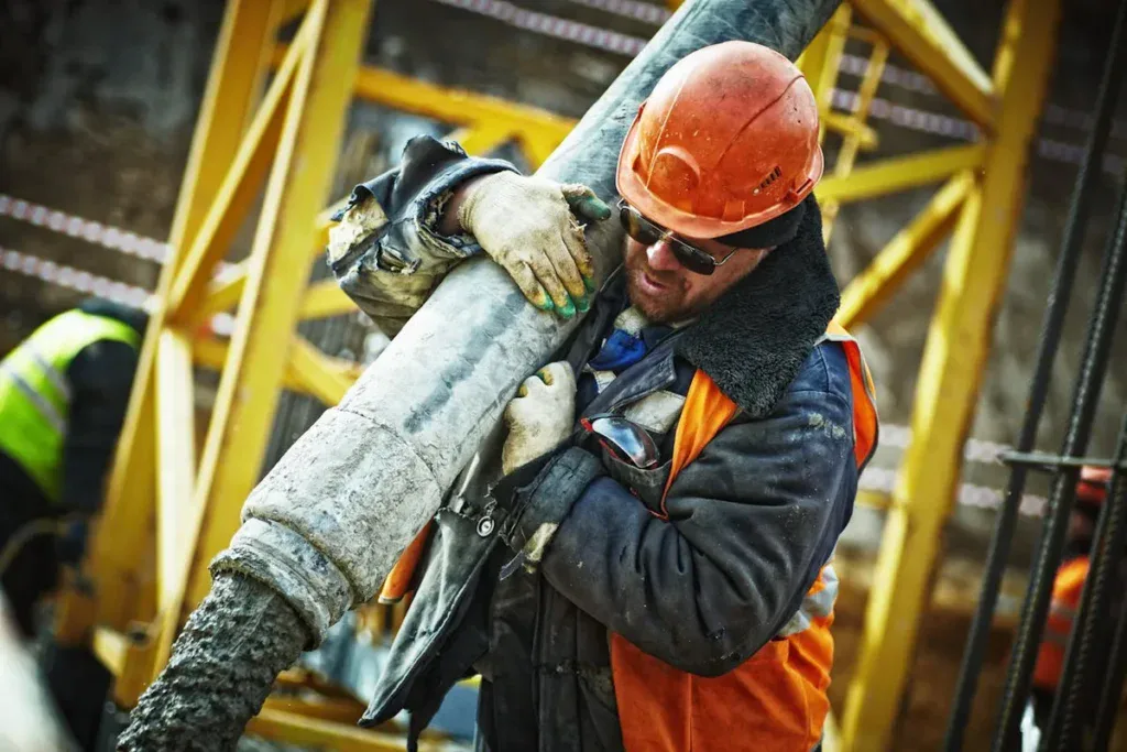
5. Custom Photography and Visuals
Professional photography turns construction websites from generic to remarkable. Your projects represent months or years of hard work.
Many construction companies still rely on stock images that fail to showcase their actual achievements.
What is custom photography in construction websites
Custom photography for construction websites captures professional, high-quality images unique to your company’s projects, team, and work processes.
These photos document your actual construction sites, completed projects, and team members at work. Your construction projects need a detailed visual record that is indexed by location and date.
Everything is captured, from existing conditions to underground utilities, weatherproofing, and completed structures.
Projects range from single milestone shoots to regular interval documentation that shows progress from groundbreaking to completion. This creates visual narratives showing transformation over time.
And it’s something stock photography can’t deliver.
Why custom visuals outperform stock images
Custom photography gives your construction website authenticity that stock images can’t match. You own exclusive rights to images that no one else can use. This makes your website stand out in a competitive market.
Construction companies use custom photography to showcase their attention to detail, modern equipment, efficiency, and beautiful architecture. These qualities build trust with potential clients.
Marketing messages become more credible and persuasive when backed by relevant images of your actual projects.
How to capture and optimize custom visuals for web
Hire photographers with construction industry experience who understand both photography principles and construction site safety.
These professionals can direct themselves around job sites without disrupting work activities.
A methodical organization of visual assets makes sense. Construction photos should be indexed by location and date. Stakeholders can access them through secure cloud-based platforms. Your team can quickly access full photo records from anywhere using this method.
6. Background and Featured Videos
Video content rules today’s construction lead generation strategies. Construction companies now employ this powerful medium to showcase their expertise and projects.
The right video can elevate a typical construction website into something outstanding. It captures visitors’ attention right away.
What are background and featured videos
Background videos play behind text or other elements. They create dynamic movement on construction websites without requiring user interaction. These subtle animations start automatically when pages load and loop to create visual interest.
Featured videos work differently as standalone content pieces. Users actively choose to watch these project walkthroughs, testimonials, or process explanations.
Why videos increase engagement on construction websites
Website visitors stay nowhere near 15 seconds on average, which makes quick engagement vital. Video marketing proves remarkably effective.
Construction companies find videos especially valuable. They show finished projects better than static images. They highlight scale, quality, and unique features that set your work apart.
Time-lapse videos and project walkthroughs show construction stages clearly. This builds transparency and trust with potential clients naturally.
How to use videos without slowing down your site
Video optimization starts with proper compression. Tools like FFmpeg can substantially reduce file sizes while maintaining quality. Videos that replace GIFs need their audio tracks removed to minimize size.
The poster attribute with Intersection Observer API lets your page download videos only when users scroll to them. This smart approach improves load times by displaying a placeholder image until the video comes into view.
7. Micro-Animations and Motion Effects
Motion creates meaning on construction websites through thoughtful micro-animations and subtle interactive elements. These small yet powerful design touches transform static pages into dynamic experiences.
Your construction portfolio comes alive as users navigate through it naturally.
What are micro-animations in web design
Micro-animations are small, purposeful movements that exist within a larger website experience. They accomplish single tasks through brief visual feedback.
The animations respond to user actions or system changes. They create trigger-feedback pairs. Users can start the trigger by clicking or hovering. The system can also start it when certain conditions are met.
These small visual movements are not like static elements that stay fixed on screen. They serve a vital role by showing users when interaction happens or is possible.
Why micro-animations improve interactivity
Micro-animations substantially boost construction website usability by giving immediate visual feedback. Users see their actions confirmed right away. This creates a satisfying loop that keeps visitors interested in your portfolio and services.
These subtle movements do more than just work well. They point attention to important information on construction websites without overwhelming anyone.
Construction companies can stand out through micro-animations.
Just as writing sets the tone, animations show personality.
How to use animations subtly in construction website design
Every micro-animation needs a purpose. They should not exist just for decoration.
Construction websites should focus on animations that showcase project galleries. They can demonstrate service processes or guide users to contact information.
Your animations must work on all devices. Construction clients often check websites from their phones at job sites. Small screens need animations that perform just as well as desktop versions for clear communication.
8. Minimalist Design Approach
Minimalist design has evolved into a lifeblood trend for construction websites. It offers a perfect balance between aesthetics and functionality.
Leading construction firms now welcome this approach to create striking first impressions without overwhelming visitors.
What is a minimalist design in construction websites
Minimalist design in construction websites simplifies interfaces by removing unnecessary elements.
The focus remains on prioritizing essential content. This strategy creates clean, uncluttered websites where each detail serves a specific purpose.
Why minimalism enhances clarity and professionalism
Simple and clean aesthetics improve user experience through minimalism. A distraction-free design naturally guides visitors through content. This approach improves navigation and reduces cognitive load. Websites with minimalist designs typically load faster due to fewer elements.
Negative space, often called “the backbone of minimalist interfaces,” draws attention to important elements like project galleries or service descriptions.
How to implement minimalism without losing impact
Content prioritization marks the first step in implementing minimalism. Identify elements that truly support your construction company’s core message and functionality.
Then remove everything else.
A limited color palette with one bold accent color helps highlight critical elements, like call-to-action buttons.
Note that effective minimalism doesn’t mean rigidly cutting content. It means presenting information clearly. Designers often say, “subtract it till it breaks.” Unless an element’s absence would create serious problems, it should go.
9. Social Proof and Testimonials
Construction companies face a major challenge in building credibility with potential clients online.
Clients need to trust their contractors before investing thousands or even millions of dollars in construction projects.
What is a social proof in website design
Social proof shows potential clients what others say about your services.
Reviews, testimonials, case studies, star ratings, and accreditations all work together as powerful tools on construction websites.
Why testimonials build trust for construction companies
Recent studies show that 91% of homeowners look at online reviews and ratings right after checking prices.
This shows how vital social proof has become in construction marketing. People naturally trust what other customers say about a business.
Learn how we increased R&O Construction’s user engagement by 126% with a web redesign here.
How to display testimonials effectively
Some testimonials work better than others. You need to place them strategically throughout your site, not just on a single page.
Specific feedback like “They finished the foundation two weeks ahead despite weather delays” works better than general praise.
Adding full names, project details, and locations makes testimonials more credible.
10. Bold Brand Messaging
Bold messages are the foundation of successful construction website design.
They turn visitors into clients through powerful communication that appeals to them.
What is a bold brand messaging
Bold brand messaging builds a unique identity. It uses smart language that aligns with your construction company’s values and speaks to your target audience.
Bold statements beat generic building-themed slogans. They show your positive attitude.
Why strong messaging matters in construction website design
Strong website design with clear messaging creates lasting first impressions whenever a potential client visits your website.
Prospective clients need confidence in your capabilities when they visit your site. Your brand succeeds only through effective communication.
How to craft and place bold messages on your site
Your audience’s understanding sets the foundation. A consistent, identifiable voice should match your construction company’s personality.
The messages should focus on solving client problems through clear benefits. Clients should know what experience to expect.
A simple yet influential structure works best when you focus on key information. Your homepage should display bold statements prominently to create an immediate impact.
Get a Custom Construction Website Design That Converts With Blacksmith
Your construction company’s website works as a digital storefront that leaves an impression on potential clients before they see your actual work.
These ten design trends provide practical ways to turn your outdated website into an amazing one.
They will boost your lead generation and help your business grow as long as you dedicate enough time to each one.
But we’ll be honest with you for a moment here; working on all of these website design construction trends takes a long time.
Especially if you’re trying to optimize for conversions as much as possible. It can take from weeks to months depending on how many people are involved in the web design project.
This is time you could be using to work on other aspects of your business. So what now?
That’s where we come in. Here at Blacksmith, we pride ourselves on constantly providing the best website designs for brands wanting to stand out and reach new conversion goals.
As a professional construction web design company, we have a group of seasoned web designers and developers ready to create the perfect custom construction website for your company. We will apply the latest trends and strategies in construction. This ensures your website outshines your competitors’.
Still unsure if investing in a custom construction website is the right call for your company? Don’t worry, click here to schedule a call with us and we’ll give you a website audit for free. This way, we can show you all of the areas where your website is losing leads and how we can fix and improve it.


