
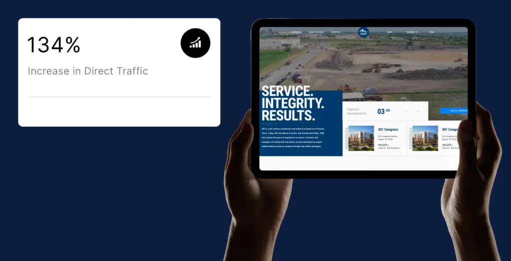
+134% Increase in Direct Traffic After Website Redesign
Leading commercial real estate firm HPI Real Estate was held back by an afterthought website with low organic traffic and almost non-existent conversions. A comprehensive digital transformation resulted in a 134% surge in direct traffic and a 58% increase in website visits.
About HPI Real Estate
With web design, BSA improved the reliability, performance, and uptime of HPI Real Estate
HPI Real Estate Services & Investments is a leading, Texas-based, full-service commercial real estate firm with a stellar reputation for service, integrity, and results. However, their previous digital presence was an afterthought and did not reflect their real-world expertise, creating a critical need for a website that could finally match their brand’s quality and drive business growth.
Services Rendered
The Challenge
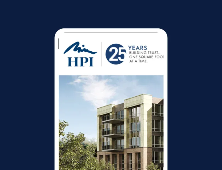
A Generic Brand Presentation

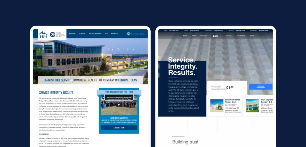
Outdated Website Layout
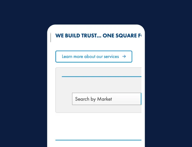
Weak Conversion Pathway
The Solution
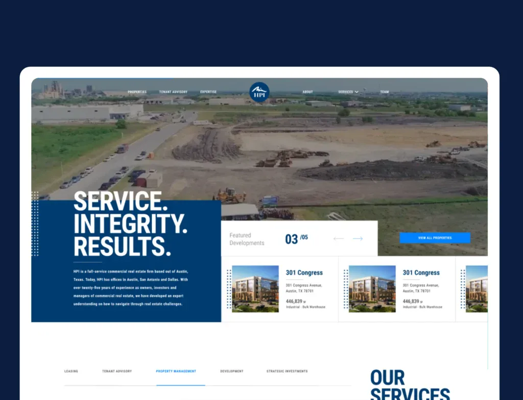
Modern, Streamlined Layout
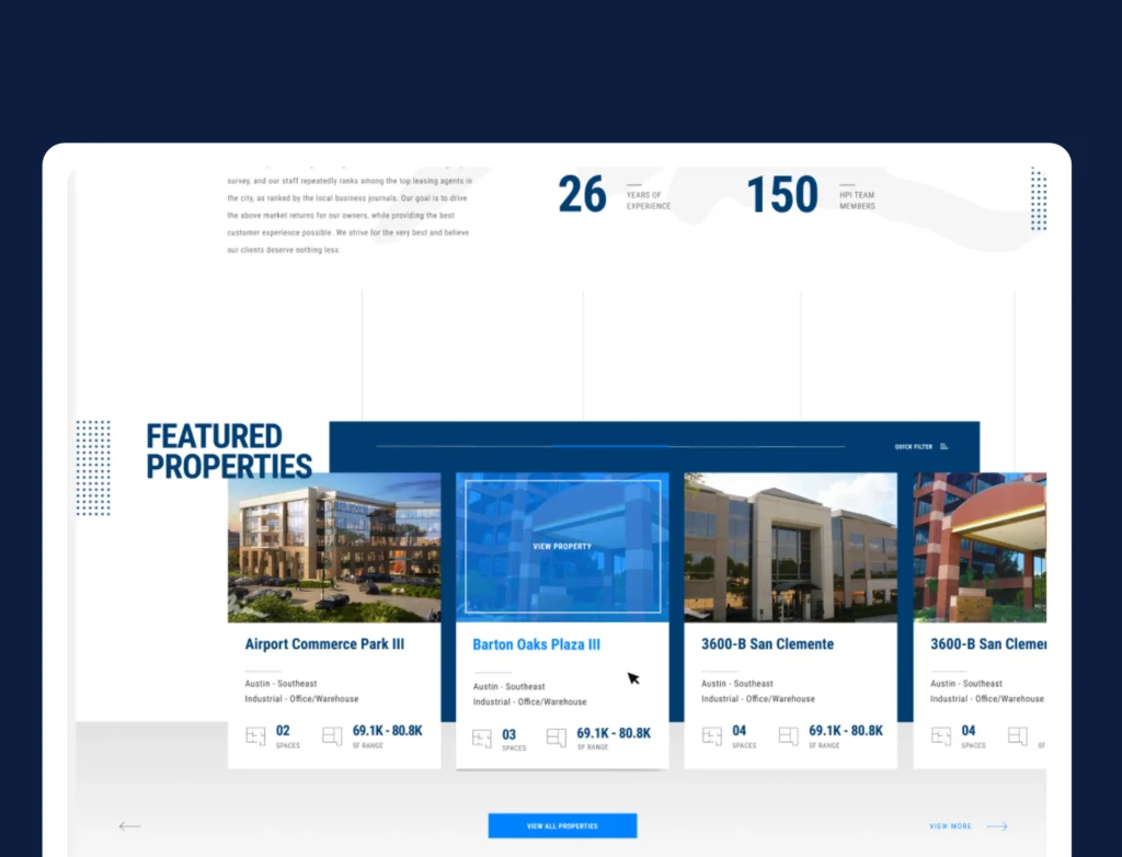
We introduced a clean, scannable layout with balanced white space and structured content sections. This allowed users to quickly identify key information such as services, markets, and contact details, improving overall readability and engagement.
Enhanced Conversion Flow
Proper CTAs were strategically positioned throughout the website, ensuring that visitors could easily take the next step, whether requesting information, exploring available properties, or connecting with the team.
Cohesive Brand Experience
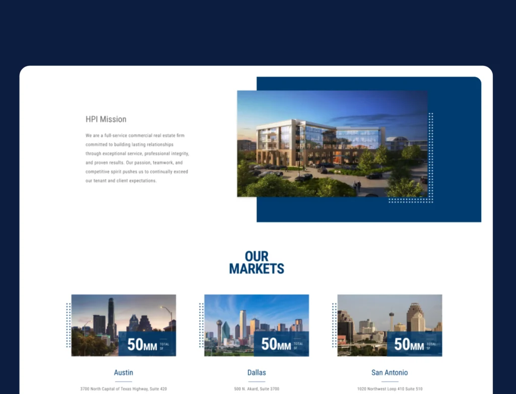
We integrated consistent color tones, authentic imagery, and typography that reflected HPI’s professionalism and local expertise. This gave the brand a stronger digital presence and improved recognition.
The Results
Delivering Measurable Impact
Our interventions yielded significant results for the brand.
+134%
-45%
58%

Contact Us
Let’s Work Together
Find out if Blacksmith can be a fit for your next digital initiative!
“*” indicates required fields
