


Did you know that more than 74% of visitors are likely to return if the website has a good mobile UX?
While this metric talks strictly about mobile users, the reality is that UX is vital for both mobile and desktop visitors.
eCommerce websites that don’t abide by the eCommerce UX best practices will watch as their competitors gain all of their hard-earned clients.
Why? Because no client wants to deal with an unresponsive and complicated UX only to buy a single product.
We’re in an abundant world where you consumers can pick alternatives in a blink of an eye if something on your website isn’t to their liking.e
While you can’t directly control what they think about your products, you can control how you present them and how your website looks.
In this article, we are going to show you 20 of the best eCommerce UX best practices that you should implement for your own website and how they should look.
Trying to improve your eCommerce store but don’t know where to start? Let us help.
Our Top 20 Favorite eCommerce UX Best Practices
This list is in no particular order. All of these eCommerce UX best practices should be taken into consideration when trying to optimize your eCommerce website.
1. Having a Mobile-First Design
We’ve said this multiple times by now, and we’ll say it again: having a website that feels native on any mobile device should be your priority.
Especially if you’re an eCommerce company. Most people are browsing and looking for different products on their phones all the time.
Searching for products on mobile devices is convenient, and most big companies have well-organized and mobile-friendly websites for users to browse through.
Your eCommerce website should follow suit.
But how?
With a mobile-first design approach, of course.
Instead of building your eCommerce website as a desktop-first website, you focus on building it with mobile users in mind first, and then you expand to desktop.
This way, you ensure that every single mobile device is compatible with your eCommerce website from the get-go.
This removes any issues they might have, such as buttons being too small or the website loading in a weird way once they go in.
While having a mobile-first web design means a complete rework of your eCommerce website, it is well worth the investment.
2. Simplify Navigation
Poor and complicated navigation is one of the fastest ways for you to lose a potential customer. Research shows that if a visitor can’t find what they are looking for in less than 6 clicks, then they are very likely to abandon your eCommerce website.
Visitors don’t want to feel like they’re wasting their time while searching for a product on your website. They instead want to find what they need as quickly as possible and with as little effort as possible.
A great example of an eCommerce website with simple yet effective navigation is none other than Sephora. They organize their products into categories and let visitors filter by type so they can find exactly what they need quickly.

3. High-Quality Product Images
This should go without saying, but having high-quality images of all your products is one of the most influential eCommerce UX best practices out there. While you don’t necessarily change your UX in any traditional way, you make it look better by using product images that actually attract visitors.
Don’t skip out on taking good pictures of your products. Make sure they look their best and that visitors have the option to see different angles if possible.
Big companies such as ASOS and H&M are great examples of eCommerce businesses with amazing-looking product images. They not only showcase their products from different angles, but they also go the extra mile and add images of how the product would look on someone.
This extra effort can be the determining factor in whether someone buys the product or not.

4. Make Good Use of Product Videos
Videos are by far the most engaging type of content online, and it is one of the best eCommerce UX best practices out there. Product videos communicate details and showcase products in ways that photos can’t. This makes it perfect for enticing visitors who might not be sure if the product is what they are looking for.
Videos also keep visitors engaged for longer than images, making it more likely that they will consider a product or continue browsing.
Big eCommerce brands like Zappos use short product videos on most of their items to let visitors see how the item really looks in a real-world scenario.
5. Simplifying search with AI
Having a well-optimized and intelligent search function can significantly increase the likelihood of visitors finding the exact product they want with fewer issues.
AI-powered tools can help visitors by autocompleting, suggesting synonyms, and having typo tolerance. While all of these features might seem small, the reality is that when combined, they add up and increase the odds of visitors finding what they truly need.
Amazon is by far the best example of this. Its search bar gives you suggestions based on past searches or popular products related to it. It also understands typos and suggests searches based on what it thinks you were actually trying to say.
6. Optimize your eCommerce Site Speed
Your website performance is directly tied to your UX. This means that optimizing your eCommerce website for speed as much as possible is a must if you want to rank well and improve your visitors’ experience.
But what should you change on your website to improve its overall speed? Here are some things you should consider:
- Image compression: This is the number one issue we see on eCommerce websites all the time. While having high-quality images is important, you need to compress them or all of your pages will take forever to load. Use a WebP format for little to no quality loss.
- Hosting Quality: Not having a good hosting service can definitely reduce the speed and performance of your eCommerce website. Make sure you host your website on a well-known and reputable hosting provider.
- Too many plugins: Double-check all your plugins and remove all the ones you’re not using or that are redundant. While plugins are great, having too many can decrease your website’s speed without even noticing.
By solving these three issues, your website will be significantly faster, and your visitors will thank you for it.
Explore how we increased Vertx’s user engagement by 58% with a complete website redesign in our recent case study.
7. Clear Calls-To-Action Buttons
One of the most important eCommerce UX best practices you should take into consideration is knowing where and how to place your CTA buttons. Remember that your main goal as an eCommerce store is to convert visitors into paying customers.
By adding CTAs in strategic places inside product pages, you make it much more likely that visitors will click on them and order the item.
Apple is excellent at this. While they use minimalist CTA buttons, they are placed in strategic locations that contrast with all their white space. Their clever use of copy and images helps that CTA land even better every time a visitor gets to that section of the page.

8. Guest Checkout
Despite adding features and ways to improve your visitors’ experience, sometimes it can all be for naught if they don’t want to create an account. What then?
That’s where guest checkout comes into play. Instead of forcing potential customers to create an account to buy your product, let them use guest checkout for simplicity.
Guest checkout removes any friction and lets them have the option to create an account after a purchase if they truly want to.
Best Buy’s checkout allows customers to check out without having to sign in, which makes it easy for anyone to buy a product at any point.
9. Multiple Payment Options
Consumers want flexibility nowadays. Your eCommerce store shouldn’t be restrictive when it comes to payments. Instead, you should expand your payment options as much as possible.
From digital wallets to apps that let you BNPL (Buy Now, Pay Later), they help you expand your accessibility and reduce cart abandonment overall.
10. Transparent Pricing
Be transparent with the cost of all the products you showcase before customers have to go to checkout. Potential customers don’t want to find out that the product they added to their cart actually costs $50 more due to shipping, for example.
Make sure your product pages clearly showcase the real price of your product; this way visitors don’t get a nasty surprise once they reach their checkout page.
Etsy is a perfect example of an eCommerce store with transparent pricing. They display shipping costs and estimated delivery dates on all of their product pages. This sets clear expectations before customers even go to checkout.

11. Trust Signals and Social Proof
Shoppers want as much validation as possible before committing to any sort of purchase. This means that your product pages and your homepage should have trust signals and social proof everywhere.
Trust badges are a great way to showcase that your product follows certain guidelines and is compliant. While social proof helps you by showing visitors what past customers truly think about a specific product.
Social proof can come in many different forms, but the main ones you should care about are testimonials and reviews. Adding them right after your product description can significantly improve a visitor’s trust in the product they are viewing.
12. Make Your Shopping Cart Accessible
A floating or sticky cart button ensures that visitors always know where to go if they want to check what products they have added or if they want to go to checkout. By making it simple to find, you keep it in their minds all the time while they look at products.
This entices them to potentially click on it and go to checkout.
H&M uses a sticky cart that follows users no matter how far down they go. Not only that, but users can also hover over the cart to see what items they’ve added so far. This saves them a whole click and doesn’t force them to go to another page just to look at what they added.
13. Personalized Experiences
Personalization is no longer a big differentiator. It is now a feature that visitors expect from almost all eCommerce stores, and it is why it is on this eCommerce UX best practices list.
AI-driven recommendations, personalized homepages, and targeted offers all boost engagement and loyalty because they show users that you care about what they like.
Amazon is again the best example of this, by having complete recommendations such as “Inspired by your browsing history” and “Frequently bought together.” Both are fantastic ways to incentivize customers to buy more products they might be interested in.

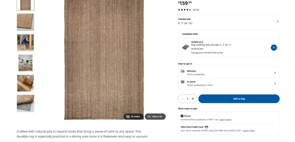
14. Optimize Product Descriptions
Your product descriptions should inform, persuade, and reassure customers. They shouldn’t only be about what it can do, but about what it does for your customers. Make sure your copy is easy to scan by adding bullet points, feature-benefit framing, and expandable details so shoppers find what they’re looking for.
Ikea creates near-perfect product descriptions by adding both technical specifications and concise descriptions. This blends the best of both worlds and lets customers visualize how their products would look in their homes.
15. Wishlist and Save-for-Later Options
Not every visitor is ready to shop as soon as they check your products. Some are waiting for a discount or sale before they buy certain products. Make it easy for them by adding a wishlist option that notifies them when any product goes on sale.
A fantastic example of this is Steam, which uses a wishlist system to notify users when a product goes on sale, both via the app and through their email.
16. Progress Indicators in Checkout
Checkout anxiety and doubts are real. Progress bars showing how much more a customer needs to do to order can reduce that anxiety by letting them know how much more is left.
It’s one of the smaller eCommerce UX best practices on the list, but it can be the differentiator between someone leaving before checking out or not.
Learn how we improved Veteran Guardian’s website traffic by 85% with a complete website redesign in our latest case study.
17. Simplify Returns
Return policies can make or break trust for most customers.
Make sure your return policies are clear and simple to understand.
And make sure to show your return policies at your checkout so customers understand what they need to do if they want to return a product.
Having a good copy of your return policy will ensure fewer issues down the road with customers.
18. Live Chats and Chatbots
Real-time assistance has been slowly closing the gap between online and in-store experiences.
Chatbots can now handle FAQs and simple questions, while live chat can provide human support for complex questions, such as return policies and issues with products.
Sephora is a great example of how a mix of a chatbot and live chat can make a difference when it comes to customer service.

19. Accessibility Features
Accessibility done right ensures inclusivity and compliance with all the global standards, such as WCAG. Alt text, ARIA labels, keyboard navigation, and color contrast are only some of the main accessibility features that your eCommerce website should have.
Accessibility features ensure that everyone is welcome on your website, regardless of their disability, and they protect you from any legal risks regarding accessibility.
20. Consistently Test and Optimize
One of the best eCommerce UX best practices from this list is understanding that your eCommerce marketing isn’t static. You should always be trying to improve your website in some way, shape, or form.
UX is truly never finished; even after applying all these eCommerce UX best practices perfectly, there is still more you can do to improve your store.
Make sure that you’re always checking your analytics and heatmaps so you learn what is effective and what isn’t. Use A/B testing regularly to optimize every single page in your eCommerce platform.
But remember, when A/B testing, don’t try to change more than one thing at a time, or it will be difficult to know what is actually working or not.
Get a Custom eCommerce Store that Converts with Blacksmith
We just went through 20 different eCommerce UX best practices and provided you with examples that directly show how big companies apply them.
You should apply all these eCommerce UX best practices to your store as soon as possible.
But we get it; applying all this not only takes a long time, but it also requires a lot of web design and development knowledge.
So what now?
That’s where we come in. Blacksmith is an eCommerce Web Design Agency with seasoned web designers and developers ready to create the perfect eCommerce website for your business.
We will tailor all of the best practices to your industry and ensure that your website stands out from the competition.
Unsure if investing in a custom eCommerce website is what your business needs?
Don’t worry, click here to schedule a call with us and we will provide you with a complete website and brand audit. This way we can show you areas on your website that need improvement and how you can fix them.


