

+126% User Engagement After Web Redesign for R&O Construction
Renowned firm R&O Construction had an outdated website that failed to reflect their legacy of quality and innovation, hindering their ability to connect with potential clients. A comprehensive web redesign focused on a brand-centric design pattern, smart navigation, and a user-friendly interface resulted in a 126% surge in user engagement and a 75% increase in new project inquiries.
About R&O Construction
With web design, BSA improved the reliability, performance, and uptime of R&O Construction
R&O Construction is a renowned firm specializing in diverse construction projects. Committed to quality and innovation, they consistently deliver on-time, within-budget solutions, backed by a dedicated team and a focus on client satisfaction. To better reflect their legacy and the benefits they provide, they needed a modern, user-centric website that could serve as a powerful tool for client engagement and business growth.
Services Rendered
The Challenge
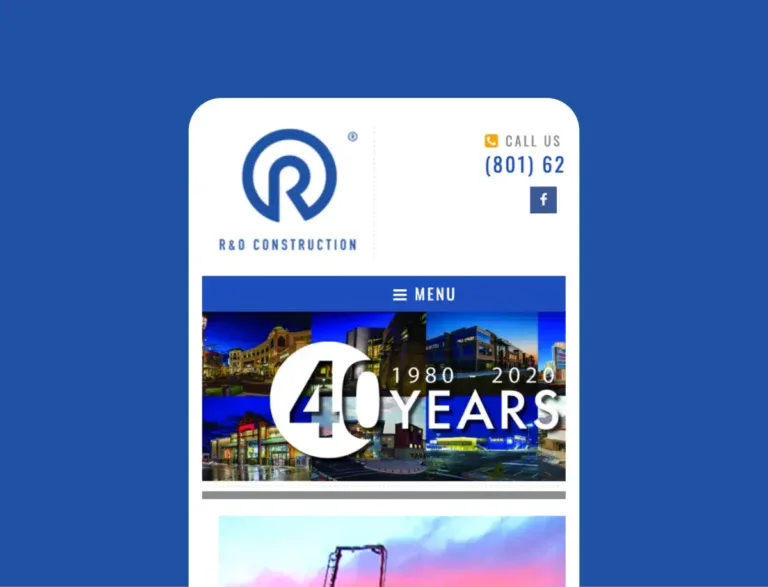
An Outdated and Unbranded Design
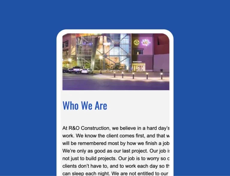
A Restrictive Technical Foundation
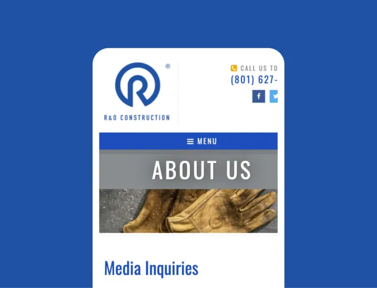
An Unengaging User Experience
The Solution
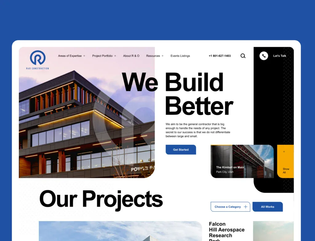
Redesigned Header for Seamless Navigation
We introduced a new header section with a simplified menu structure, making it easier for users to find key information at a glance. Clear navigation paths reduced friction and improved the overall user journey across the site.
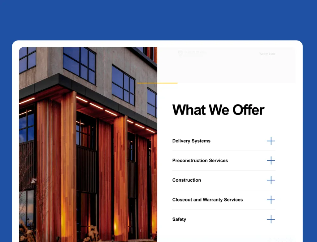
Clean Interface with Strong Visual Hierarchy
The site was restructured around a modern, uncluttered layout. Strategic use of white space, consistent branding, and clear font hierarchy guided users naturally through the content. This improved readability and also enhanced the professional presentation of the brand.
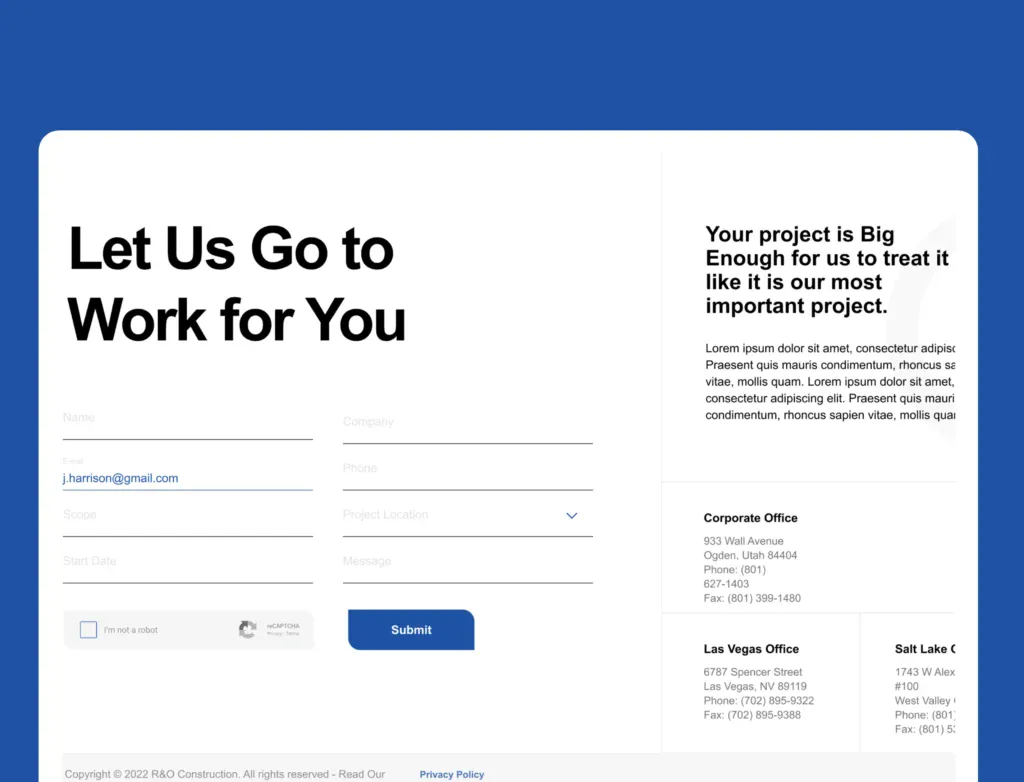
Conversion-Focused Form Design
A dedicated form was redesigned with a clear call-to-action, minimal fields, and intuitive placement. By making it simple for users to take the next step, the form served as a key driver for lead generation and conversions.
The Results
Delivering Measurable Impact
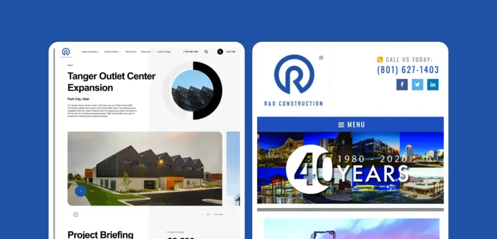
Our interventions yielded significant results for the brand.
+126%
+75%
+60%

Contact Us
Let’s Work Together
Find out if Blacksmith can be a fit for your next digital initiative!
“*” indicates required fields
