

Boosting Page Views by 128.57%
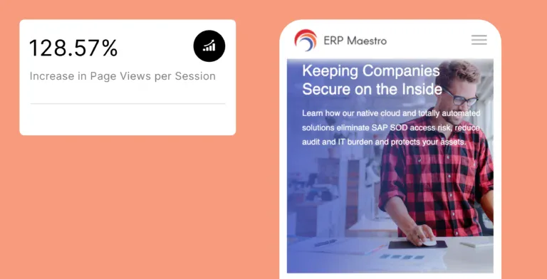
The B2B software brand ERP Maestro had an outdated website with broken elements that failed to build trust. A strategic redesign focused on a professional brand identity and a clear visual hierarchy boosted page views per session by 128.57% and reduced the bounce rate by 21.72%.
About ERP Maestro
Blacksmith transformed ERP Maestro digital presence through a data-driven web redesign
ERP Maestro is a leading software provider specializing in automated security and compliance solutions for enterprise ERP systems. Their website is their primary tool for educating a highly technical audience, from IT managers to C-suite executives, on the critical importance of their solutions and for generating qualified sales leads.
Services Rendered
The Challenge
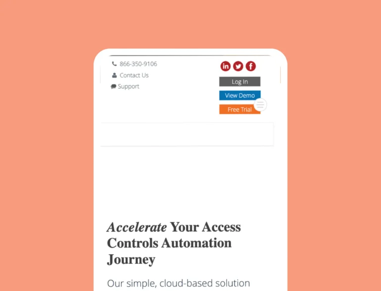
Broken User Experience

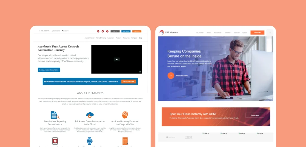
Unprofessional Brand Integration

Weak Visual Hierarchy
The Solution
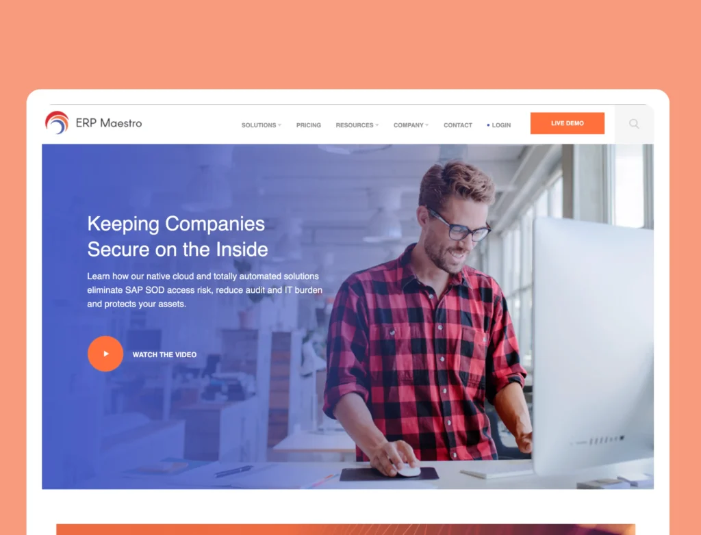
A Streamlined Layout
To combat the high cognitive load, our solution was to create a streamlined user flow. We replaced dense paragraphs of text with concise, scannable copy, supported by icons. Most importantly, we implemented clear, high-contrast Call-to-Action (CTA) buttons at key decision points, making the path to conversion intuitive and effortless.
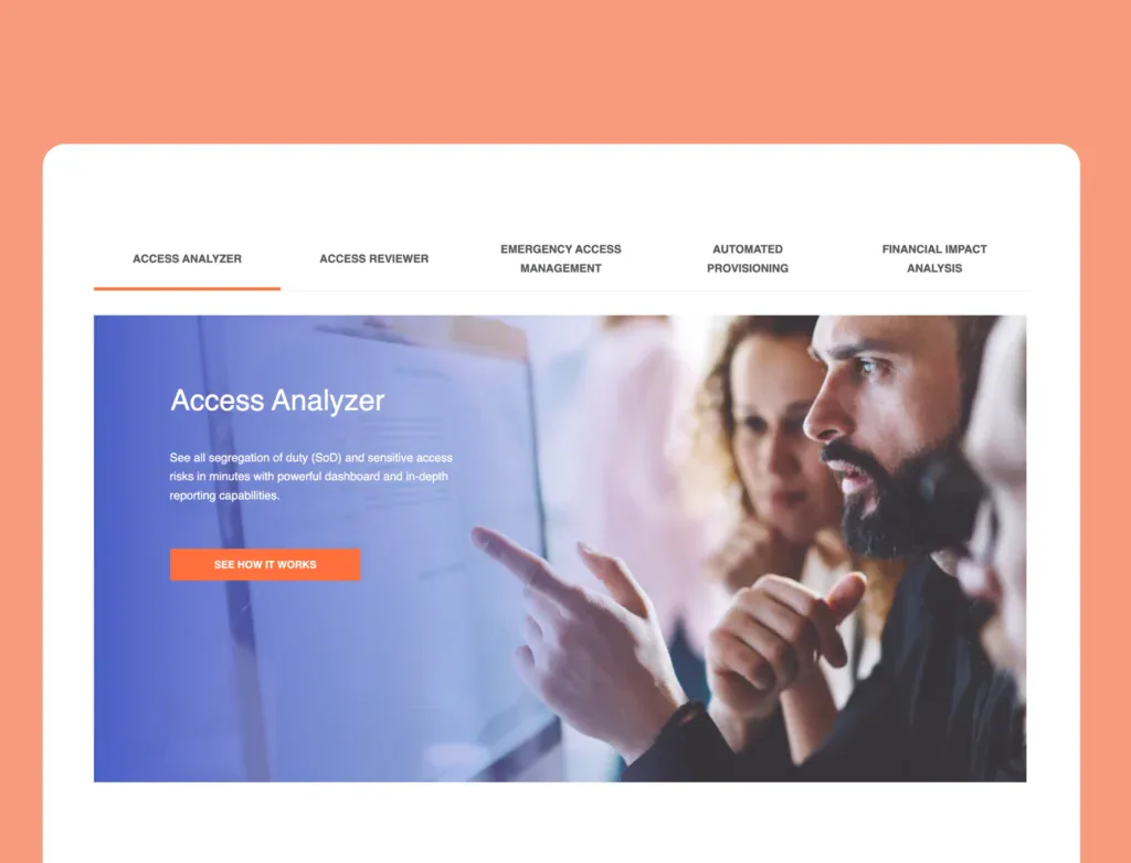
An Engaging Interface
We implemented a clean, custom design with a strong visual hierarchy and pictures to make the content more engaging. This enhanced the interface and guided users naturally through the site, encouraging them to view more pages.
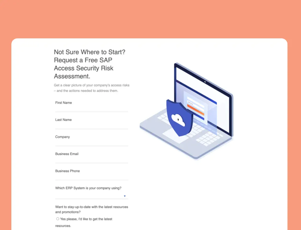
Conversion-Focused Pages
We executed a complete web architecture overhaul, designing custom sections that focused on conversion. This allowed web visitors to submit requests and learn about the company’s services quickly.
The Results
Delivering Measurable Impact
Our interventions yielded significant results for the brand.
128.57%
81.76%
-21.72%

Contact Us
Let’s Work Together
Find out if Blacksmith can be a fit for your next digital initiative!
“*” indicates required fields
