


If you run a business in San Francisco, you already know how competitive it can be. Your website is often the first thing a potential customer sees, and its main goal is to make a strong impression instantly.
This is exactly why minimalist San Francisco web design has become the go-to approach for brands that want to stand out while stripping away the noise. But don’t worry, minimalism does not mean boring. It means intentional. Let’s break down what a minimalist web design actually looks like in the Bay Area, why it matters, and how you can put it into practice.
Are you trying to improve your website but don’t know where to start? Let us help.
What is Minimalist Web Design?
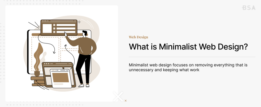
Minimalist web design focuses on removing everything that is unnecessary and keeping what works. Think of clean layouts with plenty of whitespace, simple navigation, and a clear message that is front and center. Zero clutter or distractions anywhere.
San Francisco brands such as Dropbox have been doing this for years. Their websites use very simple color palettes, generous spacing, and straightforward copy to guide users exactly where they need to go.
This is minimalist San Francisco web design in action, and it works because it respects your visitor’s time and attention. They don’t have to jump through hoops to find out what they need.
At its core, minimalism in web design follows a few guiding principles. Every element on the page should serve a purpose. If it doesn’t help the visitor understand your brand or take the next step, then it probably shouldn’t be there in the first place.
However, we don’t mean that your website should feel empty. We mean that every headline, image, button, and section is placed with a specific intention and not just included to fill space.
Why San Francisco Brands Are Going Minimalist
There are a few reasons why minimalist San Francisco web design resonates so strongly in this market.
Your Audience Expects It
San Francisco is a tech-savvy city. The people who are visiting your website are generally used to polished, high-performing digital experiences.
This means that an outdated site sticks out for all the wrong reasons. Research shows that nearly half of users judge a company’s credibility based on its website alone, suggesting first impressions carry real weight.
In a city where your competitors include some of the most well-funded startups and established tech companies in the world, a sloppy website can cost you a potential customer’s trust before they even read your headline.
The city’s culture rewards simplicity. San Francisco’s tech culture has long championed the idea that the best products are the ones that feel effortless to use. This whole philosophy extends to the web. The Bay Area’s design community tends to favor clean interfaces, functional aesthetics, and user-first thinking.
It’s no coincidence that many of the world’s most recognizable and popular minimalist websites were created in the Bay Area.
When your audience lives and works in this environment every day, they naturally expect the same level of polish from your brand.
Attention Spans Are Short
The average internet user decides in seconds whether to stay. A minimalist layout puts your key message up front so visitors grasp what you offer immediately without having to dig through layers of content.
When 94% of first impressions are design-related, you can’t afford to overwhelm visitors with competing visuals and cluttered navigation.
It Performs Better on Mobile
With around 60% of global web traffic coming from mobile devices, your site needs to look and function well on smaller screens. Minimalist designs naturally translate better to mobile since there is less content to rearrange and fewer elements competing for space.
In San Francisco, where people are constantly browsing on their phones between meetings, during commutes, or while waiting in line for coffee, mobile performance is not optional.
The Business Case for Clean Design
Minimalist San Francisco web design isn’t just an aesthetic choice. Data shows why it drives results.
Studies have found that clean, content-first layouts can increase viewing time by around 59% compared to cluttered alternatives. Simplified navigation has been shown to reduce bounce rates by up to 40%.
On the flip side, roughly 38% of visitors will leave a page entirely if the layout is unattractive. That’s a significant chunk of potential customers walking away before they even get to read your message.
Minimalist websites also tend to load faster, and speed has a massive impact on your bottom line. Sites that load in one second see conversion rates roughly 2.5 times higher than sites that take five seconds to load. Each additional second of delay can reduce conversions by about 7%.
When you remove heavy graphics, unnecessary scripts, and bloated layouts, your pages naturally load faster. For an eCommerce brand, that speed difference can be the main factor that generates tens of thousands of dollars in additional revenue per year.
There’s also an SEO advantage. Google considers page speed a direct ranking factor, and sites that meet Google’s Core Web Vitals standards tend to perform better when it comes to visibility. A faster, cleaner site doesn’t just keep visitors around longer; it helps them find you in the first place.
For marketers and brand owners, the takeaway is clear. Investing in a clean and minimalist design isn’t just for show. It’s a practical decision that directly affects your bottom line.
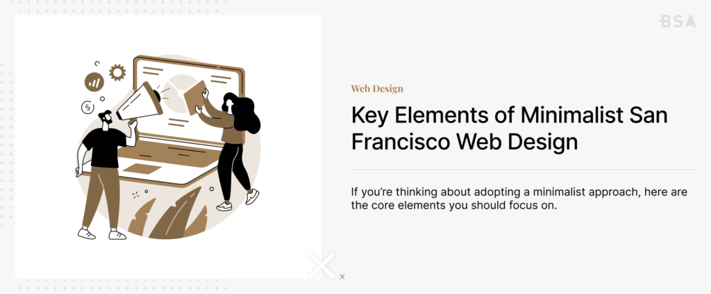
Key Elements of Minimalist San Francisco Web Design
Strategic Use of Whitespace
Whitespace isn’t wasted space. It gives your content room to breathe and helps visitors focus on what matters. About 60% of users say they prefer websites with generous negative space, which shows that it isn’t just a web design preference.
Whitespace also creates visual hierarchy, naturally guiding the eye from one section to the next without using arrows, borders, or other heavy-handed design cues.
Bold Typography
Minimalist sites tend to lean on strong typography to create visual hierarchy rather than heavy graphics or complex layouts. Choose fonts that are easy to read on any device and let your words do all the heavy lifting.
Recent UX studies showed that typography-first designs can improve readability by as much as 31%. In a minimalist framework, your font choices carry even more weight because there are fewer visual elements to compete with.
Focused Color Palette
Stick to two or three colors that align with your brand. Minimalism thrives on consistency, and a restrained palette makes your site feel cohesive and professional. Around 85% of users prefer websites that have a clean, minimal background, so you don’t need a rainbow to make an impact.
A well-chosen accent color can draw attention to key buttons and links without overwhelming the rest of the page.
Clear Calls to Action
Every page should have a purpose. Whether it’s signing up for a newsletter, booking a demo, or making a purchase, your call to action should be easy to find and nearly impossible to miss. Placing CTAs above the fold has been shown to improve conversions by about 30%. Minimalist design actually makes this a lot easier since there are fewer distractions on the page, which means that your CTA naturally stands out more.
Fast Load Times
Fewer design elements generally mean faster pages, and speed matters more than most people realize. Nearly half of users expect a page to load in under 2 seconds.
Over half of mobile users will abandon a site that takes more than three seconds to load. For San Francisco brands competing in crowded markets, every fraction of a second counts.
Intuitive Navigation
A minimalist navigation menu doesn’t just look cleaner; it actually helps visitors find what they’re looking for faster.
Research suggests that minimalist navigation menus improve click-through rates by around 17%.
Limit your main menu to the most essential pages and use clear, descriptive labels. If someone can’t figure out where to go within a few seconds, then you have bigger problems.
The Role of Dark Mode and Adaptive Designs
One of the most recent and useful developments in minimalist San Francisco web design is the adoption of dark mode and adaptive color systems. With more than 80% of users using dark mode on their devices, designing for both light and dark environments has become essential for modern websites.
Dark mode pairs naturally with minimalist design because it reduces visual noise and draws attention to key content. It also reduces eye strain in low-light conditions, which matters for users who browse in the evening or in dimly lit spaces. For San Francisco brands that cater to tech-savvy audiences, offering a dark mode option signals that you’re paying attention to current user preferences.
Adaptive designs go a step further by automatically adjusting layout contrast and color based on factors like the user’s device settings, time of day, or ambient lighting. This kind of responsiveness is becoming a baseline expectation rather than a premium feature.
What a Minimalist Design is Not
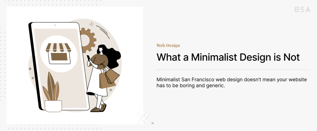
It’s worth clearing up some common misconceptions about minimalist design. Minimalist San Francisco web design doesn’t mean your website has to be boring and generic.
One common challenge we see with changing to a minimalist design is that too many brands adopt the same stripped-back look and end up looking identical.
The best minimalist sites find ways to inject personality without adding clutter. This can be through custom illustrations, subtle micro-animations on hover, or a distinctive voice in your copywriting. In fact, micro-animations in particular have gained traction in recent years.
Small touches like hover effects and smooth transitions can guide users intuitively without cluttering the interface, and studies suggest they can boost engagement by up to 20%.
Your goal with your website is to be simple but memorable.
Minimalism also doesn’t mean removing important information. Some products and services require detailed explanations. Minimalism is about organizing that content thoughtfully so visitors can find what they need without feeling overwhelmed. A well-structured FAQ section, expandable content blocks, or tabbed layouts can house detailed information without cluttering the main page.
Minimalism isn’t a one-size-fits-all solution. Some industries thrive on visual richness and complexity. However, for most San Francisco brands, especially those in tech, SaaS, fintech, and professional services, a clean and focused design tends to outperform busier alternatives.
How a Minimalist Design Supports Marketing Goals
For marketers, minimalist San Francisco web design isn’t just about looking good. It’s about creating a space where their campaigns can perform at their best.
When you drive traffic to a landing page through paid ads, email, or social media, you want visitors to focus on one thing: your offer. A cluttered page with competing visuals, multiple CTAs, and distracting sidebar content dilutes focus. A minimalist landing page, on the other hand, removes the friction and keeps the visitor’s attention where it needs to be.
This matters especially for paid campaigns where every click costs money. If you’re spending on Google Ads or Meta campaigns and sending traffic to a slow, cluttered page, you are wasting your budget. A clean, fast-loading landing page improves your return on ad spend (ROAS) by giving visitors a frictionless path to conversion.
A minimalist design also supports brand consistency. When your website uses a tight color palette, consistent typography, and clean layouts, it becomes significantly easier to maintain the same look across your social channels, email templates, ad creatives, and printed materials.
That consistency builds recognition and trust over time, which is especially valuable in a competitive space like the San Francisco market to differentiate your brand.
Get a Custom Minimalist Website That Converts With Blacksmith
After reading this article, it’s clear that investing in minimalist web design is a great choice for most brands. But we’ll be honest with you, creating a minimalist web design can take weeks, if not months, of constant trial and error. This is time you could spend on other areas of your business, so what now?
That’s where we come in. Blacksmith is a San Francisco Web Design Agency, a team of web designers and developers ready to create the perfect minimalist website for your brand.
Still unsure if investing in a new minimalist website is what your business needs to grow? Don’t worry. Schedule a call with us, and we’ll provide you with a full website audit. This way, we can show you where your website might be losing clients and how a minimalist website can help.


