


Key Takeaways
- Typography is a brand asset that affects trust, credibility, and first impressions.
- Fonts should align with brand positioning, audience expectations, and industry norms, not personal preferences.
- Digital-first performance, including readability across devices and platforms, is a must.
- Fonts should prioritize clarity, accessibility, and consistency for long-term usability and scalability.
- Simple, well-governed typography systems outperform complex or trend-driven font choices over time.
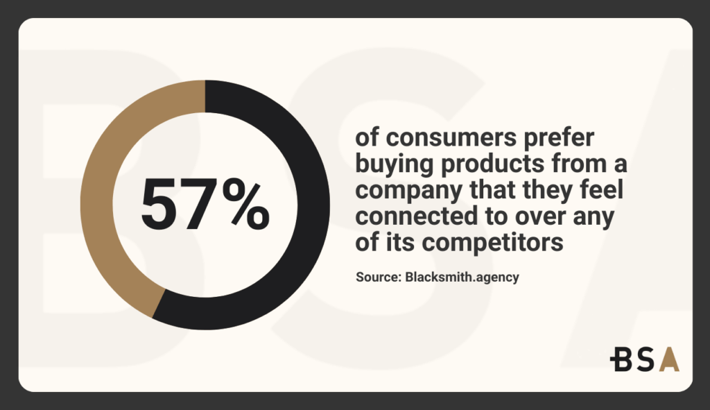
Did you know 57% of consumers prefer buying products from a company that they feel connected to over any of its competitors? One of the best ways to connect and hook a potential customer into a loyal customer is with the proper use of branding tools, such as fonts.
But choosing the best fonts for business isn’t only about finding the one that looks the best for you and using that. Typography functions as a core strategy that directly influences perception, trust, usability, and long-term recognition.
Fonts set the tone before anyone reads a word. They influence how customers see the brand’s credibility, professionalism, and emotions.
Typography is a key element across many areas. It appears on websites, mobile apps, marketing materials, presentations, packaging, and internal documents. When used correctly, fonts can reinforce brand positioning and improve clarity.
This article provides an easy-to-understand framework for selecting the best fonts for business branding. It connects typography psychology, brand positioning, audience expectations, and practical implementation. This makes it so that all of your font choices actively support your brand’s growth no matter what.
Trying to improve your branding but don’t know where to start? Let us help.
Why Typography Matters in Business Branding
Typography is often seen as an afterthought in branding. But in reality, typography should be seen as a major pillar in any branding strategy due to its close connection to brand voice. The structure, spacing, and style all influence how a message is interpreted and processed.
From a branding perspective, fonts serve four core functions.
First, they establish immediate perception. Users can judge credibility and quality before seeing your product or its descriptions.
Second, they can reinforce brand personality when picked correctly. Fonts can convey traits like authority, approachability, precision, creativity, and innovation. This depends on their style and features.
Third, they support usability and accessibility. Readability across devices and environments can affect engagement, comprehension, and conversion.
Fourth, they can enable consistency at scale. As brands grow, typography becomes a core stabilizing element across teams, vendors, and channels.
Choosing the best fonts for business branding can seem a bit complicated when you consider these four points, but we’ll help simplify the process for you.
Knowing Your Branding Positioning Before Picking Any Font
Before even considering a new font, businesses should clearly know what their brand stands for and how they want customers to perceive them. This is vital since the typography picked should reinforce and express this strategy, not compensate.
Every single brand operates along some sort of dimension, such as:
- Formal vs. informal.
- Traditional vs. modern.
- Conservative vs. expressive.
- Authoritative vs. friendly.
A font that signals precision and authority will feel out of place if your brand is a playful consumer brand. An expressive and unique font will make consumers question whether they can trust this enterprise.
The best fonts for business branding are the ones that reinforce the company’s goals without making them explain themselves.
Aligning Fonts with Business Category Norms
Typography does not exist in a vacuum. Industry context shapes expectations. Financial services, healthcare, legal, and B2B technology sectors often prioritize clarity, restraint, and credibility. Creative industries, lifestyle brands, and consumer startups often embrace bold and unique typography.
Strong and effective branding does not mean that you should ignore category norms within your industry. It means understanding them well enough to align with them deliberately while knowing when to deviate from them to stand out.
The Psychology Behind Business Typography
Typography psychology examines how the visual characteristics of fonts directly influence and affect cognitive responses. These effects mainly occur subconsciously and consistently across most audiences.
Serif Fonts
Serif fonts are generally associated with heritage, stability, and trust. Their letterforms guide the eye along lines of text, which primarily improve readability in long-form content. For business branding, serif fonts are mainly used to convey credibility, expertise, and longevity.
You can generally see designers using serif fonts in sectors where seriousness and professionalism matter the most, such as finance, law, publishing, and education.
Sans-Serif Fonts
Sans-serif fonts are generally seen as simple and efficient fonts when compared to serif fonts. Their clean forms perform well on screens and are widely used in digital-first brands. For many companies, sans-serif is the perfect balance between professionalism and accessibility.
As digital touchpoints dominate brand experiences, sans-serifs are often among the best fonts for business branding due to their versatility and legibility.
Script and Decorative Fonts
Script and decorative fonts carry strong emotional signals but have reduced readability. In business branding, it’s uncommon to use this font for body text or main interfaces. However, when used sparingly in headers, logos, and accents, it can add personality and uniqueness.
Their use should be intentional and controlled, especially in professional and scalable brand systems.
Readability and Legibility as Business Requirements
A font may look unique and easy to read in isolation but fail when deployed across real-world scenarios. Both readability and legibility are non-negotiable for business branding.
Readability is about how easy it is to read longer texts. Legibility focuses on how well you can see and recognize each letter. Both are equally important and benefit from each other.
Any font with tight spacing, hard-to-read characters, or extreme stylistic features can cause cognitive load for users. For businesses where users scan, compare, and decide in a matter of seconds, this friction can cost conversions altogether.
The best fonts for business focus on clarity under real usage conditions. This means understanding how the font appears on small screens and in low-contrast settings. It also considers how customers view content.
Explore how we increased bulb’s new users by 22.6% with a new branding strategy in our most recent case study.
Choosing Fonts Based on Your Target Audience
The font you pick should directly reflect how your audience thinks, acts, and consumes information.
B2B and Enterprise Audiences
B2B audiences typically value clarity, precision, and efficiency. Fonts’ main goal should be to reduce friction and signal competence from the moment a potential customer sees it. Neutral, highly legible typefaces often outperform expressive designs in enterprise environments.
Consumer and Lifestyle Audiences
Consumer brands can and should prioritize emotional resonance and memorability. Typography can play a strong role in differentiation, as long as readability and legibility isn’t affected in the process.
Global and Multilingual Audiences
For businesses that work globally, choosing a font is key. It must support different languages and diacritics. Also, be aware of character differences that can change completely. A font that might work perfectly in English may look strange in another language.
Typography Considerations for Digital Content
Modern business branding is mainly digital. Websites, mobile apps, SaaS platforms, dashboards, email campaigns, and digital documents are how people find a brand today. As a result, typography must be evaluated not only for aesthetics but also for performance in digital environments.
Screen Performance and Hinting
Fonts created for screen use have optimizations that improve clarity at various resolutions. Poor clarity reduces performance and can lead to eye strain, which ultimately brings with it reduced engagement.
Digitally optimized fonts take into consideration pixel grids, hinting, and anti-aliasing behaviors across operating systems and browsers. Testing and ensuring that your font looks good on iOS, Android, and Windows is vital.
Responsive Scaling
Typography must adapt instantly across different screen sizes. Fonts with balanced proportions and a clear hierarchy scale more effectively in responsive websites. Choosing the best fonts for branding means picking typefaces that stay strong across breakpoints.
Some fonts stay clear and proportional when scaled down. This helps keep stroke contrast and spacing intact. But others can completely collapse visually at smaller sizes. This makes body text hard to read and headlines overly dense. Choosing the best fonts for business branding means prioritizing typefaces that maintain structural integrity across breakpoints.
User Interface and Product Typography
For businesses with digital products, typography isn’t just about marketing. It plays a key role in user interface (UI) design. Fonts must support rapid scanning, data density, and extended reading sessions. In these contexts, neutrality and clarity often outperform uniqueness and personality-driven type choices.
UI typography should be easy to read and reduce overall cognitive load rather than introduce visual novelty. Fonts that have a consistent width, open counters, and have predictable spacing help users read and process information faster while reducing overall friction.
Font Pairing for Business Branding Systems
The most successful brands rely on a typography system rather than a single typeface. A systems approach ensures flexibility while keeping consistency.
Establishing Hierarchy Through Contrast
Effective font pairing creates visual hierarchy without confusion. This hierarchy helps users easily tell apart headlines, subheadings, body text, captions, and interface elements.
You can create contrast by using different types of fonts. This includes serif versus sans-serif styles, as well as variations in weight, width, or optical size. But contrast needs to be intentional. Pairings that are too similar can feel accidental, while pairings that contrast too much can feel disconnected.

The best fonts for business branding work together effortlessly while clearly signaling functional differences within the content.
Limiting Complexity for Scalability
A common mistake in font pairing is making it too complex and overthinking it. Too many font families or weights can hurt consistency. This issue often arises as teams grow or when outside vendors join in.
Strong branding systems often use one main font family with different weights. They also include a secondary font for support. This approach simplifies the strategy. It balances flexibility with governance. Plus, it makes implementation easier on different platforms.
Consistency Across Marketing and Product
Font pairings should work equally well in marketing materials and product environments. If the typography system fractures between brand and product, the brand experience will start to feel disjointed.
Evaluating font pairings across real use cases, landing pages, email headers, UI tables, and long-form content ensures consistency and avoids having to redesign down the road.
Custom Fonts vs. Licensed Fonts
Having to pick between custom and licensed fonts is a brand decision that is mainly tied to your long-term goals and scale.
Advantages of Licensed Fonts
Licensed fonts offer reliability, speed, and cost efficiency. Established type foundries take all the risk by heavily testing, ensuring complete language support, and performance optimization. For most small to mid-sized businesses, licensed fonts provide the most flexibility without the complexity that custom fonts bring with them.
Strategic Value of Custom Fonts
Custom fonts create a visual asset that competitors can’t replicate. They also allow brands to insert their personality and uniqueness directly into their fonts, which strengthens long-term recognition.
However, custom fonts require a big commitment and investment, not just design-wise, but in maintenance, updates, and documentation. Without strong brand governance, the benefits of custom typography can quickly disappear.
Custom fonts are most effective for organizations and large corporations with an established branding strategy, internal design resources, and an organized brand guideline.
Evaluating ROI in Typography Decisions
The decision between custom and licensed fonts should be grounded in return on investment (ROI), not just looks. A custom font doesn’t magically improve branding outcomes if the underlying strategies and executions are weak.
For many businesses, licensed typefaces serve as the best fonts for business branding due to their safety and consistency, rather than bespoke designs used inconsistently.
Accessibility and Inclusive Typography
Accessibility is a core component of any successful and professional business branding. Typography choices directly impact whether a user can engage with your content comfortably or not.
Legibility for Diverse Users
Inclusive typography considers users with visual impairments, cognitive processing styles, and reading contexts. Fonts with ambiguous characters, tight spacing, or excessive stylization can make it hard for these people to read your content quickly.
Clear differentiation between characters such as “I,” “l,” and “1” is very important in digital interfaces, forms, and data-heavy areas.
Compliance and Risk Management
Digital accessibility is a legal requirement in most industries and countries. Typography that fails to meet accessibility standards exposes your company to compliance risks and reputational damage.
Accessible fonts lessen the need for design fixes like big font sizes or extra spacing. These fixes can disrupt the layout’s consistency.
Accessibility as a Brand Signal
Beyond compliance, inclusive typography signals professionalism and empathy. Brands that focus on accessibility respect their audience. This attention to detail builds trust.
The best fonts for business branding are easy to read and look great. They show that clarity and inclusivity can go hand in hand.
Typography and Brand Consistency
Typography only holds value when you apply it consistently across all your pages and touchpoints.
The Role of Brand Guidelines
Clear typography guidelines ensure that all of your teams, partners, and vendors use fonts correctly. These guidelines should not only show what fonts you’re using, but also how to use them effectively.
Well-structured guidelines reduce interpretation errors and prevent visual drift over time. They also shorten the time that new team members and agencies need to adjust.
Consistency across channels
A brand’s typography should be consistent across all platforms. This includes websites, mobile apps, presentation decks, and marketing emails. Using the wrong font can hurt recognition. It also shows your business may lack discipline.
But remember, consistency does not equal rigidity. It means controlled flexibility within specific parameters.
Scaling Typography
As your business grows, more people learn about your brand. Typography that is simple, documented, and easy to use scales a lot more efficiently than complex systems reliant on expert oversight.
Learn how we increased Coaching Right Now’s returning users by 20.9% with a new branding strategy in our latest case study.
Common Mistakes When Picking a New Font
Here are some very common typography errors we often see from misaligned priorities rather than a lack of options.
Prioritizing Trends Over Brand Strategies
Design trends come and go, but your typography decisions should be seen as long-term investments. Fonts picked mainly for trend relevance will generally feel dated in a matter of years, which forces you to rebrand earlier than you should.
Businesses that focus on a timeless font rather than a noble one will save themselves a lot of work and stress in the future.
Designing for Internal Taste Rather Than Client Needs
Internal stakeholders often project personal preferences onto brand decisions. While internal alignment matters, the font you choose should cater to your audience first.
Fonts that look “interesting” to team members might be confusing and unappealing to your audience.
Over-Customization
Too much customization, like using many fonts and styles, creates inconsistencies and errors. Complexity increases maintenance costs and dilutes brand clarity.
The best fonts for business branding thrive when they are met with a defined branding strategy instead of unrestricted experimentation.
Get a Custom Branding Strategy That Converts With Blacksmith
Choosing the right font for your business can be more complex than it looks. After reading this guide, you might see that there’s more to it than just picking one.
The reality is that picking your brand’s font is a vital step for any business that wants to grow. But there are several steps that you should have in check before that. Knowing what those steps are and working on them could take you weeks or even months to complete. That’s time you could be using on other aspects of your business. So now what?
That’s where we come in. Blacksmith is a Professional Branding Agency with a group of digital marketing experts ready to create the perfect custom branding strategy your business needs. From a branding guideline to ideal fonts, your business will have the branding it deserves.
Still unsure if investing in a new branding strategy is the best idea for your business? Don’t worry, schedule a call with us and we’ll provide you with a complete brand audit. This way, we can show you the areas where your brand might need some help and what we can do to improve it.


