


Want UX tips for apartment websites that turn browsers into renters? Users leave websites that take longer than a second or two to load. Bad design makes them abandon your site faster. Your apartment website faces fierce competition. Modern renters expect fast, tailored, and adaptive interfaces that work well on their phones.
This piece covers 15 UX design trends and the best UX tips you need to implement in 2026. You’ll find UX design tips and tricks for everything from 3D floor plans to AI chatbots, mobile-first design to accessibility features that expand your renter pool.
1. Interactive 3D Floor Plans and Virtual Tours
Renters make faster decisions when they can explore units before scheduling in-person visits. Data show that 82% of buyers are more likely to request a tour if a listing has floor plans. This statistic reveals why 3D visualization has become a critical component of apartment marketing.

Traditional 2D floor plans force potential renters to imagine spatial relationships and furniture placement. 3D floor plans eliminate this guesswork.
They showcase unit layouts with realistic depth and detail. Prospects can see how rooms connect, where natural light enters through windows, and how their furniture might fit in each space. This visual clarity reduces renting stress and builds confidence in decision-making.
Implementation Tips for Virtual Tours
Your equipment choices determine tour quality. Start with a 360-degree camera like the Ricoh Theta Z1 or Insta360 X4, paired with a quality tripod. A sturdy tripod costs around $100 give or take.
Lighting consistency matters more than most realize. Turn all lights on or keep them all off throughout the tour. Mixed lighting disrupts the visual experience and lacks continuity from room to room. Film during daylight hours. Natural light makes units appear more inviting and showcases spaces at their best.
Common Mistakes to Avoid
Poor preparation ruins otherwise good tours. Remove clutter and personal items before filming. Prospects want to imagine their belongings in the space, not work around current tenant possessions.
Avoid using heavily edited or AI-generated images that misrepresent unit size. Trust erodes when viewers find the virtual tour doesn’t match reality. Authenticity builds credibility. A small closet shown honestly won’t break the deal, but deceptive staging will.
Technical issues kill engagement. Check battery levels on all equipment before starting. Test camera positioning in each room and review footage for stitching errors. Even minor technical problems distract viewers and diminish your professional image.
2. Mobile-First Responsive Design
Google’s search ranking algorithm now heavily emphasizes page experience, with mobile-friendliness serving as a core signal. Your community website ranks lower in search results when it lacks mobile optimization. Visibility and lead generation capacity suffer as a result.
Three-quarters of apartment searches happen on mobile devices. The conversion timeline accelerates on mobile, too. Data reveal that 70% of mobile searches result in an action in less than an hour. Renters using mobile devices have more urgent needs compared to desktop browsers.
Best Practices for Mobile Apartment Browsing
Responsive design adapts content to suit whatever screen size views it. The approach relies on flexibility rather than creating separate mobile versions. Breakpoints determine when layout changes occur. Property grids display well on desktop, but responsive design converts them to single columns on mobile screens.
Touch interaction requires different considerations than mouse cursors. Clickable elements just need bold colors for visibility and larger sizes for easy tapping. Buttons should measure at least 44×44 pixels. Well-spaced navigation links prevent mistaps.
Forms create friction on mobile devices. Keep them short by requesting only the name, phone number, email address, and preferred tour type. Drop-down menus, radio buttons, and tick boxes reduce typing requirements. Long forms greeting mobile visitors cause abandonment right away.
Registration functionality shouldn’t disappear on mobile. Users need the option to save searches and favorite properties across devices. A great responsive website captures as many leads on mobile as on desktop.
Common Mistakes to Avoid
Treating mobile as an afterthought damages your lead generation. Many property managers rely on pre-built, templated mobile websites provided by property management software companies. The desktop version may meet expectations, while the mobile version remains inadequate.
Poor optimization makes accessing media on small screens difficult. Renters experience frustration sorting through floor plan and amenity pages on badly designed mobile sites. Prospects struggle to learn about apartments while navigating your mobile site, so they move on quickly, and you lose great leads.
Testing across devices matters. Use Google’s Mobile-Friendly Test to review your site’s mobile performance. Browser developer tools simulate different screen sizes and help identify issues. Test property listing layouts, navigation menu functionality, contact form submissions, and loading speeds across various devices.
3. High-Performance Image Loading for Amenity Galleries
Your amenity galleries showcase pools, fitness centers, and common areas through multiple high-resolution photos. These visual assets attract renters. They also create performance bottlenecks when poorly optimized.
Google considers page speed when ranking websites. Slow sites receive lower search visibility. You’ll spend more on paid advertising to compensate for lost organic traffic. Your competing properties with faster websites rank higher and capture leads before prospects find your listings.
Implementation Tips for Fast Image Loading
Compress images without sacrificing visual quality. Tools reduce file sizes by removing metadata and color profiles that browsers don’t need. The standard for web-optimized images sits at 72 pixels per inch.
Serve modern formats like WebP and AVIF. These formats deliver better compression than JPEG and PNG. Use the <picture> element with <source> to provide fallback options for older browsers.
Add the loading=”lazy” attribute to images. This native browser feature delays loading offscreen images until users scroll near them. The technique saves bandwidth and prioritizes visible content.
Add height and width attributes to prevent layout shifts. Browsers reserve proper space for images before they load and create stable page experiences.
Use srcset and sizes attributes to serve images sized for screen resolution. A 100px display shouldn’t receive a 1000px image file.
Common Mistakes to Avoid
Skip serving oversized images. Match image dimensions to display requirements. Large files waste bandwidth and slow down load times.
Avoid using only PNG format for photographs. While PNG supports transparency, file sizes balloon compared to compressed JPEG or WebP alternatives.
Don’t lazy-load images visible in the initial viewport. This delays critical content and frustrates users immediately.
4. Simplified Contact and Booking Forms
Form abandonment costs you qualified leads every day. Your inquiry form acts as the bridge between interest and action. Poor design creates friction that sends prospects to competing properties.
Renters browse apartments during lunch breaks, commutes, and evening searches. Forms that require excessive typing or difficult navigation on smartphones lose these time-sensitive leads.
Best Practices for Lead Capture Forms
Request only information you’ll use. Name, email, and message fields are enough for the original contact. Asking for company size or budget requires giving prospects clear reasons to share. One property reduced fields from 11 to 4 and saw conversions jump by 120%.
Replace generic “Submit” buttons with specific action phrases. “Schedule Your Tour” or “Request Availability” sets clear expectations and feels more human. Tests show these value-driven calls-to-action improve conversion rates substantially.
Send confirmation right after submission. Automated emails showing received information, plus response timeframes, demonstrate organization. Add next steps, like calendar links for demo bookings or FAQ locations for support questions.
Common Mistakes to Avoid
Long forms overwhelm prospects and trigger abandonment. Cart abandonment reaches 70% when checkout forms become too complex. Skip requesting full addresses, company details, and job titles for simple tour requests.
Complex captchas that require users to solve difficult problems should be avoided. Google reCAPTCHA v2 or v3 verifies human visitors without frustration. Honeypot techniques eliminate captchas while blocking spam.
Prospects shouldn’t wonder about next steps. Add text below buttons like “We’ll respond within 24 hours” to set expectations. Silence after submission breeds doubt about whether forms were sent.
Bugs and skipped testing damage conversions. Preview forms on devices of all types before launch. Check battery levels, review footage for errors, and verify submissions reach your inbox.
Cluttered layouts create cognitive overload. Group related fields, add white space between sections, and use headers to break lengthy forms. Clear visual hierarchy guides users through completion.
5. Clear Pricing and Availability Transparency
All-in pricing removes ambiguity from the leasing experience. When you publish rates that reflect every recurring charge, from utilities and parking to pet fees, renters see what they’re paying for and why.
This clarity makes choices realistic, improves lead quality, and boosts closing ratios. You end up with leads who know they can afford your units and can move forward to sign a lease.
Implementation Tips for Displaying Rates
Pricing consistency matters on platforms of all types. Audit rent prices on your property management system, website, online application portal, chatbot, and listing sites. Mismatched rates create confusion and erode trust when prospects find inconsistencies.
Check your API settings to verify each platform pulls from the correct pricing field. Understanding sync schedules helps you spot lags and minimize gaps between pricing updates.
Several states now require fee disclosure. Properties in Connecticut, Massachusetts, Minnesota, Nevada, and Colorado must comply with total-price disclosure laws. Compliance reduces legal dispute risks.
Common Mistakes to Avoid
Hidden fees destroy credibility. Renters notice when advertised rent is different from actual monthly costs. Outdated pricing from delayed sync confuses prospects and forces your leasing team to work harder.
They must verify correct amounts and regain trust. Review sync timing to prevent displaying stale rates from days ago.
6. Neighborhood and Location Information Integration
Renters purchase lifestyles, not just square footage. Your prospects want to know what the surrounding community offers beyond your property lines. They need information about nearby activities, restaurants, and landmarks before deciding where to live.

Commute times determine apartment viability. Proximity to work or public transportation saves time, especially when you have traffic that creates stress each day. Renters want realistic commute estimates from your property to their workplaces or schools.
Best Practices for Showcasing Neighborhoods
Break location data into digestible segments with hyper-local categorization. Display specific neighborhood information rather than generic city descriptions. Name the actual neighborhood in your copy. Don’t assume prospects know your area as well as you do.
Interactive mapping tools show your property’s relationship to local businesses, schools, and transportation. These maps help users visualize their routines and explore the area context before visiting.
Neighborhood insights from residents living in your area add authenticity. Highlight specific details like walkability to coffee shops and proximity to farmers’ markets. Describe what makes each neighborhood unique.
Common Mistakes to Avoid
Map filters that don’t populate results frustrate users. Test all interactive features before launching. Skip generic statements and provide specific examples that paint clear lifestyle pictures.
7. AI-Powered Chatbots for Instant Responses
Speed determines whether prospects become residents or disappear to competitors. The gap between interested and gone is measured in minutes rather than days.
Chatbots simulate live interactions on apartment websites by providing instant responses, answering questions, and capturing lead information. Modern renters expect immediate assistance, and this immediacy addresses that expectation.
AI-powered chatbots offer 24/7 engagement. Potential residents browse property listings late at night and on weekends when leasing offices close. Answering queries around the clock puts your apartments on the map and builds strong engagement while reducing lead drop-off. You never miss opportunities from prospects researching during off-hours.
Instant responses reduce frustration and keep conversations going without delays. Potential renters arrive with immediate questions about price, availability, location, and features when they visit property websites.
Implementation Tips for Apartment Chatbots
Define your chatbot’s purpose before deployment. Setting up a chatbot because other communities use them misses the value that this technology offers. Create specific goals around your chatbot’s deployment. Decide whether you want users to fill out rental applications, schedule virtual tours, or capture contact information for future outreach.
Focus on metrics like bots triggered, user engagement, handoff percentage, and leads captured. Error messages, customer satisfaction scores, and bounce rates all deserve analysis. Continuous monitoring and retraining improve chatbot performance and coverage for user intent. These customer insights reveal what works and what drives people away silently.
Brand your chatbot thoughtfully. Chatbots become part of your brand once you let them loose. Give your bot a name corresponding to your community, use brand colors for the chatbot interface, and assign a personality. Many brands now use chatbot technology, making it worthwhile to think about distinguishing features so your bot stands out.
Common Mistakes to Avoid
Creating pushy chatbots drives prospects away. Spammy, aggressive bots push prospects to competitors unintentionally. Moderation matters. A bot should gauge user responses and know when to back off. Sending quick reminders when users remain unresponsive proves acceptable, but sending notification series sends prospects running elsewhere.
Long-winded messages defeat chatbot purposes. Many people prefer communicating with chatbots to get quick answers about apartment communities rather than hunting for information on property websites. Sending large text blocks undermines this advantage.
Your apartment chatbot should add value and create pleasant, helpful experiences supporting business goals, so keep answers clear and concise. Long-winded bots prove equally annoying as pushy ones.
Relying solely on AI without human oversight creates issues. AI streamlines many tasks from tenant screening to maintenance scheduling, but depending entirely on automation without human checks leads to problems. AI tools excel at automating repetitive tasks yet still require human oversight to handle nuances, exceptions, and decisions based on personal judgment.
Chatbots fall short in situations where emotions run high. Distressed customers dealing with urgent issues want people who can empathize, not scripted bots.
8. Advanced Search Filters and Sorting Options
Apartment hunting creates stress when renters must sift through hundreds of unsuitable listings. Using filters that narrow results based on specific parameters provides the most effective way to minimize search time. Prospects waste hours reviewing properties that fail to meet simple requirements without proper filtering capabilities.
Thousands of properties exist in a market, which makes search customization unrealistic without filters. Renters cannot manually inspect every listing. Filtering saves time and mental energy by eliminating unsuitable options before prospects even view them.
Price range filters prevent emotional disappointment. Renters experience sticker shock while browsing apartments, but filtering search results to specific price ranges prevents them from falling in love with unaffordable units.
Move-in dates affect availability. Platforms that let users set move-in date filters show only properties available when needed. Time is wasted on units with incompatible timelines without this feature.
Best Practices for Apartment Filtering
Start filtering with non-negotiable criteria before learning about priorities. Set maximum monthly rent, including all fees, desired bedroom and bathroom counts, and target move-in dates first. Properties that are unsuitable get eliminated right away with this foundation.
Apply location filters next using neighborhood names, zip codes, or custom map boundaries. Drawing specific areas on interactive maps focuses searches on acceptable commute radii. Users love map features for setting perimeters around desired neighborhoods and learning about areas visually.
Natural language processing understands the meaning and intent behind queries rather than requiring predefined terms. Users don’t browse hundreds of mismatched listings or spend hours refining filters. They express needs in plain English and receive accurate, relevant results. Synonyms, variations, and nuances that keyword searches miss are understood by this technology.
Some platforms already implement natural language capabilities. Users can type conversational queries such as “three-bedroom house with a pool near downtown” or “condo with a view of the lake under $500k.” Appropriate filter combinations are created from these requests automatically.
Real-time availability syncing prevents frustration. Prospects get annoyed when they find perfect properties only to learn they’re already rented. Syncing with Property Management Systems solves this instantly. Guests should set flexible arrival and departure dates with clear calendar feedback rather than guess at availability.
Common Mistakes to Avoid
Outdated or inaccurate listings destroy user trust. Units advertised at specific prices may have already been rented or had price increases. View listings as starting points and always verify details with landlords or property managers directly. Platforms must sync data frequently to prevent displaying stale information.
Filters that are too narrow frustrate users by yielding few or no results. Platforms must detect these bottlenecks in real time and adjust parameters or suggest related alternatives automatically. Balance keeps experiences productive without overwhelming users. Systems should explain why and recommend loosening specific criteria when filters eliminate all results.
Missing essential filter options limits platform usefulness. Simple filters like rent budget, number of rooms, and rental type prove insufficient. Advanced platforms distinguish themselves through amenity filters, pet-friendliness options, availability calendars, and property ratings. Prospects face many housing options, which makes these factors decisive.
Failing to offer natural language search falls behind user expectations. Renters find traditional keyword and filter navigation frustrating and time-consuming. Modern platforms that provide conversational search interfaces save time and improve accuracy compared to manual filter manipulation.
Access to filters is blocked behind registration walls, which backfires. Users want to explore options before committing contact information. Require registration for saved searches and alerts, but allow simple filtering anonymously.
9. Accessible Design for All Users
Web accessibility affects 61 million Americans with disabilities who need equal access to online information.
Inaccessible websites exclude people just as physical stairs block wheelchair users. Noncompliance carries steep consequences. Websites that prioritize accessibility reach broader audiences, capture more interest, and demonstrate your commitment to inclusivity.
Implementation Tips for Inclusive Design
Color contrast between text and backgrounds must be sufficient. Users with limited vision or color blindness cannot read content when contrast falls below acceptable ratios. All images need descriptive alt text so screen readers can convey information to blind users.
Specific descriptions like “one-bedroom floor plan with open kitchen” work better than “image1234.jpg.” Videos should have synchronized captions for deaf visitors.
Forms need clear labels, keyboard access, and error indicators that screen readers can interpret. Full keyboard navigation is essential since some users cannot operate mice. Zoom your site to 400% to verify layouts don’t break. Use the tab key to traverse pages and confirm smooth functionality.
Common Mistakes to Avoid
Some disabled users block widgets. Screen readers don’t announce colors, so skip relying on color alone to convey information. Proper form labels beat placeholder text.
Accessibility isn’t one-time work. Each new image, form, or document added requires accessibility consideration. Building accessibility into the original design works better than updating it later.
10. Dark Mode and Theme Preferences
Dark mode has evolved from a trendy novelty into an expected standard feature. More operating systems and apps now support dark mode. This trend leads users to look for dark mode options on their favorite websites. Your apartment website visitors expect the same customization they get on their devices and favorite platforms.
Reduced eye strain tops the list of reasons users activate dark mode. Many users find dark mode visually appealing and easier on the eyes during low-light environments. Dark mode helps users browse for longer periods without discomfort by reducing screen glare.
Research participants report experiencing less eye strain and fewer headaches when using dark mode permanently. One user mentioned that bright lights hurt their eyes. They said they feel “a lot less eye strain” and have fewer headaches with dark mode on.
Dark mode changes how listings appear on apartment websites. Clean contrast puts focus on what matters: the glow of a pool at night or the texture of stone countertops. Dark mode frames visuals like a black matte around a print to sharpen every detail that buyers care about.
When executed properly, dark mode signals restraint, and that is what premium buyers respond to in luxury markets.
Best Practices for Implementing Theme Options
Always give users the choice to switch between light and dark modes. A simple toggle button can make all the difference. User autonomy remains paramount since people want to choose how their interface looks at work, at home, and on every device.
Mirror the device’s operating system dark mode settings by default. Many users may not know dark mode is available. If they have to enable it manually in the app, it can be frustrating. They might feel annoyed if they need to turn it on twice: once on the device and again in the app. Providing a display mode switch within the application is fine, but know that users will not look for it in most applications.
Testing dark mode functionality proves critical for ensuring consistent and high-quality user experiences. Include unit and snapshot tests to confirm JavaScript functionalities and UI rendering in a variety of environments.
Test dark mode carefully before adding it to your website. This will help ensure it works well on all devices and browsers. Also, check that it meets user expectations. Gather user feedback to identify any issues and make adjustments.
The complexity of dark mode implementation can range from straightforward to advanced. Simple implementations use pure CSS media queries. Moderate implementations add a JavaScript toggle with localStorage. Advanced features offer clear theme management with animations, adaptive images, and session persistence.
Common Mistakes to Avoid
Poorly executed dark mode designs can lead to low contrast between text and background and make content difficult to read. Ensuring proper contrast ratios is critical for accessibility. Three main issues make it difficult to read in dark mode: overly thin fonts, overly thick fonts, and poor color contrast.
Fonts without sufficient color contrast with the background are difficult to see and read in both dark and light modes. Consider adding strokes, glows, shadows, or gradients. These effects should show up in dark mode but disappear in light mode. This way, your text in logos remains clear and legible. This strategy can be helpful in email communications because email clients may display your messages in both light and dark modes.
Dark mode may not line up with every brand’s identity. A brand with a bright, playful aesthetic might find it challenging to translate its visual identity to a darker palette. Don’t let your brand fade into a sea of grays at night if it is bold and colorful in light mode.
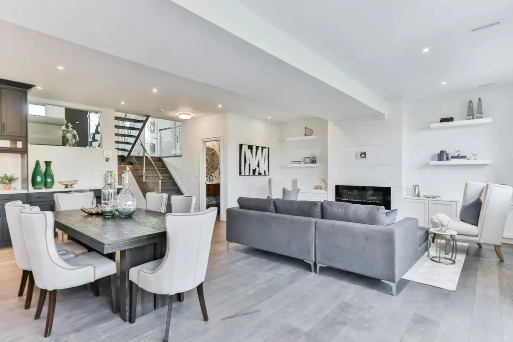
11. Interactive Amenity Showcases
Visual amenities influence property valuations substantially. Research shows amenity views add about 8.3% to apartment prices, with open space views alone contributing 5% to 7.5% value increases.
Renters don’t purchase square footage; they invest in lifestyles and daily experiences. Shared amenity spaces like pools, fitness centers, and lounges substitute for private yards and make professional presentation non-negotiable.
Implementation Tips for Amenity Features
Professional photography transforms amenity spaces from overlooked features into compelling selling points. Capture detail shots that highlight textures and finishes rather than flat wide angles.
Stage spaces with subtle lifestyle touches. Place yoga mats in studios, fresh towels by pools, and books on lounge chairs. These details help prospects imagine themselves using the facilities. Natural lighting creates bright, inviting atmospheres.
Professional lighting eliminates harsh shadows. Update photos from multiple angles and incorporate lifestyle images of residents enjoying spaces. Feature amenity content on dedicated website landing pages, blog posts showcasing usage ideas, and social media channels with candid resident shots.
Virtual tours enable prospects to experience facilities remotely and maintain their interest throughout the decision-making process. Pair compelling visuals with benefit-focused descriptions that explain how amenities improve daily life.
Common Mistakes to Avoid
Inaccurate amenity documentation costs revenue. Properties skip corner unit premiums, don’t label fireplaces or ceiling fans, and wrongly assign multiple view amenities to one unit. Poor photo quality signals neglect.
It undermines perceived value. Generic shots that lack context or lifestyle elements should be avoided. Properties that rely on static images without video content miss engagement opportunities. Resident testimonials specific to amenity experiences provide social proof that shouldn’t be wasted.
12. Streamlined Online Application Process
Application fraud continues to rise while fraudsters become more fluent in circumventing systems. Manual checks of income and job history used to require on-site associates to make many phone calls and review lots of documents.
Operators reduce risk while providing better prospect experiences. They also reduce strain on hardworking teams by increasing screening sophistication. Optimized systems encourage consistent procedures because they evaluate each applicant using similar parameters.
Prospects with good intentions benefit from faster processing and receive rapid answers. High housing demand, combined with limited supply, creates exceptional application volumes. Advanced screening becomes valuable when several applicants look similar on paper.
Best Practices for Digital Applications
Mobile-friendly applications prove critical since renters are savvy with digital tools. Platforms enabling completion at any hour eliminate the need to visit leasing offices during business hours. Applications can be reused for 30 days, saving time and money.
Renters submit applications through user-friendly platforms in minutes. Electronic signatures allow for completing entire processes online. Application fees are paid via credit or debit cards.
Confidence ranks as the most important element that products must provide to users. Covering all needed contract information creates this confidence. Digital processes let both sides track history in one place and provide full rental control.
Common Mistakes to Avoid
Incomplete applications substantially affect approval processes. Missing documents or unanswered questions make applicants appear disorganized or unreliable.
Double-check the forms and ensure that you complete all fields. Supporting documents like proof of income and ID copies should be included. Even minor discrepancies raise red flags. Verify that the information matches pay stubs, tax records, and government IDs.
13. Social Proof and Resident Testimonials
Renters trust peer experiences far more than property marketing claims. Testimonials from current and former residents provide unbiased viewpoints that generic advertising cannot replicate. Research confirms that most renters check online reviews before inquiring about properties.
Positive reviews improve credibility and boost visibility on search engines and listing platforms. Properties with healthy review volumes fill vacancies faster and command premium rental rates.
Reviews from residents who stayed for full lease terms or renewed multiple times are valuable. They show how management deals with issues over time. These reviews reveal if conditions improve or decline and how move-out charges are managed.
Implementation Tips for Displaying Testimonials
The best time to ask for reviews is after good interactions. You can also ask during lease renewals, when tenants are happy with their experience. Send friendly reminders via email or text. You want to seek reviews on a regular basis rather than collecting batches all at once.
Residents should share thoughts on Google, Yelp, and social media platforms like Facebook. Cross-platform presence builds stronger reputations since consistency on multiple sites indicates legitimacy. Your website needs dedicated testimonial sections. Share testimonials on social media to reach larger audiences.
Management must respond to all reviews. Management responses matter almost as much as the reviews themselves. Concerns should be addressed with empathy rather than defensiveness. Professionally specific responses suggest accountability, while silence or hostility suggests that problems won’t improve.
Common Mistakes to Avoid
Fake reviews destroy credibility. Company insiders, such as employees or family members, must reveal their ties to the business. Properties cannot misrepresent the independence of company-controlled review sites.
Suppressing negative reviews violates regulations. Management cannot intimidate tenants into removing reviews or showcasing only positive feedback. Balanced representation builds authentic trust. Reviews from the past 6 to 12 months matter most since management and conditions change frequently.
Businesses cannot provide compensation for writing reviews with positive or negative slants. Properties with 40-50 reviews should continue requesting feedback on a regular basis. Ongoing streams of positive testimonials improve search rankings and demonstrate consistent quality.
14. Personalized Unit Recommendations
Personalization meets customers where they are rather than forcing generic experiences. Websites with interactive experiences offering personalization outperform static alternatives.
Renters begin searching 3 or more months before moving. This extended timeline creates opportunities to gather behavioral data and refine recommendations. Customer data platforms track which units prospects explore, whether they open application portals, and how often they return. This intelligence distinguishes high-intent prospects from casual browsers.

Personalization drives measurable results. Properties using interactive experiences enjoy 2X lead-to-tour conversion and 80% cost-per-lead savings compared to other automation technologies. The approach reduces customer acquisition costs by up to 50%.
Best practices for AI-driven suggestions
AI analyzes budget, location priorities, and amenities to provide tailored recommendations. Content-based filtering matches user criteria against property attributes. Collaborative filtering identifies patterns among similar users. When one user likes balcony units and five others with similar priorities also favor balconies, the system recommends what those similar users view.
Natural language processing interprets conversational queries rather than requiring rigid filters. Renters describe needs like “quiet building near public transit” and receive relevant matches. Systems learn from interactions and show more top-floor units with large windows when users favor those attributes consistently.
Implement decay functions prioritizing recent behavior over historical patterns. Half-life settings of 14 days reduce older interaction values by 50% every two weeks. This ensures that systems adapt when users change from rental searches to luxury purchases.
Segment reporting reveals how models affect different user groups. High-activity users respond differently from low-activity users. Without segmentation, you miss growth in specific cohorts.
Address cold start challenges by recommending popular, diverse content to new users lacking a feedback history. Introduce new properties into recommendations gradually, even without statistics.
Common Mistakes to Avoid
Over-personalization creeps users out. Balance data collection with user comfort. You’re providing better experiences, not tracking everywhere people go. Review collected data types and use only what creates value.
Missing data hurts personalization. Insufficient behavioral information prevents algorithms from recognizing unique priorities. Build workflows that capture relevant interactions across channels frequently. Clean entries by standardizing formats and fixing errors.
Failing to set clear goals wastes resources. Define concrete objectives, like increasing conversion rates by specific percentages or reducing cart abandonment. Track 3-5 metrics that indicate progress toward targets.
Personalization requires iterative refinement rather than set-it-and-forget deployment. Test algorithm changes, UI placement variations, and creative versions extensively.
15. Micro-Interactions and Progress Indicators
Small animations respond to user interactions, like button presses or form submissions. These subtle movements create a sense of direct control and responsiveness.
Microinteractions provide immediate visual feedback that confirms actions have been recognized. When you tap a button, subtle color changes or ripple effects signal successful interaction.
Progress indicators prove especially valuable when you have multi-step processes like rental applications or tour bookings. These elements help users understand where they are and what remains, which reduces anxiety and abandonment.
Animations designed with care create emotional connections between users and interfaces. Subtle movements or playful interactions generate positive emotions, like joy or surprise, and make experiences more memorable.
Implementation Tips for Apartment Websites
Timing determines whether animations boost or frustrate experiences. Keep microinteractions swift, lasting at most 300 to 400 milliseconds. Animations within this range feel responsive without causing delays. Proper easing functions, like ease-in-out, create a natural flow.
Loading indicators manage expectations during wait times. Subtle spinners, skeleton screens, or progress bars communicate that systems are processing requests.
These elements reduce frustration by showing progress rather than leaving users wondering if actions were registered. Netflix shows this with progress circles that display download percentages. This helps users see how much is done and prevents them from closing the app too soon.
Navigation animations maintain context during transitions. Smooth movements between pages or menu items help users avoid feeling lost. These animations create continuity throughout browsing experiences.
Call-to-action elements benefit from subtle movements. Gentle bounces or pulses draw attention to “Request Availability” or “Apply Now” buttons without being intrusive.
Common Mistakes to Avoid
Overusing animation creates chaotic experiences that distract from content. Every hover and scroll shouldn’t trigger busy animations. Reserve motion for moments that boost understanding or provide necessary feedback. Animations should be purposeful rather than decorative.
Slow or unclear feedback frustrates users. Animations dragging beyond 400 milliseconds feel sluggish and test patience. If removing an animation would make the narrative cleaner, skip it. Microinteractions need restraint and single, unified movements rather than multiple competing motions.
Repetitive animations annoy users who encounter them often. Actions users perform dozens of times daily should have subtle or no interactions. That charming jingle loses its appeal after the hundredth play.
Animation cannot save poor design. If the design’s functionality lacks clarity or usability, adding motion won’t fix problems. Ensure designs make sense before implementing animations.
Get a Custom Apartment Website That Converts With Blacksmith
Implementing all 15 UX tips at once might feel overwhelming, but you don’t need to tackle everything at the same time. Picking a few of them and working on them is the ideal plan. That being said, some of these UX tips for apartment websites are a lot more complex than they might seem.
They can take weeks or even months to properly implement, and that’s without considering maintenance. That is time you could be using on other aspects of your business, so what now?
That’s where we come in. Blacksmith is a Multifamily Web Design Agency with a group of professional web designers and developers ready to create the ideal apartment website for you.
Still unsure if investing in a new apartment website is what your business needs? Don’t worry, schedule a call with us and we’ll provide you with a full website audit. This way, we can show you the areas where your current website is lacking, and what a new website could do for your conversions.


