


The best websites to inspire design from LA tech firms prove that Southern California rivals any tech hub for digital breakthroughs. These companies understand that tech website design goes beyond aesthetics and creates memorable user experiences.
We’ve analyzed six examples: SpaceX, Snap Inc., Dollar Shave Club, Tinder, Headspace, and Riot Games.
Each brings unique approaches to visual storytelling and brand expression. You’ll find what makes their tech website inspiration valuable for your own digital presence.
Trying to improve your website design, but don’t know where to start? Let us help.
1. SpaceX
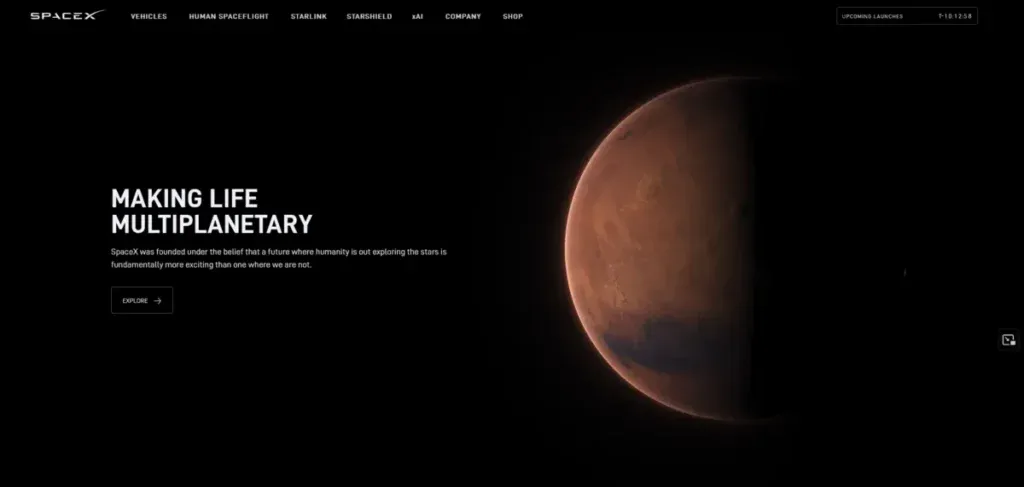
SpaceX transforms technical achievements into compelling visual narratives that capture global attention. The Hawthorne-based aerospace company treats rocket launches as broadcast events rather than corporate announcements. This production approach sets it apart from traditional aerospace communications.
Bold visual storytelling
SpaceX builds anticipation through weeks of strategic content releases before major events. The company explained the booster catch mechanism well before attempting it and shared specific criteria that would trigger a catch attempt.
This approach is different from traditional aerospace broadcasts. Competitors rely on static camera angles, minimal commentary, delayed feeds, and corporate spokespersons reading prepared statements.
SpaceX employs multiple camera angles, including onboard perspectives, live telemetry, technical commentary from actual engineers, and live audience reactions. The Falcon Heavy boosters touching down in perfect synchronization exemplify how SpaceX transforms technical achievement into visual poetry.
Immersive product showcases
Telemetry overlays make complexity visible without requiring explanation. Speed, altitude, and trajectory data are displayed live during broadcasts and give audiences direct access to mission-critical information. Viewers watch separation events, reentry heating, and landing burns from the rocket’s perspective through onboard cameras. Split-screen views show simultaneous footage of booster return and payload deployment. The presentation format itself creates natural tension.
Engineer commentary provides authenticity that traditional corporate broadcasts lack. Real technical staff explain what is happening during launches and replace polished corporate messaging with genuine expertise. This choice reinforces SpaceX’s position as an engineering-focused organization while making complex operations available to broader audiences.
Clean navigation structure
Website redesign concepts for SpaceX focus on reducing user frustration while increasing participation. Analysis identified that SpaceX.com serves to keep users informed of progress on projects, missions, rockets, and rideshare opportunities to space.
Testing revealed the overall layout works well, but new global navigation and hamburger menu options could ease user frustration.
The design approach follows best practices that make navigation easy for users and incorporates familiar elements like back buttons and close icons alongside orientation tools like progress bars. Design decisions went through multiple iterations to determine the best system for users.
Color and UI element changes can improve key performance metrics. The strategic use of visuals supports SpaceX’s mission to communicate complex technical information while maintaining a broad appeal across different audience segments.
2. Snap Inc.
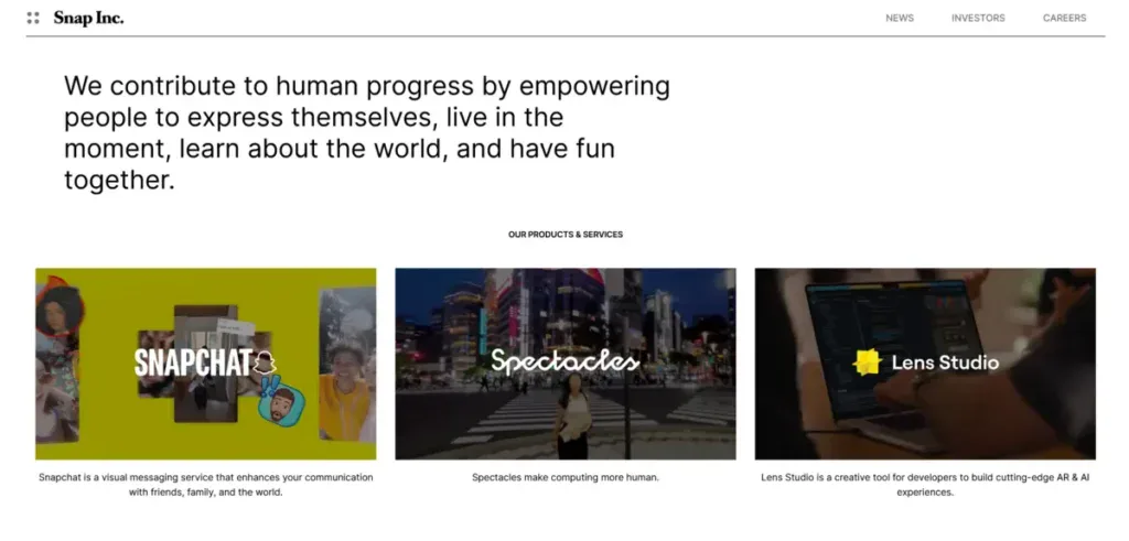
Snap Inc. built its entire brand around a quirky ghost icon and a bright yellow backdrop. This proves that playful design choices can establish cultural dominance in social media.
The Santa Monica-based company’s website reflects this same philosophy through interactive experiences and mobile-optimized interfaces that prioritize fun over formality.
Playful brand identity
The ghost logo started as a one-night design project. It became one of the most recognizable symbols on social media. Founder Evan Spiegel created the friendly ghost with a goofy grin and its tongue sticking out.
This design carries deeper meaning than surface-level cuteness. The ghost symbolizes the “now you see it, now you don’t” nature of snaps that disappear after viewing. It serves as a clever visual metaphor for the app’s promise of impermanence and privacy.
Snap made bold decisions that set it apart from competitors. The company welcomed being different by choosing a quirky concept and a loud color to define its identity.
Other startups might have played it safe with their branding. Snap went with yellow and a cartoon ghost. This strategic choice gave Snapchat a much more playful and youth-oriented image than its competitors.
The decision not to use any text or wordmark in its primary logo signaled confidence. The brand guidelines emphasize using only the official Ghost logo available for download. This symbol-only approach demonstrates that strong branding doesn’t need words to communicate identity.
Interactive elements and animations
Snap operates over 3.5 million AR Lenses from both the company and creators. The app’s camera serves as the primary gateway and drives daily opens that average dozens per user. This camera-first approach powers the interactive experiences that define Snap’s tech website design.
The Animation tab of Bitmoji Suite offers creators multiple ways to bring characters to life. You can choose from existing animations in the Animation Library. You can generate new ones using a Text Prompt or upload a Video to capture animation from it.
The Animation Library organizes content into three categories: Actions for full-body animations without facial expressions, Emotions for full-body animations with facial expressions included, and My Gallery, where your custom animations appear after being generated.
The Text Prompt feature generates animations by entering descriptions in the input field. Capture from Video allows you to generate animation by uploading a video and extracting the person’s movement from it. Only the first 10 seconds or 512 frames will be processed, though. The Stitch animations option lets you easily combine any animations from the library.
Mobile-first approach
Snap reached 478 million daily active users by mid-2025. This anchors its role as a camera-first platform driving AR and spatial computing. Its reach in ages 13-34 and pivots into hardware make its monetization strategy distinct.
Snap captures a specialized niche among Gen Z and mobile-first users. It ranks ahead of Meta and TikTok in AR engagement metrics and daily AR use.
The camera-based social interaction model proves that mobile-first doesn’t just mean responsive design. It means building every feature around how people use their phones throughout the day.
3. Dollar Shave Club
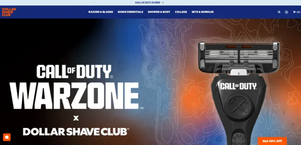
Dollar Shave Club’s Los Angeles headquarters produces some of the most studied copywriting in e-commerce, proving that words sell as well as visuals when you understand your audience.
The company disrupted a billion-dollar industry not through superior product technology but through conversational writing that made razors feel personal. Their website shows how personality-driven copy converts browsers into subscribers.
Conversational copywriting
Research revealed a disconnect between Dollar Shave Club’s playful brand reputation and its website experience. The team studied emotional tone. They found that the digital experience missed the warm, conversational touch that made the marketing stand out.
The team hypothesized that improving emotional resonance in the purchase funnel would increase subscriptions. They started with a small test that many organizations would have blocked as too minor to matter. The experiment tweaked the copy on the first two funnel steps and switched from clear but formal language to conversational phrasing.
The company injects humor into every customer touchpoint. Email subject lines read like texts from a friend: “What happens to a poop when you hold it until it goes away?” and “Should I Be Moisturizing My You-Know-What?”
This approach makes mundane grooming products feel entertaining rather than transactional.
Homepage copy introduces personality in stages rather than overwhelming visitors right away. The hero section plays it safe with clear value statements before the FAQ section reveals the full, sassy voice.
This measured approach acknowledges that homepage traffic comes from varied sources, some of which are unfamiliar with the brand. The FAQ copy rewards readers who scroll that far with the buoyant tone they expect from Dollar Shave Club.
Strong call-to-action placement
A single call-to-action strategy removes decision paralysis. Dollar Shave Club’s email campaigns feature only one path forward: sign up or join now. Each email funnels prospects to landing pages with identical singular CTAs. No distractions compete for attention and keep users focused on conversion.
Segmentation targets the right prospects at the right moment. The company crafts campaigns for abandoned cart leads who filled out forms but didn’t complete purchases. These hot prospects have already engaged with the brand and liked the product enough to almost buy. Targeting highly involved prospects with direct sales requests produces better results than blanket campaigns.
Barrier removal addresses objections before they form. Dollar Shave Club identifies common protests like “I don’t need razors every month” and “What if I don’t like the blade I choose?” then answers them preemptively in email copy. This strategy confronts purchase hesitation head-on rather than hoping prospects overcome their doubts on their own.
Personality-driven design
Visual identity reinforces brand character through deliberate choices. The website uses rustic imagery with a typeface in faded white against wood plank backgrounds. This combination creates a masculine feel that contrasts with the sleek corporate aesthetics typical of personal care brands.
Color palette stays simple and purposeful. Dark gray, white, and orange dominate the design. The orange logo sits centered in a white navigation bar and creates eye-catching brand reinforcement. These choices signal that Dollar Shave Club operates outside traditional grooming industry conventions.
The review platform builds trust through authenticity. Dollar Shave Club hosts user reviews prominently and highlights the customer-centered brand nature. With more than 31,000 reviews available, visitors gain confidence before trying the service. This transparency contrasts with brands that hide customer feedback or curate only positive responses.
4. Tinder
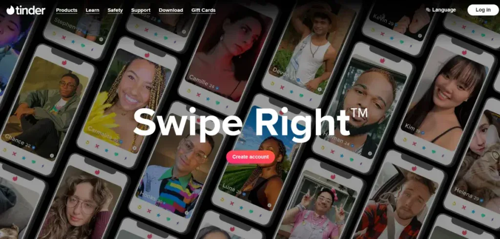
Tinder pioneered the swipe-based interface that became a cultural phenomenon, proving that stripping away complexity drives unprecedented engagement.
The dating app launched in Los Angeles in 2012 with features that made mobile dating feel natural rather than awkward. Their tech website design reflects the app experience. They use bold colors, smooth user flows, and clear messaging that shows value right away.
Vibrant color palette
The pink and gray color scheme carries strategic meaning beyond visual appeal. Tinder’s primary pink (#FD3A73) represents passion. Gray (#424242) symbolizes trustworthiness. This combination addresses the dual nature of dating apps and balances emotional excitement with platform reliability.
The brand updated its color palette in 2017 to include variations that work across different contexts. Orange (#FF7158) joined the palette alongside magenta (#FD2B7B) and created a gradient effect that adds energy to static screens. These warm tones contrast sharply with the neutral gray. Interactive elements stand out without overwhelming users.
Simple user experience
Tinder’s onboarding removes barriers that cause abandonment. You log in with Facebook or a phone number and skip the lengthy profile creation that competing apps require.
The app populates your profile from Facebook automatically and lets you start swiping within minutes. This efficient approach has crushed other dating apps that demanded extensive questionnaires before showing matches.
The registration flow follows a one-task-per-step methodology. Each screen focuses on a single action with the main input field in autofocus and keyboard-ready mode.
Progress bars perform multiple roles during setup. The indicator at the top shows how many steps remain and provides feedback about the current status. It keeps you motivated through visual confirmation. You’re more likely to finish the task when you see you’re one or two steps from completion.
The swipe mechanism itself demonstrates behavioral design mastery. Tinder pioneered Swipe Right® and Swipe Left™ features that became synonymous with choice-making.
The app limits information on each card and shows mainly photos with minimal text. This reduction in cognitive load makes the first move easier.
Clear value proposition
Tinder’s mission statement communicates purpose in six words: “To increase romantic connectivity worldwide.” This clarity extends to the website and app interface. You understand what the platform does without reading explanations or watching tutorials.
The value proposition targets specific demographics. Tinder positions itself for quick connections rather than lengthy compatibility assessments and is popular among singles under 25, with 60% of users under 35. Profiles remain brief and focus on basic information like name and age, with a few photos. You can link your Instagram and Spotify accounts to add depth without filling out forms.
The freemium model relies on clear upgrade messaging. Tinder shows you the number of people who liked your profile and motivates premium subscriptions.
Benefits like unlimited swipes and location changes appear contextually when you hit free-tier limits. This strategy generated USD 1.40 billion in revenue during 2021, mostly from subscription services.
5. Headspace
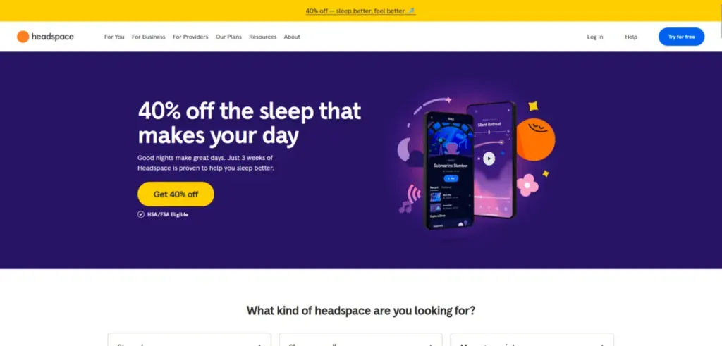
Headspace operates from Los Angeles as a mental wellness platform that treats design as therapy rather than decoration. The company’s approach to tech website design centers on creating environments that reduce anxiety instead of stimulating participation metrics.
Every color choice, shape, and interaction gets reviewed against one question: Does this make users feel safe, relaxed, and focused?
Calming design elements
The color palette serves a psychological function beyond brand recognition. Headspace selects gentle blues, warm yellows, and calming neutrals based on how these shades influence mood rather than how they perform in A/B tests. The team chose nature-inspired tones that create emotional responses before cognitive ones.
Rounded shapes appear throughout the interface by design. Nothing sharp or intense makes it into the final version because angular elements trigger subtle stress responses. Spacious layouts give content room to breathe and make the interface feel approachable rather than demanding.
Micro-interactions follow the rhythm of breathing. Transitions move slowly and echo inhale and exhale patterns. These animations don’t flash or pop for attention. They respect user pace in ways that feel rare among attention-hungry interfaces. Loading screens become opportunities to ease anxiety rather than test patience.
Custom illustrations
The signature illustration style communicates brand values through visual language. Playful characters make complex mindfulness concepts available. These aren’t decorative additions but integral communication tools that convey empathy through design.
The illustration approach evolved to include emotional range. Characters now express stress, sadness, and contentment rather than showing only joy. This expanded emotional vocabulary helps users see themselves reflected in the interface. Animations simplify abstract meditation concepts into understandable visual sequences.
Minimalist interface
Users describe the app as easy and pleasant to use, with visually striking design elements that don’t overwhelm. The typography uses rounded letterforms that remain clear and readable. Type choices balance personality with function and give just enough character without pulling focus.
The interface offers surprising depth beneath apparent simplicity. Interactions feel user-friendly because the taxonomy makes content easy to find. Clean style and strategic white space create calm, with color appearing only to highlight important elements. Consistency extends to motion timing and creates unified experiences across all touchpoints.
The design system maintains emotional consistency across mobile apps, smartwatches, and websites. This modular approach scales without diluting the brand’s signature feeling. Warm language is integrated throughout and makes every prompt feel like a gentle suggestion rather than a command.
6. Riot Games
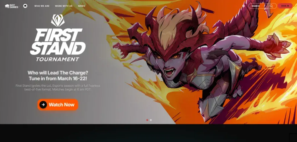
Riot Games approaches tech website design through the lens of game development. Every visual element serves gameplay clarity and character expression.
The company behind League of Legends operates from Los Angeles with over 4,500 team members in 20+ offices. They create games like VALORANT, Wild Rift, Legends of Runeterra, 2XKO, and Riftbound. Their website reflects production pipelines that prioritize player experience over corporate polish.
Gaming-focused aesthetics
Character artists translate 2D designs into 3D space. They create and sometimes invent character anatomy. These specialists master proportion, likeness, and readability. Tiny in-game models remain believable forms that capture character fantasy. The workflow has modeling and texturing. Artists hand-paint details or use shaders to bring characters to life.
Animation builds on poses over time rather than continuous movement. Strong poses are the foundations of believable, satisfying motion through careful timing and spacing. State machines and parametric blending handle the technical implementation.
Different animations work together and overlap based on game events that happen in real time. This technical infrastructure means characters react appropriately to whatever happens around them during gameplay.
Community-centered features
Player value drives development decisions at Riot. Teams work with communities to inform features and improvements.
The new social panel in Riot Client makes seeing what friends play easier. It facilitates chat and joining games together. Infrastructure teams equip developers to move fast and change plans based on feedback. Features are shipped to players faster.
Character-driven visuals
Concept artists function as problem solvers. They create visual solutions for development goals. Rapid ideation forms the core of their work rather than drawing amazing pictures. Drawing remains an important communication tool, though. Artists establish constraints, prepare designs, narrow ideas, and rally teams around concepts.
The Polycount Wiki provides learning resources from game industry professionals. Forums offer critiques and advice for character artists. ArtStation showcases thousands of professional artists and helps aspiring creators understand industry standards.
What Makes L.A. Tech Website Design Stand Out
These six companies reveal patterns that define tech website design emerging from Los Angeles. Their approaches stem from a city where entertainment industry standards meet startup velocity and create expectations that differ from Silicon Valley’s engineering-first culture.
Creative brand expression
Los Angeles designers prioritize bold typography and vivid colors that serve functional purposes beyond aesthetics. SpaceX turns launches into broadcast events. Snap Inc. built an empire around a playful ghost. Dollar Shave Club made razors entertaining.
These choices reflect Hollywood’s influence on visual storytelling, where every frame communicates character. The unique blend of technological proficiency and artistic sensibility makes LA designers skilled at creating websites that balance function with visual impact.
User experience priorities
User experience anchors design decisions across LA tech firms. Designers focus on accessible navigation and fast loading times that involve without overwhelming.
Tinder’s swipe mechanism and Headspace’s calming interfaces demonstrate this principle. Good UX design retains visitors and converts them into customers by minimizing frustration and maximizing ease of use.
Performance and responsiveness
Responsive design ensures websites function across all devices. Mobile-first approaches dominate, with designers treating mobile as the default rather than an afterthought. Core Web Vitals now shape layouts before aesthetics enter discussions.
Strategic use of visuals
Custom illustrations and animations boost engagement with unique artistic elements. Riot Games’ character-driven visuals and Headspace’s calming design elements show how visuals communicate brand values without words.
Get a Custom LA Website That Converts With Blacksmith
SpaceX, Snap Inc., Dollar Shave Club, Tinder, Headspace, and Riot Games demonstrate that Los Angeles tech companies create websites that balance entertainment value with functional design.
But creating a website with the design and interaction of these websites takes more than knowing how to create a website. It takes weeks, if not months, of planning and strategizing before you can see results.
This is time you could be using on other aspects of your business, so what now?
That’s where we come in. Blacksmith is a Los Angeles Web Design Agency with a group of seasoned web designers and developers ready to create the perfect website for you.
Still unsure if a new website is what your LA-based business needs? Don’t worry, schedule a call with us, and we’ll provide you with a complete website and brand audit. This way, we can show how a new website can help your business grow and stand out in LA.


